Sunday, October 30, 2011

SIMON SAYS SHOW A HOUSE

Happy Monday Everybody!!  HAPPY HALLOWEEN!!!

Did you see the BIG NEWS over at SIMON SAYS STAMP AND SHOW?   We are so excited to now have 1,000 FOLLOWERS!!!  Yippee and Ya-Hoowee!!   Thank you to everyone who is a follower...and if you're not one, why not sign up?  We'd love to have you on join us!  While you're signing up...check out the Design Team's creations for you this week!!!  They will knock your socks off!  This week's challenge theme....."A HOUSE".

I decided to make that plural and make a vintage shabby chic row houses triptych. 
(Isn't THAT a fancy word for a three paneled something or other?)

Because of the length of the triptych, it is hard to get a really good picture showing all of the detail.  You can click on the picture to get a larger image.

I began with three plain chipboard houses.  Each house measures 5 1/2" x 4".  Each of the houses features a different dimensional window.  The chipboard windows are from an Australian company, ScrapFX.  Aren't they awesome?  In each window is a beautiful little vintage girl from a collage sheet I purchased from Dezinaworld.  Love them!! 

The first house was sprayed with some Snow Cap Diorama Paint I found on a clearance aisle at a local craft store.  The fact that it looked like stucco fascinated me, so I bought it.  I sprayed it right onto the chipboard and let it dry.  I love the texture it gave!  Then I distressed my "stucco" house with Scattered Straw followed by Tumbled Glass Distress Ink.  Next I heat embossed a Tim Holtz flourish from his French Market set using Ranger's Antiquities Verdigris.  I love the variation in color and texture you get with this embossing powder.  I then distressed around the edges of the house with my new favorite Tim Holtz brown, Gathered Twigs.  


Next I added the dimensional window.  There are two pieces to this window.  I pounced Silver and Gold Paint Dabbers onto the chipboard window to create a weathered metallic look.  The under piece has what I thought could be a "curtain".  So, I first painted that area with a cream base and then went over it with Tumbled Glass Distress Ink.  Then I masked it off and heat embossed a script design from Tim Holtz' Mini Ornates stamp set using Ranger's Queens Gold Embossing Powder.  I used a piece of scrap paper as my background for the window and placed the beautiful little vintage girl, longingly looking out the window.  A silver Ideaology Corner that has been lightly touched with some paint from a Juniper Paint Dabber (for a more patina look) is at the top of the window.  

Isn't she a lovely little girl, looking out of the window?

Next I added a Grungeboard fence using Tim Holtz' Iron Gate On The Edge Die Cut across the bottom of this house.  It was also pounced using a Silver and Gold Paint Dabber and patina-ed with a Juniper Paint Dabber.  

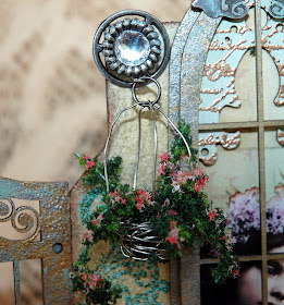
Finally, I made a little hanging basket out of silver wire and added some delicate vines and flowers using Flower Soft's Sweet Pea for the flowers and a mixture of Shamrock and Christmas Green for the greenery.  The basket is hung in place on the chimney of the house using an Ideaology Sprocket, a Charm Clip and a "bling" brad.


The second of the row houses features a large window with moveable shutters.  I love the detail on this window frame!!  (More about that in a minute.)  The base of this house is white watercolor paper that was colored with a mixture of Picket Fence Distress Stain and Claudine Hellmuth's Painterly Pink Studio Paint.  I distressed the edges of the house with Gathered Twigs.  Then I lightly spritzed the front with Sunflower Sparkle Perfect Pearls Mist.  Although it is mostly covered up, I stamped the house with the script text from Tim Holtz' Papillon stamp set using Sepia Archival Ink.  

A close up look at the Copper Paint added to the frame.

Next I added the dimensional window that was first inked with Gathered Twig.  Then I lightly brushed some Copper from a Paint Dabber onto the brown, using my finger.  I love the results of doing that.  The flower bough at the top of the window was also made with the Flower Soft products used on the first house.  However, making the bough was more detailed than making the hanging basket.  


First I fashioned the bough out of white wire.  Then I used Glossy Accents to glue the green Flower Soft particles onto the wire, making my leafy base.  I wanted the flowers to look more like bunches of lilac type hanging flowers, so instead of just adding some glue and sprinkling the flower particles on the greenery, I made individual bunches of flowers by gluing them onto white wires and then hot gluing them into the green bough.


The detail in the shutters of the window was done by heat embossing a design using Gold Embossing Powder on typing paper, then cut to fit the shutter and glued into place.  The shutters are held in place using medical tape that is colored with Gathered Twig Distress Ink.  The medical tape allows the shutters to open and close.  I love interactive, dimensional things!


Again, a lovely vintage girl is wistfully looking out of the window; up towards the Ideaology bird from Tim Holtz' Adornments that is making a nest in her chimney.  A copper Corner with some Juniper accents adorns the peak of this house.


The third and final row house is completely covered in various Tim Holtz Tissue Tapes that have been colored using Broken China and a touch of Scattered Straw Distress Inks.  The edges of this house are also inked with Gathered Twigs.  I used the larger of the Tim Holtz' Fabulous Flourishes to heat emboss the background of this house using Queen's Gold Embossing Powder.  There is also some gold heat embossed accents along some of the edges.  This house features an arched picture window that is colored using a Butterscotch Paint Dabber followed by heat embossing some Queens Gold Embossing Powder scattered on top.  Then I lightly added some Juniper paint.  


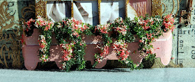
The window box is made from Grungeboard.  It is colored using the mixture of Painterly Pink and Picket Fence Distress Stain.  It is die cut using Tim Holtz' Plaque and Postage die for the top and bottom detail.  The hanging vines and flowers in the window box were made from the same Flower Soft products as the previous two houses.  


Since this window is not a dimensional window, I did the best I could to make it appear to be one.  I made a "curtain" out of a distressed piece of pink crepe paper and placed it behind the sweet vintage girl who is sitting at the window.  Then I pop dotted the window on top of the house and pop dotted the window box out even further to wrap around the window.  The peak of this house also has an antique gold Ideaology Corner that is lightly touched with Juniper paint.  There is also a little lion head door knocker to the right of the window that is holding a small metal key.  

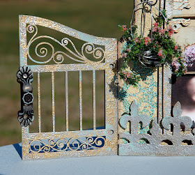
The intricate ScrapFX Chipboard Gates have also been pounced with a silver and gold Paint Dabber and lightly touched with a Juniper Paint Dabber for that aged, worn and weathered shabby chic look.  The two gate handles (purchased at a local craft store) are an antique gold finish and also touched with Juniper paint for a patina look.       
            

The back of all the houses are covered in a scrap piece of Glitz Design paper that I had.  The "hinges" are actually one of Tim Holtz' Movers and Shapers Mini Labels that have been colored with the silver, gold and Juniper Paint Dabbers.

Houses....such fun!  Now it's YOUR turn to create something to do with houses and post it to SIMON SAYS STAMP AND SHOW CHALLENGE.  You could win a


How cool is THAT?!?!  And ... you could be selected as one of our TOP THREE entries and receive our coveted BLINKIE for your blog!  Good luck!  I can't wait to see what you create! 

Sunday, October 23, 2011

SIMON SAYS BE MONOTONE!!!

Hi Bloggers!!!  This week, Simon Says Stamp and Show Challenge is all about ONE COLOR....ANY COLOR!!  Sound boring?  Well...it's not!  It's fascinating to see what you can come up with only using one color and the shades of that color.


I LOVE BROWN!!!  So I chose to do my piece in shades of BROWN on an extra large tag.
 Kaz of The Little Shabby Shed recently sent me a beautiful large tag she had made for me and I loved the size!  I've not seen them in stores where I live, so I made my own.  It measures 8 1/2" x 4".  This is the first one of these that I've made.  

The very first thing I did to my blank manila tag was to use Tim Holtz' DREAM Movers and Shapers die cut and cut it in the right hand corner.


I used ALL of Tim Holtz' browns in his Distress Inks line; including the NEW Seasonal Fall color - GATHERED TWIGS.  I am IN LOVE with this brown!  I started distressing my tag from the lightest to the darkest brown Distress Inks:  Tea Dye, Vintage Photo, Brushed Corduroy, Frayed Burlap, Gathered Twigs, Walnut Stain.  Next, I used Tim's splatter technique to distress the background.  To do this, you simply cup your fingers and spritz some water into your cupped fingers.  Then flick your wrist and quickly spread your fingers, releasing the droplets of water onto your inked surface.  Because Distress Inks are water soluble; the water will begin to react with the ink, leaving a really cool random splatter pattern.  Then just blot  and/or heat tool the tag.

I was watching a Dyan Reaveley tutorial the other day and loved her idea of not using a block underneath a stamp when you're stamping if you're wanting a partial print.  So, I used that technique on my background of this tag.  I added portions of a mesh background from Tim Holtz' Ultimate Grunge stamp set.  I stamped it in Coffee Archival Ink...a rich, wonderful dark brown permanent ink color.   


Next I wanted to give some texture to my tag.  I took a little of Claudine Hellmuth's Gesso and added a few drops of Coffee Archival Ink Refill Re-Inker to "brown it up".  Remember...I can only use ONE COLOR and you can tint the white Gesso!  Then I laid an alphabet stencil on top of my tag and swiped the colored gesso over the stencil with a Ranger Craft Scraper.  (Immediately wash your stencil after using Gesso on your stencil.  You don't want the Gesso to harden on it).  Then I lightly heat tooled the Gesso to set it.  The Gesso stays raised and it feels neat to run your fingers over it.  


I cut a strap out of Plain Grungeboard from Tim Holtz' Hardware Findings die cut and a Grungeboard butterfly from Tim Holtz' Mini Butterflies Movers and Shapers die cut.  The strap was inked with Coffee Archival Ink, dried and then inked with embossing ink.  I then sprinkled Antiquities Rust, Espresso and Mushroom Adirondak Embossing Powders (all brown tones) and heat set them.  The butterfly was inked with Tea Dye Distress Ink and then stamped with a script stamp using Coffee Archival Ink.  The Pen Nib for the butterfly's body is alcohol inked using Espresso Alcohol Ink.  


I found the vintage picture of this angelic little boy in my computer files and edited it to add a few more sepia tones.  I sized the picture 2" x 2" to fit onto a Tim Holtz' Square Fragment.  I first alcohol inked the fragment using Ginger and Caramel Alcohol Inks.  Then I removed the alcohol ink from the center of the fragment by using some Alcohol Ink Blending Solution.  Next I used some Glossy Accents to attach the vintage picture to the fragment.  I cut out a larger square out of kraft paper, distressed the edges with a Tonic Paper Distresser and then inked the edges with Walnut Stain Distress Ink.  I glued the kraft paper in place, wrapped some brown-ish twine around the tag, tied it off and then glued my vintage portrait on top.  

Underneath my vintage fragment picture, I stamped one of Tim's Sayings ... "In dreams we catch glimpses of life larger than our own."  That stamp is from Tim's Mini Ornates stamp set.  I love that saying and thought it went well with the "DREAM" die cut.  I stamped the saying in Coffee Archival Ink and to add texture, I sprinkled Ranger Clear Embossing Powder over the top of it and heat set it.  


At the bottom of the tag, I used Tim's Filmstrip Ribbon and repeated the vintage photograph of the little boy four more times; sized it and glued it onto the filmstrip using Glossy Accents.  I then glued the filmstrip onto the tag.  To the left of the filmstrip is another of the Pen Nibs that has been alcohol inked with Espresso Alcohol Ink.  

As you can see...using one color doesn't have to be boring!  Be creative in how you use texture, mix colors and blend shades of one color to create a monotone masterpiece!

If you've not stopped by Simon Says Stamp and Show's Challenge yet, you really need to do so!  My Design Teammates have once again outdone themselves to bring you such delicious monotone art!  Check it out!!!

Then create and enter your Magnificent Monotone in our challenge.  You could win a......

 
 from our generous sponsor!  You could also be selected and recognized as one of the TOP THREE entries for the week!  So, get busy!!  I can't wait to see where your creativity takes YOU!
 

Sunday, October 16, 2011

SIMON SAYS SHOW SOME STRIPES & MINI BOOK TUTORIAL

Okay, I have to admit...stripes are not my favorite things to work with.  So I was a bit baffled by what to create this week for the Stripes Challenge.  If you haven't already seen the amazing designs my SIMON SAYS STAMP AND SHOW Design Teammates have created for you this week...you should head over to THE CHALLENGE BLOG and have a look!  They are so inspiring!!!  Week after week they bring it for you!! 

I haven't made a mini book in a while and in fact, I'd never made one of the mini books I'm about to show you.  But, I was fascinated with it because you can make the interior of the book from ONE SHEET OF 12x12 PAPER!  The rest is from small pieces of chipboard and cardstock scraps.  Doesn't sound like very much...but the results have all sorts of creative potential!

First, let me show you and tell you about my little Butterfly Mini Book and then I'll show you how I made it.

  
Here is the cover of my mini book.  I used the beautiful papers from Graphic 45's now retired (but still available) Botanicabella Collection.  I distressed all of the edges and interior of this book with one of Tim Holtz' new fall Distress Inks, Gathered Twigs.  It is a warm, rich brown color.  I love it!  Next I used stamps from Tim Holtz' Papillon and Fabulous Flourishes sets to create my cover. The images were stamped with Jet Black Archival Ink.  I cut out 4 butterflies from one of the sheets of paper from the G45 collection.  I glued them together at the bodies using Glossy Accents.  (As a matter of fact, all of the gluing I did on the embellishments was done with Glossy Accents.)  Next, I added just a touch of Platinum Stickles to the golden area of the top wings and then covered the wings with Crackle Accents to give them more of a vintage look.  Platinum Stickles are a GREAT color to use when doing vintage.  It takes on all sorts of antique colors: silver, gold, copper, etc.  Love it for vintage work!!!  I then lifted the top wings for a more dimensional look.  Next, I found 4 vintage images of butterflies and sized them 1" x 3/4" to fit in the little frames of Tim Holtz' Filmstrip Ribbon.  Then I glued them in place.  Next I glued my dimensional butterflies down.  Then I added the "B" from Tim Holtz' Grungeboard Alphabet Soup.  I covered the "B" with Platinum Stickles for that vintage feel and glued it in place.  Finally, I added a metal gold book plate with the word "butterflies" in it.  This word was also found on the same page as my dimensional butterflies.  I covered "butterflies" with Crackle Accents; again, for a more vintage look. 


Here is the back of the book.  I simply stamped parts of flourishes in various locations.


I didn't completely embellish the interior of the book because I wanted to show you the difference in the plain vs. lightly embellished pages.  Here are two pages that are obviously not embellished...only distressed with Gathered Twigs..AND I USED STRIPED PAPER - in keeping with this week's challenge theme!  I did not put anything in the pockets but they are the perfect size for ATCs or mini tags.  

Before I go any further talking about the embellishments on the interior of the book, I want to show you a piece of paper from the Graphic 45 Bontanicabella collection.  It is called "Antiquities".

  
Isn't this beautiful?  I used this one sheet to make several of the backgrounds on the interior of the little mini book.  The individual images would also make wonderful little inserts or mini tags for the pockets.  I wanted to show you this sheet first so you can better understand how perfectly it works on the interior pages....and it's all from just one sheet of paper!

  
Here is the interior of the front cover and the first pocket.  I decided to make this book about butterflies so I typed out several butterfly quotes I found online.  I sized them to fit in my little book.  The two inside cover quotes were torn and distressed with Gathered Twigs and lightly edged with a black cats eye ink pad.  I also lightly dusted them with Biscotti Perfect Pearls Powder for a subtle shimmer.  As you will later see, the quotes on the interior of the book are done differently.  The butterflies on the opposite page are one of the images on the Graphic 45 Antiquities sheet shown above.  All I did was cut it out, distress it with Gathered Twigs and lightly go around the edges with Platinum Stickles for a more vintage feel.  Then I glued it in place.  Easy peasy...


The words on this quote are cut out individually and glued in place.  I first distressed the quote with Broken China Distress Ink and edged each piece with a black cats eye.  The background on the opposite is another of the images from Antiquities.  Only this time, I altered its appearance by using an Aqua Paint Dabber, Picket Fence Distress Stain and water in a Mister.  I mixed the three on my craft sheet to create a color and applied it to the paper using some Cut N Dry Foam.  Heat dry and then keep adding color until you get the opaqueness you're looking for.  (You can still see the text above my stamped butterflies).  I love the texture, marbled look and the really different backgrounds you can achieve by using this technique.  I lightly distressed the edges with Gathered Twigs and just edged with a black cats eye.  Then I stamped two butterflies from Tim Holtz' Papillon stamp set and lightly smeared some Crackle Accents over much the surface with my finger and let it dry.  I finished this background by lightly dusting Biscotti Perfect Pearls over some of the perimeter and then glued my background in place.  I added a piece of vintage lace that I lightly distressed with Wild Honey and Rusty Hinge Distress Inks.


The quote on this page was done like the previous page except I distressed with Gathered Twigs.  I used another of the images from Antiquities on the right.  I distressed the image with Wild Honey and Gathered Twigs and edged with a black cats eye.  I punched out a small butterfly using Martha Stewarts' Butterfly Punch.  Then I turned the butterfly over, edged it with Platinum Stickles and let it dry.  I glued the background in place and then glued the body of the small butterfly back in the hole I'd created with the punch.  I pulled up the wings for a more dimensional look.  I distressed a piece of vintage lace with Gathered Twigs and glued it down.  Then I cut another of the beautiful butterflies like I used on the cover out of the Botanicabella papers and glued it in place. 


 The quote on this page was distressed with Wild Honey and a touch of Gathered Twigs.  The image on the right is yet another from Antiquities.  I first distressed it with Gathered Twigs and added some Broken China.  When I blended the blue-ish Broken China over the brown Gathered Twigs, I got a beautiful teal-ish green.  I punched another butterfly and distressed it with Broken China and then lightly smeared some Platinum Stickles all over it.  When it dried, I glued it's body onto the background and lifted the wings.  


This is the  final page I embellished.  The quote was distressed using Gathered Twig.  The background image on the opposite side (again from Antiquities) was again altered using paint and stain.  This time, I used a Terra Cotta Paint Dabber, Picket Fence Stain and water in a Mister.  Using the same technique, I achieved more of a white background.  You can still see the text underneath.  I stamped my image of the little winged girl using Jet Black Archival Ink and heat tooled it dry.  Then I lightly added some Orange Peel, Stardust and Black Diamond Stickles to her wings.  When dry, I glued the background in place.  Then I added the really neat vintage stamp that I covered in Crackle Accents and distressed with Gathered Twigs.  The stamp is also one of the images on the Botanicabella papers.   

This is an inexpensive project to do.  You can construct the interior of the book from ONE SHEET OF 12x12 paper.  I basically made this entire book from scrap chipboard and the equivalent of a little over two sheets of paper!  Just imagine the creative possibilities with so little materials needed!!

So, are you curious as to how to construct this little mini book?  Here's how to do it:

1.  Start with a piece of 12x12 cardstock.  Lightly score it at 3" intervals horizontally and vertically.  You should end up with 4 rows of 4 squares or sixteen 3" squares in all.  Lightly fold all of the folds so that you can better see the squares.  Then lay the sheet out flat again.


2.  Next, start at LEFT side of the 12x12 sheet of scored cardstock and cut right on the VERTICAL fold line up to the last HORIZONTAL line.  STOP!  Don't cut past that last horizontal fold line that intersects at that point.

3.  Turn the 12x12 sheet completely around.  The strip you just cut will now be on the right side and the uncut portion of that strip is at the bottom.  Locate the next vertical fold line in on the RIGHT hand side that has not been cut (and next to the uncut portion of the first vertical fold line you just cut).  Begin at the bottom and cut directly on the VERTICAL fold line up to the last HORIZONTAL cross line and STOP!  (Just like you did on the previous fold line). 

4.  Turn the 12x12 sheet completely around again.  The two vertical strips you have cut will now be on your left side.  Locate the next vertical line from the LEFT had side that has not been cut (and next to the uncut portion of the last vertical fold line you just cut).  Begin at the bottom and cut directly on the VERTICAL fold line up to the last HORIZONTAL cross line and stop!  (Just like you did on the previous fold line).

5.  Turn the 12x12 sheet completely around again and cut the last VERTICAL strip up to the last HORIZONTAL cross line and STOP!

 
Your 12x12 sheet of paper should now look like this (if you slightly pull it apart).

6.  Beginning with the lower LEFT side, you are going to fold the squares together, using a mountain/valley fold.  Start by folding the first square UP and proceed with a valley/mountain/valley system.  When you get to the top of the first strip, just fold the first strip BEHIND the top of the second strip and keep folding...valley/mountain/valley.  When you get to the bottom of the next strip, simply fold all of your gathered squares BEHIND the bottom of the next strip and repeat the valley/mountain/valley.  When you reach the top of the last strip, simply fold the gathered squares BEHIND the top and repeat the valley/mountain/valley fold until all of the squares have been folded into a little 3" stacked book that when turned on one side should open like this:


  (At this point, most of the tops of your pages are open.  Only a couple of them are folded.  That is not a problem. We will join them with double sided tape in a minute.  Just be sure that your book has a flap on each end that will glue to the book covers and that you can see visualize how the pages will be formed soon.  Set aside...
Now your book will need covers....


7.  Cut two pieces of chipboard 3 1/4" square.  Cut whatever cardstock you want to use as a cover for your book in a 3 1/2" square.  Mark in 1/4" on the top and one side of your cardstock and draw a line.  This will help you place your chipboard correctly on the cardstock.  Use just a dot of glue or a little piece of double sided tape on the wrong side of the cardstock to hold it in place as you fold over the sides.  Use 1/8" double sided tape around the outside edges of your chipboard (to hold your folded over cardstock).  Clip the corners of the cardstock to miter them onto the backside of the chipboard.  At this point, I cut two more cardstock squares that were just under 3" and covered the backside of my exposed chipboard cover before attaching the book pages.  Now to form the book....

8.  Fold the book back up into the 3" stack of folded squares.  The two outside flaps are what will glue on to the chipboard covers you just made; so don't include those in the taping of the book.  Turn the book over so that you are working with the INSIDE of the pages and have the book in a stack.

It is important to remember when doing this step that as you are working, the open pocket side of the book will always be closest to you when putting the book together.  The back and/or spine of the book will always be the farthest away side from you (opposite of the open pocket side). 

9.  Unfold just the top flap and the first "page" which consists of two squares.  Put 1/8" double sided tape on the edge of the two sides and the and at the FOLD next to the flap.  (What will be the front of the page will be folded at the moment).  Press together.  (Right now, the front of this pocket is folded.  It will be opened after the book is all put together).  Open the next two squares and they will fold the opposite way from the first squares you just taped.  Be sure that the OPEN edge of the book is facing toward you.  The back side of the book should be a folded edge, spanning both squares.  Put double sided tape at the left edge, the fold on the inside and at back along the folded edge.  Press those squares together.  The front of this pocket will be open.  Open the next two squares.  They will open the same way your original two squares opened.  Tape along the two edges and along the FOLD next to the pages that are starting to stack.  (This is creating the spine for your book as well as closing off the top and bottom of the page).  The front of the page is folded at this time.  The next two squares will fold out the opposite way (as they did earlier).  This time, be sure that the FOLDED edge is FACING YOU and the OPEN edge is at the BACK.  Tape the left side, the right side along the inside fold and along the open edge at the back with double sided tape and press into place.  Now fold out the next two squares and tape them along the two edges and along the fold next to the stacked squares.  Fold over and press into place.  Open out the next two squares. This time, the OPEN edge will be facing you.  The FOLDED edge will be at the back.  Tape the left  and right (along the inside fold) edges and tape along the FOLDED edge at the back.  Press in place.  Open the last two squares, tape and press into place.  Everything should be taped together except the two flaps on either end of the stack.  Your book should look like this (minus the semi-circle punched pockets).


10.  Using a 1" circle punch, center and punch HALF of the circle punch on all of the pockets.


11.  Cut open the pockets that are folded along the fold line to open them up.

12.  Distress all of the edges of the edges of your mini book.


13.  Put double sided tape on the side of the FLAPS that is to adhere to the INSIDE covers of the book.
14.   Center the inside covers and line them up with the back side of the cover.  The spine of the book should be just inside the back edge of the cover.
 
  Wha-La!!!  Your little mini book is finished and ready for embellishing!

Now...it's YOUR turn to create something with stripes and post it to our challenge at SIMON SAYS STAMP AND SHOW!!
 
If you are the lucky winner of our random drawing, you will win a 


And.... you could be chosen as one of our TOP THREE designers for the week!  I've seen some pretty incredible creations every week!!!  Are YOU one of the next TOP THREE??
Good luck!!!


Sunday, October 9, 2011

THINGS WITH WINGS

Simon Says .... "Show Some Things With Wings."  I love butterflies and they definitely have wings.  So, my challenge piece this week is all about butterflies.

You need to check out the amazing designs my Design Teammates have made for you at Simon Says Stamp and Show Challenge.  Every week...they rock!!  Then, after you get your inspiration, create your "Things With Wings" piece and enter it in our challenge.  You could be the lucky winner of our generous sponsor's

  
WooHoo!!  And ... you could be recognized as one of our TOP THREE artists for the week!  We have some amazing entries every week ... so this is quite an honor to receive our Top Three Blinkie for your blog!

Now ... on to my Butterfly Suitcase ...

Before I go any further...I believe in giving credit where credit is due.  The basic idea for this suitcase came from Kathy Orta of The Paper Phenomenon.  She actually did an entire suitcase made out of paper.  While I didn't want to make an entire suitcase out of paper, I did love the idea of a suitcase interior that was interactive.  So, I modified some of her ideas from her paper suitcase, added her basic paper wallet (with my own design), did my own dimensions and construction and came up with ....


this shabby chic style butterfly suitcase using the beautiful Gabrielle papers from Bo Bunny.  Unlike Kathy's suitcase that is all paper, this is a very sturdy wooden suitcase that I bought at Hobby Lobby on sale for $5.  It measures 12" wide, 8 3/4" tall and 4" deep.  It's a perfect size and weight!  All of the gluing was either done with Ranger's Glue 'N Seal or Wonder Double Sided Tape.  After I applied the papers, every edge was sanded and inked to really give it that shabby chic look.

As I said, I used Bo Bunny's Gabrielle papers entirely on my suitcase.  I love the rich, wonderful warm colors of these papers...the teals, the creams, the browns.  Pure shabby chic elegance!  


The front of the suitcase features a pocket.  I made accordion sides on the pocket so that it can expand.  It is held shut by two velcro tabs on either side and straps made out of kraft paper that really work.  I bought the antique gold buckles and little keyhole brads on the tabs at JoAnns Fabrics.  

 
Here is the back of the suitcase.  The kraft paper straps go all the way around. All of the kraft paper accents are distressed using Vintage Photo Distress Ink and edged in Walnut Stain Distress Ink.  Then I lightly dusted over all of the kraft paper accents with Sunflower Sparkle Perfect Pearls.  All of the papers are distressed with Vintage Photo and Walnut Stain as well.


All of the hardware on the suitcase was originally a shiny silver.  I removed all of it with a little screwdriver and pounced Metallic Gold and then Ginger Alcohol Inks all over the handle, hinges, latch and even the screw heads.  This transformed the shiny silver into shabby chic hardware that blends perfectly with the rich gold and brown hues of the papers.


Hanging from the newly colored hardware are some charms I created.  The patina dragon fly charm was added to some color coordinated beads I strung and wired to the handle base.  The little butterfly girl collage was something I put together and added inside a metal Industrial Chic piece I bought at Michaels.  Originally, it was an antique silver color so I altered it with Gold Alcohol Inks to better match my suitcase.  Then I added just a touch of Juniper Paint Dabber by brushing it on with my finger to give my charm a more patina look.  I love the charms dangling from the handle! 


Here is a picture of the interior of the suitcase without anything in it.  The straps were part of Kathy Orta's paper suitcase.  I thought they were so cute, I made them for my wooden suitcase as well.  The antique gold swivel hooks were also purchased at JoAnns and really do latch and unlatch...just like an old suitcase!  The ribbon is dark brown twill.  The top compartment folds down ... much like a regular suitcase; to reveal yet another pocket behind it.  It is held in place with a kraft paper strap and hidden velcro closures.


Here is the suitcase with all sorts of "treasures" inside that I made using various materials.  More about those in a minute.


And here is the upper portion of the suitcase when it is flipped down to reveal the hidden pocket in the interior of the lid.  The partition is made from chipboard, covered in the Gabrielle papers and distressed on all edges with the Distress Inks.  I also added a butterfly twill ribbon at the base of the interior pocket for decoration.


The bottom of my suitcase is home to my butterfly collection board.  This board was made using a piece of chipboard covered in more of the Gabrielle papers.  The chipboard butterflies are also from Bo Bunny and coordinate with the Gabrielle papers.  I used various Stickles including Platinum, Fruit Punch, Aqua, Waterfall and Patina to accentuate the detail on the chipboard butterflies.  I stamped the butterfly sentiment on a blank chipboard frame and I pop dotted all of the butterflies in place on the board.  The cover on the board is simply some plain plastic packaging from Tim Holtz' Grungeboard.  He says to NEVER THROW AWAY THE PACKAGING!!  He made a believer out of me!!!  I covered the edges with more of the twill butterfly ribbon and made a pull out of the brown twill ribbon that I used on the straps of the suitcase interior.  I added a few "vintage" metal buttons on the corners and the butterfly board was complete.


Here are the other items I made to put on the interior of my suitcase....all about butterflies! 


I found the magnifying glass at Hobby Lobby.  It was black plastic.  I used some Metallic Gold Acrylic paint and swiped it all over the magnifying glass with my finger to give it a shabby chic finish.  Now, I have an antique gold magnifying glass!  I added a butterfly charm and some pretty brown ribbon complete with black butterflies already on the ribbon.  Behind the magnifying glass are some vintage butterflies images that I had on my computer.  I sized them to fit in the pocket, printed them out on newsprint paper and then distressed them with Vintage Photo and Walnut Stain Distress Inks.  They really do look and feel really old! 

On top of the butterfly papers is a little blank journal that I made using plain newsprint paper, chipboard for the covers and then some black masking tape as the spine.  I also had an old vintage book cover titled "The Butterfly Chase" that I had in a file on my computer. Perfect!!! I sized it to fit the cover of my little journal and printed it out.  Then I distressed the edges with the distress inks.  Next, I colorized the cover; especially the little boy and girl and butterflies using Perfect Pearls powders and a small Sakura Water Brush.  You simply dip your water brush into the powders, mix the water and Perfect Pearls into a "paint" on your craft mat and then paint your image.  It's that simple!   


Next to the little journal is a butterfly net.  I made this using a 4" wooden embroidery hoop, painted with dark brown paint and some loose netting that I made into a small net.  


Here is my bug jar with a butterfly captured in it.  It really does have holes poked in the top of the metal lid...just like we did when we were kids!  The pretty teal lace trim is from Bo Bunny's Gabrielle coordinates called Gabrielle Ribbon Wraps.  The butterfly was cream colored but I sprayed him with various color mists I concocted to match the beautiful salmon color in the papers.

Finally, I made a paper wallet to slip in the interior pocket; using kraft paper and covering it with more of the Gabrielle papers.  This is the exterior of the wallet.  "How To Know The Butterflies".  What a perfect vintage book cover to add to my cover.  I found this modified version of an original cover on Vintage Catnip.  It was all done it browns and creams.  So, I added some Tumbled Glass and Vintage Photo Distress Ink to give it just a hint of color.  Then for texture and also a little "bling", I added some Patina, Platinum and Picket Fence Stickles.  It really is a beautiful accent to the cover papers I chose to use on the paper wallet.


Here is the interior of the paper wallet.  As you can see, it has lots of pockets.  In here, I used the 6x6 Gabrielle Paper Pad on the pockets because the images were smaller than on the 12x12 papers.  I also added some embellishments from Bo Bunny's Gabrielle Trinkets.


Here is the paper wallet with some little ATC cards I made stuck inside.  We did an ATC card challenge a couple of weeks ago and I said that I would be showing you some more ATC cards that I was working on for a future piece.

Here are three little vintage ATC cards I made especially for the suitcase.  I loved the little vintage children and I made the backgrounds from scraps of the Gabrielle papers that I layered, spritzed and altered.  I added the sentiments and butterfly wings behind those vintage babies.  So sweet, so delicate ... just like butterflies!!

I love my new suitcase and it fits perfectly in a guest room that I am continually redecorating into a shabby chic room.  I'm working on another suitcase now using Graphic 45's Wizard of Oz papers. When it's finished, I'll share it with you!


Have a wonderfully creative week and remember to take time to PLAY!!  It's SOUL FOOD!