Wednesday, October 5, 2011

THE COFFIN BOOK......Mwahhhhh

I warned you guys!!!  Halloween (other than Christmas) is my favorite holiday for crafting!!!
A good friend and I were wanting to make a coffin box~book.  We'd seen several different variations of these on the internet but none that was exactly what we'd envisioned.  So, we put our heads together and came up with our own rendition of a three dimensional box that is also a book!   

My Artchix buddies came over to my house this past Monday and we spent the day making this SPOOKY but FUN Halloween piece! 


It's basically made out of black chipboard, black cardstock and a Tim Holtz' large ring binder.  While the design is my own...I have to say that I was heavily influenced by Laura Denison from Following the Paper Trail when it came to the skeleton on the cover.  She was the first I saw to use a regular skeleton body but adding a larger skeleton head on it.  I thought that was hysterical and I used that idea.  So, thanks to Laura for being so clever!  
Laura is a fellow Ranger U grad and a very talented and innovative designer of all sorts of intricate things.  If you've not checked out her blog, you should!!

As I said in the beginning, this is a box but it's also a book!!  I love that you have room inside the front cover to really do some dimensional work.  So, when you open the cover of this spooky little coffin, you will find a witch waiting in the wings!  She's all decked out in her black cardstock hat, black and orange tulle skirt and black tulle cape.


She's just waiting for Halloween night so she can fly off on her broom.  In the background, is a picture of her "Mummy".  Mwaaaaah-ha-ha!


The opposite page is a pocket with spooky twigs (thanks to Tim Holtz' Twigs die cut).  Inside are vintage Halloween postcards.

  
Turn the page and you are greeted by vintage Halloween trick or treaters.  Tim's picket fence die is a perfect topper for this Grungeboard picket fence pocket!


On the opposite page, you can pull on the vintage pumpkin and Mr. Skeleton will appear to say "Trick or Treat"!  Otherwise, he likes to hide out underneath the embossed partial coffin top.


Turn the page again, and you're greeted by a spooky bat.  But wait...he's got a surprise!


His wings open up to reveal a witch in his tummy!  This was made using clear plastic packaging from Tim Holtz' Time Pieces, his witch stamp from his Mini Halloween 2 stamp set and some Halloween confetti.  The bat's skin is done with the Ink Refresher technique I shared with you a few weeks ago when I introduced you to Mr. Bones.  


The back interior wall of the book features a "Goretrait".  Again, I was influenced by Laura Denison.  She used a "Goretrait" ~ or a picture that appears so be normal and then you shift it and it becomes a ghoul ~ in her coffin box.  I thought that would work perfectly in a space that has to be fairly flat because the book rests against the back when the box is closed.  So, I tore away an area on the back paper where my Goretrait would be ... and made it appear as if the ghoul's portrait was busting through the wall paper!!


Close the coffin box and here is the back cover.  I wrapped the loose ghastly netting from the front around to the back because I loved the texture of it.  You may recognize the "hardware" straps.  They are from Tim Holtz' Hardware Findings die cut and made to look like weathered metal.  The "skin" on both the front and back of the book are also made using the Ink Refresher technique.

So, there it is....my coffin box and book!!!  I loved making this and allowing myself to just create and have fun!  It is a very welcomed piece to add to my Halloween decorations....sitting with Mr. Bones and my ATC Halloween Mini Drawer (see on previous posts). 

I hope you're having a delightfully crafty week!  Remember to take time to PLAY ....
It's SOUL FOOD!

Sunday, October 2, 2011

IT'S ALL ABOUT WENDY!!!

Good Monday morning everybody!  Last week's challenge was "Men Only"  This weeks' challenge is all about the girls....in particular....one very talented and super creative lady.... THE WeNdY VecCHi of Studio 490!!!  Don't you just love her stamps and Art Parts??  Wendy, if you're reading this, you are a genius!!!

I have a lot of Wendy's stamps and Art Parts.  There were so many inspiring things to choose from that I really had a lot of trouble zeroing in on what to use.  The only thing I knew before I started was that I wanted to use her new Art Shrine and her Dress Form Art Parts.  Other than that, I had no clue where this challenge piece would take me!!  And that is typically how I create....I just start in and let what I'm making tell me where it wants to go.  Here is my finished piece:


As I said, I started with an Art Parts Shrine.  I painted a base coat with white acrylic paint  because I wanted to go for more of a "fresco paint" type of look.  I then inked the background with Broken China and Wild Honey Distress Inks.  I love the subtle chalky looking finish I got.  Next I stamped the entire background with a text stamp using Jet Black Archival Ink.  

The frame for the Art Parts Shrine really tested my patience!  I started out with a base coat of white acrylic paint.  Then I covered it with Spiced Marmalade Crackle Paint.  When it dried, it looked amazing!  I distressed it with Black Soot but some of the crackle kept flaking off, exposing the white underneath.  I was not happy with that at all.  So, I ended up sanding all of the crackle off.  BUT...THAT'S NOT A PROBLEM WITH THESE STURDY ART PARTS!  Then I decided to paint the frame using a Terra Cotta Paint Dabber followed by a light washing with some Picket Fence Distress Stain.  Finally, I very lightly brushed a touch of Juniper Paint Dabber on to my finger and distressed the frame.


As I was working on the shrine, I thought it would be cool to add a shelf.  So, I pulled out the largest of the scallops from Wendy's Scallops Trim Art Parts which coincidentally is exactly the same size as the bottom of the shelf!!! That would be the front of the shelf.  I cut a 5 1/2 x 3/4 inch piece of out chipboard to be the actual shelf.  I painted both with white acrylic paint.  I wanted them to look sort of like an old weathered farmhouse door, so I sanded them.  Then I lightly distressed them with Wild Honey Distress Ink.  I poked a hole on either side of the shelf that I would later use to attach some swivel clasps.  I attached the shelf bottom to the frame using black masking tape and then I also hot glued the joint to strengthen the shelf.  Then I glued the interior of the shrine and the frame together using Glossy Accents. 


I decided to combine a couple of Wendy's Art Parts together to create a top for the shrine.  They are the Pocket Watches and the largest of the flowers from her Florals Art Parts.  The pocket watch was distressed using Gathered Twigs from Tim Holtz' new Fall Seasonal Distress Ink Three Pack.  What delicious colors!!!  I chose to not use the pocket watch as a pocket watch but rather as a "doo hickey" (for lack of a better word) to showcase Wendy sentiment.  I lightly distressed a piece of white cardstock with Vintage Photo Distress Ink and then stamped "Remember...Life Every Day of Your Life" from Wendy's Life and Art stamp set.  Next I lightly brushed over it with Heirloom Gold Perfect Pearls to give it a subtle shimmer.  The large flower was heat embossed with a mixture I made using Ranger's Queens Gold and Copper Embossing Powders.  When I finished that piece, I knew that I wanted to string Tim Holtz' Swivel Clasps from the pocket watches to the shelf I had made.  So I joined two clasps together on each side at the jump rings so that they would perfectly reach.  I attached them to the pocket watches but waited until the end to attach them to the shelf.  


The Dress Form from Dress Forms And More was also base coated with white acrylic paint.  I lightly distressed it with Pumice Stone and Tumbled Glass Distress Inks.  I then heat embossed leaves onto the dress form from Wendy's It's Face Art stamp set using Gold Embossing Powder.  I lightly dusted over the dress form using Biscotti Perfect Pearls Powder for an extra subtle shimmer.  I used two sets of wings from Wendy's Simply Wings Art Parts.  The largest set were colored using Seedless Preserves and the smaller wings were colored using Ripe Persimmon from Tim's new Fall Ink Triple Pack.  The larger wings were stamped with Wendy's famous polka dot pattern from her All About Art stamp set.  The smaller wings were stamped with a little cross hatch pattern and gold heat embossed around the edges.  The larger set of wings were glued to the back of the dress form and the smaller wings were glued on top of the dress form.  For added interest, I added a key hole from Tim Holtz' Locket Keys Ideaology.  The dress form needed a head!  


I LOVE the faces on Wendy's It's Face Art stamp set.  So I used the smaller of the Queens And Crowns Art Parts (base coated with a flesh tone acrylic paint) and stamped a partial face onto it.  I then colorized the lips using a small Sakura Water Brush and making my own paint from Forever Red Perfect Pearls Powder and the water brush.  Then I gave her a blue eye by making my own paint with Blue Raspberry Perfect Pearls Powder and the water brush.  I added some Perfect Copper Perfect Pearls to her eye lid using the same paint technique.  Next I lightly added some Victorian Velvet Distress Ink with my finger to give her cheeks a blush and finished off her face with a light dusting of Biscotti Perfect Pearls.  The crown attached to the face was heat embossed with gold embossing powder.  I added another crown Art Part on top and heat embossed it with my Queens Gold and Copper Mix.  I off set that crown just a bit when I glued it on for a more three dimensional effect.  Then I cocked her head to give her an attitude and glued it onto the dress form body. 


The tall flower to the left is from Wendy's Florals Art Parts.  It is painted using Butterscotch and Bottle Paint Dabbers.  Because I love Wendy's polka dots so much, I chose to reuse them on the flower.  The center of the flower is a three dimensional flower I created from Wendy's 6 petal flower stamp on her Dimensional Rose Art stamp set.  The flower was created on manila tag paper using Wild Honey and Broken China Distress Stains and water.  I lightly brushed it with Heirloom Gold Perfect Pearls for more shimmer.  The flower is growing out of an ink bottle from Wendy's Borders and Bottles Art Parts. 


I first base coated the bottle with white acrylic paint and then covered it with an Aqua Paint Dabber.  Then I highlighted it a little with a Silver Paint Dabber and distressed the edges with a black cats eye ink pad.  The label on the bottle is from Wendy's Tools For Art stamp set.  It is stamped onto kraft paper and then covered with Crackle Accents.  


The smallest flower in the little "spool pot" is also from Wendy!  The wooden spool pot is painted using a Butterscotch Paint Dabber.  The little flower is from Wendy's Ticket To Art stamp set.  The flower was stamped three times onto the scrap manila paper I used to create the three dimensional flower.  I then cut out the small flower, glued the centers together and spread out the petals.  I added a black button as the center for the flower.  I added a chipboard stem, painted with Bottle and Butterscotch Paint Dabbers and the leaves stamped onto a Peeled Paint distress cardstock are from Wendy's Nature's Art stamps set.  


After all of the pieces were glued into place on the shelf, I joined the Swivel Clasps to the shelf.  Finally, I embellished the pocket watch at the top by adding a silver bee charm, that I toned down by rubbing Gold Paint Dabber over the surface with my finger.  I added a stamped hand from Wendy's Mail Art stamp set.  It is heat embossed with my mixture of Queens Gold and Copper embossing powders over cardstock colorized with Broken China Distress Ink and then edged with a black cats eye ink pad.  I tied a little black cord around the finger, reminding you to "Live Every Day Of Your Life" and it is also pointing upwards towards Wendy's sentiment that the bee is holding;  "Believe in Yourself" from her Art Inspiration stamp set (stamped onto kraft paper).  Isn't THAT sentiment so true??

So there you have it...my Wendy Vecchi project for this week!!!  I hope you enjoyed seeing it and reading about all of her wonderful products I used in this piece!  See...I TOLD you I had a lot of Wendy stuff!!!  (smile) 

Check out the wildly creative and super cool pieces my Design Teammies have made for you at 
SIMON SAYS STAMP AND SHOW CHALLENGE!!!

Then enter your Wendy Vecchi piece in our challenge.  You could win our wonderful sponsor's very generous gift of.....(drum roll).....  


You may also be selected as one of the Top Three artists for the week!!!  So, now it's YOUR turn to get your Wendy on and get busy!  I can't wait to see what you'll create!!  Good luck!! 


Friday, September 30, 2011

THANK YOU KAZ!!!

I got another wonderful package from far far away!!!  This time it is from Karen Hall or as I prefer to call her, "Kaz" of "The Little Shabby Shed".  If you have not checked out her blog, you should!!  Kaz is an amazing talent.  But even more, she is such a sweet, loving and caring person!!

Kaz and I became fast friends online mainly from complimenting each others work on the Simon Says Stamp and Show and Grungy Monday blogs.  Kaz's blog was recently featured in this edition of Craft Stampers' Magazine in the UK.  More about that in a second...


In one of our email conversations, I was going on about how we didn't have that magazine here and I would love to see the article about her.  So...Kaz...being the amazing person that she is; said she'd send a copy right over!!!  I received it the other day.  But, she didn't just send me the magazine!!!  She sent me a gorgeous extra large tag she made especially for me.  After drooling over the BEE-U-TEE-FUL tag and having to touch every inch of it, I curled up in my chair in my bedroom, next to my new lamp (see my post from the other day), laid my beautiful new "ART" tag next to me and became completely engrossed in the magazine.  So many wonderful pictures and articles!


Here is Kaz' feature on her blog.  "Blog of the Month" is a new feature that the magazine has added and Kaz' blog is the first.  Great choice Craft Stamper!!  Kaz' work is really, really...I mean REALLY GOOD!  Even THE LORD TIM OF HOLTZ has her on his "Blogs & Stuff" section.  She's in some excellent company there!!  She is also on the wickedly creative Dyan Reaveley's Design Team.  I love it that Kaz is so down to earth, so willing to share techniques and just talk about anything and everything in art.

As I was reading the magazine, I ran across another of my Brit buddies and a fellow Ranger U Grad from the class of 2011 .... Hels Sheridan of Ink On My Fingers.  Hels is another extremely talented, creative artist and if you're around her for 10 minutes, she will have you peeing your pants from laughing at her.  She is hysterical.!!  I had no idea that I was hangin' out online with such a bunch of celebrities!!!  (smile)  I am so proud of my Brit buddies!!!  They are amazing talents, creative geniuses and just GOOD PEOPLE!  
Kaz, I love you girlfriend!!!  Thank you from the bottom of my heart for the wonderful magazine, your BEAUTIFUL large tag you made for me and for the sweet little note and black ribbon!  I treasure all of it and I treasure your friendship!


Wednesday, September 28, 2011

MY GARAGE SALE TREASURES

My mother in law came for a visit last weekend while our husbands went to the OU vs. MU  college football game in Norman, Oklahoma.  She and I had the best time!!

One of the things we did was go to some garage sales around my area.  We hit the sales on the second day.  For those of you who are big garage sale people, you know that after the first morning, most of "good stuff" is gone.  But, we went anyway...something to do!!! 
I didn't find too much but here are a few little treasures that made it home with me.  I found two more of the little metal pencil sharpeners (player piano and covered wagon) that I love for $.25 each!  Yippee!!!  I already have the piano but for a quarter...I couldn't pass it up! I also loved the two spoons.  Not sure what I'll do with them but they were calling my name!  I also love the wit of Mark Twain and got a book of his quotes for another quarter.  The bag of crochet twine....LOVE IT!  That will definitely be incorporated into some of my work.  It was $.50. 

But .. my best find was ......
this beautiful floor lamp.  It is a sort of antique bronze and gold finish and not a scratch on it.  The shade is a lovely vintage looking crinkled taupe satin and the beaded trim is in perfect condition.  It snapped it up the second I saw it for $20.  The lady who owned it said she had purchased it at a very exclusive gift and home decor shop in the town where I live and had paid well over $100 for it.  It is such a heavy lamp and so well constructed, I had no doubt she was telling the truth.  

I have two or three spots in my house that this lamp would be perfect.  But for now, it's new home is next to my leather chair and ottoman in our master bedroom.  It will be a perfect reading lamp!

Tuesday, September 27, 2011

A SURPRISE FROM THE NETHERLANDS

My sweet friend and Simon Says Stamp and Show Design Teammate, Terry from the Netherlands surprised me with a very special package the other day!!

She had asked me for my address and said she was going to send me something.  I had no idea what it was but I figured since we'd talked about different embellishments and laces, etc.  maybe she was going to send me a little piece of lace or a little paper embellishment.
Still, I was like a kid waiting for Christmas!  Every day, I would check the mail box and nothing.  But FINALLY, her package arrived!!!!  When I received the envelope, it was MUCH BIGGER than I expected.  I couldn't wait to open it up and see what my buddy had sent to me.
I opened it up and you couldn't have slapped the smile off of my face if you tried!!!  I was so touched at what my dear, sweet Terry had sent me!  There, wrapped up in the beautiful cream lace was the Travel Journal that she'd made for our Simon Says Challenge a few weeks back.  I had commented to her that I thought it was a lovely piece.  I never dreamed that she would send it to me...but she did!!!  She said she wanted me to use it to journal about my recent trip to China with my husband.  What a sweet and wonderful thing for her to do!  Along with the journal wrapped in the lace, Terry had tucked a beautiful hand made card into another piece of blue lace.  I was overwhelmed at her precious gift and I will treasure it!!!

Terry, thank you from the bottom of my heart for this most special gift but even more importantly, the gift of your friendship!
 

Sunday, September 25, 2011

MEN ONLY!!!!

Hello bloggers!  It's another Monday and time for a new Simon Says Stamp and Show Challenge!  Let's hear it for the boys!!  This week's challenge is all about THE MEN!  
Now, the challenge is NOT for "MEN ONLY"...but the challenge pieces need to be masculine.
When I started thinking about what to do for a "MEN ONLY" piece, the first thing that popped into my head was that old song from The Judds; "Grandpa, Tell Me 'Bout The Good Ol' Days". (Sorry if that song will be in your head all day now!)  I couldn't shake it so, that was my inspiration for this frame; honoring my Grandfathers.
This is a simple wooden frame that I bought for $1.  It measures 8 x 8 inches.  I painted the frame with Raw Umber Acrylic Paint and let it dry.  Then I covered it with a background paper from the fabulous Graphic 45 Proper Gentleman paper collection.  I sanded the edges and distressed them with Vintage Photo Distress Ink.


I wanted to do something different with this frame, so I added a pouch made out of Hero Arts Kraft Paper  (that has been distressed with Vintage Photo Distress Ink) so that I could put extra pictures and whatever other little "treasures" I wanted to in it.  I just made up the pattern.  It's a simple little pouch that measures 3 1/4 x 5 1/4 inches.  I scored a 1/4" space in the center of the bottom and folded it.  I rounded the corners with a Fiskars Round N Round Corner Punch.  Next I cut two small pieces of kraft paper, 2 1/2 high x 2 inches wide.  I scored the paper every 1/4" using my Martha Stewart Score Board (love this thing!).  Then I folded it into an accordian and attached one to each inside of my little pouch folder using 1/4" Wonder Tape.  I glued the pouch in place.  (It hangs over the one side of the frame but that was intentional.)  Then I fashioned a strap out of another piece of distressed kraft paper.  I started with a piece of paper that was 1 1/2" wide x 9 inches long.  I scored it at 1/4" and at 1".  Then I folded under the two sides and secured them with Wonder tape.  I used my corner rounder to round off the bottom of the strap.  I distressed the edges of the strap using Black Soot Distress Ink and then I lightly (using my index finger) rubbed Perfect Gold Perfect Pearls powder on the strap to give it just a hint of a shimmer.  I used my Crop-A-Dile (on the largest hole setting) to punch three holes and then affix Antique Gold Grommets that came with the Crop-A-Dile.  I adhered the top of the strap to the top of the frame.  Finally, I attached one set of small round adhesive backed Velcro underneath the strap.  The strap is not only decorative but functional.  The velcro holds my little "treasures" in place in the pouch.  (By the way, the pocket holds pictures of both my husband's and my Grandfathers and my father's military service cards.)
Next, using Plain Grungeboard, I cut out different size gears from Tim Holtz' Gadget Gears die.  I also cut out a few from Tim Holtz' Mini Gadget Gears die.  I even ran a few of them through my Vagabond using Tim Holtz' Collage Texture Fade.  Then I pounced them with Gold and Silver Paint Dabbers for that rough metal effect.  To really scuff them up, I scratched a few of them using my Tim Holtz'  Craft Scratcher Tool before further distressing them with Black Soot Distress Ink.
I cut some clock faces from the Graphic 45 Proper Gentleman paper collection, inked the edges with Black Soot and then covered the clock faces with Crackle Accents for a really vintage feel.  After they were dry, I glued them onto the gears and set them aside until I figured out how to place them.


Using a vintage image of a little boy, some Clear UTEE, my Melting Pot and a round cookie cutter, I created this little "medallion" to place on my frame.  Simply grease the inside of a cookie cutter with a liquid embossing ink (to coat the surface and prevent sticking).  Lay the cookie cutter over the image.  Pour the melted clear UTEE into the cookie cutter...just enough to the thickness you want.  It doesn't take much!  Let it set for a few minutes and the remove the cookie cutter.  Pull away the paper underneath and you have your vintage medallion.  I glued it onto one of the die cut gears and set it to the side.


I wanted to use an image of a man on my frame and found the perfect one on yet another sheet of the Graphic 45 Proper Gentleman paper collection.  I cut him out, inked the edges with Vintage Photo.  I decided to hang a smaller clock on his hand and have a chain coming from the top of the clock to his pocket, reminiscent of a vintage pocket watch.  He's a great image but he looked a bit small in comparison to all of the "manly" gears.  So, I stacked two of the coordinating papers from the collection and made a large rosette to put behind him.  By stacking the papers, I mean that I cut two strips from Tim Holtz' Flower Strip Paper Rosette die cut.  I had one of the strips about 1/4" beyond the first strip and taped them into place using regular scotch tape.  (That hold the papers in place and also strengthens the pierced folds).  I glued the rosette together using Glossy Accents and let it dry.  Then I distressed it with Black Soot and finally edged it with Platinum Stickles...my favorite Stickles for vintage work.


Finally, it was time to make the very thing that I first envisioned when I started this frame.  I cut pennants from Tim Holtz' Pennants On the Edge die cut and covered them with a coordinating paper from Proper Gentleman.  (I left a small tab on the top of the pennants so that I could fold the paper over the black cording I used to join the pennants and then glue the paper tab in place on the back side of the pennant).  The letters are Tim Holtz' Vintage Market die cut onto cream cardstock and distressed with Platinum Stickles.  Finally, I made a small banner on my computer that says "tell me 'bout the good old days" and printed it out on white cardstock then distressed it with Vintage Photo and Black Soot.  I laid everything out, glued it all into place and now I have a new frame.  The picture in the center....that dapper fellow is my father's father when he was a young man.
Now it's your turn to create something for MEN ONLY and post it to our challenge at SIMON SAYS STAMP AND SHOW!  If you're needing a little more creative food, check out the wonderful designs made especially for you by my design teammates.  Their work is always so inspiring, so unique and off the charts GOOD!!!  Then enter your art into our challenge.  You could be selected as one of our TOP THREE artists for the week.  You could also be the lucky recipient of our sponsor's very generous prize of ...

So, join the fun and YOU could be a lucky winner!!!

Thursday, September 22, 2011

BOOOOOOO Blocks!

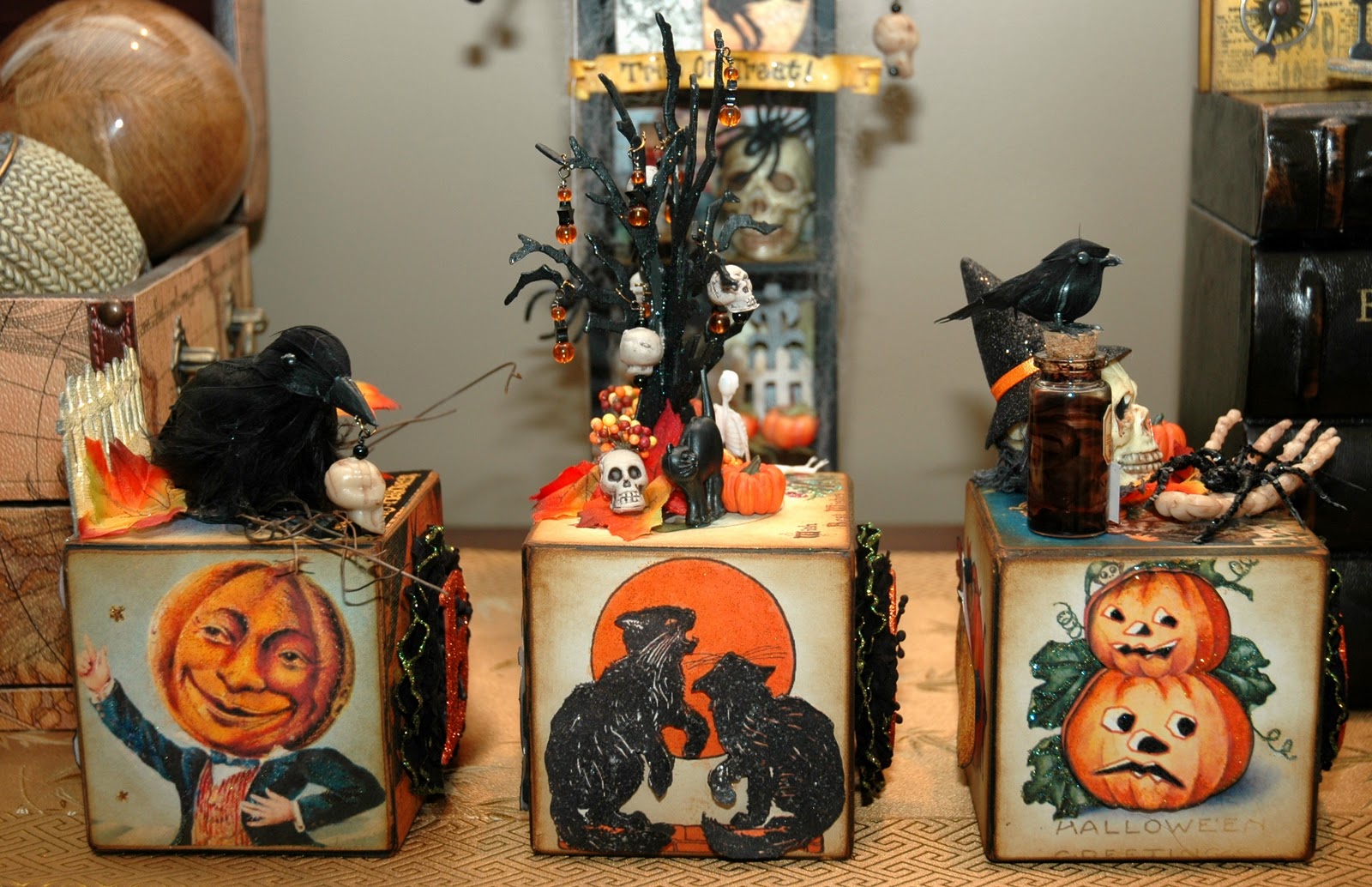
I started this fun little project this past Monday with a small group of my buddies.  We call ourselves "Artchix" and we get together once a month to "play".  We started making "BOO BLOCKS".  We got the blocks covered while we were together but then had to finish them out on our own. 
They are made out of 3 1/2" light weight wooden blocks.    The letters are 2" chipboard letters from The Paper Studio that I found at Hobby Lobby.  They are painted and then "glitzed" with Pumpkin Orange fine glitter from Art Glitter.  The black "things" behind the letters are Reflections flowers I found at Michaels and used as my background.  I stickled around the outer edges of the flowers with Orange Peel Stickles...which, against the black background, went a weird green on me...but I love it! 
Here is the top of my "B" block.  Many of the embellishments came from Michaels' Halloween section.  They always have fun stuff to craft with for Halloween.
Here is the first "O" block's top. Does the tree look familiar?  It's Tim Holtz' Spooky Tree die cut that I cut twice and fused together by making a slit in both trees...one from the top and one from the bottom of the trunk and just slid them together.  Next I hot glued them together.  Then I painted the tree with black paint and when dry, I added some Black Diamond Stickles.  I made the charms and hung them onto the tree branches.
  
Here is the other "O" block's top.  Again, lots of fun stuff from mainly Michaels to embellish with.  The vial is Tim Holtz and the labels are 7 Gypsies.   I put the skeleton together using just a skeleton head, a separate Halloween hat and some loose gray "spooky" netting.  I clipped off just a piece of the netting and used it for hair on my skeleton.  I love the boney hand and the sparkly black spider sitting on it!

Left side view of the blocks

Each side of the blocks are covered with images from Vintage Halloween Postcards that I cropped, sized and printed out on white cardstock for everyone.  You will see all of the different designs on the pictures.  All are glued into place (actually I used double sided tape to secure them in place on the wooden block), all edges sanded and then distressed with Vintage Photo Distress Ink.  Some of the images are printed out twice so I could pop dot them on top of the original.  All have some stickles on them; to help "glitz" them up a bit but also add to the vintage feel.

Back view of the blocks

Right side view of the blocks.

These are easy to do and really go pretty fast!  I have a set for Valentines' Day and plan on making a Christmas set as well.
I hope you're having a wonderfully creative day!  Thanks for stopping by!

Sunday, September 18, 2011

SIMON SAYS SHOW AN ATC

Happy Monday Everybody!!!

I have to admit, I am new at ATCs.  I've only made a couple of traditional ATCs ... you will see those as part of a future challenge. (smile)

But for this challenge, I decided to make a chunky ATC.  I LOVE these! They are basically an ATC, only dimensional.  I have only made one other of these...but after making this one, I am quite sure I'll be making more.  They look so cute sitting on a shelf together.  Chunky ATCs can be as simple or as intricate as you can imagine them to be.

 I titled my Chunky ATC "Time Passages".  It reminds us of how quickly time flies. 

The ATC is made from chipboard that is put together with 1/4" Wonder Tape (on the inside).  The back and front are the standard ATC size.  The two smaller sides are 3.5 x 1.5 inches and the top and bottom measure 2.5 x 1.75 inches.  I made each side individually and then put them together at the end.

The front of my ATC was done using a piece of white cardstock and a Wendy Vecchi stamp from her A Form Of Art stamp set.  I colorized the cardstock with Vintage Photo and Tumbled Glass Distress Ink.  Then I used some Gold Paint Dabber paint on my finger to go around the edges of the chipboard and also add highlights to the front.
The clock face is recessed.  I did this by stamping the small clock face from Tim Holtz' Going Somewhere stamp set on a piece of white cardstock.  I distressed it with Vintage Photo and then covered the surface of the clock face with Crackle Accents and let it dry.  Next I used the packaging from Tim Holtz Ideaology Time Pieces to make the recessed area.  I cut one of the smaller time piece indentions out of the plastic and left an edge around it that I could glue onto the chipboard.  Then I cut a 1.5 inch circle out of the chipboard and my stamped and distressed paper.  I painted the edging gold.  Using Glossy Accents, I glued the clock face into the recessed area.  Then I glued the clock face in place on the interior side of what would be my chunky ATC.  I made "TIME PASSAGES" on my computer, cut it into little banners, distressed them and glued them in place.  Finally, I painted small chipboard-"ish" die cut clock hands from ScrapFX with gold paint and attached them to the clock face using one and a half Tim Holtz' Hitch Fasteners.  I dangled a gear from Tim Holtz' Sprocket Gears, attaching it to a piece of chain using a Tim Holtz' Jump Rings.

 This my favorite side of the ATC.  It features a vintage child with butterfly wings holding a picture of herself as an old woman..."Sunrise...Sunset".  The background paper on this side was colorized and distressed the same as on the first side.  The vintage typewriter letters on the background are from Tim Holtz' School Desk stamp set.
The butterfly wings behind the sweet little vintage girl are made to look iridescent by using a small Sakura Water Brush filled with water and dipped into Sour Apple, Turquoise and Perfect Pearl Perfect Pearls powders.  When combined with water, the powders make a almost like a translucent paint.  It really adds a beautiful shimmer.  The little copper frame is one I had in my "stash" of stuff.  I sized the image of the old woman to fit, lightly distressed it with Vintage Photo and glued it in place with Glossy Accents.  The "SUNRISE...SUNSET" banner was made on my computer and I distressed it and glued it in place.  The little organza roses at the bottom are from Tim Holtz' Trimmings.  They are colored with a combination of Worn Lipstick and Spiced Marmalade color mists that I made using Distress Ink Reinkers, a couple of  Mini Misters and water.
The back side of the ATC features an image that is seen on Graphic 45's Steampunk Debutant papers.  The background is done using the same elements as on the other sides.  The top of this side is punched using a Martha Stewart Doily Lace edge punch.
 The image is colorized with a couple of colored pencils to add a bit of blush to her cheeks and some color to her eyelids and lips.  The tiny clock parts are from Stanislaus and are glued in place using Glossy Accents.  A wing from Tim Holtz' Regal Adornments Ideaology is placed underneath my very "timely victorian lady" with another computer generated banner, reminding us that "TIME FLIES".
The background of this side of the ATC is done using Tim Holtz' Nostalgic Tissue Tapes on chipboard and then distressed using the Vintage Photo and Tumbled Glass Distress Inks.  The frame is from Tim Holtz' Tag and Bookplates die cut.  It is distressed using gold paint and lightly edged with Black Soot Distress Ink.  It is then made to have a patina finish by added just a bit of Juniper Paint Dabber from my finger.
The vintage image was sized to fit the opening of the frame, glued in place and then covered with Glossy Accents to give the appearance of glass.  I added more of Tim Holtz' Sprocket Gears to this side and I dangled a Tim Holtz' Muse Token~"Forevermore" from one of the gears.
After completing all of the sides, I painted (using my finger) all of the edges with gold paint.  Then I put all of the sides together using the Wonder Tape.  Finally, I finished embellishing my Chunky ATC by adding elements to the top.
The top of the Chunky ATC features particles of time.  The little dome clock is a little "treasure" I found on clearance at Hobby Lobby.  The small vial laying on it's side is from Tim Holtz' Vials.  The little clock pieces spilling out of it are glued in place using Glossy Accents.  
The Chunky ATC is elevated using three wooden spools that are painted gold.

If you have not seen the ATC examples made by my design teammates at Simon Says Stamp and Show, you need to check them out.  They are wonderful!!!  So many ideas to get your creative juices flowing!  Then enter our challenge and post your entry on to our blog.  You could be the winner of our weekly drawing for a very generous 
 You may also be chosen as one our the top three designs, earning you the right to display our coveted TOP THREE BLINKIE for your blog!
So...join us and SHOW US YOUR ATC!