Sunday, April 29, 2012

A KALIDESCOPE OF COLOR

Happy Monday Everybody!  This week's Simon Says Stamp and Show Challenge is all about COLOR....A KALEIDOSCOPE OF COLOR!  So, put on your thinking caps and create something with lots and lots of color!  Stop by the Simon Says Stamp and Show blog to see what my amazing Design Teammates have created for you this week.  There are some great ideas, products and techniques for you to check out!


If you're wanting lots of intense color, try Dyan Reaveley's Dylusions Sprays!  They are amazing and so easy to use!  They are what I used on this tag to get such vivid colors.  And this is on a manila tag! Imagine how these colors would pop on a white background!  
I knew that I wanted to use Tim Holtz' Mona's Sketchbook stamp set on this project.  So, I sort of laid out the design in my head and then got to work.


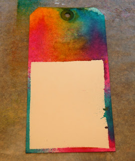
First I cut out a piece of cardstock the size of my stamped Mona image and masked a #8 Manila tag with it.  Then I lightly misted my tag with water and began randomly spraying Vibrant Turquoise, Bubblegum Pink, Pure Sunshine and Fresh Lime.  I gave them a chance to wick and run. Then I dried the sprays and removed the mask.


This is what my tag looked like after the masking and before I lined up my Mona Lisa stamp as best I could and stamped it in place using Jet Black Archival Ink. 


I then used my three shades of green watercolor pencils from my Faber Castell Mixed Mdeia Green Aquarelles to colorize and blend the area behind Mona's head (to soften the manila tag that was exposed).  These watercolor pencils are so easy to use!  I just colored in the area and then used my Tim Holtz Detailer Water Brush to blend out the color.  It's a nice, subtle background that doesn't compete with the more vivid colors of the overall tag.  Next I added some color to Mona's face with Faber Castell's Gelatos.  I used Peach for the fleshy tones in her face and Guava for the blush in her cheeks, lips and a hint of color on her forehead.  Instead of using a water brush on her face, I simply rubbed the color and blended it with my finger.


Next I heat embossed "Creativity Is Allowing Yourself To Make Mistakes.  Art Is Knowing Which Ones To Keep" at the top of my tag.  I used Black Embossing Powder to really make it pop against the colorful background.


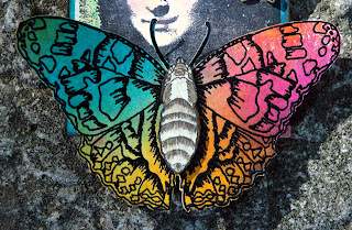
Then, I added the beautiful butterfly.  This is a Holly Berry House stamp that I have had for a long time.  To get the vibrant color, I first sprayed another plain manila tag with the same Dylusions spray colors that I did for the tag.  Then I heat embossed the butterfly in black so that the black lines would really stand out. I wanted the body to be more neutral so I used my Pitt Artist Pen Big Brush in Warm Grey from the Faber Castell Mixed Media Sampler to color directly onto the stamp and then I stamped out just the body section.  I then used the Watercolor Pencils and the Pitt Pastel Pencil from the same Neutral Mixed Media Sampler set to colorize and blend the butterfly body.  Again, I added the brown tones directly onto the body and then blended them out using the Detailer Water Brush.  I glued the butterfly in place and the pop dotted the body over the butterfly to give added dimension.


Finally, I added an Ideaology keyhole from the Locket Keys set around the hole in the tag.  I added a piece of black Hug Snug ribbon and a mini safety pin with a couple of little antique gold trinkets attached.  At the right side of Mona's head, I added a couple of Ideaology Sprocket Gears to hide an area of the bare tag that I wanted to "tone down".  I also wired a small antique gold butterfly charm to hang freely from the sprocket.


A Kaleidoscope of Color!!!  That's your theme this week!  I can't wait to see your entries into our challenge.  We always have such wonderful entries!  It's hard to choose the TOP THREE!  You may also be the lucky winner of our generous sponsor's weekly 


Good luck & take time to play ... it's SOUL FOOD!


Friday, April 27, 2012

IT'S RANGER U TIME AGAIN ...

To all of those lucky, talented artists that are attending RANGER U ... congratulations! Welcome to the Ranger family!


It was this time last year, that I was part of one of THE MOST amazing opportunities and experiences of my life.  Not only did I get to go to Ranger Industries, see their amazing facilities and meet the people behind all of the wonderful products we enjoy.  I met wonderful artists literally from around the world! We shared three glorious days of learning, experimenting, laughing, EATING (thanks Mario) and making enduring, treasured friendships.  Receiving the really deep instruction from Tim Holtz and Claudine Hellmuth was a dream come true!  Such talented, creative and REAL people! LOVE THEM!


Hels, Cheryl, Yvonne (me) and Linda ... I so love you guys!

Here are just a few of my very very special lifetime friends I made at Ranger U.  We affectionately call ourselves "The Airport Girls". 

So, to all of you who are at Ranger U right now, soak in every second of it!  It will be over before you know it!  You are in for an AMAZING once in a lifetime experience!  I wish you a weekend of such joy!  

And...once again, welcome to the Ranger U alumni!  

Wednesday, April 25, 2012

APRIL TIM TAG

Better late than never!


April has been such a busy month for me! I am just now getting around to making my April tag to join in on the Tim Holtz 12 Tags of 2012 using the Reflections Stamp and the Fancy and Floral Texture Fades.

Tim used his new Bird Branch die cut on his example.  I did not have that, so I improvised; using that beautiful bird on a branch stamp from his Urban Tapestries stamp set.  I colored the stamp using my Tim Holtz Distress Markers and then stamped onto the Specialty Stamping.  


I cut it out and pop dotted it onto the already stamped, embossed and distressed tag.  I drew a few extra twigs onto the tag using the Vintage Photo Distress Marker and Crushed Olive for the leaves.  Then I hot glued a little brown excelsior "nest" onto a branch.  I love the dimension it gave.


I added the Word Band using twine for a more rustic "natural" look.  I thought the corners of the tag needed something.  So, I used the smaller version of the vine from Tim Holtz' Fairytale Frenzy.  I inked it with Gathered Twig and without using a block, randomly stamped portions of the vine image onto the corners of the tag.

Wonder what technique Tim will use for May's tag?  

I hope you all are having a wonderfully creative week! I am enjoying this beautiful Midwest Springtime!

Much love & take time to play!

Sunday, April 22, 2012

WHAT'S YOUR FAVORITE WORD?

This week's Simon Says Stamp and Show is all about words.  To be specific, your favorite word.  Words are such powerful things.  They can hurt and heal.  They can tear down or they can encourage.  So, choose your words wisely.  

I love words like CREATE, INSPIRE, ART and JOY but I think probably my favorite word is..... FAMILY.  When all else fails, our relationships and our families are our bedrock.  I am so thankful for the parents that I had who, by their example, taught me the meaning and the value of a "FAMILY". 


In honor of my favorite word, I have created this vintage "FAMILY" frame from a 6x6 piece of chipboard.

I began by cutting "FAMILY" out of the chipboard using Tim Holtz' Family Movers and Shapers.  Next, I cut out the Mini Vintage Cabinet Card on the left side of the 6x6 board.  I would use this opening as a frame for my vintage portrait.  I wanted this piece to look and feel like an old stone or tile square.  So, I began texturizing the basic chipboard first with some molding paste.  When that was dry, I brushed over it with Claudine Hellmuth's White Gesso.  When that was dry, I mixed Toad Hall and Snowflake Paper Artsy Fresco Finish Paint colors together to get a soft, sage greenish color for my background.


Here is a closeup of my background after applying the molding paste, gesso and paint colors.  I love the texture and the color!  I wanted more depth so I dabbed a cut piece of Cut 'N Dry Foam into just the Toad Hall paint and dabbed it onto the background to add some darker and lighter areas.


Finally, I repeated the dabbing of color onto the background.  Only this time, I introduced Old Gold Fresco Finish Paint to add a bit of shimmer and sophistication to what was looking like a piece of rough tile.  The picture shows the addition of the gold accent.


Here is my frame at the end of applying the texture and the paints.  Next, I heat embossed a design from Tim Holtz' Artful Artifacts stamp set.  I used Queens Gold Embossing Powder.  It is a wonderful antique gold color.


I stamped the entire design on the open area to the right of the frame.  Then I stamped portions of the design to the left corners.  I accented the mini cabinet card opening by heat embossing the gold around the perimeter.  Then I randomly heat embossed some of the outside edges of the frame in gold.  


Finally, I heat embossed "FAMILY" in the gold.  I think the gold embossing makes a dramatic difference on my frame.  I love it!


Next, I added a piece of black cardstock that was lightly dry brushed with some of the Old Gold Fresco Finish Paint behind "FAMILY" so that it would really pop.  I added my vintage portrait of the mother and her two daughters.  I think that picture, with it's sepia and black hues with the black behind "FAMILY" is a perfect combination.


The right side of the frame was the perfect place to add my vintage film reel.  This was made using Tim Holtz' Filmstrip Ribbon, his Mini Gears die cut and two small pieces of a dowel rod.  I originally made this film reel on my Red Letter Day 6x6 board I made for Simon Says Stamp and Show's challenge.  The four gears are cut from Grungeboard and colorized using Gathered Twig Distress Ink.  If you don't have this seasonal ink color, any brown ink will work.  I two pieces of dowel rod (approximately 1 1/4") and also distressed them with Gathered Twig. sized vintage pictures on my computer to fit the filmstrip ribbon and then glued them into place using Glossy Accents.  I backed the filmstrip with a piece of newsprint to hide all of the cut edges of the pictures.  Then I rolled both edges of the filmstrip onto the dowel rods and hot glued them in place.  Next I hot glued the gears onto the ends of the ends of the dowel rods.  I secured the top film reel in place using wire.  I secured the bottom reel in place with hot glue.  


This piece adds a lot of dimension to the frame and I love how the film strip plays off of the vintage portrait in the mini cabinet card cut out.  Finally, I hot glued a few vintage metal buttons on to the left side of the frame.

Now it's YOUR turn to immortalize your favorite word and enter it into our challenge at Simon Says Stamp and Show.  You could be chosen as on of our TOP THREE entries for the week and you also have a chance to win our most generous sponsor's weekly prize of a ...


Check out the wonderful ideas and examples that my Design Teammates have waiting for you this week.  Their work is always incredible and this week is no exception!

Good luck and I can't wait to see your favorite word and how you capture it in an art form!


"VINTAGE" PAPER DOLL ALTERED BOX

Frilly and Funkie's challenge for the next two weeks is "Repurpose To Upcycle".  I decided to use this challenge to create something with a purpose...a place to store my vintage paper dolls in a proper container.

So, I have given "life" to an old shoe box that I was storing my paper dolls in.  Except, the box was sitting on a shelf in a closet; unmarked and unloved.  Now, it has new life and everyone knows what is in the shoebox.


First, I covered the box with some old papers that I had sitting around, gathering dust.  Then I inked and distressed the edges and sides of the box so that it would look as old as my paper dolls.


You can see the "discolored" paper on the sides pretty well in this picture.  I wanted this box to look like it had been stored away in an attic for years and years.


 Here are some of my paper dolls that are safely stored in this little box.  Some of them are very old and I need to keep them in plastic bags to preserve them and their little outfits.


I recycled some old buttons, some feathers, little pieces of scrap ribbon, some old doilies, little lace scraps and flowers to the top.  They are scattered among the darling little paper dolls (also recycled) that I chose to decorate the top.


I was really happy with how this turned out.  And now...I have not only a cute "home" for my paper dolls but also a box that I will proudly use as a decoration in my shabby chic room.

Thanks to Linda and the gang at Frilly and Funkie for their wonderful vintage themed challenge! I love playing along and also seeing everyone else's lovely creations!

Take time to play...It's SOUL FOOD!


Sunday, April 15, 2012

ATCs ARE ADDICTING!!!

Good Monday morning everybody!  I hope you had a fantastic weekend! I am just returning from a week long cruise to the Bahamas.  It was so beautiful and relaxing!  I'm rejuvenated and ready to get on with this weeks' Simon Says Stamp and Show Challenge!  Be sure to stop by the challenge blog and check out the amazing samples that our Design Team has made to inspire you this week.  Amazing creations!!!

This week is "Anything Goes".  I am currently taking part in a couple of ATC swaps and wanted to share three of the cards I've made.  They are perfect for an "Anything Goes" theme because, as you will see, they are totally different.

My first card is a sweet dimensional vintage ATC titled "Starlight Starbright ...".  


The ATC card is backed with some mounting board.  Using Matte Multi Medium, I tore some tissue paper with a script and butterfly pattern and randomly glued it onto the ATC card.  I also tore some book text and layered it onto the ATC card.  When it was dry, I tore away the edges and added some Wild Honey, Broken China Distress Inks and a bit of Monarch Orange Archival Ink to further colorize the background.  Then I added a touch of a Chestnut Roan and Sepia Black Cats Eye Pads at the edges.  I then dusted the card with Sunflower Sparkle Perfect Pearls to give it a beautiful subtle shimmer.  I computer generated the sentiment, edged it in black and glued it in place.  


The sweet little vintage girl is an image I have stored on my computer.  I sized her to fit on the ATC and cut her out.  She is edged with the brown and black cats eye pads and popped into place using pop dots.  The Crystal Bling on the ATC was originally clear.  I added Butterscotch Alcohol Ink to colorize it to be a twinkly yellow gold color.  I cut it apart and laid it in place.  It was self adhesive.

My next card is a dimensional ATC done in a COMPLETELY DIFFERENT style: Dyan Reaveley style.

 
The background was done on Cold Press Watercolor paper with Wild Honey, Worn Lipstick, Broken China and Mustard Seed Distress Stains.  Then I lightly added some Black Soot Distress Ink around the edges to add some definition to the card.  Next I randomly stamped some of Dyan's backgrounds from her Basic Backgrounds stamp set in Jet Black Archival Ink.  The image of my funky girl is from Dyan's Pondering Petunia stamp set. She is stamped with Jet Black Archival Ink onto the new Specialty Stamping Paper and colorized using my Distress Markers.  I added some stiff black wire for hair and popped her in place.  The sentiment is from Wendy Vecchi's For The Arts stamp set.


The third ATC is back to my roots and the vintage, heirloom style.  Here is a sweet little dimensional ATC that is so charming.  She is my favorite.


As I was making this ATC, I was thinking of my little year old granddaughter.
This ATC was done on a mounting board.  It is covered in layers of book text and old hymns from a hymnal.  Again, I used the Matte Multi Medium to glue and seal the papers.  When dry, I tore away the excess paper and applied some Tattered Rose Distress Ink to the background.  Because it is more translucent, it wasn't the pink I was trying to achieve.  So, I washed the background with some more opaque Painterly Pink Studio Paint, adding more paint and less water in some areas.  Then I washed over the ATC with Blank Canvas Studio Paint to get that shabby chic feel.  I lightly edged the card in a black cats eye to make the black letters and the edging around my little vintage ballerina pop even more.


The lettering is computer generated and glued into place.  My little ballerina is an image I have on my computer.  I sized her to fit, cut her out and made a little tutu out of pink tulle to give her more dimension.  I glued the tutu in place with hot glue and added the little pink bow.  Then I popped her into place using pop dots.  Finally, I added the three little Hero Arts Pink Pearls in the corner.

So...ANYTHING GOES!  Create your masterpiece and enter it into our challenge.  Three projects will be chosen as our TOP THREE and you will receive special recognition for your achievements.  ONE lucky person will receive our generous sponsor's gift of ....


So...get crackin' and let's see what wonderful ideas you come up with for 
"ANYTHING GOES"!  Thanks for stopping by my blog!  I can't wait to see your entries!

Sunday, April 8, 2012

A LORD TIM TECHNIQUE ~ ARCHIVAL RESIST

Hello everybody!  If you were one of the lucky people who recently completed Tim Holtz' 
then you will be ready to jump on this week's challenge from Simon Says Stamp and Show....
"A Lord Tim Technique".

 I chose to do the "Archival Resist" technique (among others) from Day 3 of Tim's Creative Chemistry classes.   It is done using Archival Inks as a resist against Distress Inks.  Ready?  Here we go...


The background for my steampunk tag was done using the Archival Resist Technique.  I began with an extra large tag (measuring 4 x 8 1/2") cut from Gloss Paper.  


Before I did any stamping, I used a masking technique to create my clock face.  I stamped the clock face from Tim Holtz' Curiosities stamp set onto a piece of scrap paper, cut it out and temporarily adhered it to my tag.  (More about it's construction in a minute).

  Then I I randomly stamped images from Tim Holtz' Ultimate Grunge and Dyan Reaveley's Basic Backgrounds stamp sets out of Archival Inks.  The colors I used are:  Vermillion, Monarch Orange and Aquamarine.  They are oil based permanent inks and when mixed with Distress Inks; which are water based inks, the Archival Ink will resist the Distress Inks.  As Tim would say because, "oil and water don't mix."

The basic background when completed.

After I stamped all of my background images, I used Gathered Twig Distress Ink and rubbed the ink pad all over the Gloss Paper tag.  I went around the masked clock face with an Ink Blending Tool to be sure that I better defined the circle for the clock face.  I removed the mask and buffed the tag with a soft cloth.  I put the clock face mask back in place and stamped the images that look like broken glass randomly around the masked clock face and elsewhere on the tag using Jet Black Archival Ink.  Then I lightly distressed the outside edges of the tag with Black Soot Distress Ink with an Ink Blending Tool.  Next I placed the scrap paper that I had cut the clock face from on the tag and lightly distressed the area that would be my clock's face with Wild Honey Distress Ink followed by Black Soot lightly around the edges.  Then I stamped the clock face directly onto the distressed circle using Jet Black Archival Ink and heat set it.  Next I stamped the sentiment from Tim Holtz' Words for Thought stamp set.  Finally, I stamped the image of the hot air balloon directly onto the tag.

  
I decided to make my hot air balloon dimensional, so I stamped a total of 6 images onto a piece of manila cardstock using Jet Black Archival Ink.  I colorized the balloons with in Ink Applicator Tool and Barn Door Distress Ink.  I added more depth of color to the balloon by sharing areas with a Fired Brick Distress Marker and then blending it with a Small Sakura Water Brush.

  
Then I swiped the Jet Black Archival Ink pad across a script stamp and stamped all of the balloons with the script image.  Here you can see the shading of the balloons and the light script image on the balloons.  Next I cut out all of the balloons, glued 4 of them back to back and cut off any excess paper that did not match up.  Then I inked all of the edges with a black cats eye pad so that only black edges showed.


I folded two sets of balloons in half lengthwise and stacked them.  Using Tim Holtz' Tiny Attacher, I stapled two sets of the balloons together on the center fold.  I glued one balloon onto the stamped image on the tag.  The final balloon is what I used for the center.  It was just one stamped balloon that I folded in half and glued (wrong sides together).  I attached it to the center of the dimensional balloon with a 1/8" piece of double sided tape.  It worked perfectly! Where there was a hint of the tape showing, I simply painted over it with a Barn Door Distress Marker to hide it.


Before I attached the dimensional portion of the hot air balloon on to the tag, I added some elements.  First, I distressed some Trimmings Ribbon, cut it in half and tied it to a large game spinner.  I then added a silver Foliage flower with a Long Fastener and bent the flower so that it would cover the "construction" of the top of the hot air balloon.  I also attached a piece of chain to the game spinner that would stretch over to my clock face using a couple of Jump Rings.  Then I hot glued the game spinner in place at the top of the balloon on the tag.  Next I added the little pennants on the balloon by colorizing a scrap of Gloss Paper and cutting double sided pennants.  I folded them in half, glued them onto a piece of black cording and attached each end of the black cording underneath the first dimensional balloons.  I hot glued the center pennant to the center folded balloon.  Then I hot glued the center back of the hot air balloon in place on the tag (allowing all of the sections of the hot air balloon to be dimensional).

Next I completed the clock face that I'd started with the masking technique.


The stamped, masked face was already in place.  But I wanted to really make it POP!  So, I added a pair of the smaller Regal Adornments Wings and a 7 Gypsies Optical Lens.  The lens was plain so I stamped a small "man in the moon" type of image on the underneath side of the glass using Jet Black Archival Ink and heat setting it.  I LOVE how it turned out!!!  Very ghostly and quirky!  Then I wired the Word Key onto the handle of the Optical Lens.


I gave dimension to the sentiment by popping a couple of the words and altering them from the original stamp.


On the other side of the tag, I filled up the blank area underneath the balloon with more dimensional elements:  a couple of Gears, a Pen Nib and a Light Bulb that were hot glued into place.

I love Tim Holtz' style, techniques and his products...as you can tell by my steampunk tag!

Now it's YOUR turn to create some magic using one of Tim Holtz' Techniques.  Then post it to our challenge at SIMON SAYS STAMP AND SHOW.  Check out the incredible "Tim Techniques" that my amazing Design Teammates have waiting for you ... AWESOME!

If your creation is chosen as one of our TOP THREE, you will receive special recognition.  You could also be the very lucky winner of our generous sponsor's ...


Have fun with this challenge!!!  Thanks for stopping by my blog!!!


Wednesday, April 4, 2012

FRILLY & FUNKIE CHALLENGE ~ I'LL TAKE YOUR WORD FOR IT

Linda Coughlin and the gals over at Frilly & Funkie started a new challenge today.  I love Frilly and Funkie because the challenges have to be in a vintage style...something that is very dear to my heart. 

This particular challenge is all about words and a sentiment that you want to create a piece around.  My sentiment is "Who Were You Before You Put Yourself Last?"  I love this thought provoking question.  Think about it....


The sweet little vintage girl is deep in thought and she is perfect for my chosen sentiment.

I created this piece on a 6 1/2 x 4 1/2 piece of watercolor paper as my backing.  I can use this on a 5x7 card or as a little wall hanging.  The background paper is from The Glitz Girls and so is the ferris wheel ephemera card.  The flowers are sprayed to coordinate and the buttons are ones I had in a big blue Ball canning jar.


The sentiment is stamped onto a piece of distressed pink crepe paper that has been glued to a piece of Grungeboard.  The die cut is one of Tim Holtz' Mini Labels.  I added the two holes with a CropADile and added an antique copper grommet to each side.  Brown checked ribbon holds the sentiment in place.  I also added touches of antique lace underneath the sprayed roses.

   
My sweet little girl is a vintage photograph that I have on my computer.  I sized it and she is glued onto a piece of Grungeboard that is die cut from Tim Holtz' Mini Baroque.  I then added some ruffled crepe paper behind the Mini Baroque that has been aged with some Honey spray and then edged with Chestnut Roan and Sepia Black cats eye ink pads.  I love the way it looks and I think it added even more of a vintage feeling to the photograph.

Since spring is here, I took this piece outside to photograph it among my bridal wreath bushes that are absolutely beautiful right now.


WELCOME SPRING!!

Take some time to stop and smell the flowers, listen to the birds and soak in some of our beautiful world.

Thanks for stopping by my blog! Have a glorious day!


Sunday, April 1, 2012

INSPIRATION FROM STUDIO 490

I hope everyone had a fantastic weekend! It's Monday morning and time for a new Simon Says Stamp and Show Challenge.  This week..... let's all get a little inspiration from 

I LOVE so many of Wendy's products!  The first time I saw this gift card holder, I couldn't wait to make one so I could use Wendy's stamps and Art Parts all over it!

I made this gift card holder using a plain 6x9 catalog envelope for the base.  You can take something that looks like this:


and make it look like this:

Interior of the gift card holder.

I used the yellowy tan ClearClasp Closure envelopes from Staples for this project but I have also used the white 6x9 envelopes.  
(You just need to distress any envelope before adding the papers when making this project). 

Not only are there three slits to hold tags or gift cards on the interior of this card but both ends are completely open so that you can also slip more mementos, special notes, pictures or whatever you choose into this gift card holder!

Check out this YouTube video featuring Kathy Orta of Paper Phenomenon for the basic construction of this gift card holder.  It is an easy, inexpensive project to make and you get AMAZING results!  Imagine this as a birthday card, a baby shower gift or even a Christmas gift!  Yep...pretty dang cool! 

 One thing I did differently than Kathy's instructions:  I actually decorated the paper for my pages as much as possible BEFORE I adhered them to the envelope.  That way, if I decided I wanted to do any dimensional work that required using the underside of the paper, I could do that BEFORE I glued it to the envelope. 

Let's explore the gift card holder I made using Wendy Vecchi's amazing stamps!  What you do with your imagination and your own papers, stamps and embellishments is the key in determining the personality and charm of your gift card holder!

Exterior of the gift card holder.

The basic papers I used are from Bo Bunny's Etc. 6x6 paper pack.  The beauty of this project is that none of the pages require anything bigger than a 6" page!  So you canuse those lesser expensive 6x6 paper packs or even scraps for this project.  Again, check out Kathy Orta's link for the construction details.  I chose 5 pages from Etc. to work with to cover my 6x9 envelope.  I distressed the envelope and all of the papers with Vintage Photo and Black Soot Distress Inks.

The cover of my gift card holder features Wendy's Florals Art Parts.  You are a bit limited as to where you can do dimensional work for this project.  The cover is not a problem, so I chose to add some Art Parts to the cover.  Part of the cover is hidden under the flap, so that is fun to create.  
Here is the flap closed...


Here is the flap open....


The stamp sets used on the cover are:  Flower Art, Ticket To Art and A Form of Art.  They were all stamped in Jet Black Archival Ink.  The polka dot on the yellowish flower was stamped in Coffee Archival Ink and is from the All About Art stamp set.  The ribbon tied around the dress form is Hug Snug that I distressed.  I made a slit on both sides of the waist and ran the ribbon under the paper then tied it on the top.  (This is one of the reasons that I did most of the decorating of my papers BEFORE I adhered them to the envelope).


The flap front features really cute footprints.  Those were stamped in a combination of Coffee and Jet Black Archival Inks.  The footprints are from Wendy's For the Arts stamp set.  The other side of the flap features those cool random numbers also stamped in both Coffee and Jet Black Archival Inks.  The numbers are from Wendy's Art Parts stamp set.

Now let's open up the gift card holder to reveal some more Wendy-liciouis-ness!

The first inside page features slots for pictures, tags, ATC, and of course, a gift card!  Here is a picture of the bare page....


Here is a picture after adding some tags or ephemera...


The stamps used on this page were all stamped in Jet Black Archival Ink.  They are from Wendy's Tools For Art, A Form of Art, Art Rules, An Eye For Art and Mail Art stamp sets.  Tucked into the slots are various little blank tags.  The bottom slot is especially created for a gift card.  In this case, I have tucked in Tim Holtz' Alpha Cards, distressed with Vintage Photo and a touch of Wild Honey Distress Inks.


The right page would be perfect for adding one larger picture or a couple of matted pictures.  But, since I'm focusing on Wendy, I decided to make a funky page using more of Wendy's Stamps.  The artsy head is from Wendy's Art Rules stamp set.  The rest of the images on this page are from Wendy's new Call It Art stamp set. 


I created coupon book by stamping what looks like a sheet of coupons on to kraft paper.  Then I cut the coupon sheet into thirds.  I folded in between the coupons to make them look more distressed and give them more dimension.  Then I added Vintage Photo and Black Soot Distress Inks to distress the edges.  I doubled taped the tops together and then added a piece of black masking tape for a binding.  


The telephone is a favorite of mine!!!  I stamped the phone twice onto manila cardstock using Jet Black Archival Ink.  Then I added clear embossing powder over the phones and heat embossed them to get that shiny black appearance.  I cut the phones apart (like I did on a Wendy Vecchi project several months ago) so that I could add a pop dotted dial and add the curly black cord (made from painted wire).  Then I pop dotted the receiver with black pop dots.  The coupon book and the telephone are flat enough for the gift card holder to close just fine.


The back of the gift card holder is sort of funky, too.  It features that lovely gentleman from Wendy's Call It Art stamp set.  I stamped him onto a frame from 7 Gypsies really wonderful Frames Collage Tissue Paper.  I LOVE that tissue paper!!!  Then I adhered it onto the paper using Matte Multi Medium.  It is a great glue that dries clear and also seals the paper.  Next I lightly washed the paper around the frame using Picket Fence Distress Stain.  All of the stamping on the back cover was also done with Jet Black Archival Ink.  "Embrace The Possibilities" is from Wendy's Celestial Art stamp set and the header is from Wendy's Art From The Heart stamp set .  The crown is from a Clear Art Stamps set called Altered Art.  The ART image is from Katzelkraft.


Finally, the tag was quickly put together by gluing two pieces of scrap back to back.  I cut a tag, distressed it and stamped two more Wendy sentiments onto it.  They are from Life and Art, Art Rules and Art Parts.  I attached the tag to a piece of natural colored waxed thread and made a cord to wrap around the gift card book.  That's it!!

Now it's YOUR turn to get your Studio 490 style going!  Join our challenge at Simon Says Stamp and Show.  My wildly talented Design Teammates have created some really amazing projects for your viewing pleasure.  You won't believe all of the different "takes" on Wendy's products!  Really fun to see!!!  

Our generous sponsor is awarding a lucky random winner with a....


If you are selected as one of our TOP THREE entries for the week, you will receive special recognition for that.  So, come join us!  Thanks for stopping!  Remember to take time to play!!!  It's SOUL FOOD!