Showing posts with label A Vintage Journey Challenge. Show all posts

Thursday, October 22, 2015

A HAUNTED HOUSE ART/JUNK TWINE BINDING JOURNAL FOR A VINTAGE JOURNEY

Hello everyone!  

I am so excited to announce that I was recently asked by Brenda Brown to do a guest designer spot 
for A Vintage Journey.  This was like a homecoming for me as I was one of the original "Creative Crew" when A Vintage Journey launched in February of 2014.

The theme for October is "Journaling with Tim" ... something right up my alley as I have always been a huge fan of Tim Holtz' style and I am currently have so much fun learning, experimenting and creating my own art/junk journals.

I played around with Tim's Artful Dwellings die cuts and created a very dimensional Haunted House cover.  Complete with ghostly visitors, rickety old siding and spooky roof peaks, this book is definitely a one of a kind.  With a combination of some Tim Holtz and DecoArt Media Line products, I had a complete blast making this book and so can you!

Here are a couple of little sneak peaks for you ...


"Knock Knock ....
"Who's There?"
"Doncha."
"Doncha who?"
"Doncha 'witch' you could come in and play?"


Looks like Tim's "Creepy Kids" are stopping by for a visit ...


And what would a Haunted House art journal be 
without good ol' Grandma's portrait hanging in the foyer?

For a complete pictorial tutorial on how to create this art/junk journal, head on over to 

Happy Fall and Happy Halloween! 


Thursday, May 1, 2014

FOND MEMORIES VINTAGE ATB

Hello vintage lovers and welcome to my blog!

My fellow Creative Guide, Terry is hosting this bi-weekly challenge at A Vintage Journey.  The theme she chose is "Fond Memories".  Ahh ..... don't you just love the sound of that?  It conjures up so many memories of my childhood and family. So I decided to capture some of my "fond memories", those precious moments in time, on this very vintage ATB block.


Appropriately titled "Where I Come From," every side of my block focuses on my precious parents and grandparents.  They truly are where I come from and I am so proud of how they lived their lives and were such a huge part of who I am today.

Let me share my memories with you as I guide you through how this ATB came to be. 
I'm not sure if there is a "correct" format for an ATB or not. I guess it really doesn't matter ... as long as it's a cube, right?  So, strap on your seat belts and let the creative journey begin!


 Since I didn't have an Eileen Hull 3 D Blocks/Cubes die cut, (has three sizes of blocks included in the die cut), I used my We R Memories Gift Box Punch Board and kraft cardstock to create a 3 1/4" box. It went together so easily!

 Then I reinforced all of the seams with structure strips. You've seen me use these before.  They are 1" strips of paper, scored down the center at the 1/2" point.  Double sided 1/4" Scor Tape is added to either side of the strip and these are used to reinforce joints, seams or corners. I distressed all of my edges with Gathered Twigs and Black Soot Distress Inks to create an even more vintage look.


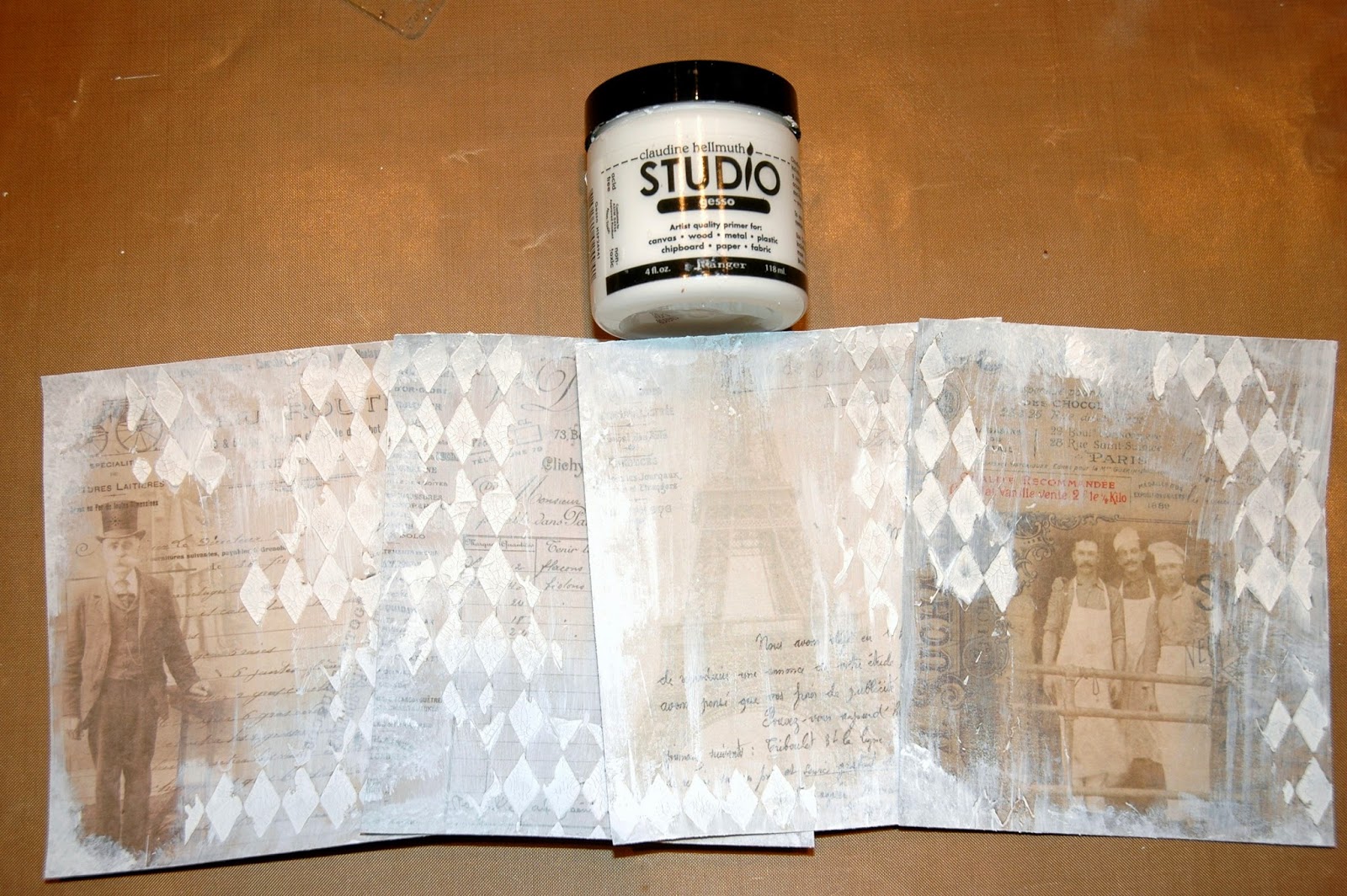
 The next step is to decide on my background papers for all of the sides of my block.  I have chosen these gorgeous images from Tim Holtz' new Wallflower Paper Stash.  I cut them from the 6" squares section from the stash.  I inked around all of the edges with Gathered Twigs and Black Soot to give them a more worn, old look as well.
 I decided that each side of my block was going to pay tribute to my beloved parents and grandparents.  I went through family photos saved on my computer.  I sized them to fit my blocks and the little special features I wanted to do on each side.  In some instances, I cut around the people instead of using an entire photograph.

 
 A perfect example of this is on the top of the block.  This is a photograph of myself at age 2. I still have this little dress that I was wearing! I I decided to cut out my picture and pop it onto the top because I loved the background paper and thought that the photograph and the paper worked well together. "Where I Come From" is computer generated, distressed and glued onto the top. "Collector of Memories" across the bottom of my photograph is from Tim Holtz' Words Remnant Rubs and I thought it perfect for this block as I am a collector of memories and proudly display them here.

The photograph is printed out on semi-gloss photo paper.  I colorized the little dress with Tumbled Glass Distress Ink and my hair is lightly tinted with Scattered Straw Distress Ink.  I will remind you how to colorize black and white photographs later in this journey. I edged the photograph (and all of my paper and photographs) with Gathered Twigs followed by a touch of Black Soot.

Moving away from the top, let's start with the side dedicated to Roy and Maeme, my paternal grandparents.


He was in the Army during World War I and her family immigrated to the US from Sweden before she was born. They were simple people who lived their lives for their family. Possessing very little money but having a strong faith, they loved and nurtured two growing boys ... the youngest being my father. Sadly, they both passed away while I was very young but I still have wonderful memories of walking with my Grandpa to get a Popsicle from the store on the corner every Saturday.  Grandma always had on a apron and I loved having delicious family meals in their sunlit breakfast room that Grandpa had added on to the back of their modest home.

The photos above are the beginning stages of what would end up being a gate fold presentation.


I added the two side panels with Tim's Tissue Tape and two Ring Fasteners that would serve as pulls to open up the gate fold. The back of this center piece would glue directly onto my ATB. 


I loved the florals of the background of the center portion so I decided to cut out the images of my Grandpa, Grandma and myself. I also wanted to have a little pocket where I could store some of my memories of them. So, I picked a small clear glassine envelope that I had and cut off most of the backside of the envelope, leaving tabs that after adding 1/4" Scor Tape, created a pocket I could attach to the background. I colorized my little dress and Grandpa's shirt to bring more warmth and "life" to this very special picture of me with my Grandparents.


And here is the finished interior of my gate fold page.  I added Tim Holtz' Borders Industrious Stickers (arrow and stars) to my Grandpa's side and sweet little German scrap flowers and metallic Dresden trim to my Grandma's side.  In the center, you can see the glassine pocket behind my Grandpa in his Tumbled Glass colorized shirt, me in my Tattered Rose colorized dress and my Grandma. 
** To colorize these images, I simply used a Cut N' Dry Craft Nib with a chosen Distress Ink color and lightly colored in the item that I wanted to highlight.  When finished, I used my Ink Blending Tool and Antique Linen Distress Ink and gently pressed over the images.  Antique Linen softens the look and "sets" the colors.


 Here is the front of the gate fold section.  I added more of Tim's Tissue Tape to the outside edges and a piece of ribbon through the Ring Fasteners to serve as a pretty closure. I added another piece of Picket Fence washed Tissue Tape to the front and heat embossed "family" using Black Embossing Powder. To the left is a small Mirrored Star.  Isn't that paper just beautiful?  Very vintage looking!

Moving to the front of my block is a flip out section featuring my maternal Grandparents.


The whole idea for this section came from this ... I loved this "Received of" image that was a part of one of the 6x6 Wallflower paper sections.  This piece actually measures about 2 1/2" across ... not quite wide enough for what I wanted to do with it.  So I added some kraft paper behind it, distressed the edges using a Tonic Paper Distresser and Gathered Twigs and Black Soot. I also left a 1/4"  tab on the right that I could use to create a little binding for a mini album that I could then glue to the block background. 


 Here is the backside of my "Received of" cover. This is a photograph of Claude and Edna, my maternal Grandparents.  They married very young and had two daughters by the time my Grandma was 18.  They divorced when my mother (the youngest of the girls) was very young but my mother always remained very close to both of her parents. Grandpa was one of the smartest men I ever knew; which was quite an accomplishment considering he had to quit school in the 8th grade to help with his family. He was a veracious reader and I think he knew something about everything.  Grandma was a sweet young girl who modeled and always loved fashion.  I remember my mother telling me how she used to sit and watch her mother get ready for work or a date.  She thought she was the most beautiful woman in the world.  Unfortunately, my Grandmother passed away when I was only three and I really don't have a lot of memories of her.  But I do remember her laugh and her big brown eyes.  That is something that she passed down to my mother and my mother passed on to me. 
I added a piece of Tim's Tissue Tape to the left and a "together" Chit Chat onto the photograph. The little "2" is a Number Brad and behind the photograph is a piece of vintage lace.


Here are the photographs that I used to create the other "pages" for my little photo album.  All were mounted on kraft cardstock and all have a tab on the right.  This is where I double side taped the photos together to create the album. (The back of the center photograph has another photo of my Grandfather using a metallic oval frame that you will see in a future photograph). 


 Here is the album put together.  The photo on the left was taken of my Grandma and Grandpa in 1926, probably not long before they separated.  It is sort of a sad story because my Mother showed me letters that her Father had sent her over the years telling her that he would love her Mother until his last breath but that they just were not good together.  When Grandma passed away at the young age of 51; my Grandfather was heart broken.  Such a sad love story.  Flipping the page ...


The photo of my Grandfather is framed by a Tim Holtz metallic Industrious Frame. I love the vintage quality they add. I also added a cream pearl flourish to the left of my Grandmother's cabinet card photograph. The background of her picture is what I glued to the block. 

  
To provide a pretty closure to my album, I added a Mini Paper Clip and a Heart Charm. It works perfectly!


And here is the finished side celebrating my maternal Grandparents. I added a "tell your story" from Tim's Words Remanent Rubs and a metallic "C" from Tim's Cirque Industrious Stickers. I slightly altered the pewter looking metallic "C" with some touches of a Gold Paint Dabber.
Now it was time to move to the side reserved for my Mom and Dad.


For this section, I wanted to use several photographs. So I decided to create my own "accordion folder" that could store the additional photographs I wanted to include.  I created the folder from a 3 3/4" x 3 1/4" piece of Wallflower paper.  This allowed me to have 1/4" tabs along the bottom and sides that would fold under.  I also created two 2 1/2" x 3" accordion sides out of kraft cardstock.  I scored the two sides every 1/4" to create the accordion folds. I distressed all of the edges with Gathered Twigs and Black Soot.


Next, working on the backside of the folder, I attached my two accordion sides using a piece of double sided 1/4" Scor Tape. 


With the one end of the accordion side attached to the front of the folder, I simply lined up the bottom of the paper that would be background paper glued onto the block to the bottom of my folder front. I made sure the outside edges also lined up and then pressed the back tab of the accordion side in place on the back of the paper.


I chose this photograph of my parents on their wedding day for the front of my folder.  Calvin and Loretto were married on October 19th, 1946. Little did they know when they started playing tennis together in high school that they would fall in love and marry, have two children, five grandchildren and so far, seven great grandchildren!  After the end of World War II, Daddy came home from being a radio man and gunner in the Navy.  Mom had an office job but always loved "artsy" things.  Their love deepened while he was away and upon his return, they decided that they wanted to live out the rest of their days together. Daddy graduated from the Kansas City Art Institute but knew he would not be able to provide for a family as a "starving artist".  So, he worked as an advertising manager his whole life. I still have some of his art from his art institute days and I am amazed at how gifted he truly was. Mom never met a stranger.  She was so full of life and loved every second of it. They are both gone now but I cherish everything they taught me, all of the purely selfless love they gave me and I will thank God for the rest of my days that he blessed me with my parents. 


Here are the photographs of my parents that I included in my folder.  I colorized the first photograph with Tumbled Glass and Tattered Rose. I have added photo corners to the photos and mounted them on either torn black cardstock (reminiscent of photos being torn out of old scrapbooks) or kraft cardstock. They are "filed" into the mini folder and can easily be removed.


Here is a photograph of the finished side.  I ended up clipping off the paper tab I'd left at the top of the folder and I added a File Tab with the caption "dreams".  I thought this was so appropriate for this wedding picture and all of their fulfilled dreams that lie ahead.
And finally ... the last side of my block.  One that I dedicated to some of the very strong women in my life and a photograph that means the world to me ...


Four generations ... my maternal Great Grandmother, Emma (far right), my maternal Grandmother Edna (far left), my Mother Loretto (center) and me sitting on her lap.

I colorized this photograph with Mustard Seed, Tattered Rose, Tumbled Glass and Shabby Shutters and went over it with Antique Linen. 


I added photo corners and wrapped the photograph with twine and a Word Band. I colored the letters by running Salty Ocean Distress Paint over the band and then wiping off the surface, leaving the blue paint in the letters. "Capture life's moments".  Yes, we should all do that by photograph but especially in our memories!  I then added Tim's "4" Numeral that was covered with Tissue Tape, lightly colored with a Worn Lipstick Distress Paint. When dry, I distressed the edges with Black Soot and coated the number with Rock Candy Distress Crackle Paint.  Underneath the "4" I added "GEN" (to represent "generations") using Tim's Label Letters

Thank you for sharing my fond memories with me as we journeyed through the construction of this vintage ATB.  I hope that I've inspired you to share your own fond memories with all of us at A Vintage Journey by entering our challenge. Please tell us what of Tim's products or techniques strongly inspired you to create your piece.  At the end of our two week challenge, all of your Creative Guides will choose the project that speaks to us the most to receive our most generous sponsor's £10 gift voucher to 


http://www.countryviewcrafts.co.uk/

Thanks for sharing a bit of your day with me!  I can't wait to read about your fond memories!


Thursday, April 3, 2014

A VINTAGE JOURNEY THAT'S A LITTLE BIT FRENCH

Are you ready for a trip to France?  Well, not literally, but creatively speaking.

Astrid MacLean is hosting our creative endeavor this week. It is "A Little Bit French".
This can have so many interpretations ... "Oui"? I invite you to pull out your creative passport and join in on the fun over at A Vintage Journey. The Creative Guides have some gorgeous projects waiting for you there.

Have you ever created something only to have someone say, "that's beautiful but what are you going to do with it?"  Being more of a mixed media artist, I get that question a lot more than probably someone who is primarily a card maker or a scrapbooker. Their art has an obvious purpose.  

But sometimes, don't you just feel like creating something purely for the artistic value and it doesn't necessarily have to have a purpose? I hope that I'm not the only one who feels that way from time to time. 

But I also like to create things that do have a specific purpose; usually a home decor piece.  Today, I took the "A Little Bit French" challenge and created this ....


a French shabby chic kleenex box cover. I'd never made one and thought it might be a fun thing to do.

Anyone can do this.  You just need to measure the sizes of your kleenex box and increase the numbers just a little bit before you cut your chipboard, so that your creation can easily slide over the kleenex box. In this case, my kleenex box sides measured not quite 4 1/2" wide and approximately 5 1/4" tall.


So, I cut 4 sides out of chipboard that measured 4 3/4" wide x 5 1/2" tall.  The top is 4 3/4" square and I die cut the oval in the center using the medium sized oval from Tim Holtz' Sized Ovals die cut


I created "structure strips" out of kraft cardstock cut into 1" strips then scored down the center at the 1/2" mark. Next add a piece of doubled sided tape (in this case I used 1/4" Scor Tape) on either side.


 Then you basically make a box without a bottom on it.  To do this, begin with your center section and adhere one of the structure strips cut to a 5 1/2" length to the outer edge of the chipboard.  Then line up a side piece (it doesn't matter which one is first) at a 90 degree angle and attach the side to your center with the Scor Tape. You will repeat this for all sides of the box. But before completing the square box, add the top of your box to what will be the front or back using the structure strips and attaching it in the same manner. Then complete the box.  At this point, all of the structure strips will be on the INSIDE of the box.


Apply more structure strips on the OUTSIDE of the box for more support. Cut each strip to fit the length of the joint and attach in place. Do the sides of the box first and then the top.  Now you are ready to cover your box.


Since this is a French themed challenge, I immediately thought of Tim Holtz' French Industrial Paper Stash. I cut these papers from the section that has the 6"x6" squares.  I cut them to fit my 4 3/4" x 5 1/2" chipboard sides.  Before attaching them to the sides of my box, I wanted to shabby chic them up a bit.


First I added some of Wendy Vecchi's Crackle Texture Paste through Tim Holtz' Harlequin Stencil.  I absolutely love this stencil for a french theme and also the Crackle Paste. It's creamy, easy to work with and you get great crackled results!


When that was dry, I lightly brushed some white Gesso over the papers.  Be careful to not cover up your images too much with the Gesso. It's fairly opaque if you brush it on fairly heavy. Then heat set it.


Time to experiment! I wanted to add color to my sides; a teal-ish color because I LOVE teal.  But I wanted to do it in an unconventional manner. Experimenting is so much fun and sometimes you stumble onto the coolest things!  So, on my Non Stick Craft Sheet, I mixed some of Wendy Vecchi's new Archival Ink Reinker colors; Leaf Green and Forget Me Not.  (These are permanent inks and once they are dry, they will not react with water). And I added a little water to dilute the ink down and added a spritz of Sunflower Sparkle Perfect Pearls Mist.  


The color was just a tad too green for me, so I softened it with Peacock Feathers Distress Ink and "Oooh La La" ... I love the teal-ish tone that I got!


The absolute coolest thing happened when I started adding my brown tones.  First (not pictured) I used my Ink Blending Tool and began adding Gathered Twigs Distress Ink to pull in the brown from the paper still showing underneath. Then the magic happened!! I used a make up sponge and started adding Wendy Vecchi's Potting Soil Archival Ink to darken the harlequin pattern and then began randomly adding it to the paper. I guess it was the Sunflower Sparkle that was in the teal-ish wash that I created; but when I started rubbing the Potting Soil ink over the colored paper, it started looking like a tarnished brass finish.  The coolest thing ever!  You really need to try that!  It's AMAZING!

  
Next I added some Black Soot Distress Ink using a small eye shadow sponge just to the raised harlequins and a touch around the edges of the paper.  That really added a lot of definition to the papers.


Here's a trick for adding stamped images to surfaces that are not flat ... I stamped some "french" images from Tim Holtz' stamp sets; Paris Memoir, Papillon, Mini Classics, Attic Treasures and Paris To London onto white tissue paper using Jet Black Archival.  I heat set the image and then tore out around them. Then I lightly brush Matte Multi Medium over the area I was going to apply the stamped image. I laid the stamped tissue paper in place. Then lightly brushed more Matte Multi Medium over the top. The tissue just "melts" into the background.  I actually lightly brushed over the entire paper with the Matte Multi Medium and let it dry.  Once dry, I added highlights to some of the images using a spritz of Sunflower Sparkle on my Non Stick Craft Mat and a Detailer Water Brush.  In the photo above, you can see the stamped images and also the subtle golden highlights.  I also used the eye shadow applicator to add some Florentine Treasure Gold Guilding Wax to the raised harlequins and randomly along the edges of the papers.  


Once all four sides had the stamped additions to them, it was time to attach them to the chipboard sides.  I did that with 1/2" Scor Tape.  When all of the side papers were in place, I added Tim's Tissue Tape to cover the edges. Then I inked the tape first with Peacock Feathers followed by Potting Soil and finally some random swipes of Florentine Treasure Gold.  

I created the top for the box in the same manner that I did on the sides.  I Tissue Taped the edges and it was time to finish embellishing each side.

  
Side One ~ I added Tim's Ribbon Flags cut out of scrap paper from the French Industrial Paper Stash. I distressed the banner with Picked Raspberry Distress Ink and a touch of black on the edges.  Then I stamped "REVE" which is the French word for "DREAM".  I then brushed Rock Candy Distress Crackle Paint on top and let it dry. I gently pounced the banners with Gathered Twigs and glued them to a piece of black cording that I draped across the top. I added two small Ideaology Fleur De Lis (with their charm tops clipped off) from Tim's Adornments to cover the ends. Finally, I altered the two silver Pen Nibs with Gold Paint Dabber, some Florentine Treasure Gold and a little black acrylic paint to represent dried ink and glued them in place. 


Side 2 ~ I added Tim's Plaquette that I distressed with Potting Soil Archival Ink. Then I die cut the flowers from Tim's Tattered Flower Garland from more scraps from the paper stash.


I distressed the leaves with Evergreen Bough and Gathered Twigs Distress Inks.  The flowers were distressed with Picked Raspberry and Mustard Seed.  Then all were brushed with Rock Candy Distress Crackle Paint and left to dry. After drying, I edged all of them in black. I added a piece of vintage tulle behind the flowers and leaves and glued them in place.


Side 3 ~ I added the Prima resin picture frame that I had distressed with black acrylic paint then a Gold Paint Dabber and a touch of Juniper (greenish) Paint Dabber (for a patina look) and a touch of Florentine Treasure Gold. The metal crown at the bottom is from Tim's Regal Adornments It originally was a pewter color but was altered with Green Amber Treasure Gold, a touch of Silver Treasure Gold and Florentine Treasure Gold.  The decorative metal piece at the top was a little "treasure" in my stash of stuff.


Side 4 ~ I added Tim's Ornate Plate with a computer generated "AMOUR" which in French means, Love.


Once again, here is my finished very vintage/shabby French kleenex box cover! 

"Je pense que c'est très joli. Aimez-vous?"  
English Translation:  "I think it is very pretty. Do you love it?"

I'm glad that your vintage journey led you here today!  I hope you will join us at

A Vintage Journey with your own "A Little Bit French" creation.  You could be the lucky winner of our generous sponsor's
£10 gift voucher at


Have a wonderfully crafty day and enjoy YOUR vintage journey!


Thursday, March 20, 2014

A VINTAGE MINI ALBUM FILLED WITH WORDS

Good Morning Blogging Friends!

Spring has finally arrived!  I am so happy about that and it shows in my vintage mini book that I have created especially for A Vintage Journey.  Alison's is this week's host and her challenge theme is  ... "WORDS".

I hope that you will join us by creating a vintage/shabby piece and enter our challenge.  We so love seeing everyone's interpretation of the themes. I hope that you enjoy seeing all of your "Creation Guides" projects made especially for you to teach you and give you ideas on ways to use Tim Holtz' techniques and products That being said, let the journey begin ...

I love words.  They can be so powerful. Words can be hurtful or they can inspire and raise the human spirit.  So here are my words and pictures in a tutorial form to take you through my mini book. I tried to incorporate a lot of various techniques throughout the book.  Most of the backgrounds are papers with words or numbers from Tim's Lost and Found Paper Stash.  Some are easily visible while others are covered with inks, paints, embossing pastes; just all sorts of fun things that I was experimenting and playing with.  


This book is full of Tim Holtz sentiments from various stamp sets; all positive, all encouraging and hopefully a little thought provoking.


Believe it or not, this mini book started out as three manila folders.  It is super simple to construct, inexpensive and really fun to embellish.  I totally played and experimented with every page and I have to say that I loved the artistic process! 
What a fun VINTAGE JOURNEY!

I saw the idea for the basic construction of the mini book on a YouTube Video by Michelle Mooney.  Here is the link: http://www.youtube.com/watch?v=4ZMxfvLOJtc you can use as a reference if needed.

For the basic construction of the mini book, you will need 3 manila folders, some double sided Scor Tape or a glue of your choice, Distress Inks to distress the edges of the mini book, a bone folder, a Paper Distresser, 3 #8 Manila Tags, a paper cutter and a ruler.
  1. Start by cutting across three manila folders 6 1/2" tall (measuring from the bottom of the folder up the folded edge). Save the left over folders to create tags or to use on other projects.  Pay attention to the location of your tabs as you cut so you can vary them as your outside edges.
  2. The center fold line of the manila folders will change as you line up the outside long edges of the folder (not including the tabs).  Fold the manila folders across and create a new center fold line. Use your bone folder to burnish that new fold line.
  3. Take one side of the folder and fold it in half on the outside so that the edge of the folder will meet the center fold line.  Press the folder down to burnish the fold mark with a bone folder. Repeat this for the other side. You should have what looks like a "W" when you are finished. Then repeat this for all three folders. (You are creating the pages for your mini book). You can leave the edges of the folder squared off or round them off with a corner punch...whatever look you prefer. 
You will now begin putting the book together; creating pockets at the center top and also on the side when joining the sections together.

 (In the photo above, I have not yet taped the section together, that is why that little opening exists)

1.  Use glue or tape (I prefer tape because it is dry and immediately sticks) for this step. Determine which will be the top of each section of your book. (The side tabs that are sticking out from the folders will help you determine how you want them to appear on the outer edge of your book). Locate the center of your "W" for each section.  On the INSIDE of that "W", add glue or tape along the bottom and outside open edge of the "W" then glue the sides together. This will create a pocket at the center top. At this point, before you stick the pages together, you may want to distress the upper portions of the pages so that when you look down into the pocket, it won't be manila folder cream. Then press the pages together and you have joined the "W" in the center and also created a top loading pocket at the same time. When you have done this, your section should look like an upside down "T". Do this for each of the three sections. 

 
2. Stack all three sections together, paying attention to where the tabs on the outsides edges appear. To join them and create the side pockets at the same time, start with the front center section.  Apply Scor Tape or glue along the inside folded edge and across the top (and/or bottom) of the page. In the photo above, I have added a piece of Scor Tape along the bottom of the opposite page because that page is shorter (because of the extending tab on the right. I did not want the excess tape to be exposed.) At this point, if you want to distress the edges of what will be inside of your side pocket, do that now.  Then lay the front section on top of the center section and glue in place.  You have joined the top and center sections together and also created a side pocket at that point.  Repeat this step BACK page of the center section and the front of the third section. 

 (Sorry for the skip in my camera.  No clue what happened...but you can see how the book is coming together after Step 2.)

3.  Next tape the front of the third section to the back of the center section in the same manner you did in Step 2. 

  
Now the book is put together and should look like this with top pockets where you taped each "W" together and side pockets where you joined the sections together.

 
I added a pocket on the interior of the front and back covers and also three #8 manila tags throughout the book.  The tags are simple folded and taped to the interior pages that you will then cover with paper to hide where the tag is attached.  (You will see that during the embellishment stages of my book.)  The pockets, I simply measured how big I wanted them to be and increased that size by 1/4" on the sides and bottom.  I scored the 1/4" tab and then folded it under and taped it and attached it to the page after I'd completed the page itself.
That is all there is to the construction!  Now the real fun begins!! 


For the front and back covers, I started with a 4" x 6 1/4" piece from a 12x12 sheet of Tim's Lost and Found Paper Stash.  


I first swiped Broken China and Rusty Hinge Distress Inks onto my Non Stick Craft Sheet, spritzed them with water and dragged the paper through the beads of color.  Heat set and repeat until you get the desired color that you want. 

  
TIME TO EXPERIMENT!!  I swiped Broken China onto the craft mat and spritzed it with Sunflower Sparkle Perfect Pearls Mist rather than water.  Then I dragged the paper through that and heat set it.  I was loving the subtle sparkle and the mottled look I was getting from the Perfect Pearls Mist.  Then I just started tapping the paper onto the partially drying Perfect Pearls Mist and got an even more mottled effect.  Very cool!
I distressed the edges of the paper with a Tonic Paper Distresser (you could also use scissors).  Next I wadded up the paper then smoothed it out again and lightly went over the creases and the distressed edges with Gathered Twigs Distress Ink and a Black Cats Eye Ink Pad.
Next I added some of Tim's Sketchbook Tissue Tape to cover the tab.
EXPERIMENT TIME AGAIN!!  I took a Collage Glue Stick and randomly smeared it around the edges of the entire book (a page at a time).  


 After smearing the glue on a page, I blotted off most of it with a paper towel.  While is was still tacky, I used an Ink Blending Tool with Gathered Twigs and sort of ground it into the edges of the pages.


The ink really stuck to where the glue was just a bit tacky and creates some really cool looking age marks.  This is easy and fun to do.  Try it!


Then I taped my cover in place and my book was on it's way.  I did not actually finish the cover of the book until the very last thing, so that I could really play and experiment with the inside pages without damaging the cover.  And...I had no clue what the cover was going to be until it was time to do it. 
 Now let's have a look at the inside pages and I'll give you a brief explanation of what I did on each page. 


Pages 1 and 2

I used more of Tim's Paper Stash papers from Lost and Found on both of these.  
On the left, I distressed the paper with Peacock Feathers and Rusty Hinge inked around the edges with Gathered Twigs.  I stamped the dragonfly from Tim's Classics #1 stamp set using Wendy Vecchi's Potting Soil Archival Ink.  I love the deep, rich brown.  The pocket has a die cut top from Tim's Scallops die cut. I distressed the pocket with Gathered Twigs and added another piece of Tim's Paper Stash paper that had been colored with Broken China and lightly swiped with Picket Fence Distress Paint to the top of the pocket.  Next I added "DREAM" from Tim's Destinations Salvage Stickers.  I love the license plate look!  Finally, I added a deep brown ribbon through the holes of the pocket and tied a little bow.

On the right, I used a 4" x 6 1/4" piece of vintage photographs. The sentiment is stamped onto a piece of manila paper that has been die cut from Tim's ATC And Corners die cut and distressed with Wild Honey and Gathered Twigs.  I used Tim's Spritz and Flick technique to further mottle the background. I distressed the edges with a Paper Distresser and inked them with a Black Cats Eye Ink Pad.  I stamped the sentiment from Tim's Way With Words stamp set. Finally, I attached the photo corners that I'd inked with Vintage Photo Distress Stain and edged in black.  I taped the ATC in place, letting it slightly hang out over the edge of the page.  (Be sure that you distress the back side of things that will hang over and edge so you don't see any white paper!)

 
 Pages 3 and 4

The page on the left began with a piece of dictionary cardstock from Tim's Lost and Found Paper Stash.  I applied Wendy Vecchi's Crackle Paste randomly on the 4" x 6 1/4" paper with a toothbrush and let it dry.  I then inked the entire page with Peacock Feathers and in Ink Blending Tool.  Then I created a "wash" made from Vintage Photo Reinker and a little water.  I brushed it over the entire page and blotted off the excess with a paper towel.  Then heat set, repeating the process until I got the rich brown that I was looking for in the cracks. Then I lightly spritzed Sunflower Sparkles Perfect Pearls Mist over the paper had heat set. I stamped the pen nibs from Tim's Artful Artifacts stamp set onto a piece of manila cardstock that had been distressed with Vintage Photo.  Then I cut all of them out and lined the edges with a Black Soot Distress Marker. (You don't want white edges!) Next I stamped the sentiment from Tim's Words For Thought stamp set with Jet Black Archival Ink onto manila cardstock.  I left a slight edge when I cut it out and lined the edge with a Scattered Straw Distress Marker and the Black Soot Marker right on the edge.  I pop dotted the sentiment in the center of the page and surrounded it with the pen nibs....that carried on over onto the next page.
The "Create" tag ...
Between the two pages is the first of three tags.  I had folded the bottom of the tag and bone folded it to create the "tab" that I would use to attach it to the next page.  I then distressed the tag with Vintage Photo and Gathered Twigs.  I distressed the edges of the tag with a Paper Distresser and inked those edges again with Gathered Twigs.  I laid out my design and then stamped the sentiment from Tim's Classics #11 stamp set using Black Archival Ink.  Then I stamped the dragonfly from Tim's Classics #17 stamp set and colorized the wings using Broken China and a Detailer Water Brush.  I then doodled the little curly black lines between.  Next I stamped the "C" from Tim's Classics #14 onto a piece of manila cardstock using Ranger's Distress Embossing Ink.  I then sprinkled it with mostly Black Embossing Powder but then added little bits of Ranger's Verdigris Antiquities Embossing Powder to give a patina look.  Then I heat set it and let it cool.  I cut out around the image, leaving a little edge that I colored with a Scattered Straw Distress Marker.  I also lightly added some Scattered Straw Distress Ink to the "C" and "CREATE" using a Detailer Water Brush.  I covered this image with a piece from a Mica Sheet using small brads. Then I glued it in place on the left side of the tag.  Finally, I taped the tab portion of the tag in place on the next page and moved on to complete that page.


This page also has the 4" x 6 1/4" dictionary cardstock as a background from Tim's Lost and Found Paper Stash. It is distressed with Rusty Hinge, Scattered Straw and Gathered Twigs.  It is lightly sprayed with Dylusions White Linen Spray.  Next I laid Tim's Cargo Stencil over the top and using a make up sponge, I stenciled the letters in place using Jet Black Archival Ink.  (Immediately clean the stencil or this permanent ink will stain your stencil!) Then I taped the paper in place, hiding the tag tab.  Next I edged the page using Tim's Elements Tissue Tape to give that page lots of definition. The sentiment is stamped onto one of Tim's Journaling Tickets that I have altered by dabbing it with Picket Fence Distress Paint to cover the numbers on the one end of the ticket.  (I didn't want them to interfere with the stamped sentiment.)  Picket Fence dries more opaque than it appears when you apply it.  Then I added Peacock Feathers and Wild Honey and a touch of Gathered Twigs at the edges to color the tag.  I also added black just at the edges.  


Pages 5 and 6

Cut a 4" x 6 1/4" piece from manila cardstock.  Stamp David from Tim's Artful Artifacts stamp set with Jet Black Archival; centered and to the left edge of the cardstock. Mask the face (by stamping another image of David, cutting it out and laying it over the face).  Distress the rest of the paper with Rusty Hinge, Mustard Seed and a bit of Peacock Feathers.  Edge the cardstock with Gathered Twigs and Black Soot.  Continuing with the mask in place, stamp the measuring tape image from Tim's Artful Tools stamp set on the background. Remove the mask and add a piece of filmstrip tissue tape to the top and bottom of the page. Color the eye with Salty Ocean Distress Ink and a Detailer Water Brush. Stamp "LIFE" and "It's all perspective" from Tim's Good Thoughts stamp set onto manila cardstock that has been distressed with Vintage Photo. Cut them out mount them onto a piece of black cardstock, leaving a small black edge when cutting them out. Edge the black cardstock with a Gold Paint Dabber. Stamp the paint brushes from Tim's Artful Tools stamp set onto manila cardstock using Jet Black Archival Ink and cut them out, leaving a small border. Color the border with a Scattered Straw Distress Marker and edge with a Black Soot Distress Marker. Color "LIFE" and portions of the paint brushes with a Worn Lipstick Distress Marker. Color the metal bands on the paint brushed with Tarnished Brass Distress Stain and a Detailer Water Brush. Glue the three brushes behind "Perspective".  Then add pop dots behind the words and pop them in place. Add "TIME" from Tim's Words Remnant Rubs to the folder tab.

Cut a narrow piece of corrugated paper into a 4" x 6 1/4" rectangle.  Edge and lightly distressed the raised corrugated areas with Black Soot. Lightly run Wendy Vecchi's Red Geranium Archival Ink pad over the raised areas as well.  Die cut a piece of black cardstock with the Tim's ATC die cut.  Stamp the "wishes" sentiment from Tim's Good Thoughts stamp set onto the black cardstock using Ranger's Distress Embossing Ink and sprinkle with Antiquities Frosted Crystal Embossing Powder.  Heat set to matte finish, not a complete gloss of this technique will not work. Rub white chalk over the letters and then gently wipe away the excess chalk dust with your fingers.  Mount onto a piece of Kraft Cardstock that has been distressed with Gathered Twigs.  Punch the corners to make them rounded.  Distress the edges with Black Soot. Stamp another heart from that same sentiment using the Distress Embossing Ink and sprinkle with Fired Brick Distress Embossing Powder.  Heat set and rub off excess particles with your fingers.  Cut out the heart, leaving a slight edge and color the edge with a Fired Brick Distress Marker.  Glue in place over the heart on the sentiment. Tear a piece of Tim's Terminology Tissue Wrap to cover a portion of the background. Distress with Gathered Twigs and ink the edges with Black Soot.  Randomly stamp some polka dots and checkerboards from Tim's Bitty Grunge stamp set in Red Geranium and Jet Black Archival onto the Tissue Wrap. Glue in place. Center the "chalkboard" on the page and glue in place.  Add a silver metallic arrow from Tim's Borders Industrious Stickers

The Soar Tag ...

Distress a manila tag with Wild Honey and Peacock Feathers then Gathered Twigs and edge with Black Soot.  Paper Distress the edges and add more Black Soot. Stamp Tim's butterfly from Fairy Tale Frenzy stamp set using Jet Black Archival. Then stamp the sentiment from Tim's Stuff to Say stamp set. Color in the wings on the butterfly using Spiced Marmalade Distress Ink and a Detailer Water Brush. Use Glossy Accents on the butterfly's body and drippings. Randomly stamp the letter sampler from Tim's Artful Artifacts on the background using Jet Black Archival. Place "SOAR" from Tim's Ransom Alpha Parts onto a piece of black cardstock and cut out a rectangle. Back the rectangle with a piece of chipboard and glue it together. Cut out the rectangle again. Edge the rectangle with a Gold Paint Dabber.  Pop dot "SOAR" in place on the tag and then dab the Gold Paint Dabber on top of the letters.  Heat set.  Apply Scor Tape to the back side of the tag "tab" you have folded under and attach the tag to the lower top of the right page.


Pages 7 and 8

The left page is done right on the manila folder and is probably one of my favorite pages in the book. I distressed the background using Peacock Feathers, Mustard Seed and Gathered Twigs Distress Inks. I then did Tim's Spritz and Flick method with water to mottle the background followed by a light spritzing of Sunflower Sparkle Perfect Pearls Mist.


Here is what the page looked like before I added some stamping and the little fairy girl. 


The little fairy girl from Tim's Winged Things stamp set is stamped onto a piece of Specialty Stamping Paper and colored using Wild Honey, Broken China and Shabby Shutters Distress Inks on the girl's wings and clothes.  Her skin is done using a combination of Scattered Straw and Tattered Rose. It make a beautiful skin tone. Then I added more Tattered Rose to her cheeks. Her hair is a combination of Scattered Straw and Tea Dye Distress Inks. Then using an Ink Blending Tool and Antique Linen, gently grind the ink all over the colored image.  This "sets" the color and seems to just blend it all together so beautifully. Next I cut out the girl, leaving a small border that I later colored with a Scattered Straw Distress Marker and edged with a Black Soot Marker.  

I stamped three column tops from Tim's Classics #2 stamp set.  I colorized them with Pumice Stone Distress Ink and a Detailer Water Brush. Next I stamped the two small globes from Tim's Tiny Things stamp set on the two outer column tops and colorized them with the water brush and Peacock Feathers for the water and Rusty Hinge for the continents. Next I stamped the sentiment from Tim's Random Quotes stamp set and added the doodled frame around it with a permanent fine line black pen. I then randomly stamped portions of the small flourish from Tim's Fabulous Flourishes stamp set. To add some nice highlights, I spritzed Sunflower Sparkle Perfect Pearls Mist onto my Craft Sheet and used the water brush to add detail to the column tops, around the frame and randomly on the flourishes. I distressed around the edges of the page with Gathered Twigs and a touch of Black Soot and then pop dotted the winged girl perched on the center column top. 


The right side is a brown spattered cardstock from Tim's Lost and Found Paper Stash that I tore into an approximate 4" x 6 1/4" rectangle. I distressed the edges with Black Soot. I stamped the crackled background from Tim's Ultimate Grunge stamp set followed by Tim's Weathered Clock from his Soulful Journey stamp set. I added "JOURNEY" from Tim's Traveling Friends stamp set at the top and the bottom sentiment from Tim's Good Thoughts stamp set at the bottom. I colorized the hands on the Elements Tissue Tape with the water brush and Broken China and Tattered Rose. Finally I stamped "BRAVE" (taken from a sentiment in Tim's Way With Words stamp set) onto the outer tab and added the little doodled design. 


Pages 9 and 10

The left page is also done directly onto the manila folder.  I lightly distressed the page with Peacock Feathers and Gathered Twigs.  I stamped the sentiment from Way With Words stamp set in the center of the page using Jet Black Archival. I then inked around the edges with Black Soot. 

The "ART" Tag ...

Distress a manila tag with Wild Honey and Peacock Feathers then Gathered Twigs. Distress the edges with a Paper Distresser and then ink with Black Soot. Lightly spritz the tag with Sunflower Sparkle Perfect Pearls Mist. Randomly stamp the larger Fabulous Flourish stamp set onto the tag using Jet Black Archival. Emboss the letters "ART" from Tim's Cirque Alphabet using Ranger's Distress Embossing Ink and Black Embossing Powder. Lightly sand the tops of the letters to reduce the shine. Cut them out and ink the letters with Peacock Feathers. Edge them with a Black Soot Distress Marker. Glue them in place on the tag.  Using a Black Graphite Pencil and a Detailer Water Brush, create a shadow around the letters.  Apply Scor Tape to the underside of the "tab" created on the tag and glue the tag in place on the upper portion of the right page. 


The right page is heavily distressed onto a piece of cardstock with numbers from Tim's Lost and Found Paper Stash.  With my finger, I added Wendy Vecchi's Crackle Paste lightly and randomly over the paper.  When it was dry, I heavily inked the page with Peacock Feathers and a little Gathered Twigs. I then edged the page with Black Soot. Next I stamped the soaring bird from Tim's Bird Feather stamp set in the upper portion of my page, underneath where the "SOAR" tag would rest. Next I randomly stamped the "Fig. 1, etc" from Tim's Bird Feather stamp set followed by random stamping of the love letter and leaves from Tim's Nature Walk stamp set. At the bottom of the page, I heat embossed the sentiment from Tim's Random Quotes stamp set using Distress Embossing Ink and Black Embossing Powder. Finally I added the black measuring tape from Elements Tissue Tape and gently smeared paint from a Gold Paint Dabber around the edges and on the crackles of the page. I then added Scor Tape to the page and glued it in place on the manila page. 


 Pages 11 and 12

The page on the left is a combination of Ripe Persimmon, Peacock Feathers, Mustard Seed and Gathered Twigs Distress Inks blended together on a 4" x 6 1/4" scrap that looks like a ledger page from Tim's Lost and Found Paper Stash. It is then lightly spritzed with Sunflower Sparkle Perfect Pearls Mist. I continued the black measuring Tissue Tape across the top of this page. The stamped head image is from Tim's Classics #11.  


It is stamped onto manila cardstock and colorized using a Detailer Water Brush and Tattered Rose, Scattered Straw Distress Inks for the skin tones.  I then added some Gathered Twigs around the perimeter of the head, eyes, nose and neck for a shadowing effect as well as the eyebrows. The lips are Tattered Rose and the eyes are Faded Jeans. I cut out the head, leaving a small border that was colored with Scattered Straw and edged with Black Soot. I added the two strips of harlequin Elements Tissue Tape across the page and added the doodled outline on either side of the tape. I then glued the head in the center of the page and added "SERENDIPITY" from Tim's Winged Things stamp set underneath the head.  It was stamped onto manila cardstock using Jet Black Archival, cut out and edged with a Black Soot Marker. I then glued the head onto the center of the page with Serendipity right under it.  I added some art journaling around the head and randomly stamped some polka dots from Tim's Bitty Grunge stamp set in Jet Black Archival.  Finally I used just a touch of Turquoise Perfect Pearls Powder and wet the end of a Q-Tip.  I tipped the Q-Tip into the powder and added some shimmery turquoise dots on top of some of the black polka dots. 

The final page of the journal features a Mona Lisa from Tim's Mona's Sketchbook stamp set.  She is stamped onto the page and then masked in the same manner as David was on page 3.  I then distressed the manila folder page primarily Peacock Feathers and edged it with Gathered Twigs.  Then I cut out just Mona's silhouette, layered it on top of the stamped Mona and added the Persimmon coloring inside of the circle around Mona's head.  I added a pocket to the final page in the same manner that I did on the front interior page only this time, I dry embossed the pocket with Tim's Bricked Texture Fade.  I then colored it with Rusty Hinge and Fired Brick Distress Inks.  I added color to the mortar and also the chipped bricks with Pumice Distress Ink and a Detailer Water Brush.  I inked the edges with Black Soot and glued it in place.  I stamped the sentiment from the Mona's Sketchbook stamp set and the line of stars in Jet Black Archival Ink onto a piece of plain white tissue paper.  I then tore the tissue paper around the sentiments.  I brushed Matte Multi Medium onto the surface of the brick pocket and laid the sentiments in place.  I covered the sentiments with a light top coat of Matte Multi Medium and heat set them dry. (I had also added another little strip of Tim's Tissue Tape to the outside edge of the page).

I glued the 4" x 6 1/4" back of the book in place and returned to the front of the book to create my cover.


The cover of the book features sweet vintage images from some of Tim's newest stamp sets: Nature Walk and Bird Feather.  First I stamped the nest onto the page using Jet Black Archival Ink and heat set it. Then I colored the nest using Gathered Twigs and a Detailer Water Brush.  I then used the larger love letter and lightly stamped it onto the center of the cover. I stamped the bird from Nature Walk onto manila cardstock with Jet Black Archival and colorized it using Rusty Hinge and a Detailer Water Brush.  I cut it out, leaving a small border that I colored using a Scattered Straw Distress Marker and edged it with a Black Soot Marker. I added some little feathers and real tiny wooden sticks under the bird and glued them in place using Glossy Accents.  I pop dotted the bird and popped him in place.  "WORDS" at the top of the cover is more of Tim's Alpha Parts that were glued in place using Glossy Accents (even though they are adhesive on the back, I still like to secure them with Glossy Accents). Then I pounced over them with a Gold Paint Dabber and heat set them.


 Finally, I added a binding to cover where I had glued the folders together.  I cut a 1 1/2" x 6 1/2" strip of natural Sticky Back Canvas and distressed it with my own mixture of a little Gold from a Paint Dabber mixed in a Mini Mister with Water.  I sprayed that onto the canvas and heat set it. Then I distressed the edges with Gathered Twigs and Black Soot.  I stamped the buttons running down the center of the binding with Jet Black Archival Ink and added the "faux stitching" with a permanent black ink pen. I removed the backing of the canvas, added a piece of 1/2" Scor Tape (to better ensure the permanent sticking to the book), positioned the binding over the folded edges of the manila folders and glued it in place.

DONE!

The back sides of the inserted tag flip outs are left blank for journaling and more tags, notes or ephemera can be added to the top and side pockets. 

This was so much fun to make and it really brings me joy to look over the pages and read all of the sentiments.

Now come join us at A Vintage Journey and link your creation to our challenge.  You could be the winner of a lovely £10 gift voucher from our generous sponsor ...

http://www.countryviewcrafts.co.uk/
 
and be a part of this exciting new challenge blog where we LOVE the Tim Holtz' vintage/shabby/grunge style! 

Thanks for stopping by and enjoy YOUR vintage journey!