Monday, February 14, 2011

SIMON SAYS STAMP CHALLENGE - SHOW US A TAG

Happy Valentine's Day Everybody!

I am putting the cart before the horse with this post, but since the SIMON SAYS STAMP CHALLENGE is SHOW US A TAG, I'll post a picture of my tags first and then I will tell the story behind them.
This is the front side of the tags.

This is the back side of the tags.

Now for the story behind them....

I saw a folder book made from a manila folder in the current issue of Cloth Paper Scissors and it fascinated me...so I decided to try my hand at making one. I had no idea where I was going with it.  I just wanted to try it!  I pulled out various papers I had laying around and before I knew it, I was sewing the book together.  Here is a picture of the finished book without any tags in it.
I found my stash of some older Tim Holtz' 9x9 Distressables papers and used them throughout almost all of the book.  I stamped vintage buttons on some Sticky Back Canvas and used it as the outer "spine" of book as well as an embellishment on one of the interior pockets.  I sewed the book together and stamped "CREATE" and "TIM" on the outer exposed edges of the manila folder.  It's a cool book but it needed tags!
Since I'd used those Tim Holtz papers that I dearly love to create the book, I decided the tags needed to stay with the Tim Holtz theme.  Almost all of the sayings and stamps are from his stamp collections. 
I used all sorts of techniques in creating the tags; fantasy film for the wings of the little girl sitting on the clock, rusted enamel technique over the saying on the "let yourself fly" tag, other different heat embossing techniques, stamping right on the tag or stamping on cardstock and then popping the image on a tag.  I stamped a "negative strip" on vellum and took a couple of images off of Tim's Photographic stamp to use as the heads inside of the negative strip. It was still hard to see the images so I put cardstock behind it.  Problem solved.  I had neve rdone that before, but I liked the result.  I couldn't go too crazy with embellishments because the book has to be able to half way close. (smile)
Here is a picture of the completed book with the tags slipped into their pockets.
This was my first attempt at a project like this and it won't be my last!  This was so much fun to do and I love how it all came together.  I had no idea which tag was going where as I worked on them.  As Tim always says, "don't over think it".  So, that is what I tried to do.
Have a great week everybody!  Take some time to play...IT'S SOUL FOOD!

Wednesday, February 9, 2011

SIMON SAYS CHALLENGE - EMBOSSING

Simon Says "Show Embossing!"  So, I'm going to show some embossing! This is a tag I created using several different embossing techniques. First I started with a tag that I distressed with Wild Honey and Broken China Distress Inks. Next, I rubbed Walnut Stain Distress Ink over the interior of Tim Holtz' Patchwork Texture Fade folder so that all of the raised areas would be colorized with Walnut Stain. Then I slipped the colored tag into place and dry embossed it.
Next, I ran an embossing pen over the raised areas and sprinkled them with a mixture of Queens Gold and Copper embossing powder.  Then I heat set the powder. I love the result! The patina looking tag is contrasted by those beautiful dark brown areas that are then highlighted with the goldish copper embossing powder! So, dry embossing followed by heat embossing layered on top of the dry embossing.
Next, I lightly rubbed the embossing ink pad on the edges of the tag, sprinkled more of the mixed embossing powder on the edges and heat set them. I like the randomness of the embossed powder. It looks like it is flaking off in some areas.
I love all of the images on this patchwork texture fade. The King of Clubs symbol, the big crown, the number 13 and the old vintage clock face specifically caught my eye. The King of Clubs image made me think of the playing card stamp I used on this tag.
I heat embossed the design on the card using Antiquities "Rust" embossing powder. I colored in the "king" in the center of the card using colored pencils. I distressed the edges of the card with Tim Holtz' distress tool and inked the card with Vintage Photo, Walnut Stain and a little Black Soot Distress Inks for that aged look.  Finally, I repeated the technique of lightly rubbing the embossing ink pad randomly around the edges of the card, sprinkled them with the goldish-copper mixed embossing powder and heat set it. I raised the card off of the tag using pop dots.
As a finishing touch, I heat embossed "LUCKY" on a scrap of a Graphic 45 paper and mounted it again onto a piece of kraft paper. I distressed the edges of the kraft paper and inked them with Black Soot. I attached two dark keys with small ball chains and popped that element into place above the playing card.
 Finally, I added two earring pieces I found at a flea market to either side of "LUCKY".The earrings had no embellishments on them, only a bare metal cavity. So, I added the "bling" to the center of the earrings. I don't think they look like earrings anymore!  
I named this tag "The King Of Diamonds".

Tuesday, February 8, 2011

COMPENDIUM OF CURIOUSITIES CHALLENGE #31 - RUSTED ENAMEL

I can't believe it's already Challenge #31! This one was ALOT of fun to do!  I won't give away the technique of doing the Rusted Enamel.  You'll have to check out Tim Holtz' Compendium Of Curiousities book, page number 41 to figure that one out! But, I CAN tell you how I did the rest of the tag.
I used Tumbled Glass, Frayed Burlap and Walnut Stain Distress Inks to distress the tag. The stamps I've used on this tag are primarily from an Oxford Impressions set called "Steampunk Works". I LOVE the detail of these stamps! Check out the bird...his wings are measuring tapes! So cute!

I stamped a couple of designs right onto the tag after I did the Rusted Enamel technique.  The rest of the images were stamped onto an old manilla folder using black Archival ink. Then I inked them with Vintage Photo Distress Ink for that real vintage look. I cut out the center of the round frame style of stamp so that I could add a vintage picture. I chose a mustached man from Tim Holtz' Distressables and DooDads-Wings and Things #2. But, before I glued the man in place, I used a piece of plastic packaging from one of my MANY Tim products to make a little "glass" cover over the picture. It's cool when you hold the tag in the light because you can see the reflection of the "glass". I made my own STEAMPUNK "metal" tab out of the same manilla folder. I heat embossed it with copper embossing powder and then lightly distressed it with Black Soot Distress Ink. I used that same technique on the wind up key in the bird's back. Before putting STEAMPUNK in place, I put a piece of plastic over the opening, just like I had done on the vintage picture.  Finally, I stamped one of Tim Holtz' blank tickets from his 100th Collections-Odds and Ends stamp set. I heat embossed ART with copper embossing powder in the center of the ticket and stuck it into place with one of Tim Holtz' Memo Pins from his Ideaology line.
I pop dotted the mustached man's image and the steampunk bird for more of a 3D effect. And what's a steampunk tag without metal embellishments? I added a few of Tim Holtz' wonderful metal pieces from his Foliage and Sprockets and Gears Ideaology line. A little ball chain adds extra interest as it goes in and out of some of the elements on the tag. Finally, I colorized and distressed some Hug Snug seam tape and attached it to the top of the tag.  
It's COLD outside and more snow is on the way! What a good time to stay indoors and PLAY! Take some time to explore your imagination and see what you can conjure up! You may really surprise youself! 

Thursday, February 3, 2011

SIMON SAYS CHALLENGE - SHOW SOME LOVE

The Simon Says Challenge this week is Show Some Love.  Well, here is my LOVE.

These wooden blocks are about 3 1/2". I painted them with either a red or antique white base. Then I sanded them just a little bit and touched them up wtih Vintage Photo Distress Ink to give them more of a vintage feel.The front sides of the blocks display "LOVE". I built this side up by using a red foil or white paper heart doilie as the base. Then I layered hearts I cut out from a vintage-ish Valentine paper I had. The letters are 2" chipboard letters from the Paper Studio. I heat embossed them with red tinsel embossing powder and placed them on top of the hearts in the center of each block.

All other sides of the blocks are decorated with retro Valentines. Are they not just so fun? Just looking at these reminds me of the Valentine parties we used to have in elementary school.  We would decorate shoe boxes and cut a slit in the top of them so everyone could drop their Valentines in our boxes. I actually think I remember some of these!
These are either Valentines that I have or images that I found online and saved. I sized them to fit my blocks, printed and cut them out. Then I glued them onto the painted sides and let them dry. Next, I covered each side with Rock Candy Stickles to really make the colors on the Valentines "pop" and also to give them that crystally vintage finish that Rock Candy Stickles provides. Finally, I embellished each side with all sorts of different trims, bling, mini red roses, and other fun items to fit the theme of that Valentine. For example, the cowboy Valentine is encircled by "rope". The shaving Valentine has "lather" made from a liquid applique pen that was heated to make the bubbles "pop". Then I sprinkled some small crystal glitter on the lather to make is sparkle. I made the popcorn "pop" on the popcorn Valentine by using Picket Fence Stickles and kept mounding it on until it created its own realistic looking popcorn. I also did the same effect around the Valentine and added some glitter to the Picket Fence Stickles while they were wet.

A LITTLE MORE FROM CHA

For those of you who were not able to attend CHA this past weekend in LA, I am posting a few more pictures. I've had lots of people emailing and asking to see more...
This beautiful vintage tray was at the Advantus booth, where all of Tim Holtz' inspiring Ideaology line was on display.  This piece has got to be a Tammy Tutterow creation.  I recognize her classic style.  I also love this because for those who think of Tim's products as always having to
reflect his "grunge" style; you can see that it can clearly cross over to a much softer, lighter application.  Pictured below was another vintage tray in the Advantus booth.  Same product, different configuration of the compartments but totally different look.  I love them BOTH!
LOVE how you can configure the compartments in so many different ways to accommodate the "treasures" you've accumulated to put inside them.
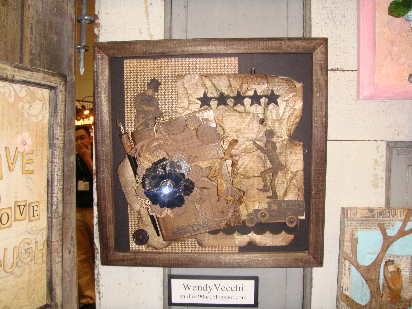
A very Wendy Vecchi-ish piece also in the Advantus booth.  I really liked the originality of this piece.  Very cool.
Here is another Wendy Vecchi-ish piece.  I love houses and clocks so naturally, this unique piece at the Advantus booth caught my eye.

From 7 Gypsies...I LOVED this little vintage ticket holder.  They had several of these sitting around their booth with all sorts of whatnots and knick knacks in them.  I think these are about as cool as they can be.  Big enough to hold a lot of stuff but small enough that they can be tucked into lots of smaller places on shelves or counter areas without taking up a lot of space. 
And one more thing I will share today...a really pretty piece that caught my eye at the Kaiser Craft booth.  This beautiful tree was adorned in Kaiser's beautiful flowers and little die cut frame. I thought this was an interesting way to display a "Family Tree".

CHA may be over now, but it really got my creative juices flowing! There were so many wonderful products previewed this year. So many amazing displays to represent each of the product lines. So many talented artists who freely shared all of their wonderful creativity. So, while CHA may be over...the FUN is just beginning!!  Check out your stores for the new product lines!  You will be pleasantly surprised at how wonderful they are!  Remember to take time to play, it's SOUL FOOD!

Tuesday, February 1, 2011

WINTER CHA

This was my first opportunity to go to CHA and I have to say, it was everything I hoped it would be...and MORE! I want to thank three very very special ladies for making my CHA experience such a memorable one.
 I attended CHA with Timi, Nancy and Nancy from For Keeps Sake in St. Louis, Missouri. They took me "under their wings" so as to speak and I learned so much from traveling around the show watching them do their "magic". Boy, do these ladies have an eye for everything WONDERFUL to take back to their customers!  They were so excited about so many things they were seeing this year. If you're in the St. Louis area, you guys have NO IDEA what's coming!  LUCKY YOU!!!  I am going to start guest teaching at For Keeps Sake in April and I am truly excited about it! These ladies are fun and really customer minded. So, thank you to them for letting me tag along and especially to Nancy Wethington....she has got to be one of the most geniune, sweetest people I have ever met. She is sooo talented and knowledgeable about her craft. It was a pure pleasure to walk the show with her.  She teaches a variety of classes and techniques at For Keeps Sake.   

I met some amazing people and saw some just astoundingly beautiful art and products at CHA!  The way some of the booths displayed their pieces...just phenominal.  For example:
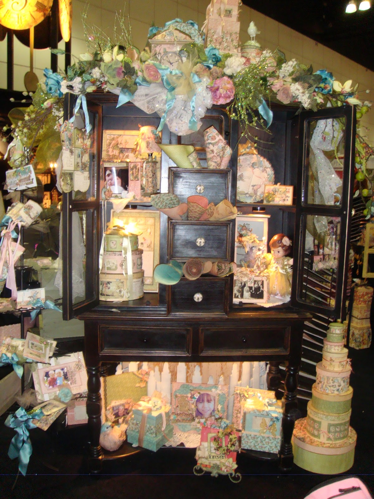
GRAPHIC 45 - ONCE UPON A SPRINGTIME COLLECTION
Just beautiful pieces and a feast for the eyes everywhere you looked!
I have to admit, I was not a huge fan of their Le Cirque collection. I liked it but just wasn't in LOVE with it.  Then I saw their booth...
LOVE THIS STUFF!! This is just a small little portion of their Le Cirque display.  The colors and designs of this paper just popped.
Loved the Pink Paislee new lines this season as well.  The Pink Paislee people are so accomodating, so proud of their product (rightfully so) and just so nice! I particularly loved their Daily Junke and Butterfly Gardens lines.  The papers and accessories are just amazing! I can't wait to get my hands on them!
I saw a couple of paper lines that were new to me:  Glitz Design was one of them. I walked into their booth and immediately fell in LOVE with Afternoon Muse.  It is a soft, whimsical paper with really cute chipboard albums, "Paper Layers" and "Whatnots" that coordinate with the papers.  A really sweet "vintage-ish" look that I am drawn to.
Another really awesome soft colors and whimsically fun vintage line was displayed at the GCD booth.  It was titled "FUNHOUSE" and boy, was it ever FUN to look at! The paper and the embellishments and coordinating pieces are just amazing! Tina Higgins, the designer for Funhouse hit it out of the park with this one! The whole booth was so tastefully done and truly fit the theme of this paper line.  All of their lines were beautiful as well...but the booth had a bit of a circus atmosphere with it's kissing booth, and character photo boards.  They even passed out little "sweets" bags filled with penny candies. Love their booth and their papers...particularly FUNHOUSE.  Be on the look out for THAT one!  It's a winner! Hopefully I will locate those pictures I took soon so I can post one.
7 Gypsies had just a phenominal booth chaulk full of their wonderful products and samples. Love their new Lille line and all of their trays, drawers, etc.

Stampabilities had some really beautiful projects using their wonderful dies! Their new Grand Calibur machine for cutting and embossing their big dies or several of their smaller dies at the same time is really amazing.  So easy to use and the new larger dies they introduced at the show have so much detail and beautifully intricate designs! LOVED it!
Then, of course, I love everything Tim and there was all of Tim Holtz' new products displayed at the Ranger, Advantus, and Stampers Anonymous booths.  He just "brings it" every season. I truly love his new stamps, his dies and all of his new Ideaology pieces. And I can't wait to get my hands on the new Distress Stains! The samples in these booths were amazing.

This gorgeous metal squares piece was created by Linda Cain.


Here are a few "Designer's Challenge" pieces that were on display at the Ranger Booth. These entries are from Tim, Wendy Vecchi, Linda Cain and Tammy Tutterow. I just loved them! They were all so different and all beautifully done.
This is just a SMALL...I repeat SMALL sampling of CHA. It was amazing! Those new products should be hitting the stores in a few weeks. Check them out because you won't believe how wonderful they are! I heard a lot of people saying that THIS was a really good show...finally some things to get REALLY EXCITED about! 


Tuesday, January 25, 2011

SIMON SAYS CHALLENGE - A CHILDHOOD MEMORY

First of all I have to say....I AM HEADING TO CHA IN A COUPLE OF DAYS!  This will be my FIRST TIME to go and I am excited beyond description! All of the incredibly talented designers, product developers and new products that I will be seeing there are AMAZING! I am sure I will be on CREATIVE SENSORY OVERLOAD...but I will be like a big sponge...just soaking in every minute of it!

Here is my entry into this week's Simon Says Challenge - A Childhood Memory.  I made a series of blocks titled "FAMILY".  One block for each letter.  This is part of the "M" block that I share with my husband.  This particular side is my side of the block devoted to my younger self. 

It is a simple wooden block that is covered in different papers on all sides.  Each side is then finished out in pictures and elements and tells its own story.  My idea was to have a family album that is on blocks rather than in a book that gets put on a bookshelf and no one ever looks at.

On this side, I attached a "pull out" using some G45 cardstock that serves as a matting for my pictures.  It is folded into 3 equal sections. I then sized my pictures to fit in the sections.  I added a little Vintage Photo Distress Ink to the pictures and black photo corners to the edges.  I love the black photo corners with the sepia tones of the photographs. I was trying to achieve a real vintage and heirloom feel with these blocks. 
Finally, I added various metal letters to spell my name and a metal heart hanging by a paper clip on the other side.  The paper clip and the heart serve as an embellishment when the pictures are folded out.  When the pictures are folded in, the paper clip holds the pictures together.

Have a wonderful week and take time to play!  It's SOUL FOOD!

Monday, January 17, 2011

JUST A REMINDER...

I will be at Scrapbook Generation this Wednesday, January 19th from 10 - 12 for

"Distress Inks 101"
It's FUN ... it's FREE ... and everyone is invited!
Everyone who attends will be given a sheet of the information about Distress Inks and the techniques that I will be covering.  Then you will be able to try the techniques out for yourself at the different "play stations" that will be available.  You will be amazed at how easy they are to use and what wonderful results you will achieve! And... the instruction sheet will be a handy reference for you when you try the techniques again at home!
So, come in out of the cold and warm up your creative juices at Distress Inks 101!

Saturday, January 15, 2011

~ REVISITING THE CHRISTMAS BOOKS ~

I have had some people comment and email me asking me about the Christmas books I pictured on my blog back in December. They were wanting to see the inside of the books. I have pictures of three of the four books and will gladly share them with you. The books started off as plain paper mache books from Hobby Lobby. I painted the exteriors with various colors and painted the "pages" to look like those old edged pages. The covers of the books were images I found online and sized to fit the approximately 5"x7" cover of the book. I distressed the covers to make them look "vintage" and then applied various colors of Stickles to make the look more festive or like old Christmas cards with all of the glitter.  
Here is the interior of "The Night Before Christmas".
I found the page on the left online and sized it to fit the interior cover of my book. I made the little bell corsage on the inside cover out of little silver bells that I glittered gold and wired them to a couple of little pine cones and a piece of evergreen garland...finished off with a red velvet bow. My mother always wore corsages similar to this at Christmastime when I was a little girl. Then I distressed and stickled the page. The interior of the book was done with various miniatures, mostly from Hobby Lobby. The "wallpaper" is some of that wonderful Daisy Ds vintage Christmas paper that is discontinued. I loved that paper and miss it! I made the fireplace using paper that looked like brick. It is flat but the distressing makes it almost look 3D. The mantle of the fireplace is Grungeboard that is inked. The Christmas tree was a plain bottle brush tree that I added ornaments and tinsel garland to. Santa was a little ornament from Hobby Lobby. He was the perfect size! The stocking hung by the chimney with care is actually a piece of snowman print felt. I cut out a little stocking shape and stickled around the outer edge of it then I glued it to the mantle.
This is the interior of Rudolph The Red Nosed Reindeer. That was my favorite Golden Book of Christmas stories when I was little. So, I wanted to leave the interior cover of the book to look like the interior of my original cover of the Golden Book I loved so much. The Santa and reindeer is an ornament that worked perfectly. I attached a 3D silver metallic star to the top of the interior of the box and it freely hangs over Santa. He is mounted on a "rooftop" that is made out of Grungeboard and covered in little wooden shingles like are used on dollhouses. The tree in the corner helps support the reindeer. I added Snowtech to the tree and to the rooftop as well as the base of the box. Then I added a little string of plastic lights to the gutter of the roof.
Frosty the Snowman...another of my favorite Golden Books. I made the interior of the cover and sized it to fit. Then I added a few snowflakes, a candy cane and some mica flakes to give it even more of a vintage look. I made the snowy scene for the background of the interior using a scene out of the original book and adding some stickles. The characters are the actual ones in the Golden Book. I sized them, cut them out, added some cardstock behind them for strength and then used small little wooden blocks to mount them in various places. I added Snowtech for that really snowy look. Of course, they are outside in the snow, so I had to add some snow to their shoulders and backs as well. I hung snowflakes from the top of the box to finish it off.

I hope this helps those of you who had asked me to post pictures of the interiors of the books. I intend to add "A Charlie Brown Christmas", "It's A Wonderful Life" and "A Christmas Story" to my "library".
Thanks for spending a little bit of your day with me! I always appreciate your visit.  Leave a comment if you're so inclined. I enjoy reading them!

Friday, January 14, 2011

COMPENDIUM OF CURIOUSITIES CHALLENGE #27 & SIMON SAYS STAMP CHALLENGE

I finally had a chance to work on my creations for the Compendium of Curiousities Challenge and Simon Says Stamp Challenge for this week. Fortunately both challenges are all about masking! I don't use this technique very much. Not because I don't love it, but because I just forget about it. There are so many wonderful techniques in Tim Holtz' book, Compendium of Curiousities. If you haven't participated in either of these challenges, I would encourage you to do so! It's so much fun and it really does challenge you to experiment with Tim's techniques and expand your creativity!

Here is what I created for these challenges....
 
Without giving away the technique, I will go through the steps I did to create this tag.


I inked Tim's Photographic Studio stamp using Vintage Photo, Fired Brick and Walnut Stain Distress Inks all at once. Then I stamped the image onto a #8 manilla tag. I love the look of multicolor stamping. It adds a lot of depth and variance of color to the image.  Then I stamped the image again and used the children as one of my masks on this tag. I also cut out the "97724" and the little girl dressed in the light dress to pop them up off of the tag using adhesive pop dots.  I added just a touch of Vintage Photo Distress ink to the little girl and inked around the edges of the little girl and the numbers with Walnut Stain. I think doing that pops the image even more.

Next I used one of the masks from Tim's "Borderline" mask set across the top of the tag. I sprayed the tag with my own concoction of Broken China, Kiwi Perfect Pearls and water in a Mini Mister as my background color.  I love the softness of it; especially when it is distressed with Vintage Photo and a touch of Walnut Stain Distress Inks. Next, I stamped "Who Where You Before You Put Yourself Last" in permanent black ink onto a piece of cream cardstock. I lightly added some Vintage Photo and accented the edges with Walnut Stain.  Then I brushed just the edges with Black Soot. 

I love this saying!!  It so thought provoking and I thought the little girl in the cream dress looked as though she was thinking that very thought! I glued the saying onto a piece of cardstock that I inked with Fired Brick Distress Ink.  I clipped the cardstock down to just accent the edges of the saying. I went around the edges of that red matting with Black Soot.  I popped the numbers, the girl and the saying in place.

I sized some little vintage pictures of children to fit inside Tim's Film Strip Ribbon and applied Glossy Accents to hold them in place. I love the way the Film Strip Ribbon ties in with the Photographic Studio theme of the stamp. I also love the way it finishes off the top of the tag.

Finally, I colored two pieces of white Hug Snug seam binding; one was sprayed with a concoction of Fired Brick, Sunflower Sparkle Perfect Pearls and water in a Mini Mister.  The other was rubbed with Vintage Photo Distress Ink. I tied them onto the tag and added a "Moments" Muse Toke with Tim's Ball and Chain.

Thanks for checking out my blog. I hope you liked the tag and I hope it inspires you to try some of Tim's techniques out for yourself!

Sunday, January 9, 2011

SIMON SAYS STAMP CHALLENGE - NEW OR UNUSED STAMP

What?! Who among us has an unused stamp? Umm...guess that would be me! I LOVE stamps! I seem to collect stamps! ...And, I use stamps...I just haven't used all of them ...YET! But, that is why this challenge is so wonderful! It made me use a stamp I really had forgotten I had!

I looked through my stamps and found one that I fell in love with three years ago when I found it in Arizona. It is a Santos Paper Doll stamp. 
I loved this stamp because it is a complete jointed paper doll...head and body, arms, hands, and even a jointed skirt. I love the fact that she can be stationary or free to move...whatever your heart desires!

I stamped the doll onto a heavy manilla folder using Timber Brown Stazon ink. Then I added Vintage Photo and Walnut Stain Distress Inks to the shaded areas indicated on the doll.  I stamped another torso and the skirt out of one of Tim Holtz'  wonderful solid papers from his Lost And Found paper stack. I embossed the torso with the Cuddlebug "textile" folder and used some Antique Gold Rub N' Buff to lightly accent the high areas of the bodice of the dress to give it a "brocade" look. I also highlighted the skirt spokes. All of the joints are put together with antique copper brads.

I then dressed the doll using pieces of antique laces for the bodice of the dress. Her hair piece is also made from antique laces. I added a touch of "bling" to her hairpiece and her bodice. Next I colored a piece of cream lace with a color I made using Tea Dye Refill Distress Ink, Sparkling Sunflower Perfect Pearls and water in a Mini Mister. This became my paper doll's shawl. 

I chose to weave a strand of heart lace in and out of the skirt "spokes" because I wanted to make this doll with a bit of a Valentine theme. I sized some vintage Valentine post cards to make a Valentine banner. I inked the edges of the postcards with Vintage Photo and rubbed Rock Candy Stickles over the fronts of the postcards to pop the color...and it did! Then I glued the postcards onto a small piece of red ribbon and intertwined it in the doll's fingers.

For the finishing touch, I colored some small white flowers (from Maya Road) and used the same color spray technique I used on the shawl. The flowers are sprayed with Spiced Marmalade and Worn Lipstick as my Distress Ink colors. I used the flowers in her hairpiece and along the ribbon of the Valentine garland.

Now that I have used this stamp, I am sure that I will use her again! She has so many possibilities!

Thanks for stopping by my blog! Have some fun and make some art! IT'S SOUL FOOD!


Thursday, January 6, 2011

COMPENDIUM OF CURIOUSITIES CHALLENGE #26

This week's Compendium of Curiousities Challenge was the RUSTED GRUNGE technique as seen on page 45 from Tim Holtz' Compendium of Curiousities book. This is a simple but really fun technique because of the amazing textures you get. Check out Tim's book and see how to do this technique. You'll LOVE the results!

I mixed two Distress Embossing Powders - Antique Linen and Vintage Photo to achieve the rusted look on my iron gate fence.  Then I added a little Black Soot Distress Ink to age it even more.
I used Tim's Texture Fade that looks like brick as my "castle" background. First I inked the texture fade with Pumice Distress Ink and ran it through my Vagabond. That made a really cool looking mortar. Then I colored the "bricks" with Fired Brick. I made another partial wall that I could curve in the front so that I could simulate my little angel girl sitting atop a castle tower.

I used that wonderful foliage stamp that is part of Tim's Fairytale Frenzy stamp set. I stamped it twice; first with Forest Moss and then I partially overlapped it with Bundled Sage to achieve an effect of vines running up the castle wall.

I attached the front wall to the tag, curving it and really making a cool 3D effect. Next I stamped my little angel girl, cut her out and tinted her with Spun Sugar. Every angel has to have wings...right? So I stamped the wings using the pair from Tim's Mini Ornates Stamp set. I mixed Queens Gold and Copper embossing powders to get a vintage yet regal looking pair of wings. I cut them out and attached them to my angel. Next I pop dotted her onto the tag. Finally, I took some very fine copper tinsel and put a little of it behind "I Believe In Angels". 

I experimented with spraying some white Hug Snug with Bundled Sage and then spot spraying Tim's Perfect Pearls Copper Mist. I LOVED the result! It looks very Shabby Chic and a perfect compliment for the green in the tag.

Monday, January 3, 2011

THE VINTAGE VALENTINE TRINKET BOX

A couple of weeks ago, I posted a "Sneak Peek" for the Vintage Valentine Trinket Box class that I will be teaching at Scrapbook Generation in Springfield, Missouri on Thursday, January 13th.

Here he is ... my Vintage Valentine Trinket Box!


I am really excited about teaching this class for a couple of reasons.
Scrapbook Generation will be open tomorrow in their brand new, larger location (right next door to their previous location). The entire store, including the classroom space will be much larger and the gals at Scrapbook Generation are excited to have so much more space to continue to carry the latest greatest of everything!
This will be my first class to teach at Scrapbook Generation...which is really exciting for me!

This little guy is so much fun to make and he will definitely add a vintage "I LOVE YOU"
to your Valentine decor!

Thursday, December 30, 2010

SIMON SAYS CHALLENGE - SOMETHING FROM YESTERYEAR

As the new year is upon us, it is a time of looking forward but also for reflecting on the past. What a great time for the Simon Says Challenge titled "Something From Yesteryear"!

This is a definitely a "yesteryear" for me.  It is an accordian book titled "Where I Come From".  It is a book I made including pictures and little "snippets" of memories I have from my childhood. 
This is the front side of my book.

This is the back side.

As I was looking through pictures to use in this book, I was instantly swept back to that time in my life. I remembered so many wonderful things that have been tucked away in my mind over the years...the people, the places, the things that meant so much to me.
These pages were devoted to my grandparents...some I never knew; some who passed on before I could barely remember them. But that is the beauty of pictures...they help remind us of those who were before us and in some ways, were a piece of the puzzle of "me".

These pages were devoted to my beloved parents. I am so proud to be their daughter and proud of the legacy they left behind. They were depression babies. They didn't have very much materially but they were rich in so many other ways.
I have wonderful Christmas memories and have carried on traditions to my own children and grandchildren that my parents began with my brother and I. My "yesteryears" are something I treasure and looking at this little book brings me so much joy.

Tuesday, December 28, 2010

COMPENDIUM OF CURIOUSITIES CHALLENGE #25

Here is my entry into the Compendium of Curiousities Challenge #25 using Tim Holtz' Scribble Stain Distress method on the background of this tag.  I have to admit that I have not used this method very much so it was fun to experiment with it again. I guess with all the cold, wintery weather outside, I am already starting to "Think Spring"!

 
I used Tim's birdcage die and cut it twice. Then I cut away the middle bars of the cage and added a cage door that is open. I glued the door in place but I wrapped some copper wire at the top and bottom joints to add some interest and metal. I love adding metal to pieces! The flowers and buds are from Tim's Tattered Flowers die. I used the smallest one and cut several out of crinolin. I sprayed them using a color spray I made using a mini mister filled with water, a dropper of Broken China and a little bit of Kiwi Perfect Pearls. I added a bit of spray made with Scattered Straw as well. I stamped the birds in dual colors - Frayed Burlap and Broken China and wiped a little bit of Vintage Photo over them.
For a subtle pop of pink and softness, I made a little vine out of Flower Soft and wrapped it in the bird cage bars. Finally, I stamped "THINK OUTSIDE THE BOX" on one of Tim's ticket stamps and added it to a memo pin that fits nicely on the bottom of the bird cage. I love that phrase and I think making the bird cage have an open door was a different use of that die. I glued it all down and added two ribbons at the top colored to match the tag.