Wednesday, June 6, 2012

Hey Friends!  I hope you're all having a wonderfully creative week so far!  


I'm excited about the Ranger blog this month!  They always have wonderful projects and greats tips for using their products.  One of my creations is being featured right now!  Click HERE to be magically transported to Ranger's blog and all of the details on how to make this really fun 6x6 wall hanging.  This piece is heavily inspired by Tim Holtz and Wendy Vecchi.  I love their products.  They are so versatile and fun!  I also LOVE Ranger products because they are so user friendly and you always get great results! 

Remember to get INKY and take time to PLAY!!  It's SOUL FOOD!

Sunday, June 3, 2012

SHOW SOME TEXTURE

Hello everybody! Welcome to another week of Simon Says Stamp and Show's Challenge.  This week...Simon Says Show Some Texture!  Check out the wonderful creations that my Design Teammies have made for you by clicking the link above.  They are so talented and work hard every week to bring original ideas to you.

Texture can come from anywhere....netting, combs, the edges of plastic cards, stencils...anywhere.  So, when you are creating with texture, think outside of the box!


I have created a texture rich trinket box.  I started out with just a simple little unfinished wooden box.  I first covered the top of the box with Claudine Hellmuth's White Gesso as my base.  When dry, I began to build two or three layers using the Gesso and Dyan Reaveley's wonderful 5x8 stencils:  Luscious Leaves, Letter Jumble, Dotted Flowers and Diamond Of A Border.  I also used a little piece of Punchinella for the honey comb effect in the center.  Finally, what looks like loose netting is actually little pieces of plastic garden weed netting that I stuck into the Gesso.


Here is my box before I embellished the top.


These leaves are from Dyan Reaveley's Luscious Leaves Stencil with Gesso scraped over the top of it.  After the Gesso dried, I painted the entire box with a light pink acrylic paint then washed it (antiqued it) with Raw Sienna Acrylic paint and water.  Then, using a small paint brush, I painted in the leaves using Italian Sage Acrylic Paint followed by some Juniper Paint Dabber.  Your can see the really defined honeycomb pattern achieved by scraping Gesso over a piece of Punchinella.


The garden netting added some neat texture as did Dyan's Diamond Of A Border and Letter Jumble Stencils.  The small polka dots at the bottom are from Dyan's Dotted Flowers Stencil.  I then lightly wiped a bit of Italian Sage Acrylic Paint over some of the raised areas using my finger followed by a touch of Juniper Paint Dabber.


Here is the top of the finished box before I added any embellishments.  You can see the sides of the box that are also textured using Metal Foil Sheets that are dry embossed.  I measured the length and width of the side of the unfinished wooden box and cut strips of metal foil.  Then I embossed them using my Vagabond and embossing folders.  I used a couple of Cuddlebug folders and the Tim Holtz Postcard Texture Fade for the front.  The sheet metal is adhesive on the back, so once I cut the strips to fit the box, it was easy to adhere them into place.


Here is the postcard front.  It is silver sheet metal that was washed with Raw Sienna Acrylic Paint and then given the patina look using the Juniper Paint Dabber.  The metal hardware was originally a shiny gold finish.  It was also given a patina finish courtesy of the Juniper Paint Dabber.


Both of the sides are embossed buttons embossed from a Cuddlebug embossing border and then antiqued in the same method at the front.


Here is the back.  The metal and the metal findings were also finished in the same way as the front and sides of the box.


The top of the box was then embellished with some metal buttons and some delicate little flowers that I dipped into melted Clear UTEE and made to look like porcelain flowers.  I added a little Hug Snug "distressed" seam tape for ribbon and some little green wire curls for added texture and interest.


Open the box to reveal four small compartments...perfect size for ATCs to be stored.  I just finished off the interior using a sheet of Pink Paislee's Butterfly Garden paper that I had left over.  I popped some of the embellishments with pop dots or by using Glossy Accents.


Here is a closer look at the top portion of the box.


Here is the bottom portion of the box.  The bird's nest is heat embossed with Rust Antiquities and a touch of Copper Embossing Powder.  The eggs are colored with a Pool Paint Dabber and then coated with Glossy Accents to make them appear more dimensional.

Working with texture...love it!  Now it's YOUR turn to create something with texture and post it to Simon Says Stamp and Show. You could be our lucky randomly chosen winner of a very generous ...


... and you could also be chosen as one of our TOP THREE entries of the week!  Considering the amazing talent that part of our weekly challenges, that is quite a feat!  Good luck and thanks for stopping by my blog! Have a great week and take time to PLAY!


THE ARTISTIC STAMPER QUEEN'S JUBILEE GIVEAWAY

I hope everyone is enjoying a fab weekend.  I worked in the yard all day yesterday, weeding beds around the house and helping the hubby and a friend clean out our garages. My sore muscles are screaming this morning, reminding me that they are there and that I should use them more often! (smile) Hopefully I can work the soreness and stiffness out of them this morning as I do more outside work.

Even though I am not British, I have met some AMAZING and TALENTED artists through this incredible art journey.  They are celebrating their Queen's Jubilee this weekend. I have been watching the coverage on television.  I am so proud for them!  Seeing their country all come together in such exciting and patriotic gatherings is wonderful!  The Union Jack is proudly flying everywhere.  People are celebrating everywhere from elaborately planned events to neighborhood parties.  I love it!

Over at THE ARTISTIC STAMPER, Jennie Boxall has a wonderful giveaway to coincide with the Queen's Jubilee.  Check out these goodies.


These would definitely be fun to win! I've already got my name in the drawing...if you decide to add yours, just click on her blog and leave a comment.  Good luck!

Sunday, May 27, 2012

THIS ONE'S FOR THE GUYS ...

I hope everyone in the US is enjoying a safe and happy Memorial Day holiday weekend.

Simon Says Stamp and Show is asking all of us to create something for the guys this week.  Check out the blog to see the wonderful masculine pieces my fabulous Design Team buddies have posted this week.  As always, they are amazing!

I got my grunge on and used almost all Tim Holtz products to create this 6x6 board.


This piece really has an emphasis on Tim's wonderful and often misunderstood Distress Embossing Powders.  They are not meant to be metallic or shiny when they are heated.  They are meant to be grainy and rough with a sand paper-ish type texture.

First I glued a piece of paper from Tim's Crowded Attic Paper Stash to a 6x6 chipboard square.  I distressed the background using Bundled Sage, Pumice Stone, Weathered Wood, Crushed Olive then Black Soot Distress Inks.  Next I embossed the 6x6 board using Tim's Postal Texture Fade.  I lightly tapped the Distress Embossing Ink to just hit all of the high areas of the embossed design and cover them with clear ink.  Then I sprinkled first Walnut Stain and then Vintage Photo Distress Embossing Powders randomly over the entire embossed image; mixing the two colors.  I removed the excess powder and heat set it into the raised image.  I rubbed off the excess powder and release crystals leaving a beautiful, rough image.


Next I randomly stamped parts of the harlequin design from Dyan Reaveley's Basic Backgrounds stamp set using the Distress Embossing Ink.  Using the same technique that I did with the postal cancellation image, I randomly sprinkled Weathered Wood and Vintage Photo Distress Powders over the ink and heat set it.  Then I distressed the board again with a little more Vintage Photo Distress Ink.


I die cut the Old Jalopy out of Grungeboard.  Then I rubbed the surface of the jalopy with the Distress Embossing Ink pad and sprinkled Black Soot Distress Embossing Powder all over it.  I heat set and removed the excess powder.  The little die cut details in the car are heat embossed with Vintage Photo Distress Embossing Powders and glued into place using Glossy Accents.  The "windows" in the jalopy are made from Mica that is glued to the backside of the jalopy die cut. I added the Plaquette across the car door.  The "smoke" coming out of the back end of the jalopy is made using a Mini Flourish die cut out of Grungeboard and painted with a Cloudy Blue Paint Dabber.  When it was dry, I smeared Waterfall Stickles over the surface and distressed the edges with Black Soot Distress Ink.  Then I glued it to the back end of the car, as if it were smoke coming out of a tailpipe.


I distressed Tim's Journaling Ticket with Vintage Photo and Crushed Olive Distress Inks with just a touch of Black Soot around the edges.  I stamped 'Enjoy The Journey" from Tim's Just Thoughts stamp set, using Jet Black Archival Ink.  I used Tim's Ruler to punch three holes equidistant on the top and bottom of the ticket.  Then I added a Long Fastener to each and pounded them with Tim's Texture Hammer to distress the heads.  The ticket is mounted on a piece from a Metal Foil Sheet that was embossed with Tim's Damask Texture Fade.  It was then rubbed with a Pitch Black Paint Dabber and I wiped away some of the paint with a paper towel, leaving a really cool antiqued look to the metal.  I then cut the edges of the metal sheet to mimic the edges of the ticket.

Finally, I added a piece of Tim's Filmstrip Ribbon to the right side of the board, using Tim's Tiny Attacher.  I pop dotted the Journal Ticket in place and then hot glued the Old Jalopy in Place.  With all of the Distress Embossing Powders, this not only has the look but the feel of a masculine project.

Now it's YOUR turn to create something for the guys and post it to our blog.  If you are chosen as the lucky random winner for the week, you will receive a ....

      
And...you could be chosen as one of our TOP THREE artists for the week!!  So...get your thinking caps on and think about all of those wonderful guys in our lives!  I can't wait to see what you create!
  

Monday, May 21, 2012

TIM HOLTZ MAY TAG ... OR IN MY CASE ... AN ATC

I love Tim Holtz' TWELVE TAGS of 2012!  If you're not participating, I encourage you to do so!  Not only are the tags really pretty and fun to do, but the techniques are way cool, too.  Click HERE to see Tim's May tag.


Here is my version of Tim's tag.  Instead of making a tag...I made an ATC.  I used Tim's miniature dress form, needle book, spool label, ruler and pattern image from his Attic Treasures stamp set.  They are the perfect size for ATCs!  

The background was done with Tim's new Spring Distress Ink colors; Peacock Feathers and Squeezed Lemonade.  I also did the spritz and flick technique to add some interest to the background.  Stamping is all done with Jet Black Archival Ink, except for the pattern image.  That was stamped with Peacock Feathers Distress Ink.

  
The dress form was stamped directly on to the background.  I stamped another dress form and cut out the bodice.  I added the skirt made from Tim's Tissue Tape.  I added some Orange Peel to the skirt and drew a line at the bottom of the skirt to give it some definition.

The wings are stamped using Tim's Distress Markers directly onto the stamp and then stamping them on Ranger's Specialty Stamping Paper.  There is a bit of a glare in the photo but they really blended nicely.  I added the smaller flower from Tim's Ideaology Foliage.  I colored it using Vintaj Patina in the green tones.  
Finally, I hot glued a little Ideaology Hanger underneath the Foliage flower to hold it in place. I also added an Ideaology Type Charm with the letter "T" to dangle from the hanger. 


The needle book and spool label are also stamped onto Specialty Stamp paper and then colorized using Tim's Distress Markers.  The little butterfly and the larger wings used on the dress form are from Tim's Papillion and the Attic Treasures Stamp sets.


The faux porcelain flowers were originally little white flowers.  I sprayed them with a mixture of Spiced Marmalade Ink Refiller, Bronze Perfect Pearls Powder and water in a Mini Mister.  Then I dipped the flowers in hot UTEE (see Tim's tutorial for the May tag) and then glued them in place on my little ATC.  They are so easy to make but really look like little porcelain flowers.

I hope you're enjoying this beautiful Spring weather and you're taking time out of your busy schedules to stop and smell the roses.  Enjoy your day and take time to play!


Sunday, May 20, 2012

THE LAZY HAZY DAYS OF SUMMER....

Hello everyone!  Happy Monday!!  

Memorial Day is fast approaching.  That means summer  vacations will soon begin!  Simon Says Stamp and Show's challenge this week is all about Summer Holidays.  The Design Team has posted some really wonderful works of art for your viewing pleasure.  Check them out over at Simon Says Stamp and Show.

 
I have created a journal using that wonderful  
Graphic 45 On The Boardwalk paper. 

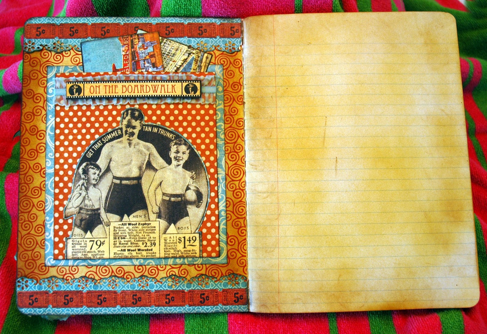
I started off with a plain 9 3/4 x 7 1/2" composition notebook.  I covered both the inside and outside covers of the notebook with great background papers.  Then I finished off the insides of the covers first; followed by the back and then finally the front.


The inside of the front cover features a really cute vintage advertisement mounted onto a pocket.  


Tim Holtz' Trimmings gathered elastic ribbon was sprayed with my own concoction of Broken China Reinker, Kiwi Perfect Pearls and water in a Mini Mister.  It was then taped across the front of the pocket using 1/8" Wonder Tape.  I added extra ribbon onto both sides so that I could tuck it under the folded edge of the pocket before gluing the pocket in place using 1/4" Wonder Tape.  Then I just taped the "On The Boardwalk" piece on top.


I sprayed a Honey Stain from Design Masters on several of the first and last pages of the journal, to give it even more of a vintage feeling.


The embellishment running across the top and bottom of the inside cover was created using a Martha Stewart Floral Lace Edge Puncher.  I distressed the edges and put them in place using Wonder Tape.  Next, I added the little tickets, also using Wonder Tape.  All of the images I've used to embellish this journal are included in this wonderful 12 x 12 paper pack!!


In the pocket, I've stuck a couple of vintage postcards I created from still more of the images included in this paper pack.


The back interior cover features a long pocket on the side so you can slip notes, pictures or other memories in it.  The postcards laying on the left side of the book can easily be tucked into the pocket on the right.  All of the vintage photos and post card images were taken from the paper pack.  I have distressed the edges of all of the photos and other cut pieces with a Chestnut Roan and Black Cats Eye ink pads.


The back cover again features more of those wonderful vintages images from the On The Boardwalk collection.  I added some ribbon trim under the accent stripe that looks like bottle caps on the left side.  


I also smashed a couple of bottle caps and added them to coordinate with the bottle cap images on the accent stripe.


The front cover is my favorite.  It features a beautiful "bathing beauty" with a small group of lovely ladies.  Paper Artsy's Hot Picks 1201 stamp set provides the wonderful vintage anchor at the top and the lovely seashell at the bottom.  

The anchor was stamped using Coffee Archival Ink.  I punched a hole in the top and ran a hemp type cording through it and down the anchor; following the cording on the stamped image.  I then continued the hemp cording down the side of the cover to add interest and dimension.  I popped the anchor in place using small pop dots.   These cute little tags are part of the paper pack.  I added them to the hemp twine and tied them with ribbon. 


At the bottom of the twine, I added an airy Tattered Floral was made from Tim Holtz' Terminology Tissue Wrap.  The flowers have been colorized first with Picket Fence Distress Stain followed by Broken China, Spiced Marmalade, Mustard Seed and Wild Honey Distress Stains.  Another smashed bottle cap was added for the center.


The seashell was colored right onto the stamp using Tim Holtz' Distress Marker Colors: Tea Dye, Spiced Marmalade, Vintage Photo, Barn Door and Dried Marigold.  I stamped the shell on Ranger's Specialty Stamping Paper.  After I dried it, I added some Tumbled Glass and Broken China highlights to the shell using Tim Holtz' Detailer Brush.  I popped the shell in place using small pop dots.  I couldn't get a good picture of the shell...but the Distress Markers really did a nice job of blending and shading the shell colors.

Now, I'm set to journal about my summer holiday and beyond!  Time to start planning YOUR summer Holiday!  Post your creation to our blog and you could be the winner of our generous sponsor's weekly prize of a .... 


You could also be selected as one of the TOP THREE entries for the week.  That is quite a compliment, judging from the amazing entries we have each week!  So, enter today for your chance to win!!!  I can't wait to see your creations!
 

Wednesday, May 16, 2012

GONE WITH THE WIND ATCs

I am a huge fan of that 1939 movie classic ... Gone With The Wind.


Clark Gable starred as the dashing Rhett Butler and 
Vivian Leigh was the perfect Scarlett O'Hara.

When I saw the sign ups for a Gone With The Wind ATC swap through my VPI art group, I knew I HAD to sign up!  I am making 6 cards for the swap....using 4 different designs.  For this swap, you were required to use vintage images from the movie.


Here are the different designs I have created...some more dimensional than others; 
but all so FUN to do!!

Since this movie was set in the deep South around the time of the Civil War, I used a Confederate flag as my background on most of the cards.  It is washed with a mixture of Folk Art Buttercup acrylic paint and water.  I love the ochre muted tone it created on the flag.  It's still there but really fades into the background and allowed me to pop the characters.

I loved this picture of Scarlett.  She was such a spoiled "Daddy's girl" and an absolutely stunning "Suthern" Belle.


"Prissy" was such a great character!  I will never forget her line, "Miss Scarlett, I don't know nothin' 'bout birthin' no babies" as Scarlett was depending on her to help deliver Melanie's baby during the Union Army's march on Atlanta.


This famous line was so typical of Scarlett.  At the end of the movie, her life is falling apart.  She finally realizes that the love of her life is not Ashley Wilkes but Rhett Butler.  As Scarlett professes her love to Rhett, he begins walking out the door and calmly delivers his famous line, "Frankly my dear, I don't give a damn!" But instead of immediately going after him, Scarlett decides she will figure out a way to win him back....but she will think about it later. After all, tomorrow IS another day!


I loved this picture of Rhett and Scarlett.  They had lots of Confederate money, a beautiful home and everything anyone could want.  But, they learned that everything can be gone in an instant as if "Gone With The Wind".

I can't wait to swap these cards and see the little masterpieces I will receive in return from the very talented group of artists who are participating in this swap.  I'll post my cards once I receive them!  Can't wait!!!

Sunday, May 13, 2012

ANYTHING GOES ~ WHAT ABOUT A CORSET?

Happy Monday everybody! I hope all you Moms out there (in the US) had a fantastic Mother's Day celebration yesterday. 

This week's Simon Says Stamp and Show Challenge is "Anything Goes".  So, get those creative thinking caps on and create whatever you heart desires for this challenge!

I am in the midst of making some ATCs for a future swap.  The theme is corsets.  The only stipulation is that the cards have to feature vintage images of corsets. Here is one of the designs I've created for the swap. While the trio of lovely ladies are wearing what I'd like to call "semi corsets", the little vintage ad features a full corset...so I'm safe.

 
I found these images online, I just fell in love with them and knew I just HAD to use them!  Aren't they beautiful?  I absolutely love teal and browns together anyway, so I love how this ATC turned out....simple yet elegant.

Ranger has some wonderful options for ATC cards in Black, Kraft, Specialty Stamping Paper and Manila.  Check them out HERE.  I like to back all of my ATCs with mat or mounting board.  (You can get it at craft stores and cut it into 3 1/2 x 2 1/2 size.)  It really gives the cards extra strength so that they won't easily get bent.  They also look and feel so much more impressive and substantial when they have a strong backing.

The background for this ATC was some left over Pink Paislee "Butterfly Garden" paper that I had.  Pink Paislee has some beautiful paper lines out right now at Simon Says Stamp.  London Market is another one that I adore right now.  Anyway...back to this ATC.  (smile)


The background is one of the teal backgrounds with small brown images of text and drawings from Butterfly Garden.  I taped it in place using 1/4" Wonder Double Sided Tape.  Next I distressed the paper using Vintage Photo Distress Ink and then just touched the edges with Black Soot Distress Ink.  This background color was such a lovely color-especially after the Vintage Photo added such wonderful rich tones.  But it needed a little "umfph".  So, I lightly brushed some Sunflower Sparkle Perfect Pearls Powder over the teal background; particularly around the outside edges.  

I tore a strip of book print from another scrap from the Butterfly Garden collection, distressed it with Vintage Photo and Black Soot and then glued it going somewhat diagonally across the ATC.  I cut off the excess edges and then distressed the edges of the card with Gathered Twig Distress Ink followed with a touch of Black Soot.


Next, I cut the trio of ladies out using my Honey Bee Scissors.  I love them for the fine detail cutting!  Then I lightly...very lightly added just a touch of Vintage Photo Distress Ink to the picture.  It's amazing what just a touch of Vintage Photo can do to change the appearance of a photograph.  I inked the edges of the ladies with a Chestnut Roan Cats Eye Ink Pad.  I always ink edges....it gives them real definition!  Then I centered the ladies on the ATC and glued them in place.  The sparkle on their pearl necklaces is courtesy of Waterfall and Stardust Stickles.


The vintage ad at the very top and the bottom of the ATC were actually one ad that I cut apart.  I distressed the ads using Vintage Photo and Black Soot Distress Inks.  Using 1/8" Wonder Tape, I placed the smaller ad line at the top of the ATC.  I gathered a bit of vintage cream tulle and glued it in place using 1/4" Wonder Tape.  Then I laid the other part of the vintage ad on top of it, using 1/4" Wonder Tape.  I liked the little bit of dimension and femininity it added to the ATC. 

Finally, I wanted to add just a small embellishment to the right side of the ATC, where I felt like there was a glaring bare spot. Melissa Frances' Cream Pearls were the perfect solution!  This set has several different sizes of the prettiest cream pearls!

Enter your Anything Goes creation in our challenge.  You might be the lucky winnner of our random weekly drawing for a...


from our most generous sponsor!  Lots and lots of amazing products at Simon Says Stamp!

You could also be selected as one of the Top Three projects for the week.  This is quite an honor as we always have such beautiful work on display from our entrees.  And also from the Design Team!!!  If you've not seen the amazing Anything Goes ideas from my Design Team buddies this week, click on the Simon Says Stamp and Show's Challenge Blog Link.
Good luck!!!