Showing posts with label Compendium of Curiosities Challenge. Show all posts

Saturday, March 28, 2015

VINTAGE CHEVRON FRAMEWORKS CANVAS FOR COMPENDIUM OF CURIOSITIES III

Hello friends!  
Can you believe that we're already on to the 25th challenge in our journey through Tim Holtz' Compendium of Curiosities III book?  It has been such fun for myself and the Curiosity Crew over at the Compendium of Curiosities III Challenge. I hope that you've learned some new techniques, some things about Tim's products and we've inspired you to try new things.  

This challenge is more of a product challenge rather than a technique challenge.  It's all about Tim's Frameworks ... those wonderful little 5 1/2" x 2 1/2" pieces of magic that can add so much texture and dimension to your art pieces. There are six in all:  the Courtyard, Honeycomb, Chevron, Trellis, Lattice and the newly released Wave. So turn to page 64 in your books and check out Frameworks.


Here is my finished project, using the Chevron Frameworks along with Tim's new Correspondence Paper Stash and the matching stamps, Special Delivery Remnant Rubs, and Paper Twine.  Unfortunately, I have not received the matching Tissue Tapes yet or I would have used them as well. 


I began this project with a 6" x 6" stretched canvas.  I covered the top with a square from Tim's Correspondence Paper Stash.  I glued it in place using Ranger's Matte Medium. Then I added a variety of washi tape designs that I already had and thought would go well with a travel or "air mail" theme. I pretty much covered the sides of the canvas with the washi tape and added a few strips on the top for more interest.  


I wanted to add some dimension to the top of my canvas; something that would lend a grunge feeling without being overpowering.  So I decided to use Tim's Bricked Stencil and add some of that multi-talented artist, Wendy Vecchi's wonderful white Embossing Paste colored with a little Carnation Red Archival Reinker.


I simply laid the Bricked Stencil on top of the canvas and while holding it in place, I randomly scraped the colored Embossing Paste through the stencil.


Happy with my design, I brushed a coat of Matte Multi Medium over the entire surface of the canvas to seal it.  Matte Multi Medium is an excellent adhesive and sealant. It goes on smoothly and dries to a clear, matte finish. You can let this air dry or gently heat set it. 

(**Notice that I still am using my Claudine Hellmuth Matte Medium?  It also lasts a long time!)


When the Matte Medium was dry, I wanted to pull everything together so I lightly brushed over the canvas first with Frayed Burlap Distress Paint mixed with a little water to dilute it a bit.  Then I added some darker brown tones with Gathered Twigs.  I wiped away any excess paint from the bricks and areas that I wanted lighter.  Then I used a bit of blue acrylic paint on my finger and added some defining edges to the canvas. 


Here is a photograph of one side of the canvas.  The washi tape really does create a very cool design and when brushed over with the paint, it really blends together beautifully.

Now that the canvas was ready, it was time to make my embellishments.


I die cut three of Tim Holtz' new Butterfly Duo die cuts and embossing folders in one set. LOVE THEM!!  I die cut my butterflies onto watercolor paper.  Then I randomly rubbed some glue onto the paper surface using my finger so that when I began adding my Distress Ink colors, the glue would cause the ink to really stick in a grungy way onto the areas where the rubbed glue was on the paper.


I began with a light coat of Scattered Straw over the entire butterfly.  Then I started in the center and started working my way out.  I added Peacock Feathers over a light coat of Faded Jeans.  The next area was a done with Wild Honey. Next I added Worn Lipstick then a light coat of Fired Brick on top of the outer edges of the wings. 

Next I brushed on a light coat of Crackle Glaze over the butterflies and let it dry.  When dry, I rubbed some Raw Umber Antiquing Cream over all of the butterflies and wiped away the excess, leaving this very antiqued matte finish butterfly.  The body was added on what would be the top butterfly using Wendy Vecchi's Black Embossing Paste and I let it dry.


Then I glued the two lower bodies together.  I added the wire antenna to the underside of the top butterfly with the embossing paste body and then using Glossy Accents, I glued the top butterfly onto the other two already joined together.  In the inset picture, you can see the dimension and the fluttering effect that the three butterflies glued together gives.

  
Since the theme of this piece was about correspondence and mail art, I created a little envelope out of scrap cardstock.  You can see the dimensions of the finished envelope front here.  I added 1/4" tabs that were scored and clipped and the top envelope flap was freehanded and cut out. I then slipped the back of the envelope in place, added 1/8" Scor Tape to the tabs and put them together. Next I added some stamping and some washi tape to the envelope and finally distressed it using Gathered Twigs and Black Soot Distress Ink to give it that vintage, aged look.  You will see the final envelope in the next photo.
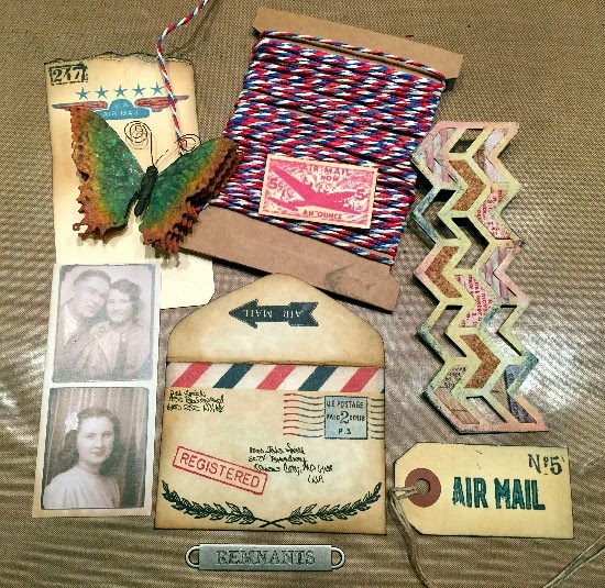

Here are all of the elements that I decided to add to the canvas: the butterfly, the envelope, a card from Tim's new Photo Booth photos (minus the top photo because I wanted the couple's picture to stick out of my envelope), various stamped images on the envelope, cardstock scraps and mini tag, Tim's New air mail colored Paper String, a Word Band and the Chevron die cut. 

The Chevron was cut out of plain Grungeboard and then painted with Antique Linen Distress Paint as a basecoat.  I then added Scattered Straw, Faded Jeans and Fired Brick Distress Inks to give it color and texture. Some of the insets are left blank.  Others are filled with pieces are fabric covered remnants, cork and distressed corrugated paper. 


Here is a closeup of the finished envelope, stuffed with all sorts of stamped memorabilia and the Photo Booth photograph. Those add such a vintage feeling!  The red and blue stamping on the envelope and memorabilia inside was done with Wendy Vecchi's Cornflower Blue and Vermillion Archival Inks. I also added a Remnant Rub from Tim's new Special Delivery set to the envelope. It's the little airplane and "AIR LETTER" writing underneath. So cute!

Behind the envelope, you can see the dimensional bricks.  I think they add a lot to this canvas and give it a bit of a grunge feeling.


Finally the Word Band was added across the bottom and held in place with Tim's new Paper String. I love how the paper string seems to also pull everything together.


So that's it!!!

Now it's YOUR turn to use one of Tim's Frameworks die cuts and incorporate it into anything you can imagine to create.  Then enter our Compendium of Curiosities III challenge. 


The wonderful people at Inspiration Emporium are hosting this challenge and awarding a $50.00 gift certificate to one of our lucky winners.  We thank them so much for their generous support!

And ... as always, Tim and Mario have been so kind to donate a mountain of Tim Holtz products to be given away to our second winner of EACH challenge!  Thank you Tim and Mario for YOUR continued support as well!

Have fun with this challenge! I can't wait to see all of the lovely art that will be posting!


Saturday, February 14, 2015

LOVE ROCKS ART JOURNAL PAGES FOR COMPENDIUM OF CURIOSITIES III CHALLENGE

Happy Valentine's Day everyone!  I hope that you're having a lovely day and are able to share it with those you love.
It's challenge number 22 over at Linda Ledbetter's Compendium of Curiosities III Challenges.  Our focus is on all things Tim Holtz; his products and his techniques.  This challenge is more of a product challenge although there is a bit of technique in using Tim's Dimensional Cutting Pad.  So turn to page 62 in your Compendium of Curiosities III book and check out it out.  The book does not go into detail about exactly how to load the Dimensional Cutting Pad but the packaging does have illustrations. But ...

In doing this project, I ALMOST royally screwed up my cutting pad and probably would have messed up my Vagabond, too so I feel compelled to say a little something about the cutting process with the Dimensional Cutting Pad. When you are using the pad to die cut your piece, you DO NOT have to use another plastic piece on top of the Dimensional Cutting Pad.  It serves as the top plastic piece to cover the die cut and the cardstock. The packaging shows this but I almost missed that important little tidbit. 

I will also share the steps with you that I did in creating my whimsical Valentine-ish altered art journal pages using Tim's Dimensional Cutting Pad and his adorable new Crazy Birds stamps.  I just got them and have been dying to make something with them.
Here are my finished altered art journal pages.  You can see the three teal-ish hearts that I die cut using Tim's Dimensional Cutting Pad.
I say "altered" art journal pages because they started out as this ... a soft cover paper children's book that was just sitting in a closet and really needing to be given a new life.  So these pages are the first of what will end up being an art journal.
I began by covering the pages first with white Gesso and a brayer. The brayer covered the pages pretty quickly and also left a little bit of texture to the surface.
Since this was going to be a "love" theme, I added just a touch of Victorian Velvet Distress Paint for a romantic touch on top of the wet gesso and worked it in with the brayer.
 I heat set that and then started adding on bits of this and that:  some torn papers (ledger page, dictionary text and egg images), a blue and white patterned napkin and cut out ephemera clock for background images.
All of these elements were glued in place using Matte Multi Medium underneath and then brushed over the pages to seal and hold these pieces in place. (Notice at this point you can still see some of the original page peeking through the gesso and paint? In the end, only little bits of that will remain visible).
I also recently received my new Tim Holtz Stencils and thought that particularly the Lace one would add more romance and fun to these pages.  So, with a palette knife, I mixed up a little of Wendy Vecchi's amazing White Embossing Paste with a little of her Red Geranium Archival Ink refill. 
Then I scraped the tinted Embossing Paste over the Lace Stencil in random places also providing more texture and layers to the pages.
To sort of "meld" everything together, I brushed over everything with a sort of white wash of white paint and water mixture. It softened the vibrant colors and seemed to bring everything into more harmony. And of course, I heat set between each layer. At this point, I laid the pages to the side and began working on my Crazy Birds and some of the other embellishments that I would use on the pages.
I stamped these two adorable little birds onto Specialty Stamping Paper using Jet Black Archival Ink and heat set them.  Then, using Tim's Detailer Water Brush, I colored them in using Peacock Feathers and Victorian Velvet Distress Inks on the bird on the left and Mustard Seed, Spiced Marmalade and Ripe Persimmon on the bird on the right. Finally, I "set" the colors by adding Antique Linen using an Ink Blending Tool over the tops of the birds.  I then fussy cut around the birds and set them to the side.
I die cut the hearts from Tim's Mini Hearts set onto a piece of white tissue paper that I had sprayed with some teal-ish spray and heat set. Then I glued that onto a piece of white watercolor paper using Matte Multi Medium and also brushed over the top to seal it. Once that was heat set dry, I followed the instructions for the Dimensional Cutting Pad and cut out the hearts. I love that they are not completely cut out.  Really neat dimension!  In the above photo, you can see the progression of the hearts as I marked around them with a black Stabilo pencil and then using Tim's Detailer Water Brush, created a shadow effect around the heart openings and along the edges of the teal-ish paper. As a final touch, I added a piece of vintage lace around each of the hearts using 1/8" Scor Tape.
Next I die cut two branches out of black cardstock (and reversed one of them) from Tim's Bird Branch die cut. I removed the bird from the branch on the right as that is where my Crazy Birds will be perched.  I glued the branches in place by brushing Matte Multi Medium directly onto the art journal pages, placing the branches and then brushing more Matte Multi Medium over them to glue them in place and seal them.

Next, using Jet Black Archival Ink, I began randomly stamping some heart images from Dina Wakley's Collaged Hearts stamp set. I love her very "artsy" hearts ... perfect for art journaling!  Everything was heat set and then time to start putting all of the embellishments in place on the pages.
I glued the three dimensional hearts onto the art journal pages using Glossy Accents. I love how they add even more depth to the already multi layered pages.
I added some black "sketching lines" around some of the images ... here around the clock.
The Crazy Birds were glued in place on the branch with Glossy Accents and then I added the sketching lines around them. I love the whimsical quality the sketching lines add.
And here are more sketching lines around a wonderful sentiment also from Dina Wakley's Collaged Hearts stamp set. 
With Tim's Detailer Water Brush, I colored in the stamped hearts using a wash of Barn Door and water to give the hearts a little more "pop".  I actually love these finished pages and can't wait to see how the rest of this children's book finishes out.

There is something very FREEING about not having a clue what you are going to make out of something and just start adding gesso and paint and "stuff" and gluing it on with Matte Medium and blending and washing and ending up with a very cool truly mixed media background!!  You should try it and see what I mean!!

Now it's YOUR turn to use Tim's Dimensional Cutting Pad and create something fun to enter our challenge.  If you are chosen as one of our TWO lucky winners, you will receive either a very generous $25.00 gift certificate from ...

http://www.thefunkiejunkie.com/

THE FUNKIE JUNKIE BOUTIQUE! 

(Click on the logo above to be whisked away to Linda Coughlin's fabulous online shop)
On top of that, she is a SUPER NICE person and wouldn't you rather do business with super nice people???

Speaking of super nice people ... our other wonderful prize package is from two of THE NICEST guys with huge hearts; Tim and Mario. They sent so many fabulous Tim products to Linda Ledbetter to divide up and give away during our challenges.  We can't thank them enough for their generosity!

So come join us!  Good luck!


Saturday, January 31, 2015

ROCK CANDY DISTRESS GLITTER FOR COMPENDIUM OF CURIOSITIES III CHALLENGE

Good morning friends and welcome back to my blog and to another new challenge over at Compendium of Curiosities III!   
This is the 21st out of 34 challenges already!  I cannot believe how quickly the time is passing.  Thanks to all of you for allowing all of us on the Curiosity Crew to share our love of all things Tim Holtz and his products and techniques with you.  And thank you for the beautiful art we have been seeing from YOU on every challenge. So inspiring!!!

This challenge is found on page 55 of Tim's Compendium of Curiosities III book.  It is Rock Candy Distress Glitter.


I have created this #8 Manila tag using Tim's technique.  While I can't divulge the actual technique with you, I will tell you this...it was SO MUCH FUN to do!  I am really not a "glitzy" girl and seldom will you see a lot of "bling" on anything I make, but the subtle sparkle you achieve from this technique is well within my comfort zone. (smile)

I will also be very happy to tell you all of the products and the steps I did in creating this tag.  This is one of those projects that literally just came together pretty effortlessly. (Don't you LOVE it when that happens?) 
I began with a plain #8 Manila tag.  I distressed the basic tag using Mustard Seed and Wild Honey Distress Inks. 


I swiped both of those colors onto my main "have to have" craft supply, my non stick craft sheet, and then spritzed the colorful swipes with water until little colorful beads appeared.  I then swiped my tag through the beads, heat set it (very important in between layers) and repeated this process; also blotting up the tiny excess droplets of colored water until my craft sheet was dry. 

 
Here is the tag after distressing with just the Mustard Seed and Wild Honey plus a little Gathered Twigs added to the edges using my Ink Blending Tool.  Then I decided that I might like to add another layer of color using the Gathered Twigs.  So, I swiped the ink pad onto my craft mat, spritzed it with water and repeated the process above until all of the colored droplets were gone.


Here is the the richer more dramatic tag after adding the Gathered Twigs. 


Next I did Tim's technique using the Distress Rock Candy Glitter.  The ink color I used on this beautiful background stamp (from Tim Holtz' Distress Damask stamp set) is Walnut Stain Distress Ink. Notice the little bits of sparkle left behind?  Love that! I later decided to add little accents of Peacock Feathers on the outer edges of the tag for what I was planning next....
Since the technique was done, it was time to add embellishments to the tag.  I had already decided to use the beautiful vintage image of an ink bottle from Tim's Typography stamp set on this tag.  An ink bottle needs an ink pen...right?  So, I decided to construct one out of a wooden skewer, one of Tim's Pen Nibs, some feathers and whatever else came to mind.


I began by stamping the ink bottle image onto a piece of manila cardstock and coloring it using Tim's Detailer Water Brush and Distress Inks.  I used Peacock Feathers for the glass section of the bottle, Scattered Straw for the majority of the labels on the bottle and a Tattered Rose Distress Marker to fill in "writing fluid" on the label. I fussy cut around the bottle and colored the edge with Scattered Straw.  Finally, I matted the bottle onto some black cardstock to really make it pop against the tag background. 


Next I colored some of Tim's Tissue Tape with an Espresso Paint Dabber. This would cover my wooden skewer and also help hold the feathers in place at the top of the pen. 


I had some lovely little teal-ish and brown (my favorite colors together) feathers and glued them to the backside of the skewer using Glossy Accents. To help hold them in place, I added a 1/4" piece of adhesive silver tape and wrapped around the end of the pen. Then I added Tim's Pen Nib to the bottom of the pen and toned down the bright silver surface with a Pitch Paint Dabber that was added then wiped off to leave a more antiqued finish. I dipped the tip of the nib in the black paint to look like dried ink. (You will see more of the pen in a minute). 


Next I distressed one of Tim's Word Bands with Broken China Distress Paint.  I simply wiped the dabber across the word band, filling up the letters and then wiping the excess paint off of the smooth surface, leaving it in the letters to highlight them. 


Finally I decided to add one of Tim's beautiful butterflies from his Papillon stamp set to my tag...flying out of the ink bottle.  So I stamped the image onto a piece of Specialty Stamping Paper using Jet Black Archival Ink.  I then colored the butterfly with Wild Honey and Peacock Feathers using Tim's Detailer Water Brush.  I cut out around the butterfly, colored the border with a Scattered Straw Distress Marker and edged it with a Black Soot Distress Marker. I added some wire to the backside to create antenna and also a cork screwy bottom piece to represent the butterflies flight pattern as it rose from the ink bottle. 


Now it was time to put everything together. But as I was starting to layout my design, I decided that my ink pen needed something else at the top.  


So, I wrapped some wire around the silver tape and added one of Tim's Type Charms to dangle from the pen.  I like that little bit of detail that such a simple step adds.
Next I used some of Tim's Trimmings to attach the Word Band in place at the bottom of the tag.  


I used Glossy Accents to glue the pen onto the tag but since it is pretty dimensional, I also wired it in place.  The ink bottle would cover up the wiring. I really love that pen going diagonally across the tag.  I love the airiness of the feathers, and the grunginess of  the wire, the pen body and antiqued nib in contrast to the softness and feminine quality of the Rock Candy Glittered damask image. 


I attached the butterfly to the bottle using the quirky wire and then I added three layers of black pop dots to pop the bottle over the pen.  It took that many layers of pop dots to "clear" the height of the pen wired onto the tag.  So, you can tell that this tag has some dimension, unlike last challenge's watercoloring technique tag that was relatively flat. 
And here again is the finished project. Simple and fun!


Now it's time for you to try your hand at this Rock Candy Glitter technique and enter our challenge. You have TWO chances to win some fabulous prizes.

Our sponsor for this challenge is 


that fabulous online store ... INSPIRATION EMPORIUM. They are giving away a $50.00 gift certificate to shop in their store!  Thank you to Inspiration Emporium for you continued support!
And, of course, Tim and Mario have donated tons of Tim's wonderful products to be given away in prize packages for each challenge. A very generous selection of these products have already been given to 20 previous winners!  Will you be the 21st?
If you are not clear on our simple rules to follow, just check them out at Linda's blog

Have a great couple of weeks and get inky!


Saturday, January 3, 2015

RINGING IN THE NEW YEAR WITH FRAYED FABRIC

HAPPY NEW YEAR ~ 2015!!

I hope everyone had a very Merry Christmas and you're now looking forward to a happily creative New Year filled with love, personal peace and joy.

We're kicking off the new year at the Compendium of Curiosities III Challenge using Tim Holtz' Frayed Fabric technique on page 66 in his book.  So turn to page 66 and check it out!!

Since Tim's birthday is fast approaching (the 7th of this month), I decided to take this opportunity to make a handmade frayed fabric birthday card for him.  I used some of Tim's Eclectic Elements Fabric as my background.

I have to apologize for the lack of photographs during the creative process of this card.  I had actually taken step by steps using my Iphone for a change.  But, before I had a chance to write up this blog post, my Iphone's battery died ... yep, DEAD AS A DOORNAIL ! I am NOT happy about that but thankfully my much anticipated NEW Iphone arrived before I go to CHA next week.  So, a happy ending.  But, I was not able to retrieve my step by step photos, so I'll just "wing it" with photographs I took of all of the elements for the card before I glued them in place.  I will share what I did to create each piece.

Word to the wise, if you have not backed up the information on your Iphone in a while, you might want to do that.  You never know when the ol' battery could go kaput!

So, here are the photos I managed to take and let's get started!!!


First of all ... HAPPY BIRTHDAY, TIM!!!  

This is the finished card.  It measures approximately 7 1/2" x  6".  The background for the cover is from Tim's Eclectic Elements material pad.  There are some really cool patterned swatches of fabric in these pads.  If you love his vintage papers from his paper stashes, then you will LOVE these fabrics! The piece I chose to use is a collage of all sorts of numbers ... something I thought appropriate for a birthday card.  


I softened the number images and the colors by white washing the material with several light coats of Picket Fence and then tinting the material with some lightly watered down Broken China Distress Paint that I smeared on to the fabric using my fingers.  When dry, I clipped around the background with pinking sheers and after adding some machine stitching for more interest, I frayed the edges.


I heat embossed (using Ranger's Embossing Ink and Fine Detail Black Embossing Powder) Tim's Blueprint Birthday Cupcake stamped onto a piece of muslin using Jet Black Archival Ink.  I layered a piece of thin batting between two layers of the muslin and using black thread, I machine stitched around the cupcake.  I then cut out around it and frayed the edges.  Check out Tim's frayed fabric technique to see exactly how I frayed the fabric...I can't give that away!

Then I colored the cupcake with Broken China, Festive Berries and Mustard Seed Distress Inks and a Water Brush.  Once set, I lightly added some Pink Bubblegum, Blue Raspberry and Sunflower Sparkle Perfect Pearls and a bit of water on a Water Brush to highlight colored areas of the cupcake. 

** When you pick up some dry Perfect Pearls Powders onto the end of a water brush, you create a shimmery sort of semi opaque paint. It's wonderful for create little subtle highlights!


Next it was time to make "HAPPY BIRTHDAY" to add to the card.  I used black cardstock and Tim's Alphanumeric thin die cuts to create the festive banners.  I simply laid the letters onto my Vagabond platform, added the black cardstock over them, carefully covered them with the plastic top and ran them through.  Then I glued pieces of muslin onto a couple of pieces of cardstock, cut out around them, leaving a bit of a border so I could fray the material and then glued the cut out banners on top of each piece of cardstock backed muslin.  I then machine stitched around the black banners and frayed the edges. Fun!!!

Next I created the large metal numeral "2" and the Alpha Parts "U" to finish out the phrase "HAPPY BIRTHDAY 2 U" for the front of the card.


I used Tim's chipped enamel technique on the "2" and I love how it turned out.  I began by coating the metal number with black gesso and letting it dry.  Once dry, I added a coat of White Crackle Paste on top of it (using my finger). Once that was dry, I lightly added some Black Soot Distress Ink to the edges of the "2".  I coated the "2" with Embossing Ink, sprinkled it with Clear UTEE and heat set it to create that chipped enamel effect.


The "U" was sanded to give it some "tooth" and then I added a light coat of Black Gesso.  When dry, I added a light coat of White Crackle Paste (using my finger).  When dry, I added a light coat of watered down Tarnished Brass Distress Paint, heat set it and added a tint of Broken China Distress Ink with my finger.  I sprayed the "U" with a sealer to keep the crackle from possibly flaking off.


The original Philosophy Tag to the left is a copper color.  I altered the tag using a Gold Paint Dabber.  When dry, I smeared Pitch Black Paint into the letters and numbers and wiped off the excess.  ( I had also darkened the letters and numbers earlier to the tag on the left to give them greater definition).  Then I added little touches of a Pool Paint Dabber (using my finger) to give the tag and also the Game Spinner and Long Fastener head a patina look. This photograph does not do justice to the real patina look that the tag has.  I assembled the Ideaology pieces and hot glued them together.


I used Tim's Chevron Stencil and Jet Black Archival Ink to add some random chevron patterns to the upper right of the background.  

Next I laid all of my finished elements onto the background and figured out my spacing.  I glued the "HAPPY" and "BIRTHDAY" banners in place and added the small Mirrored Star above the "I" in "BIRTHDAY".  Using Tim's Tonic Craft Pick, I punched holes and added Long Fasteners into the "2" to hold it in place.  Then I used Tim's Hammer to distress the heads of the Long Fasteners.  I hot glued the birthday cupcake in place followed by the "U". 


There seemed to be a blank space on the cover to the right of the cupcake that bothered me so I decided to add one more element ... a combination Tag Label and Heart Charm wired around the candle. I added "here and now" Remnant Rubons from Tim's Life Quotes Set onto the Tag Label.  


Again, I pierced a hole using Tim's Craft Pick on either side of the candle and wired the Tag Label and Heart Charm, joined together by a small Jump Ring, in place.  They are free to dangle and the heart charm does that.  But, the Tag Label is pretty much held in place by the wire. 

I then added the card front onto a card base cut from a 7 1/2" x 6" piece of kraft cardstock.  To hold the card front in place, I added several strips of 1/2" Scor Tape to the surface of the kraft cardstock.  A little Black Soot Distress Ink was also added to the edges and the center fold line of the card for a more distressed look.


Open the card and I have added "ENJOY YOUR SPECIAL DAY".  These letters are also cut from Tim's Alphanumeric thin die cuts.  Don't they look really different when using them like this instead of using them to create a cardstock banner?  I glued the letters in place using Glossy Accents and then added a coat of Glossy Accents to the tops of each letter to give them a shiny, more dimensional look.


Happy Birthday, Tim!  I hope you have the most special birthday yet.  And I hope that all of you enjoyed reading about the process in bringing this card together.

Now it's YOUR turn to start the New Year off right and join us at Compendium of Curiosities III Challenge.  Create something really fun using Tim's frayed fabric technique and enter our challenge.  If you are chosen as one of our two lucky winners, you could win a fabulous ....

     
$50.00 gift certificate from the generous folks at Inspiration Emporium! A huge thank you to them for their continued support of our challenge!

Or ... you might be our lucky winner of an amazingly generous prize package donated by Tim and Mario especially for our challenges! Take a look at THIS ....


All this goodness from those wonderful guys .. Tim and Mario!  So come join us and get in on the fun and the camaraderie of artists who love sharing Tim's techniques, his products and their own individual ideas on some absolutely gorgeous entries.

Good luck!!!