Monday, March 7, 2016

BREAK OUT OF YOUR COMFORT ZONE!!

Hello everyone!

At Creative Carte Blanche, we're all about discovering and embracing your own creative voice and style.

I've recently been working on some art journal pages with that idea in mind.  Sometimes we get so caught up in a new really cool product or someone else's style that we try to imitate it.  And we may have fun with that but we don't feel fulfilled.  That is your OWN creative voice telling you that the art you are creating is someone else's ... not yours.

That is why it's so important to experiment and play with different mediums, colors, styles and designs until you find something that really makes you happy.  Oftentimes that means you need to step outside of that "safe zone" where everything becomes easy and repetitive but not fulfilling.  When you find that artistic vein in your life's blood that makes you happy, you will have NO DOUBT that you're onto something special that brings you great joy.  THAT is when you know you're on your own artistic path.

So now, I'd like to share with you the art journal pages I've been working on and hopefully they will speak to you, too.


While I didn't photograph every step in the process of creating these pages, I will be glad to share the steps with you and the products that I used.

Most of the products I used were DecoArt.  I am on their Media International Design Team but I also love their Media products and use them quite often.


I began with plain art journal pages and sketched the area where I would have my hands breaking through the bricks.  These art journal pages are made of a heavy manila paper so I did not gesso them first.


Next swiped a baby wipe and some DecoArt Media Dark Grey Value 3 over both pages minus where I had sketched for my hands breaking through the bricks to be.  This dark background would serve as mortar between my bricks.


Instead of first using DecoArt Media Modeling Paste to create more distinct and dimensional bricks, I simply used DecoArt Media Texture Sand Paste.  This stuff is awesome! It has a gritty feel, like real brick.  I've often first used Modeling Paste and then brushed over it with the gritty Texture Sand Paste.  But today, I just scraped the Texture Sand Paste throug the Bricked Stencil using a palette knife.  Let it air dry thoroughly and immediately clean your palette knife and stencil so as not to ruin them.  

When the bricks were completely dry, I chose random bricks to add a second layer of the Texture Sand Paste.  To do this, I simply used a small brush and brushed on a thick layer so that those bricks would stand out, creating more interest on that brick wall.


Here is where I got so absorbed that I forgot to photograph the process.  Sorry about that!  When the bricks were completely dry, I first wiped over busted out area of the wall with a baby wipe and DecoArt Media Fluid Acrylics Paynes Grey.  Then I began adding color to the bricks with a combination of DecoArt Media Fluid Acrylics Cadmium Red Hue and Burnt Sienna using a baby wipe.  This gave a nice brick red hue.  Then I added random areas of DecoArt Media Fluid Acrylics Yellow Oxide to give some of the bricks a different hue.  A little more of the Cadmium Red Hue and Burnt Sienna combination followed by touches of DecoArt Media Fluid Acrylics Titan Buff to give a weathered effect.  Then a little more of the mixed red hues.  I just kept playing with it until I got the brick colors I liked.  

After I achieved the color of brick that I liked, I began adding some shadows around the raised bricks using a black Stabilo pencil and my Detailer Water Brush.  I also added some shadowing to the center of the pages and a little around the edges of the pages.


I found some clip art hands online that I liked so I sized them to fit my pages and printed them out on an inkjet printer.  Next I brushed DecoArt Media Matte Medium over both sides of the hands, letting them dry inbetween.  This sealed the hands so that I could paint over them.  Once I painted them with DecoArt American Flesh Tone Paint on the hands and DecoArt Media Fluid Acrylics Metallic Silver and Medium Grey Value 3, I let that completely dry.  Then I drew over the black lines of the hands using my Permament Black Pens.  I brushed over the hands again with Matte Medium to seal them and then glued them onto a piece of heavy cardstock.  Next I cut them out and they were ready to add some "handcuff chains".

I also had created more bricks by scraping the DecoArt Media Texture Sand Paste through the brick stencil on a piece of heavy white cardstock.  Once it was completely dry, I added the brick color as I had done on the book pages and cut out around the bricks.  These would later be used for even more dimension on the art journal pages.


I created the chains using some of Tim Holtz' Link chain, a couple of jump rings and some some wire.  I clipped the chain onto the jump ring and then added a piece of wire that would stretch onto the back of the hands.  Here, I taped and glued the wire in place and added some adhesive dots to hold the hands and bricks up off of the art journal pages.


Here you can see the construction of adding the handcuff chains and the adhesive dots to the back of the hands.  


The chains were glued in place using DecoArt Media Matte Medium.  It is a wonderful glue and dries clear.  So, I just brushed the Matte Medium where I wanted the chain to lay, then laid the chain in place, brushed away the excess glue around the chain as much as possible and let it throughly dry.  In this photograph, the Matte Medium is still wet but in the final photograph, you cannot see any of the remnants of the Matte Medium around the chain.


While the Matte Medium was drying around the chains, I added my extra bricks by adding adhesive dots to the backs of them and gluing them in place.  I also added a dot of Glossy Accents to the bottom of the dots right before I pressed them in place just to give them more reassurance of sticking in place.  Then I used my black Stabilo pencil and the Detailer Water Brush to add a bit more shadowing around them.


Finally, I added the words "BREAK OUT OF YOUR COMFORT ZONE" using Permanent Black Chisel Marker.  I made up my own graffiti style letters.  I may add more words on the opposite page at some point but for now, I'm happy with how the pages turned out and they will be a reminder to me to always keep playing, experimenting and discovering new things that make me happy on this art journey.

Thanks for stopping by and I hope you're getting outside of your comfort zone!  How else will you ever know what you might be missing???


Thursday, March 3, 2016

PAWSITIVELY CREATIVE'S "SHROOM" TO THE RESCUE!

Good morning everyone!

I wanted to share a beautiful layout done by Pawsitively Creative aka Niki.  Isn't it beautiful?  You can click HERE for the complete tutorial.  


I wanted to share this with you because I am seeing more and more scrapbook layouts with a strong mixed media influence and I am LOVING that!

When I began this latest art journey almost 9 years ago, I started out pretty much as a scrapbooker and paper crafter.  Because I get bored easily, I started venturing more and more into the world of mixed media and now I am hooked!  How many people am I talking to out there who did the same thing?

This is not to say that papercrafting and scrapbooking are boring or not a valid art form.  They definitely are!!  But for me personally, adding mixed media; color, depth, texture; gives those already beautiful pages new dimension and an artful look into even MORE of your own personality.  It takes a lovely scrapbook page from something you may have seen before to a real work of personalized art.  You can actually CREATE your own colorful backgrounds; all of the colors, images, shapes, texture, designs you love.  Whatever you can imagine, you can create to compliment your photographs.  From splatters to drip runs, you can explore and express your own artistic style and bring it to life on each and every page.  You can't buy that in a store!

So, for all of us who are on this journey to find our own creative voice, I encourage you to keep on playing, experimenting and challenging yourself.  

I'd also like to invite you to join our wonderful new community of creative vagabonds at


Click HERE to see what all of the exciting new chatter is all about!

Have a great day, everyone!

Tuesday, March 1, 2016

CREATIVE CARTE BLANCHE ART TO SHARE

It's March 1st already!  Can you believe that?  

We're just wrapping up the first month of the new Creative Carte Blanche community.  Thank you to everyone who participated in our first art adventure and left such inspiring comments for not only my Creative Cohorts but also for each other.  It's so uplifting to see artists share and support each other in such a positive way.  After all, we're ALL really on this journey of seeking out our own authentic, creative style.

I would love to share a few of the pieces of art that are displayed at Creative Carte Blanche with you.  The theme was to try something you've never done before; either a completely different style, a different color palette or perhaps a medium you've never used before.  Interpretation was left wide open.

I loved everyone's work and I am in no way picking my favorite pieces or putting them in any particular order of how much I liked them.  This is just my way of sharing the love and giving recognition and a voice to those artists who may still be developing their ability to share and express themselves through social media.

Autumn experimented with watercolor and embossing on her lovely piece found here: http://sewpaperpaint.blogspot.com/2016/02/watercolor-and-embossing-journal-page.html 

Susi experimented with using oil paint to paint a face.  I admire anyone who can do faces.  My next biggest challenge.  Here is her link:

Niki created a beautiful mixed media bottle by experimenting with black gesso as her base.  Check out her amazing results here:  http://pawsitivelycreativecrafts.blogspot.com/2016/02/altered-glass-bottle-good-bad-and.html

Anne R threw caution to the wind and experimented with encaustics.  She says she's not a real fan of her finished project but there are plenty of people who disagree with her. Here is her vibrant piece:  http://bollyanne.blogspot.co.uk/2016/02/creative-carte-blanche-something-new.html

Maura tried her hand at freestyle painting with acrylics rather than sketching it out first. I love her adventurous spirit and here is her painting:  https://www.instagram.com/p/BBnUSjaJ2Y5/

We also had two lovely ladies who shared their mixed media scrapbooking pages with us.  Who says paper crafting can't also be mixed media based?  Here's beautiful proof that it absolutely CAN and by doing so, you add even more of your own personality to your scrapbook pages!  So thank you to the next two ladies for sharing their art.

Niti and her colorful layered piece can be found here:  http://nitisartfromheart.blogspot.no/2016/02/mixed-media-fun-with-elephants.html

Linda Pekrul created an absolutely lovely background for her very feminine layout.  See her work here: http://blueskyscrapping.blogspot.ca/2016/02/watercolour-background.html

A HUGE THANK YOU to everyone who joined our first art adventure.  Keep 'em coming!  I will be introducing a new adventure on Friday.  Stay tuned!!

"REFLECTIVE' ART JOURNAL PAGES FEATURED AT TUESDAY'S TUTORIALS

Good morning friends!

I am so excited that my good friend and a truly amazing talent, Marjie Kemper is featuring my "Reflective" art journal pages on her first post of March's


Click HERE to be whisked away to Marjie's very cool Tuesday feature.  Then you will be able to view the entire tutorial for my art journal pages (shown below).


These are the art journal pages that she is featuring.  They were done for
Wanderlust 2016, a year long program of online classes featuring various artists.  It's a great experience.

The prompt for these pages was, "Today I'm feeling ..." 

Thanks for taking the time to stop by my blog and I hope you'll check out Marjie's Tuesday Tutorials and become a part of it.  There are so many beautiful art pieces she features every Tuesday.

Tuesday, February 9, 2016

WELCOME TO CREATIVE CARTE BLANCHE!!

Hello everyone!  
I am so excited to begin this new art journey with some of my most favorite people in the whole world:  Annette Green, Cheryl Grigsby, Hels Sheridan, Linda Ledbetter, Susan Mostek and Yvonne Blair.

When we finished the Compendium of Curiosities challenges, we knew we didn't want that to be the end.  Out of that desire, Creative Carte Blanche was born.  A community where you can come and share your art in a non competitive atmosphere.  You won't be told what products to use.  You won't be pigeon holed into a certain style.  You are completely free to use whatever you want to use and create whatever you want to create.  

We will give you a prompt to work with but other than that, LET YOUR CREATIVITY FLOW!!!  Then share your work with others through Inlinkz at Creative Carte Blanche.  We can all learn about different styles and products, our art experiences and what drives us as artists from each other.

The prompt for our first creative adventure is "ANYTHING GOES" BUT you must include something that you've never used or done before.  Step out of that comfort zone and either try a different style, a different color palette, different mediums; just something that you've never done before.  

I have created a couple of art journal pages doing something I've never done before:  sketching a face and hand and USING them.  It scared the stuffings out of me!  But I faced that fear head on and I actually like the way the pages turned out.  I also did some other things that I've never done before but the face and hand were my biggest fear.

I think if you will allow yourself to just "TRY" something new, you experience a real sense of freedom and satisfaction in facing that fear that holds you back from moving forward in your artistic journey.

Here are my art journal pages ...


I am taking a year long online class called Wanderlust 2016. There are different artists sharing their styles and techniques each week.  There are also informative videos on everything from types of pens and markers to different mediums I had not heard of.  So, it's been an interesting and fun experience; opening myself up to all sorts of new ideas.

There is also a year long art journaling section.  No tutorials or lists of products to use...just a prompt and the rest is up to you.  I love that!

These pages were born out of a prompt "What I really want is ...".  

When I was thinking about what I wanted to do for that prompt, I was also thinking of this first post and wanting to include something that I had never done before.  So now, I will share with you what products I used and how these pages developed.  

As you will see, I've used a variety of products.  Of course, I love DecoArt and Ranger products so I use them quite frequently. But you are free to use whatever products you find work for you.  Hopefully during this tutorial, you will find something that inspires you.

Supplies needed for these journal pages:

  • 6" x 8" Inky Journal (Yvonne Blair Designs)
  • Tim Holtz Glove Sizzix die cut
  • DecoArt Media White Gesso
  • DecoArt Media Matte Medium
  • DecoArt Media Modeling Paste
  • DecoArt Media Fluid Acrylics Metallic Gold
  • DecoArt Media Fluid Acrylics Phthalo Green-Blue
  • DecoArt Media Fluid Acrylics Titan Buff
  • DecoArt Media Fluid Acrylics Burnt Umber
  • DecoArt Media Fluid Acrylics Paynes Grey
  • DecoArt Media Fluid Acrylics Yellow Oxide
  • DecoArt Media Fluid Acrylics Titanium White
  • DecoArt Media Fluid Acrylics Medium Grey Value 6
  • DecoArt Media Fluid Acrylics Transparent Yellow Iron Oxide
  • DecoArt Media Fluid Acrylics Cobalt Teal Hue
  • DecoArt Media Fluid Acrylics Carbon Black
  • DecoArt Media Ultra-Matte Varnish
  • DecoArt Americana Flesh Tone Acrylic
  • Neocolor II Watercolor Crayons
  • Ranger Antique Bronze Acrylic
  • Seth Apter Impression Obsession Pattern Play stamps
  • Seth Apter Impression Obsession Solar System stamps
  • Ranger Archival Ink Water Can
  • Ranger Archival Ink Saffron
  • Heavy White Cardstock
  • Scraps of cardstock or other papers
  • Scraps of vintage lace
  • Scraps of distressed or dyed fibrous fabric
  • Glue stick
  • Palette Knife
  • Exacto Knife and pad
  • Various paint brushes
  • Detailer Water Brush
  • Baby Wipes

Instructions:


1.  Using a palette knife scrape DecoArt White Gesso over the surface of the art journal pages.  Set aside to dry.  I LOVE Yvonne Blair's Inky Art Journal because it lays so flat and the pages are a heavy manila type base. It's a dream to work with.


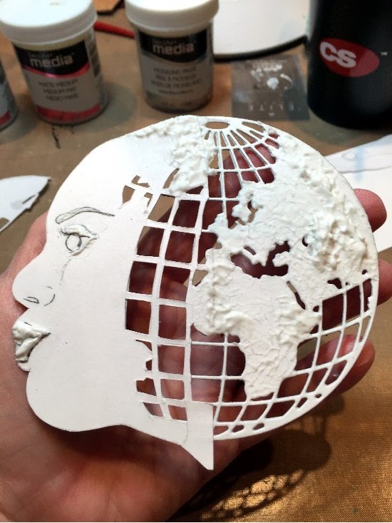
2.  Using Heavy Cardstock, cut two Sizzix Globes and glue them together using DecoArt Media Matte Medium.  I used two globes because I wanted more depth and texture.


3.  Sketch a face and hand onto a piece of paper to fit the globe.  Transfer that image to a piece of Heavy Cardstock and cut it out.  Place the face over the globe and turn it over.  Use an Exacto Knife to cut out the grid areas of the globe on the face and the section that will be placed over the globe die cut.


4.  Glue the face in place on the globe using DecoArt Matte Medium or a glue stick.  Gently heat set or let air dry.


5.  Use a paint brush and begin stippling DecoArt Media Modeling Paste on the map section of the globe.  Pulling the brush up and down will create peaks and valleys, creating a typography of the countries.  Let air dry. 


Also create an eyelid, lips and eye brow using the Modeling Paste.  This adds some nice dimension to an otherwise flat face.  Let air dry.


6.  Paint the basic skin of the face using DecoArt American Flesh Tone Acrylic paint. Let dry.  Shade the face using Neocolor II Watercolor Crayons and a Detailer Water brush.  Also paint the hand and shade in the same manner as the face. I love the Neocolor Watercolor Crayons. They go on so creamy and blend so easily with the water brush. Gently heat set.  Since the crayons are water reactive, I sometimes will spray them with a permanent fixative to seal them.


7.  Paint the grid of the globe first with Ranger’s Tarnished Brass Acrylic paint followed by highlights from DecoArt Media Fluid Acrylics Metallic Gold.  Let air dry or gently heat set.


8.  Add color to the countries using DecoArt Media Fluid Acrylics.  First paint with Yellow Oxide followed by Burnt Umber, Titan Buff, Phathalo Green-Blue and a touch of Paynes Grey to add more depth and definition around the perimeter, mountains and valleys of the countries. Let air dry or gently heat set.


9.  Tear or cut strips of paper, book text, fibrous fabric, lace; really anything that adds texture.  Overlap and arrange the scraps on the pages using a vertical and/or horizontal pattern.  It's best to use odd numbers of strips.  Glue in place using a glue stick or DecoArt Matte Medium. When all are in place, brush over them with the Matte Medium to seal them.  Let air dry or gently heat set.


10.  Add color to the pages using DecoArt Media Transparent Yellow Iron Oxide and Cobalt Teal Hue.  I used a baby wipe, my fingers and also a brush to add the color to get varied looks of the colors.  I also added more DecoArt Media White Gesso using a palette knife over sections of the pages after the paint colors were dry.  Let dry.


11.  Lay your globe lady and hand onto the pages to get an idea where they will be placed.  Sketch the word “Peace” onto the pages as if the globe lady were moving the word as if blowing a kiss.


12.  Using DecoArt Media Fluid Acrylics Cobalt Teal Hue mixed with Titan Buff, create what looks like air movement from the lips of the globe lady in the area where “Peace” has been sketched.  Add highlights using a mixture of DecoArt Media Fluid Acrylics Medium Grey Value 6 and Titanium White.  Let dry.


13.  Place the globe lady and the hand onto the pages and glue them in place using a glue stick or DecoArt Matte Medium.  Once they are dry, brush over the both using Matte Medium to seal them.  Let dry.


14. Wipe DecoArt Media Fluid Acrylics Paynes Grey randomly around the edges to define the pages.


15.  Paint “Peace” using DecoArt Media Fluid Acrylics Paynes Grey and a small brush.  Let dry.  Add a few more puffs of air using a mixture of DecoArt Media Fluid Acrylics Medium Grey Value 6 and Titanium White.  With an almost dry brush, lightly brush over “Peace” with the grey and white color combination to soften the darker Paynes Grey color and blend it into the puffs of air.

16.  Add a few random streaks of DecoArt Media Fluid Acrylics Carbon Black around the edges of the pages to frame them.


17.  To fill in what seem like areas that need something, I added a few vertical lines from Seth Apter’s (of The Altered Page) wonderful Pattern Play stamp first with Archival Ink Saffron followed by Archival Ink Watering Can, moving the stamp just off center from the first stamping.  I did the same thing with two of the circle patterns from Seth Apter’s very cool Solar System stamp set.  I love Seth's stamps because they are perfect for art journaling.  Funky images and fun to stamp independently or overlap.  


So there they are, my art journal pages using a face and hand (something I've never done before) and using the prompt "All I Really Want Is ... "Peace"; a peaceful coexistence among people of the world as well as that personal peace from which so many positive things flow. 


Come join us at Creative Carte Blanche!  Create your piece and link it out our blog.  Between everyone sharing their art, new projects being posted for your inspiration, new prompts to explore and inspirational guest artists, there will be lots to share.

Discover and embrace your own artistic style!


YOUNG LOVE CANVAS BOARD FOR DECOART MEDIA BLOG

Ah ... it's February ... the month we celebrate love.

Recently I have been experimenting with mixing mixed media art and images from vintage photographs. I find the contrast of mixing old and new rather fascinating.  My most recent piece is a little Valentine 5"x7" canvas board I've titled "Young Love".  Here is a sneak peek.


You can find the entire project and a complete pictorial tutuorial at
DecoArt's Mixed Media Blog.  

This project could either be done on a canvas or on heavyweight cardstock or watercolor paper to create your own sweet Valentine card.

As an added bonus, I am sharing the photograph of the sweet little couple with you.


Aren't they just precious?

I hope you'll check them out over at DecoArt's Mixed Media Blog.  If you'd like to leave a comment here and there, I love reading your thoughts.  Thanks so much for stopping by!


Friday, February 5, 2016

CREATIVE CARTE BLANCHE IS HERE!!

Hello everyone!  

Have you seen this on Facebook, Twitter and Instagram and wondered what in the heck is going on?


Well, it's February 5th and TODAY is the day we are announcing the launch of ...


CREATIVE CARTE BLANCHE 

I am so happy to announce this new, exciting art adventure with some of my favorite people in the whole world ... including YOU!

Click over to Creative Carte Blanche's site (link above) for all of the details.  

While you're there, be sure to check out a very special video made just for you when we posed the question "how do you find your own creative style?" to some very familiar faces; motivational and inspirational art friends.  Although no one knew what the others were saying, their common thread of thought is interesting.  I soaked up what they were saying like a sponge!  I LOVED listening them and I hope you will, too.

I'll see you back here on Tuesday, the 9th to share my first Creative Carte Blanche project with you!  Stay tuned ...


Monday, February 1, 2016

WAY OUT OF MY COMFORT ZONE TRAVELING JOURNAL


Hello friends.

This year, I have made a promise to myself to lose the "fear factor" and experiment with different styles, products and yes ... BRIGHT colors!  

Let me preface this by saying that I LOVE colors; all colors.  I see other people's work using bright colors and I adore it.  But when I try to use it on my own work, ick....

I tend to gravitate to the more earthy colors that are very "color full" but just not BRIGHT.

So, I guess this is telling me that my style is more the softer shades of colors.  That is where I intend to spend most of my time and that's okay!  That is what pleases my eye for my work and I will enjoy everyone else's lovely bright art because it really is fun and uplifting.

I wanted to share with you some of an art travel journal that I made in the Kate Crane class from Wanderlust 2016.  I have always loved her whimsical style.  

If you have not heard of Wanderlust 2016, it is a year long online course with wonderful weekly online classes from various artists.  There are also different informative videos, informal prompts to create your own art journal that coincides with the Wanderlust experience, challenges and inspiration all around.  I am loving it!    

Out of respect to Kate's paid online class, I will not divulge the construction of the art journal.  But, I will share with you a couple of pictures from my BRIGHT colored pages.  And I will share the cover with you as it is my own design and not a part of the class.


Here is the front of my journal with part of the BRIGHT interior pages peeking out.


Here is a peek at the front interior pages of the journal.  I have to say this was really fun to do and I enjoyed playing with the bright colors.  It just seemed very foreign to me.


And here is the back of my journal cover with some of the journaling pages on the back side of the accordion interior pages peeking out.

To create the covers, you will need the following supplies:

·         Two pieces of 5 ½” 5 ½” chipboard
·         Watercolor paper cut into strips, scored and folded to create an accordion book
·         DecoArt Media Fluid Acrylics Cobalt Teal Hue
·         DecoArt Media Fluid Acrylics Green Gold
·         DecoArt Media Fluid Acrylics Quinacridone Red
·         DecoArt Media Fluid Acrylics Quinacridone Magenta
·         DecoArt Media Fluid Acrylics Yellow Oxide
·         DecoArt Media Fluid Acrylics Metalilc Gold
·         DecoArt Media Fluid Acrylics Quinacridone Gold
·         DecoArt Media Fluid Acrylics Paynes Grey
·         DecoArt Media Fluid Acrylics Raw Sienna
·         DecoArt Media Mister Primary Magenta
·         DecoArt Media Mister Shimmer Turquoise
·         DecoArt Media Mister Carbon Black
·         DecoArt Media White Gesso
·         DecoArt Media Modeling Paste
·         DecoArt Media Soft-Touch Varnish
·         DecoArt Metallic Lustre Champagne Ice
·         Glossy Accents
·         Sticky Back Canvas
·         Metal Handle
·         Black Ribbon
·         Andy Skinner Serendipity Stencil
·         Seth Apter “Secret” stencil
·         Tim Holtz Splatter Stencil
·         Paint Brushes
·         Permanent Ink Pens
·         Colored Pencils
·         Makeup sponges
·         Graphite Pencil


1.  Cover the two chipboard covers with Sticky Back Canvas.  The inside of the covers will be hidden when you glue the outer pages of the accordion book to them.

2.  Paint the covers with a basecoat of DecoArt Media White Gesso and let dry. 

3.  Add dimension to the covers by scraping DecoArt Modeling Paste through a stencil.  Let air dry or gently heat set.  Keep adding more stenciled images until you are happy with your design.  Let dry.


4.  Brush a basecoat of DecoArt Media Fluid Acrylics Titan Buff over the covers.


5.  Lay the stencils back over the Modeling Paste splatter image and using make up sponge, add color to it using DecoArt Media Fluid Acrylics Cobalt Teal Hue.


6.  Add a combination of DecoArt Media Fluid Acrylics Transparent Yellow Iron Oxide and Raw Sienna to the cover; wiping it on with a damp paper towel or baby wipe.  Try not to cover the teal splatter to keep it’s vibrant color in tact.


7.  To add more depth, randomly rub on some DecoArt Media Fluid Acrylics Burnt Umber and mix with the Raw Sienna.


8.  Create a “dirty wash” using DecoArt Media Fluid Acrylics Quinacridone Gold and Paynes Grey with water.  Brush onto the covers to create shadowing.  Also add Paynes Grey around the edges of the covers with your finger.


9.   Add even more depth using a Graphite Pencil and smudge it with your dry or slightly moistened finger.


Here is what the cover looks like at this point.


10.  Cover each of the words with the stencil and then using a makeup sponge, daub DecoArt Media Fluid Acrylics Paynes Grey to color each letter.


11.  Then follow with random touches of DecoArt Fluid Acrylics Metallic Gold over the Paynes Grey.  Layer with more Paynes Grey if you need to darken the letters.


12.  The back cover is done using the same colors and the same techniques.  The doily is painted with DecoArt Media Fluid Acrylics Cobalt Teal Hue.  The letters are Paynes Grey, a little Metallic Gold and finally the Metallic Lustre.


13.  Using your finger, add small touches of DecoArt Metallic Lustre Champagne Ice to the tops of the letters to give them a metallic highlight.

14.  Attach a piece of black ribbon to the center interior of the front cover of the book. Glue the interior book pages to the inside covers. 


15.  Add a little metallic handle to the front interior cover for the black ribbon to pass through when wrapping it around the book.

I hope you enjoyed this little tutorial and maybe it gave you a new tip or trick as you create your own art!