Showing posts with label Ideaology. Show all posts

Monday, July 25, 2011

ANYTHING GOES!!

It's another Monday and you know what THAT means...it's time for another SIMON SAYS STAMP AND SHOW CHALLENGE!  This week....ANYTHING GOES!!

If you haven't already, you have just GOT to head over to SIMON SAYS STAMP AND SHOW'S BLOG and see all of the incredibly creative and wonderful creations that the Design Team has made for you.  Eye candy for sure!

Since "anything goes" is the theme, I wanted to do something really different!!  So, I made a necklace!
I created this pendant using Clear UTEE mixed with a little light pink embossing powder.

Did you know that you can color your clear UTEE with embossing powder?  Yep...you can!  It's all plastic....just different grinds.  So, it's compatible and works perfectly together!  

After I got my UTEE to a flesh color, I laid an Ornate Plate on top of a little face mold that I have and poured the UTEE into the mold, high enough to cover the inside rim of the Ornate Plate.  That joined the face and the Ornate Plate together into one piece.  Once it cooled, I removed the face from the mold.  I used some Perfect Pearls to colorize the face: Perfect Pearl and Rust mixed together.  Then to add some "blush" color to the face, I used more of the Rust.  When I was happy with the face, I gave it a little dusting with just Perfect Pearl to give it a little more subtle shimmer. 

I then painted the details on the face using different combinations of Espresso, Shell Pink, Butterscotch, and Cranberry Paint Dabbers that I mixed together or watered down and applied them with a small Sakura Water Brush.
 After I finished detailing the face, I added Glossy Accents around the edge of the face and on the upper portion of the head.  I combined some different glitters and miniature glass balls to create a unique "bling ring" to encircle the face.  I really like how it turned out...and the textures and colors work really well together.  It sort of reminds me of a Las Vegas showgirl's headdress.  I may try this again around Halloween...make the face out of green UTEE and make the bling around the face out of combinations of black glitters, etc.  I think it could make a cool witch pendant...reminiscent of the witch on Disney's Snow White. 

Next I used some paint from a Juniper Paint Dabber and smeared it on my finger tip.  Then I lightly brushed my finger tip across the Ornate Plate to give it a patina look.  I also used this technique on the Regal Adornment Wing and the two Foliage triple leaves attached at the top of the pendant.  I attached one pearl from Tim Holtz' Ideaology Baubles in front of the Regal Wing with a Jump Ring at the bottom of the Ornate Plate.  I also attached the distressed chain (that I found at Michaels to make this pendant into a necklace) with Jump Rings to the Ornate Plate.  There is also a small Lace Chain that is attached with Jump Rings and spanning from one side to the other of the Ornate Plate Pendant.  I wanted the face to be the focal point of this piece, so I decided not to add a lot of other stuff to the Ornate Plate pendant.

Now it's your turn to create ANYTHING!!  Then link it to our blog and maybe you will be the lucky winner of our sponsor ~ SIMON SAYS STAMP's ~

How cool is that?!  And...if you are chosen by our design team to have one of the TOP 3 projects submitted this week, YOU will receive our coveted TOP 3 BLINKIE to be proudly displayed on your blog!
I can't wait to see what you come up with for this week's challenge.  Remember...ANYTHING GOES!

Monday, July 11, 2011

KEEPING YOU IN STITCHES

Simon Says "SHOW SOME STITCHING" ... faux or otherwise.  
I have to admit, I love stitching on pieces but rarely do it.  I guess I just don't think of it.  But, it really does add so much; whether you hand stitch, machine stitch or just make some faux stitching marks.

Just wait until you see what my design teammates at SIMON SAYS STAMP AND SHOW CHALLENGE have for you this week.  SO AMAZING!!  You just have to see their designs for yourself!  What a talented, creative group! 

I finally finished my "Patchwork Pandemonium" piece from my weekend of classes with Tim Holtz a few weekends ago.  I added some stitching to it and decided to share it as my Simon Says Challenge piece for this week.
I was fascinated with this creation from Tim the first time I saw it several years ago.  Then he quit teaching it.  But, he decided to "revive" it again.  I am so glad and happy that I had the opportunity to go to Stampers Ink in Shawnee, KS and take this class from "THE MASTER HIMSELF".

Patchwork Pandemonium is a technique rich piece.  It is a conglomeration of Grungeboard.  Some is embossed with a variety of Tim's wonderful Texture Fades.  Some is left plain to either colorize with Crackle Paints, Distress Stains, Paint Dabbers, Alcohol Inks, Perfect Pearls Mists, Distress Stickles or cover with Tissue Tape.  

Techniques incorporated into this piece include Shabby Chic/Industrial Grunge, Distress Crackle Grunge, Distress Stain and Stamped Grunge and Double Distressed Grunge.  

The pandemonium part is that you literally just have a bunch of rectangles and squares of Grungeboard in front of you.  You just start using the different techniques to finish off the Grungeboard shapes, not having any idea how they will lay out on your finished design.  But, that is also the FUN of it!!!  It's AMAZING how it all works out!  Once you've finished all your pieces, there is a pattern that you need to follow to lay them all out and be sure that they end up in a 12 x 12 square.  Then you attach them to a 12x12 piece of Grungepaper as the backing by using Wonder Double Sided Tape.

After you have everything in place, you can begin embellishing it, leaving a slight space around the perimeter so that it will fit in a frame.  We embellished using Tim's wonderful stamps, pieces from his Ideaology line, Grungeblocks and whatever else we wanted to add.
We were also given some wax thread and a needle to stitch our piece if we wanted to.  I think the stitching adds so much!  

If you want uniform stitching, it is so much easier if you use Tim's Design Ruler to punch the holes.  His ruler is designed with small holes that run the entire length of the ruler on one side.  Just lay the project on top of cork or a surface you can pierce.  I used my Tonic Craft Pick to punch the holes evenly where I wanted them.  Then I began on the backside and made my stitches.

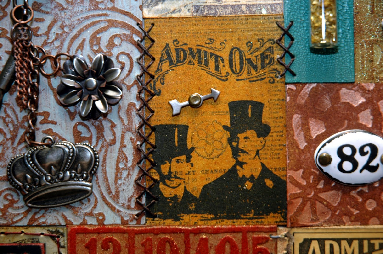
 In this area, I used dark brown waxed thread to make a cross stitch pattern.
Here I chose a blue wax thread to make a few box stitches on one side and then a random weave stitch across the top of the dress form rectangle.
I chose to go with an eggshell colored wax thread in the center of my piece to add a bit of interest around the Admit One ticket.
Still more stitching.  This time I used some brick red wax thread to make a few straight stitches above my Grungeblock.
You can add as little or as much stitching as you choose.  Here, I elected to just make three little cross stitches with the dark brown wax thread.  And...if you'll notice over to the far left, "THE DUKE OF DISTRESS" autographed my piece....making it even MORE special to me!  Gee...I wonder if I should have asked him to STITCH it?!  (haha)

My "Patchwork Pandemonium" will have a permanent place on the wall of my studio.  I totally LOVE this piece and will treasure it always.
Now it's YOUR turn to stitch something!!  Then post it to our SIMON SAYS STAMP AND SHOW CHALLENGE.  If you're out lucky random drawing winner, you will win our sponsor's most generous prize of .... (drum roll) ....


If you are chosen by our design team to be one of the TOP 3 projects entered for the week, you will receive special recognition for your amazing work by receiving our TOP 3 Blinkie Award to proudly be displayed on your blog.

So, whip out your needle and thread and add some stitching to your project!  I can't wait to see what you come up with!!!

Monday, June 27, 2011

WHAT'S IN A WORD??

This week, Simon Says Stamp wants you to show "A Word".  No...my word is not "MEMORIES".  This is a box I found at Hobby Lobby quite a while back and had never done anything with it.   But, I thought it had potential.

So, I stripped it down to the bare box (which didn't take much doing) and covered the entire box (inside and out) with various papers from 7 Gypsies Lille 8x8 Paper Pack.   I love those papers!  They are bright and fun and have all sorts of vintage images.  They are a cross between Life Is Good and a travel theme. 

I had a lot of fun cutting, gluing, stamping, distressing, transferring and embellishing.  Here is my new creation; an altered box.  My word is ..."JOURNEY".


The map on the top of the box was stamped using Tim Holtz' Air Travel Stamp Set.  I liked the top, but it needed something else.  So, I found a couple of neat architectural images; a column and an arched window that I thought would work perfectly.  I sized them and printed them out in black and white on inexpensive printer paper.  I brushed the top of the box to seal it with Claudine Hellmuth's Multi Matte Medium and let it dry.  Then I brushed my printed images with the matte medium and pressed them onto the top of the box where I wanted them to transfer.  I let them sit for about twenty minutes and then began gently peeling off the paper backing.  I lightly sprayed that area with water from a Mini Mister and gently rubbed off the excess paper pulp.  I love how they look kind of "ghosty".  I lightly brushed a wash of Golden's Yellow Ochre and water over the top of the box to blend everything together even more.  Then I brushed over everything again with the matte medium.  When dry, I distressed the edges of the top of the box with Walnut Stain Distress Ink.  Actually, I distressed all of the edges of the papers before I glued them in place with Walnut Stain.  Then I added a few white rub on flourishes...very subtle but effective.
  I added the Filmstrip Ribbon to run underneath the double Rosette I cut from Tim Holtz' Paper Rosette Die Cut.  On top of the Rosette is a compass I fashioned out of a Pocket Watch, Sprockets and Gears, and Game Spinners.  What "JOURNEY" box would be complete without one of Tim Holtz' vintage car images on it?  One of my favorite is on Tim's Road Trip Stamp Set.  "JOURNEY" is stamped using Oxford Impressions Scrabble Tile letters from their Playful Stamp Set.  I matted them on some black cardstock and sealed them with Glossy Accents.  The two metal keys were some of my "found objects" from my flea market adventures.  Check out the one that says "GAS".  I couldn't believe it when I ran across THAT one!  How appropriate for a "JOURNEY" box!!
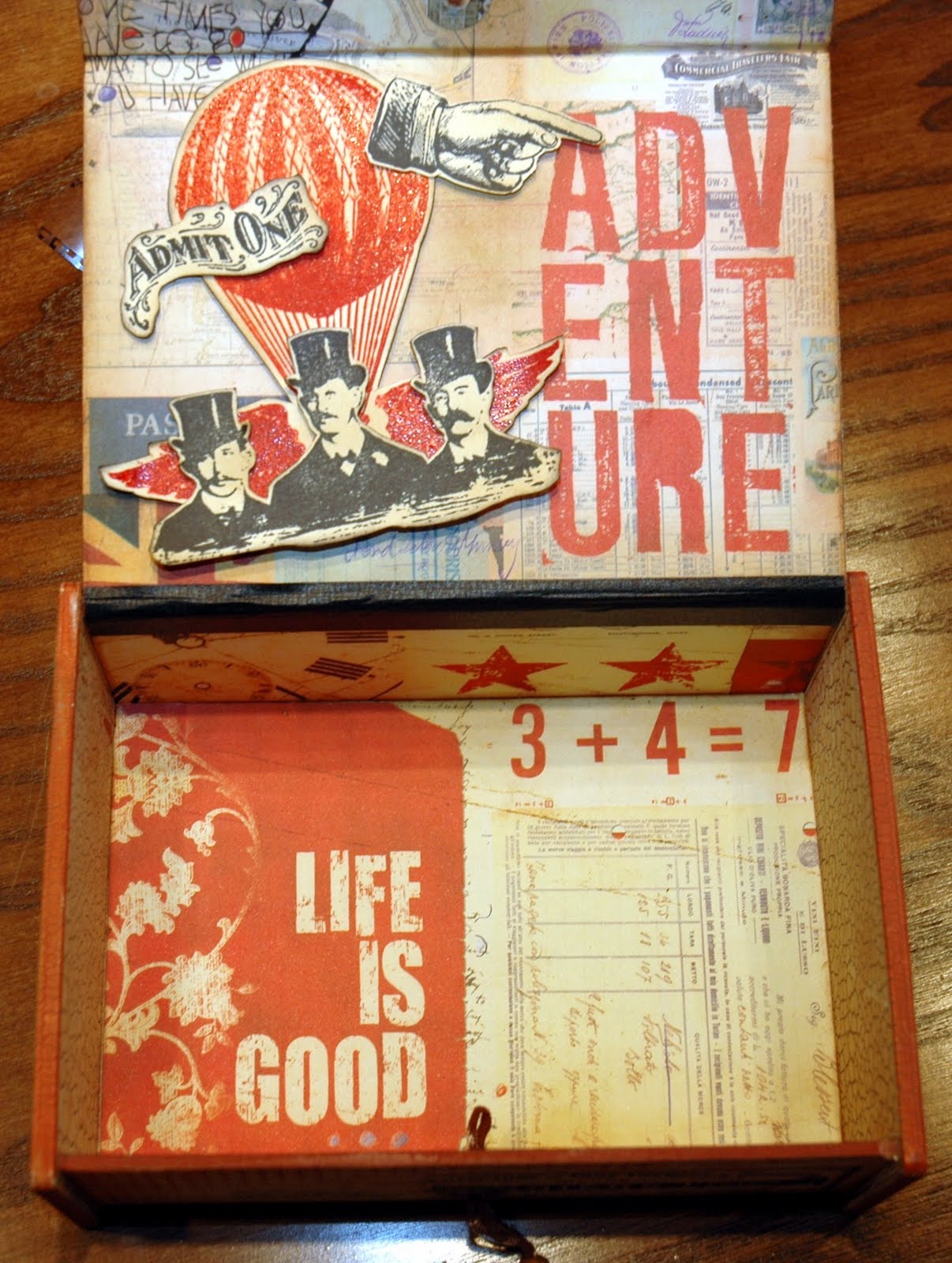
This is a picture of the inside of the box.  The paper itself is enough.  "LIFE IS GOOD and "ADVENTURE" were already printed on the papers.  But the inside top of the box was a bit bare.  So, I combined images from Tim's Steampunk Stamp Set and Oxford Impressions' Steampunk Stamp Set to create the winged hot air balloon, the three gentlemen and other steampunk images.

Now I had a new box but it was empty.  So, I decided to make a mini gatefold paper bag book to put inside the box.  I used the smaller size "Celebrate It" paper bags from Michaels and covered them with Lille Papers.  It fit perfectly!!!   
Here is the little mini gatefold book tucked inside of the JOURNEY box.
I used one of Tim's Curio Knobs to help fasten the book.  It worked perfectly!
Here are some of the inside pages of the book decorated with the some 7 Gypsies Lille (and other 7 Gypsies) embellishments.
 I love these little books. There is so much room for pictures and little surprise pockets for adding "stuff".  Once you figure out the construction of one, they really go together quickly and easily.
This is the back of my box and one of Tim's sayings that I truly believe.  What a wonderful JOURNEY we're all on...don't take it for granted!!

Thanks for joining me on my "JOURNEY" today.  Now it's YOUR turn to choose a word create a project to post to SIMON SAYS STAMP AND SHOW'S CHALLENGE.  Hop on over and take a look!  My very talented and creative Design Team Buddies have created some really awesome "WORD" pieces to share with you!  One lucky winner will receive a generous gift from our sponsor of a ........ Drum Roll ......

That's right!!!!  A FIFTY DOLLAR CREDIT VOUCHER!!!

We also choose THREE gifted artists' work each week to be given special recognition by receiving a TOP 3 BLINKIE that can be proudly displayed on your blog.  So, put on your thinking caps and SHOW US A WORD!!!

Monday, June 20, 2011

BACK TO GRUNGE!! SHOW SOME METAL!!

Simon Says Show "SOME METAL".  Oh boy!!  I LOVE metal!  It makes me think of Tim Holtz.  That alone makes me happy!  But then I think of all of his wonderful products; especially his Ideaology line and all of the METAL in those pieces!

I recently got my Tim Holtz "Artful Dwellings" die cut and saw this as the perfect opportunity to make some metal row houses.  Here is my piece for this week's challenge.

There are lots of Tim Holtz elements and products used on this piece.  I am a HUGE Tim Holtz fan.  I love his Ideaology line because it allows you to really cut loose with your creative thinking and find new ways to use all of the pieces.  I also love to mix metals.  I think it adds a lot of interest and makes things look a bit "hodge podge"...not so perfect and planned out. 

I started with a 6" x 12" stretch canvas.  I sprayed it with Stream and Butterscotch Color Wash Sprays and the spritzed a little water to let the colors run even more.  I wanted to create a splotchy background so I sprayed Color Wash onto a paper towel and dabbed it onto the canvas, creating irregular color splotches and intense colors in areas.  Then I stamped the text background using Versafine Vintage Sepia Permanent Ink and Tim's Papillon Stamp Set.  The two ends are cut out of Ranger's Silver Foil Tape Sheets using Tim's Iron Gate On the Edge die cut.  I then embossed them with Tim's Bricked Texture Fade.  I tapped the shiny silver with Vintage Sepia to dull the shine and it worked perfectly.  

 
The Artful Dwellings is a great die cut!  It has all four of the shapes for my "row houses" on one die.  I also used the Mini Openings Die Cut Set to create the windows on the houses.  I wanted to add vintage children to this piece; thus the windows.  I cut the houses out of black chipboard followed by the various metal sheets.  The first house was covered with a thin piece of aluminum that I embossed.  I also made a mini butterfly using Tim's Mini Butterflies Die Cut Set. I cut the butterfly using two pieces of thin gold sheet metal (for the front and back of the butterfly) and a piece of cardstock in between.  I embossed the butterfly with Tim's ATC sized Bingo card from the Playing Games Texture Trades Set.  I made sure that "FREE" was centered on the butterfly's body because I intended to "chain" it up.  I attached a Plaquette to this house and then chained the butterfly to the house using a Swivel Clasp.  There are flowers in front of this house.  That was done using Tim's Foliage Ideaology set.  Notice the little face peeking out of the window?
  
The second of the row houses is the largest in the set.  It was embossed with Tim's Notebook Texture Trade.  It looks like siding, doesn't it?  This house was made using thin copper sheet metal.  I then swiped  a Juniper Paint Dabber over it and wiped away the excess to create a patina look.  I added one of Tim's Corners to the roof and the smallest Timepiece to the house.  Behind the timepiece is a larger copper decorative piece I found at Hobby Lobby.  The hands on the clock are from ScrapFX.  Love their die cuts!  There is a little vintage boy standing in the door way that is created from an antique silver Ornate Plate.
The third house is my favorite.  This house was made from a thin gold piece of sheet metal and embossed with a portion of Tim's Patchwork Texture Trade.  I added the silver "4" from Tim's Numerals Ideaology set.  Does the little girl look familiar?  It's Shirley Temple!  She's leaning out of the arched window, folding her arms and waving her magic wand.  A roof line is formed above the window using a pair of the smaller wings from Tim's Regal Adornments Ideaology set.  There is a Fleur De Li (from Tim's Adornments Ideaology set) at the very top of this house.
The fourth and final of the row houses is made from a piece of thin copper sheet metal and embossed with Tim's Checkerboard Texture Fade.  I lightly rubbed over some of the raised area and around the edges of this house with a Pitch Paint Dabber.  The covering over the window is curled back to reveal yet another vintage little girl peeking out of the window.  An antique silver "DREAM" key from the Word Keys Ideaology set lays across this little house.  It is adorned with an antique gold tassle from Tim's Chain Tassles Ideaology set.  A picket fence made out of Idealogy Pen Nibs and silver wire guards this house and key.  The "crowning glory" of this house is the large antique silver crown from Tim's Regal set that sits atop the roof.

I centered the row houses and hot glued them all into place.  Then I added the two iron gate sides and added the large antique gold brad heads to the sides.  Little gold round "stars" are the finishing touch above the houses.  This piece was a lot of fun to make and surprisingly went together pretty quickly.  But then, it's easy when you're working with all of these Tim elements and pieces!  They all just make sense and work together so perfectly!

Now it's YOUR turn to show "SOME METAL".  The design team at Simon Says Stamp and Show have some AMAZING designs for you on our blog.  Head on over to SIMON SAYS STAMP AND SHOW CHALLENGE and check them out!  Then, link your creation to our blog.  You could be the weekly random winner of our generous sponsor's $50.00 credit voucher to shop at Simon Says!!!

 
If you're chosen by our design team as one of the TOP THREE artistic entries for the week, you will be awarded our coveted BLINKIE AWARD to be proudly displayed on your blog.  So what are you waiting for??? SHOW SOME METAL!!!

Monday, May 9, 2011

ANYTHING GOES!!

ANYTHING GOES!!!  That is the theme of $imon $ays $tamp and $how Challenge this week!  I encourage you to check out the challenge blog and see what wonderfully unique and creative projects the Design Team has put together for you!  If seeing those wonderful examples doesn't get your creative juices flowing...nothing will!!

And ... if you are the lucky winner of our random drawing, YOU will be rewarded with a $50.00 credit voucher that you can $pend to your heart's de$ire at our generous sponsor's store...


 If you are chosen by our team to have (in our humble opinions) the best projects for this week's challenge, you will receive our coveted Top 3 Blinkie Award to post on your blog.

 How is THAT for motivation????  

Okay....ANYTHING GOES...so.......HERE GOES...........


I decided to try some of the amazing techniques I learned at Ranger U using various mediums on ATC size cardstock.  But then what to do with them?


The perfect solution!!!  I made a wall collage using a black 7 Gypsies Printer Tray.  Each compartment houses a different technique using various Ranger products including Distress Inks, Alcohol Inks, Color Washes, Distress Stains and Paint Dabbers.  After doing the techniques for the backgrounds, I ink stamped, water stamped, heat embossed, dry embossed and tinted them to best showcase the background technique. 
For example, this section of the printer tray is an example of industrial grunge on Tim Holtz' Gadget Gears die cut.  The background is Tim Holtz' Bricked Texture Fade folder colored with Fired Brick, Vintage Photo and edged with Black Soot.  Then I smeared Rock Candy Stickles over portions of the brick for a bit of a glisten-y look.  It is finished out with some of Tim's Sprockets Gears, Game Spinners and a Word Stick.

This compartment is an example of a shabby chic background.  I placed the largest wings from the Regal Adornments over the top of the compartment to resemble a roof top.  I put a little Juniper paint from a Paint Dabber on my finger and brushed it over the wings to give them a patina look.  I thought the wings complimented the shabby chic background.  Finally, I added a Tim Holtz Pen Nib and a Fractured Doll. 

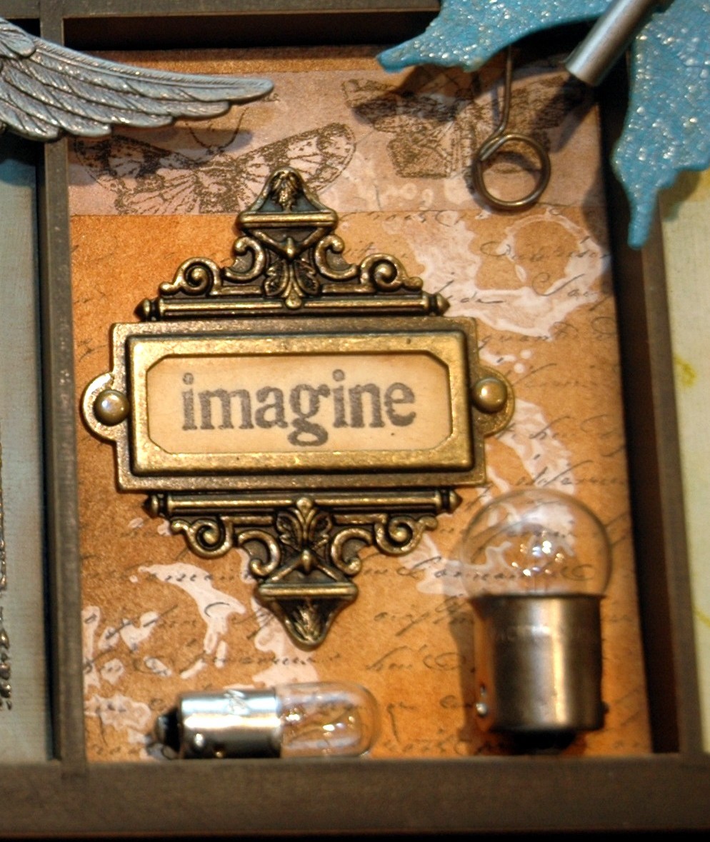
This compartment is an example of a resist technique using a Snow Cap Paint Dabber to resist the Distress Inks.  I dabbed the paint right on to the stamp and stamped the image on the cardstock.  Let it dry or heat tool it dry.  Then I blended the Distress Ink colors over the entire ATC sized cardstock.  I used a damp paper towel and wiped the ink off of the stamped image, revealing the white design.  I then lightly swiped Black Archival Ink over a script stamp and stamped over the entire background.  I finished out this compartment with some Sketchbook Tissue Tape, a Memo Pin, an Ornate Plate and a couple of Tim Holtz Light Bulbs.  
 This compartment is an example of a stamped water color background with faux porcelain flowers adorning the lower corner.  These were done by dipping paper flowers and leaves into hot Clear UTEE, removing all the drips and then arranging them in place.  The Butterfly overhead is done with Grungeboard wings painted with Broken China Distress Crackle Paint, smeared with Rock Candy Stickles and then distressed with Vintage Photo Distress Ink.  The butterfly's body is another one of Tim's Pen Nibs.
In this compartment, the dress form was heat embossed with Distress Black Soot Embossing Powder and then finished out using gathered tulle and Maya Road flowers colored with Fired Brick Distress Stain.  A Tim Holtz Hanger Clip is hanging on a Hitch Fastener.  It is holding a stamped image of a book of needles from Tim Holtz' Haberdashery Stamp Set.

Next to the dress form compartment is an example of a Rusted Enamel background.  This compartment is adorned with a Steampunk cuckoo clock I made form various Ideaology pieces and link chain.  The stamped images are from Tim's Steampunk Stamp Set.

The vintage picture of the little boy and girl was printed out on semi gloss photo paper and tinted using Stormy Sky and Victorian Velvet Distress Inks.  I tinted one half of the photo so you can see the dramatic difference the tinting makes.  Three pink faux procelain roses are sweetly sitting on the ledge in a small vial from Tim Holtz' Corked Vials.

What is a sampler without Tim's famous Umbrella Man?  He was stamped using black ink on Grungeboard and then lightly sprinkled with Black Sparkle Embossing Powder and a touch of regular black embossing powder.  The background is an example of Distress Wrinkle Free Scribble Stain.  

The JOURNEY and butterfly compartment is an example of faux batik on white mulberry paper backed with white Glossy Paper.  The design was stamped with Clear Embossing Powder and heat embossed.  Then I sprayed various Color Wash colors to create that wonderful blended batik look.  I placed the mulberry paper between a folded piece of newsprint and ironed it to remove the melted clear embossing powder.  Thus, the faux batik look!  The little birdcage is a Prima piece and the pink rose attached to the birdcage is another faux porcelain piece.  

This is an example of a different faux batik background done with embossing powders and inks rather than clear embossing powder and Color Wash.  The metal 1/2 number is a faux porcelain technique.  The Memory Frame was done by pouring hot light green tinted UTEE over the picture of the tree in the frame.  Then I added some "glitz" to the frame.  I finished it off with some Tim Holtz metal Foliage.  

The Alcohol Ink compartment was done with various colors of Alcohol Inks dripped directly or tapped onto a piece of silver Foil Tape Sheet that was embossed with Tim's Patchwork Texture Fade.  I then alcohol inked some Fragments, backed them with white Glossy Paper and popped them in various places on this compartment.  I also made a second portion of weathered clock part of the texture fade and popped it on top of the original; for more depth and interest.

The last compartment is an example of Wrinkle Free Distress that is merely stamped with "LIFE IS THE ART OF DRAWING WITHOUT AN ERASER".  I love that saying and thought it needed no embellishing other than coloring in the heart with a Red Pepper Adirondak Pigment Pen.  Sometimes less is more.
 
I really love the way this wall collage sampler turned out!  It will be a great addition to the wall in my studio and a wonderful remembrance of my time at Ranger U.

I can't wait to see what you've been inspired to create and post on Simon Says Stamp And Show's challenge this week!!  Have fun with it and remember...ANYTHING GOES!


Monday, May 2, 2011

TURNING BACK THE "HANDS" OF TIME

Hello!  Time for a new SIMON SAYS STAMP AND SHOW CHALLENGE ...  "Show Something With Hands".  The first thing I thought of was a clock.  I love clocks.  They always remind me of time and when I think of time, I get nostalgic.  So, my creation for this week is very nostalgic for me....it's a celebration of Four Generations of women in my family.
I chose a 7 Gypsies Librarie Drawer to make a very special memory box for my wall.  The photos used are family photos of my Great Grandmother, my maternal and paternal Grandmothers and my Mother.  They are all gone now but colorizing their photos makes them feel very "alive" to me.  I colorized the photos using  Distress Inks and Cut-N-Dry Pen Nibs.  There is also a picture of me as a toddler in a bluish dress.  I am the 4th Generation.  I remember that dress and it really was that color!

On the top left of the box, you will see "4 Generations".  The "4" is one of Tim Holtz' Ideaology Metal Numerals.  I made it look like chipped porcelain.  Then I added "Generations" to one of Tim's Ornate Plates.  I thought the sentiment I added across the top very appropriately tied together the "hands" challenge piece and the nostalgic theme of my memory box.
The clock face is from ScrapFX. I saw their line at Winter CHA and immediately was drawn to it.  I love their ornate clock face and array of hands.  I heat embossed the chipboard-ish clock face with a mix of Queens Gold, Copper and Antiquities Teal embossing powders.  The hands are heat embossed with Queens Gold and Copper.  The hands on the hands of the clock are from Tim Holtz' new Steampunk Stamp Set.  I stamped and reduced the size of them on my computer so that they would fit the clock hands.  Hands on hands, get it?  They are distressed with Vintage Photo and Walnut Stain Distress Inks.  The center of the clock is a metal flower from Graphic 45's Metal Staples.  I heat embossed more Copper and Antiquities Teal on the antique gold petals.  Then I bent them to add more interest.  I also added the smallest flower from Tim Holtz Tattered Flowers die cut and the smallest of the flowers from Tim Holtz' Foliage Ideaology to the clock's center.
The pocket watch is being held in place by a Santos Hand.  The watch is one of Tim Holtz' new Ideaology Pocket Watches.  I am IN LOVE with his pocket watch!  I made my own little collage to put inside.  It is a picture of my brother and I and I added the sentiment "A Brother Is A Friend Given By Nature".  There are small watch parts encapsulated in the pocket watch.  There are also small watch parts enclosed in the Tim Holtz Vial laying on it's side next to the pocket watch.  I wired some old watch parts to the top of the pocket watch and a piece of Tim Holt Link Chain runs from the top of the watch to an antique hook hanging on the side of the drawer by a Tim Holtz Curio Knob.
There are other little fun elements that are included in this very special memory box....doilies peeking out from behind pictures, a tattered flower with a small watch face as it's center, another old antique watch face up by the clock and the letters "FAMILY" nestled in front of the clock face.
I hope this inspires you to possibly pull out some old family photos and create a special memory box of your own!
Now, I encourage you to hop on over to SIMON SAYS STAMP AND SHOW CHALLENGE BLOG!  Our amazing Design Team has some wonderfully creative and inspiring samples of "Something With Hands" to share with you!  Surely they will get your artistic juices flowing!  Then link your creation to our blog!  You could be the winner of our wonderful sponsor's very generous gift of ... 
  to be used at SIMON SAYS STAMP!  How COOL is that?!  If your entry is chosen as one of the TOP 3, you will receive our coveted TOP 3 BLINKIE for you to proudly display on your blog!  Join us today!!!  And remember...take time to PLAY!! It's SOUL FOOD!!

Monday, April 18, 2011

FUNKY "ART" FUN

This week's Simon Says "SHOW A TIM HOLTZ TECHNIQUE!"  For those of you who are HUGE Tim Holtz fans like I am, you KNOW that you have TONS of techniques to choose from!  Betcha can't choose just ONE!!

So come with me on this journey...I'm going to wave my magic paint brush (made from a toothpick, copper tape and Fantasy Fiber and Wha-lah....
We're transported into the land of TIM and his amazing techniques!  How do you like my little version of me?  I'm standing on a 5x5 stretched canvas that is covered in Molding Paste textured with a palette knife and some sequin relief. It is painted with a bluish acrylic paint and then highlighted with various Perfect Pearl colors including Berry Twist, Interference Green and Copper.  

I love Tim's "Grungeblock Technique".  You know the one...where you put his Alphabet Soup letters on Grungeboard, sand them, paint them, distress ink the letters and edges and they look like printer blocks?!  Well, I did my own twist on that and instead of using Grungeboard as my base, I used Wendy Vecchi's Residential Art Parts.  I didn't want them to look like printer blocks.  I wanted them to look like funky little fun houses!
 I made my own sides and back on the "R" house so it would be 3D.  I did Tim's Grungeboard Blocks technique to create the basic houses. Then I added some designs either thruogh the sequin relief or Tim's mini checkerboard and brick stamps. Then I stamped or drew in designs on the roofs.  Before gluing them together, I did Tim's Rusted Enamel technique found on page 41 of his wonderful Compendium of Curiosities book.  This gave my houses a nice shiny, durable rusted enamel finish. I glued the roofs onto the houses and embellished them.
The butterfly features Tim's new Pen Nib for the body. The butterfly wings are heat embossed with Copper Embossing Powder over a blue card stock.  They are then brushed with Distress Rock Candy Crackle for that fine cracked porcelain look.
The little light bulb on the "R's" roof is from Tim's new Light Bulbs Ideaology.  The crown on the"A" house was made by pouring hot Bronze UTEE into a mold.  When it hardened, I added a bit of Antique Gold Rub 'N Buff to highlight the detail.  I added the little trinkets hanging from the roof of the "A" house and the Maya Road Cream Organza Roses Ribbon sprayed with a concoction of another Tim Holtz idea; mixing Fired Brick Refill Distress Ink and Perfect Bronze in a Mini Mister with water.  Then I put all the houses in place.
The round medallion featuring the lovely vintage lady is also made using hot UTEE.  I stuck a distressed doily behind her and she's peeking out from behind a metal patina butterfly with a little Vintaj clock hanging on a chain.  The other end of the chain attaches to another Tim technique.  I metal stamped "CREATE" onto a piece of thin copper metal.  Then I ran a little bluish paint over the metal with my finger, wiping off the excess and leaving a patina look.
The back side of my little ART village features a Tim saying that I love and yet another Tim technique...one that I dearly love...COLORIZING vintage photos!!!
 This is such an easy and  FUN technique with dramatic results!  You simply print out a vintage image (preferably black and white or sepia tone) on either glossy or semi glossy photo paper.  Then, taking a Cut 'N Dry Pen Nib, rub it onto the surface of a Distress Ink pad and begin colorizing your photo.  Use this technique to highlight elements in your picture!  In this case, I used Broken China for the head band and Victorian Velvet to lightly colorize her cheeks, the rose in her hair and the tulle she's wrapped in.  After you finish coloring the areas of interest, lightly go over the entire photo and the edges with Vintage Photo.  I LOVE this technique!

Thanks for coming on this little Tim technique journey with me!  Now...hop on over to SIMON SAYS STAMP AND SHOW CHALLENGE and drool over the wonderfully creative and informative Tim Techniques that my design teammates have waiting for you!
Then use YOUR imagination to create something using a Tim Technique and enter it in our challenge!
Our wonderful sponsor, SIMON SAYS STAMP is awarding one lucky person with a very generous prize of .... (drum roll) ....
If you are chosen as one of the TOP 3 artists for the week, you will receive our coveted TOP 3 Blinkie for your site!  So, what are you waiting for?  Get your Tim on and get inky!!!