Sunday, March 27, 2011

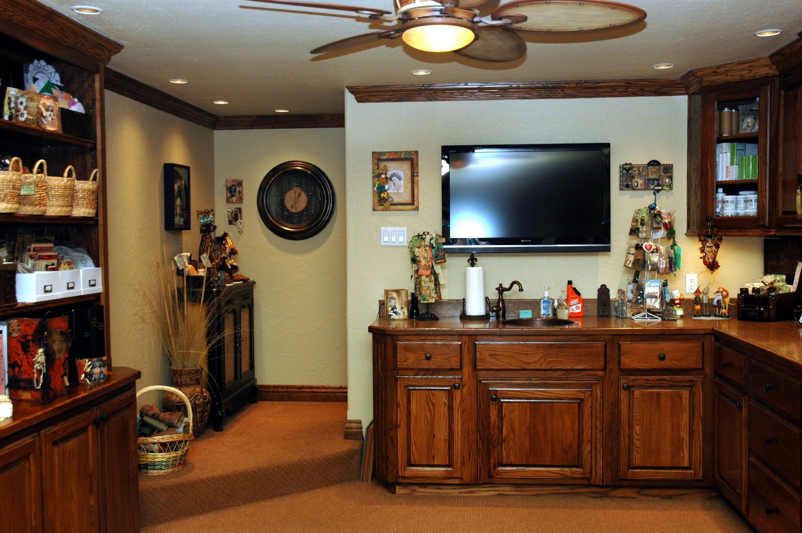
I FINALLY DID IT....CLEANED MY STUDIO!!!

It's been cold and rainy here all weekend...certainly not the Spring weather you think of. You know....sunny, birds singing, flowers and trees starting to bud. But, at least we didn't get that four letter word....SNOW! So, I'm happy about that! With the weather being so nasty outside, I decided it would be a good time to clean my studio! So, I grabbed my shovel and headed for my basement!
It actually looked like a tornado settled in the middle of it! You could hardly see my countertop for all the "stuff" on it that I'm kitting up for my For Keeps Sake Classes in St. Louis. But I finished one of the classes today and decided to clean up before I start another mess. Sound familiar?!
I've still got some things sitting out that normally aren't on my countertop...but they are for classes and waiting to be kitted. At least you can see what color the countertop is now!
Even my shelves are fairly clean...for the time being! Now, if I can just remember where I put everything!
And my work table is no longer about to be condemned! I still have a stack of Pink Paislee papers and embellishments sitting out, but I'm designing a vintage book class for May. So, those need to be close by. I cleaned my "Wall of Wonder" as I call it...so that I have some vacant hooks awaiting my new Tim Holtz stuff! I can't wait to get it so that I can start playing with it! And yes, I am a stamp hound. I LOVE stamps to use and also to display! That way, I don't forget what I have!!
I just became aware of the WOYWW group. I think it stands for "What's On Your Workdesk Wednesday". I'm betting by Wednesday, it will be a complete mess again...and I should have a lovely post for them!
The weekend is almost over! Hope you've had a good one! Tomorrow morning, the Simon Says Stamp and Show Design Team will be posting their creations for the new challenge. Check out the Simon Says Stamp and Show Challenge! You're in for a real treat...trust me!

Monday, March 21, 2011

SIMON SAYS SHOW A WORD ... "WINGS"

The SIMON SAYS STAMP AND SHOW CHALLENGE for this week is "A Word".  Hmmm.... there are so many words!  How can you choose just ONE?  I could have chosen an obvious one like "CREATE" or "BELIEVE" or "ART".  All great words!!  Then it came to me......"WINGS"!!  So many things I love have "WINGS"; especially birds, butterflies and Angels.  So, here are my .... "WINGS".
I started with one sheet of Pink Paislee's new paper "Butterfly Wings" from their "Butterfly Garden Collection".  I absolutely love this entire collection!  This particular sheet of paper already had the image of the birdcage, so I cut around it and backed it with a piece of chipboard for strength.  Then I distressed the edges with Vintage Photo Distress Ink.  I made a semi-circle pattern for the bottom of the cage and cut it out of chipboard.  I covered it with more of the paper from the same sheet and inked it with Vintage Photo around the edges.  Then I hot glued the bottom to the back of the birdcage. 

Next I made the front of the cage using Tim Holtz' Scallop On The Edge die cut.  It was perfect for anchoring the "bars" I wanted to make for the cage!  It was not quite long enough to go from side to side, so I simply cut out another strip and pieced what I needed for a perfect fit.  I added some little antique brass brads on both sides for an accent.  Next I stamped some vintage birds on the front of the cage, inked the edges with Vintage Photo and hot glued the cage front to the upright birdcage and the outer edge of the
semi-circle.
I wanted "bars" on my cage but I didn't want metal bars for this sweet little piece.  So, I took 24 gauge gold wire and threaded some 1/4" pale yellow organza ribbon on it.  Still looks like bars but not harsh...more dainty and sweet.  I attached the bars through the holes in the scallop die at the bottom and pierced a hole in the birdcage top, ran the wire through and using Wonder Tape, secured the wire to the back of the birdcage.
Now it was time for someone to move into this new little "nest"!  I found these vintage images of children and sized them to fit the birdcage.  I printed them out on semigloss photo paper.  They were black and white images.  I colorized the dress of the little girl standing outside of the cage with Victorian Velvet Distress Ink and a Cut N Dry Pen Nib.  Very simple technique...just rub the pen nib on the ink pad and lightly begin coloring in the area you want to colorize.  You can keep lightly adding more ink to areas that you want to darken or shade.  (This technique works best on photo paper rather than just cardstock).  Then I very lightly added some blush to the little girl's cheeks.  Finally, I lightly added just a touch of Vintage Photo to her face and hand.  For the finishing touch, I added some Tropical Tangerine Stickles to the collar of the dress and ribbons in the little girl's hair.  I got a little more creative on the other little girl.
I colorized her dress with Scattered Straw Distress Ink.  Then I drew some sweet little vines and flowers on her dress using Bundled Sage, Victorian Velvet Distress Inks and pen nibs.  Yes, you can actually draw your own designs with the pen nibs! It's so much fun!  Next I added just a touch of Tropical Tangerine Stickles on some of the flowers I created on the dress and a little bit of Eucalyptus Stickles on some of the greenery.  If you look at the bodice of her dress and also on the lower portion of the dress, you can see the vines and flowers that were drawn in for more detail.
When my little vintage Angels were dry, I touched all around the edges of them with a Colorbox Black Cats Eye Ink Pad.  That really makes them "pop".  I inked the backside of my Angels with Vintage Photo and added some Pink Paislee butterfly wings. 
I put some brown excelsior grass on the floor of the birdcage and placed my little yellow Angel inside the cage.  Then I added three colored eggs to keep her company...impending brothers and sisters maybe?!  I stamped "WINGS" on a piece of cardstock and made it into a banner.  I highlighted the letters and the edges of the banner with Platinum Stickles.  Then I rolled up the edges and hot glued the banner onto the Angels' hands.  I attached the pink Angel just outside of the birdcage.  She's showing you her pretty white petticoat!

I attached a flower to the lower left side of the birdcage by using an image still from that one sheet of paper.  I highlighted it with Tropical Tangerine and Eucalyptus Stickles and glued it into place.  Then I attached a paper butterfly onto the "bar".  I hot glued him at his body so his wings could be bent upward.  It too, is highlighted with Tropical Tangerine and Eucalyptus Stickles then edged with a Chestnut Roan Cats Eye Ink Pad.  
Finally, I added the ribbons and flower bouquet to the top of the birdcage.  The ribbon was white.  I sprayed it with Pink Bubblegum and Vanilla Breeze Glimmer Mist.  I had the little pink roses and the teal roses are from Prima Flowers.  I also attached a teal rose to my yellow Angel's hand.  The butterflies were made to look like they are hovering around the bouquet by attaching them to some clear fishing line and hot gluing it into the bouquet.  Finally, for a really sweet finish, I dangled little antique brass dragonfly and butterfly charms from a teal rose in the bouquet.  These charms are also part of the Butterfly Garden collection.
The back side of the birdcage is covered in more paper from that one sheet that I used for this project.  I found another vintage photograph of a little girl that was already colorized.  I added the wings behind her shoulders and inked around the edges of the photo with Vintage Photo Distress Ink.  I added photo corners and centered her on the back of the birdcage with Wonder Tape.

I encourage you to try the Distress Ink colorizing technique.  You won't believe how easy it is and when you start to add color to a black and white picture, it's like you're bringing the image to LIFE! REALLY!!!  

"WINGS" ... how fun!!  Now it's YOUR turn!  Think of a WORD and turn it into a work of art!  Then enter it into the SIMON SAYS STAMP AND SHOW CHALLENGE!  You could be the lucky winner of a $50.00 credit voucher to the SIMON SAYS STAMP STORE!  Or you could be recognized as a TOP 3 WINNER for your incredible work and receive a BLINKIE to proudly display on your blog! 

  
I invite you to pop on over to the SIMON SAYS STAMP AND SHOW CHALLENGE BLOG!  The Design Team at Simon Says are amazingly talented and "BRING IT" for you every week with their unique and imaginative creations!  Check 'em out! 

Have a great week and remember....take time to PLAY...It's SOUL FOOD!!!

Monday, March 14, 2011

KITTING UP FOR THE VINTAGE BIRD BOX

Good Monday afternoon!  I posted my SIMON SAYS STAMP AND SHOW CHALLENGE ... SHOW STARS this morning and now I'm busy kitting up all the "goodies" for my Configuration Of Your Imagination Vintage Bird Box Class that I'll be teaching this Saturday, March 19th from 10 to 3 at SCRAPBOOK GENERATION in Springfield, Missouri.  For more information and to sign up,
call the store at 417 886-0440.
And announcing....
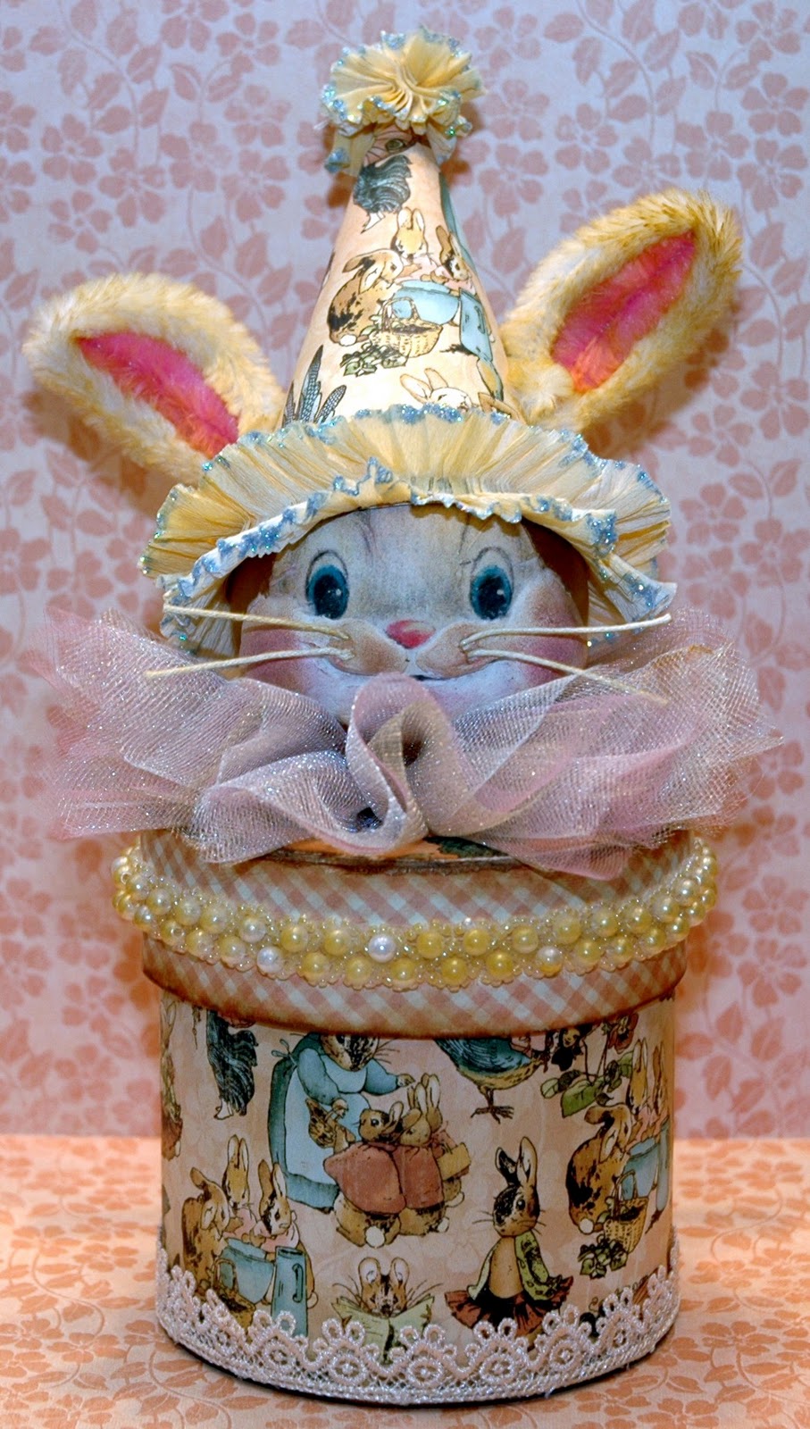
I have added the Vintage Bunny Box to my class schedule at SCRAPBOOK GENERATION!  You can register now!  Class will be on Tuesday, April 5th from 12 - 4.  Call for more information!! 

Then that weekend, I am excited to be the guest artist for a weekend workshop at FOR KEEPS SAKE in St. Louis, Missouri!  I will be teaching the Configuration Of Your Imagination Vintage Bird Box on Saturday, April 9th from 10 - 3 and The Vintage Bunny Box on Sunday, April 10th from 12 - 4.  If you're in the St Louis area, call FOR KEEPS SAKE today at 314 487-8131 to reserve your spot!  We are going to have a blast!!!
The Vintage Bunny Box we will be making in class will be square instead of round...but that is fine because it's just that much more antiquing that will show on the corners!!!

Okay...back to kitting up for class!!!  Have a great rest of the day!


SIMON SAYS STAMP AND SHOW CHALLENGE ~ SOME STARS

This week’s Simon Says Stamp and Show Challenge really took me to a nostalgic place. When I thought of stars, I immediately thought of “The Stars and Stripes” which in turn, made me think of my Dad, a proud WWII Navy Veteran. So, this week’s piece is in honor and remembrance of my Dad.

I found this 8x10 shadowbox frame on a clearance shelf at a big craft and hobby store. It was meant to hold a 4x6 picture in the center…but I thought it could serve a much better purpose….as it now has.
Sometimes I think less is more so in creating this piece, I never intended it to be dripping with stars; only some and only in strategic locations. I didn’t want them to be the focal point but rather the bits of color and imagery that I needed to accent the main focus of this collage; vintage pictures of my Dad.
I had some vintage looking paper that is just stars and some that is just stripes, so I used them when I created my rosettes and buntings. I love Tim Holtz’ Paper Rosette Strip die cut! I cut some single tiered rosettes that I used in the lower left hand corner and also one that I cut apart and used as more of a bunting in the center (peeking out behind a Registration Certification card).
I created a larger bunting at the top left corner. To do this, I cut one rosette strip out of the stripe paper and one out of the star paper. I used double sided tape to layer the stripe paper underneath the star paper. Then I just created the rosette and glued it together. I used Faded Jeans Distress Ink to distress the rosettes.
I scanned and sized the photos of my Dad and his military service cards to fit the shadowbox. I made them look older by first lightly going over them with Vintage Photo Distress Ink then Walnut Stain and finally Black Soot just at the edges. It’s amazing how just those three Distress Inks can take something from brand new to looking really old in seconds!
I added some photo corners to a couple of the pictures because I think they give pictures more of a vintage feel. There are black corners on one photograph and the "natural" photo corners on the other photo.  I added just a touch of Black Soot Distress Ink to the natural photo corners to age them a little bit.  I cut out one picture of my Dad and used it more as a silhouette in the lower right corner.  I backed that picture on a heavier cardstock and used double sided tape to adhere it to the bottom of the shadowbox.  This way, it stands out and allowed me to tuck things in behind it.
So, there you have it...SOME STARS!
Now, why don't you hop on over to the SIMON SAYS STAMP AND SHOW CHALLENGE blog and check out the other wonderful pieces that the design team members have posted in order to get your creative juices flowing?!  I think you will find their work AMAZING!!!
The challenge is so much fun and you could be the winner of a $50 credit voucher to shop at our wonderful SIMON SAYS STAMP STORE!  And...you could also be recognized for your outstanding work by receiving the coveted Simon Says Stamp Top Three Award!
 
I hope to see your work on the challenge!  Take time to play....IT'S SOUL FOOD!

Thursday, March 10, 2011

Surprise!  Look what Sonya from Counting My Blessings gave me!

It's taken me a few days to post this because A) I was out of town and  B) I had a hard time deciding who to pass this honor on to!  I had to pick SEVEN blogs...just seven!  Anyway, thank you so much to Sonya for this award!  It's nice to be recognized...especially by people like Sonya.  I met her through blogging and she is a true lady... she is also having a big giveaway tomorrow.  I have that blinkie posted on my blog.  Go check her blog and her work out.  You won't be disappointed!

Here are the Stylish Blogger Awarrd Rules:

1.  Thank the person who gave you the award and link back to them in your post.
2.  You share 7 things about yourself.
3.  Award 7 recently discovered new blogs and contact them to let them know they've been awarded.
(Some of these may not be "New" blogs but they are fairly new to me. I just love and respect their work).

Here Are 7 Things About Me:

1.  I am married to my high school sweetheart and we have been married for 35 years.  Bet you don't run into THAT everyday!
2.  We have two children and four grandchildren...love them all to pieces!
3.  I was on a dance team in high school...used to LOVE to dance!!
4.  I don't like sushi....for me, it's like eating bait.  But then, I'm not a huge seafood person.
5.  I LOVE to go "junkin' ".  If I can find some vintage laces or stuff that I can work into my art, I am a HAPPY girl!
6.  I hate Math! I hate measuring.  If it's close enough..I'm good with that!
7.  I watch some reality shows (if you can really call them that) like Surviror, Amazing Race, Big Brother, etc.  I find how humans interact with each other on those shows fascinating!  
Now for my SEVEN blog picks to honor with this award:

1.  INKIN' IT UP - KATHY EDDY
2.  IT'S A SCRAPPY LIFE - JULIE
3.  AN ART SOUL - BARBARA MASON
4.  THE SPARKLY FAIRY - EMMA
5.  SCRAPPIN' SCRAPPIN' - DONNA LEWIS
6.  BLUE BOX BABE - SARAH ENGELS-GREER
7.  ART FROM THE HEART - NANCY WETHINGTON

I hope you will check out these wonderful blogs and the amazing work these talented ladies do!  Have a wonderful rest of the week!
<3 Candy

Monday, March 7, 2011

A LITTLE METAL ANYONE??

Okay...so THIS is my first challenge piece since being added to the SIMON SAYS STAMP AND SHOW DESIGN TEAM....SOME METAL!  I LOVE METAL!!  It adds so much to a piece!  I was in a vintage steampunkish kind of mood when I created this dress form...but I like it!  :)  I love all the detail that little metal pieces add.
You will probably recognize a lot of the metal.  It's part of Tim Holtz' Ideaology line.  I started with a paper mache dress form that I covered in a text and butterfly tissue paper.  I used Multi Matte Medium to adhere the tissue to the dress form.  Then I lightly distressed it using Vintage Photo Distress Ink and added some Perfect Copper Perfect Pearls for a little "metal-ly" shimmer. (Is that a word?)
 Next I fashioned the "skirt" out of five birdcages from Tim Holtz' bird cage die.  I used Tim's "rusted enamel" technique from his Compendium of Curiosities book to colorize the skirt.  Tumbled Glass is the base color and Walnut Stain is the darker "rusted" color.  I wired all of the birdcages together, formed the skirt and slipped it into place.  Next I embellished the skirt with metal chain hanging from panel to panel.  I fashioned flowers using the smallest flower from Tim's Tattered Flowers die, and pieces from Tim's Foliage Ideaology set.  Those flowers are at the top of the skirt and on the shoulders.  I then used the holes in the bottom of the birdcage die cut to hang more metal pieces all the way around the skirt.  I finished off the skirt by adding some Maya Road Small Organza Ribbon Roses sprayed with Perfect Pearls Mists Perfect Copper.  Those sweet little roses are also the center of the flowers on the shoulders.
I added some vintage lace to the neck, at the shoulders to make sleeves on the bodice and at the waist of the skirt.  A green sash accents the waistline.  I added my own "attic flower" to compliment the vintage laces.  Hmmm...I think a Trinket Pin is in order on the attic flower.  Yep...just the right touch of metal!  I finished off the bodice with an antique copper butterfly.  I dangled a Vintaj clock from the bottom of the butterfly and added some chain to the top of the wings.  I attached the butterfly on the back side of the dress form by the chain and covered where it is attached with copper metallic wings. 
Recognize the wings?  They are part of Tim Holtz' Grungeboard Elements Collection.  I embossed a piece of a copper sheet with Tim's Damask Texture Folder.  Then I cut it out to fit the wings.  I used Ranger's 1/4" Wonder Tape (double sided tape) to attach the sheet metal to the Grungeboard wings.  I used a metallic copper paint to color the back of the wings.
On the back side of the wings, I added a vintage lace motif and added Tim's Time Piece and Game Spinners from his Ideaology line. 
The pedestal is two pieces of wood that I painted metallic antique brass (which really looks more like copper).  I added metallic flowers in between the two pieces by using silver and copper metal Tattered Flowers and embossing them with the Damask Texture Folder.  I layered silver-copper-silver and then bent the petals up for added interest.  I think mixing metal finishes can look really neat and not quite so "planned or thought out".
Our WONDERFUL site sponsor is giving away a $50 voucher in their amazing Simon Says Stamp Store! Who wouldn't want THAT?!

Checkout the Simon Says Stamp and Show Challenge blog and see the other design team member's creations.  These gals ROCK!!  Better yet...take part in the challenge and take some time to PLAY
~ It's SOUL FOOD!!!

Wednesday, March 2, 2011

It's Official! I'm a member of Simon Says Stamp and Show Design Team!!

I am so excited and happy that I am a member of the Simon Says Stamp And Show Design Team!  I'm still pinching myself to make sure I'm not dreaming! 
I want to sincerely thank everyone at Simon Says Stamp and Show for having selected me for this wonderful honor and opportunity! 
I have met so many amazingly talented people through the Simon Says Stamp And Show blog and their really fun weekly challenges.  I look forward to creating weekly themed challenge pieces and sharing ideas with everyone!  If you've not participated in the challenges, I encourage you to jump on in! They are a lot of fun and very inspiring!  The themes are very broad and easy to work with!  There are always good prizes you have the opportunity to win...AND...selected artists are recognized each week for the quality of their submitted work!  So, come join us!!!

Tuesday, March 1, 2011

WEEKEND WORKSHOPS AT FOR KEEPS SAKE, ST. LOUIS, MISSOURI

I am SO EXCITED to be invited as a guest teacher at For Keeps Sake in St. Louis, Missouri!!  I met several of the For Keeps Sake ladies when they came to Springfield in December to take my "Vintage Christmas Book" class.  We became fast friends! Talk about some very talented women who are passionate about paper crafting, their store and the products they carry for their customers!
When they asked me to guest teach at their WONDERFUL store, I was so honored!  I immediately said "YES!" before they could change their minds!  (smile)
My debut at For Keeps Sake will be the weekend of Saturday, April 9th and Sunday, April 10th.  
Saturday's workshop will feature the "CONFIGURATION OF YOUR IMAGINATION VINTAGE BIRD BOX" (see my previous post for a picture of this really fun project).

On Sunday, April 10th, the workshop will feature "THE VINTAGE BUNNY BOX".  
These classes are very different but promise to be lots of fun!  They are full of techniques and tips on the "how to's" of distressing, different ways to use products and using every day elements to make your creative work really unique. 
Check out For Keeps Sake's blog on the link above.  They have information for both classes and would be happy to get you enrolled.
If you live in the Springfield, Missouri area, I will be offering "The Vintage Bunny Box" class at Scrapbook Generation soon.  Keep watching my blog for a class date and time.

Monday, February 28, 2011

CONFIGURATION OF YOUR IMAGINATION VINTAGE BIRD BOX

I am pleased and excited to announce that I will be teaching the "CONFIGURATION OF YOUR IMAGINATION VINTAGE BIRD BOX" at Scrapbook Generation in Springfield, Missouri on Saturday, March 19th from 10 to 3.  Call or go by Scrapbook Generation to enroll and get more information!  The Vintage Bird Box is on display at the store. 
In this class, you will learn how to transform a simple Tim Holtz Configuration Box into a darling piece of home décor that no one will believe you made! This class is full of techniques; teaching the "Tim Holtz way" of the constructing the box.  Then you learn how to create all of the darling elements that fill each of the compartments. From bird nests to a flickering little cabinet card light; YOU will create this very special work of art! You just need to bring your own lunch and a few class supplies.

Class Supply List:  craft sheet, scissors, pencil, glue - liquid, stick or multi medium matte and a foam brush, 1/4" double sided tape, hot glue gun and glue sticks, Glossy Accents, sanding block, Chestnut Roan and Black cats eye ink pads, Inkssentials Pen Nibs, Rock Candy Stickles, Distress Inks – Victorian Velvet, Scattered Straw, Broken China, Walnut Stain, Tumbled Glass (Just need applicators for Broken China and Walnut stain), Long nose pliers – I will have a pair for everyone to share, if you don’t have them.

More exciting news coming....  !!

Sunday, February 27, 2011

COMPENDIUM OF CURIOSITIES CHALLENGE #33 - ALTERED METAL ALCOHOL INKS

Hello again! A big THANK YOU to Linda Ledbetter of Studio L3 for hosting the Compendium of Curiosities Challenges!  These are wonderful because it gets your creative juices flowing and also teaches or reteaches Tim Holtz' wonderful techniques from his book Compendium of Curiosities.  If you don't have a copy of the book, it's well worth having.  The tips and techniques he shares in this book can be used in so many art forms.  Whether you're a scrapbooker, a card maker or a mixed media/altered artist, you can enhance your work with Tim's techniques!
Here is my challenge piece for Challenge Number 33 - Altered Metal Alcohol Inks.
While I can't tell you the technique of the alcohol inking part, I can tell you how I constructed the rest of this piece.  I used Tim's Hanging Sign die cut to cut the top two pieces.  Then I used Tim's Styled Labels to cut the bottom piece.  I added the keyhole Movers and Shapers die cut to the bottom piece.  I turned it upside down to resemble an exclamation point.  More about the bottom piece in a minute.
I cut all the dies out of black chipboard and then again with metal aluminum.  Then I die cut the letters "CREATE ART" from Tim's Vintage Market die cut strip.  I used cardstock and cut them twice and glue each letter together to make them a bit thicker.  Next I laid the letters out on the signs and glued them in place.  Then I glued the metal on top of the signs and the chipboard letters.  Then I took a paper stump and embossed around all of the letters; working in and around all the curved and indented areas.  Next, I alcohol inked the signs and the hanger.  The colors I used are as follows:
The Hanger - Ginger and Expresso
The "Create Sign" - Caramel and Stream
The "ART" Sign - Purple Twilight and Bottle
Next, I wanted to make the letters stand out so I used a QTip and rubbed it onto an Archival black ink pad.  Then I rubbed it over the letters to remove the alcohol ink and take the metal back to the silver that I started with.  Waterproof inks will remove alcohol ink!  Just keep rubbing off the alcohol ink with the waterproof ink and then wipe the letters with a paper towel when you are finished to polish up the letters!  That simple! 
Next I punched holes in the bottom of the "CREATE" sign and in the top of the "ART" sign.  I joined all of my pieces together with jump rings. 
To finish off this challenge piece, I added a portion of a Wendy Vecchi stamp behind the keyhole.  I stamped it on cardstock and colored it in with colored pencils.  I liked the face image peeking out from the keyhole.  Then I added some butterflies that I double stamped and stacked by gluing them on the "body".  I colored the top butterflies with colored pencils but used soft, muted colors so that they would accent and not compete with the more brilliant alcohol ink colors.  I pulled the top set of wings up a little to create a fluttering effect. 
Since this is a free hanging piece, I am sure I will find some place fun to let it hang!
Enjoy the rest of your weekend!  Take some time to play...it's SOUL FOOD!


Thursday, February 24, 2011

SIMON SAYS STAMP CHALLENGE - SHOW US STRIPES

Here is my entry for this week in SIMON SAYS STAMP CHALLENGE - SHOW US STRIPES.
I started out with an inexpensive wooden frame from Michaels.  I painted the sides and back with Raw Umber and covered the front with a stripe paper from Graphic 45's Communique collection.  Then I added the vintage lace to the upper edge and fashioned an "attic flower" out of the same lace.  I added some reddish pearls to the center and added a tie from a piece of left over lace.  I also added some vintage lace around the edge of the picture portion of the frame and behind the domino strip on the right side of the frame.  This was supposed to be another stripe on top of the stripes...but it pretty much got covered up with my tissue paper flowers and the saying I attached to that side.
I made a little "Public School Report Card" from an Oxford Impressions stamp from their "School Days" set.  LOVE their stamps! The "ABC", "123", the little boy inside the report card and the saying are all from the same set.
The book is made from stamping on cardstock, cutting it out and gluing it on to chipboard.  I then inked the image and the chipboard with Vintage Photo, Walnut Stain and Black Soot Distress Inks.  I attached the front of the book to the back of the book using black masking tape as a book binding. 
The tissue paper flowers are made from plain sepia colored tissue paper I found on clearance at Hobby Lobby.  I folded the tissue several times and used a scallop 1 7/8" punch to punch out the flower.  Next I stamped images onto the flowers using Black Soot Distress Ink and several collage type stamps.  I put about 12 of them together, folded them in half and punched a small hole in the center.  Then I opened the flowers out again and I could tie the flowers together by running a thread through the two holes and tying it together in the back of the flower.  I ran a little ribbon throughout the flowers for that extra little interest and hot glued everything into place. 
Finally, I cut two more dominoes out of the Graphic 45 paper, attached them to black chipboard and put some Glossy Accents on the cream dots on the dominoes.  When they were dry, I glued them into place.  Now I have a new little vintage frame...thanks to Simon Say Stamp Challenge!!
Take time to play!! It's SOUL FOOD!!


MY BLOG WAS TAGGED AND RECEIVED AN AWARD !!

My blog was tagged and received an award . . .

I'm so honored.

Nancy Wethington from Art From The Heart sent this to me!

Blog_award
The Liebster Award.
I am trying to find out who originated this blog award. Although it keeps getting passed down from one blog to another, the origin escapes me.

As a recipient, I can now award 3 - 5 blogs to *pass it forward*.  So, I chose these four wonderful ladies and their amazing work!  They inspire me every time I look at their blogs...so talented, creative and willing to share their beautiful work!

**  Wendy Southin - DRAGONFLY DREAMS
**  Netty - NETTY'S CRAFTINGS
** Lori - I BEEN THINKIN'....'BOUT INKIN'....
** Nancy Maxwell - SUGAR LUMP STUDIOS

Time to *pay it forward* girls!
Once you get this award please pass it on to your favorite blogs (3 to 5 blogs only please).
Hope you visit their blogs and enjoy their beautiful creations!
Have a great day!!!!


Wednesday, February 23, 2011

WELCOME KATIE LYNN !

I don't usually post a lot of personal stuff on my blog because:
 A)  I don't think I'm all that fascinating and
  B)  I'm not always sure I have something "profound" to say.  But, there are those moments in life that just need to be shared. 
Meet my new granddaugther:  Katie Lynn.
This absolutely precious little bundle of joy was born on Monday morning.  She joins her big brother, or as he calls himself, "the big brudda" Cooper who is 3 1/2.  They are the children of my son and his wife. 
Our daughter and her husband have blessed us with two identical twin grandsons, Caden and Cameron, who are 31 month old. 
God has so richly blessed our lives with our four little miracles: three adorable little boys and now, our beautiful little lady.  I never cease to be amazed at how, with each new life, the love in your heart grows and grows.  I wonder how can anyone possibly have more love to give...but you just DO!

Saturday, February 19, 2011

GINGERSNAP CHALLENGE - COFFEE AND CREAM

 I am entering this vintage little spool doll in the Gingersnap Challenge for this week:  Coffee and Cream.  The only prerequisite for this week's challenge is that you had to use the coffee and cream color palette as the main colors.  I also added some black because I think black is a great accent color with browns.  I love anything vintage and, in my opinion, these colors together scream "vintage".
The spool doll is made from an old spool of thread.  The face is of a vintage lady that I found online and sized to be the correct size.  I added some Vintage Photo and Spun Sugar Distress Inks to colorize her face a little.  Her arms are from some old vintage paper doll patterns I have.  I made a pattern for her "body" so that it would be the right size. For the bodice of her dress, I folded a small cream round doily in half, added a bit of Vintage Photo Distress to it and it became the 'yolk" and cap sleeves of her dress.  I then added a piece of vintage lace around her neck as a collar and a small old button as a "broach". I finished off her dress with some tulle as a proper skirt for this vintage lass and a bit of sparkly gold ribbon to hide where the paper part and the spool part of the doll connect.   
Behind her head, are varying sizes of scallop die cuts.  The larger is black with gold Stickle accents.  The smaller is cream.  I added a piece of vintage ivory lace, vintage buttons and some cream and black feathers to make her a "fancy" her hair piece.
I also love adding metal to my pieces when appropriate.  So, I added an antique copper dragonfly to one of the sashes of her gold bow and some antique copperish metal hearts on a wire that my vintage lady is holding. 

Thursday, February 17, 2011

COMPENDIUM OF CURIOSITIES CHALLENGE #32 - INKING AND STAMPING MASKS

The Compendium of Curiosities Challenge this week is INKING AND STAMPING MASKS.  I guess my tag reflects my thoughts today....TIME IS FLYING!
I can't believe it is already almost the end of FEBRUARY!  I can't believe it's 2011!  I can't believe it's almost 3:30 and I have not even THOUGHT about starting dinner!  (smile)  My family is all getting together for dinner tonight...and I'm cooking it! Oops...I better quite playing and start thinking about doing something "responsible"!
We can't divulge how to do the technique, but I can tell you how I did the rest of the tag.  I started by stamping the weathered clock stamp onto a blank tag.  Then I did the technique of inking and masking.  The background color of the tag is Broken China Distress Ink.  I used a large harlequin pattern as my background behind the clock face.  I stamped my wings with Stazon Timber Brown on a separate piece of cardstock and sprinkled Queens Gold and Copper embossing powders over the stamped image.  I heat embossed the wings.  I am a little disappointed that not more of the fine detal of the winds came through.  Note to self:  next time, use a super fine detail embossing powder! Then I inked around the edges of wings with black.
 I inked around the edge of the tag with Walnut Stain Distress Ink and hit just the very edges of the tag with a black cats eye ink pad.  Next I rubbed Timber Brown ink over some ivory cardstock and then sprinkled it with the embossing powder mix.  I heat set it.  Then I die cut "Time Flies" using Tim Holtz' "Vintage Market" letters.  I inked around the edges of the letters with a black cats eye ink pad and glued them in place.
Next I heat embossed the flying birds (another Tim Holtz stamp) behind the weathered clock face using the same embossing powder mix.  I also tapped around some of the edges of the tag with embossing ink, sprinkled it with the embossing powder and heat set some embossing powder randomly around the edges of the tag.
I trimmed the wings to fit my clock and glued them into place.  I used Black Diamond Stickles to accentuate part of the weathered clock face and let it dry.  Finally, I added matching ribbon to the tag and a piece of antique brass chain for added interest.  I added a lock and key to the chain.  The lock and key were silver so I tapped them with Ginger Alcohol Ink to change the color to more of a copperish tone.
Make time to PLAY...it's SOUL FOOD!  Speaking of food...I need to start fixing supper!