Wednesday, May 16, 2012

GONE WITH THE WIND ATCs

I am a huge fan of that 1939 movie classic ... Gone With The Wind.


Clark Gable starred as the dashing Rhett Butler and 
Vivian Leigh was the perfect Scarlett O'Hara.

When I saw the sign ups for a Gone With The Wind ATC swap through my VPI art group, I knew I HAD to sign up!  I am making 6 cards for the swap....using 4 different designs.  For this swap, you were required to use vintage images from the movie.


Here are the different designs I have created...some more dimensional than others; 
but all so FUN to do!!

Since this movie was set in the deep South around the time of the Civil War, I used a Confederate flag as my background on most of the cards.  It is washed with a mixture of Folk Art Buttercup acrylic paint and water.  I love the ochre muted tone it created on the flag.  It's still there but really fades into the background and allowed me to pop the characters.

I loved this picture of Scarlett.  She was such a spoiled "Daddy's girl" and an absolutely stunning "Suthern" Belle.


"Prissy" was such a great character!  I will never forget her line, "Miss Scarlett, I don't know nothin' 'bout birthin' no babies" as Scarlett was depending on her to help deliver Melanie's baby during the Union Army's march on Atlanta.


This famous line was so typical of Scarlett.  At the end of the movie, her life is falling apart.  She finally realizes that the love of her life is not Ashley Wilkes but Rhett Butler.  As Scarlett professes her love to Rhett, he begins walking out the door and calmly delivers his famous line, "Frankly my dear, I don't give a damn!" But instead of immediately going after him, Scarlett decides she will figure out a way to win him back....but she will think about it later. After all, tomorrow IS another day!


I loved this picture of Rhett and Scarlett.  They had lots of Confederate money, a beautiful home and everything anyone could want.  But, they learned that everything can be gone in an instant as if "Gone With The Wind".

I can't wait to swap these cards and see the little masterpieces I will receive in return from the very talented group of artists who are participating in this swap.  I'll post my cards once I receive them!  Can't wait!!!

Sunday, May 13, 2012

ANYTHING GOES ~ WHAT ABOUT A CORSET?

Happy Monday everybody! I hope all you Moms out there (in the US) had a fantastic Mother's Day celebration yesterday. 

This week's Simon Says Stamp and Show Challenge is "Anything Goes".  So, get those creative thinking caps on and create whatever you heart desires for this challenge!

I am in the midst of making some ATCs for a future swap.  The theme is corsets.  The only stipulation is that the cards have to feature vintage images of corsets. Here is one of the designs I've created for the swap. While the trio of lovely ladies are wearing what I'd like to call "semi corsets", the little vintage ad features a full corset...so I'm safe.

 
I found these images online, I just fell in love with them and knew I just HAD to use them!  Aren't they beautiful?  I absolutely love teal and browns together anyway, so I love how this ATC turned out....simple yet elegant.

Ranger has some wonderful options for ATC cards in Black, Kraft, Specialty Stamping Paper and Manila.  Check them out HERE.  I like to back all of my ATCs with mat or mounting board.  (You can get it at craft stores and cut it into 3 1/2 x 2 1/2 size.)  It really gives the cards extra strength so that they won't easily get bent.  They also look and feel so much more impressive and substantial when they have a strong backing.

The background for this ATC was some left over Pink Paislee "Butterfly Garden" paper that I had.  Pink Paislee has some beautiful paper lines out right now at Simon Says Stamp.  London Market is another one that I adore right now.  Anyway...back to this ATC.  (smile)


The background is one of the teal backgrounds with small brown images of text and drawings from Butterfly Garden.  I taped it in place using 1/4" Wonder Double Sided Tape.  Next I distressed the paper using Vintage Photo Distress Ink and then just touched the edges with Black Soot Distress Ink.  This background color was such a lovely color-especially after the Vintage Photo added such wonderful rich tones.  But it needed a little "umfph".  So, I lightly brushed some Sunflower Sparkle Perfect Pearls Powder over the teal background; particularly around the outside edges.  

I tore a strip of book print from another scrap from the Butterfly Garden collection, distressed it with Vintage Photo and Black Soot and then glued it going somewhat diagonally across the ATC.  I cut off the excess edges and then distressed the edges of the card with Gathered Twig Distress Ink followed with a touch of Black Soot.


Next, I cut the trio of ladies out using my Honey Bee Scissors.  I love them for the fine detail cutting!  Then I lightly...very lightly added just a touch of Vintage Photo Distress Ink to the picture.  It's amazing what just a touch of Vintage Photo can do to change the appearance of a photograph.  I inked the edges of the ladies with a Chestnut Roan Cats Eye Ink Pad.  I always ink edges....it gives them real definition!  Then I centered the ladies on the ATC and glued them in place.  The sparkle on their pearl necklaces is courtesy of Waterfall and Stardust Stickles.


The vintage ad at the very top and the bottom of the ATC were actually one ad that I cut apart.  I distressed the ads using Vintage Photo and Black Soot Distress Inks.  Using 1/8" Wonder Tape, I placed the smaller ad line at the top of the ATC.  I gathered a bit of vintage cream tulle and glued it in place using 1/4" Wonder Tape.  Then I laid the other part of the vintage ad on top of it, using 1/4" Wonder Tape.  I liked the little bit of dimension and femininity it added to the ATC. 

Finally, I wanted to add just a small embellishment to the right side of the ATC, where I felt like there was a glaring bare spot. Melissa Frances' Cream Pearls were the perfect solution!  This set has several different sizes of the prettiest cream pearls!

Enter your Anything Goes creation in our challenge.  You might be the lucky winnner of our random weekly drawing for a...


from our most generous sponsor!  Lots and lots of amazing products at Simon Says Stamp!

You could also be selected as one of the Top Three projects for the week.  This is quite an honor as we always have such beautiful work on display from our entrees.  And also from the Design Team!!!  If you've not seen the amazing Anything Goes ideas from my Design Team buddies this week, click on the Simon Says Stamp and Show's Challenge Blog Link.
Good luck!!!

Sunday, May 6, 2012

FAVORITE STAMP

This week's Simon Says Stamp and Show challenge was a hard one for me....YOUR FAVORITE STAMP!  The theme is not hard...but choosing my favorite stamp was!  I have so many favorites!  Check out the favorite stamps of my design team buddies and the wonderful creations they've made for you this week at Simon Says Stamp and Show's Challenge Blog.  Their imaginations never cease to amaze me.  Always inspiring art!

I guess right now...my favorite stamp would have to be Tim Holtz Remnants set because I love the hot air balloon!  So, I chose to use that stamp set to create my piece for this week...a vintage piece reminiscent of an old wind up toy.


I started off with a little inexpensive wooden box that I bought from a craft store for $3.


I think the box is supposed to sit flat with the mesh being the top of the box.  But, I liked it up on end.  So, here is my box before I started....The first thing I did was spray the entire box with some "Honey" stain from Design Master.  It does a wonderful job of adding a beautiful aged sepia tone to a project.  My next step was probably "bass akwards" of what I normally do.  I created my paper interior of the box before I painted the outside of the box.  I think I was so excited to see my idea of the interior come to life that I just jumped in with both feet!  But, it worked out just fine.

Before and After picture of the background being added to the basic paper.

I selected a paper from my Bo Bunny 6x6 Weekend Market Paper Pad.  I wanted a paper that has just a little bit of print so that my stamped image would not compete with it.  I selected the large text from Remnants as my background. I colored the stamp with Broken China, Rusty Hinge and Walnut Stain Distress Markers.  Then I stamped it onto my piece of paper, cut to fit the inside of my box. I loved the "earthy tones" I got and how the Distress Markers blended on the paper. Then I distressed the edges of the paper with a little Vintage Photo Distress Ink and set it to the side.


I knew that my box was pretty deep and that I needed to create a "false back" in my box so that my hot air balloon would not sit back so far inside of the box.  So, I added several small wooded blocks to the bottom of my box so that I could glue my background on to them.

I covered the interior of the box with various papers from the same paper pack.  Then I stamped the hot air balloon 4 times onto Ranger's Specialty Stamping Paper. I stamped the balloon using Jet Black Archival Ink and colored it with a Barn Door Distress Marker. I used the same technique to create my dimensional hot air balloon that I used a month ago on a project.  See those instructions HERE.  

I cut out little flags for the bunting from left over Specialty Stamp Paper.  I colorized it with a Tumbled Glass Distress Marker and edged with a black cats eye pad.  I then folded and glued the flags over a black cord.  To add some "sheen", I lightly brushed the bunting with Sunflower Sparkle Perfect Pearls. Then I added the bunting to the hot air balloon.  


Finally, I knew that I was going to be adding a "passenger" on the hot air balloon, so I painted a 3/4" wood block black and glued it onto the base of my balloon.  This would give me a good dimensional base to add my flying man....


The little man was so much fun to make! I used a "SOAR" (since he's flying on the hot air balloon) Adage Ticket as his body.  It is highlighted around the edges with Sunflower Sparkle Perfect Pearls that has been painted on using Tim Holtz' Detailer Brush....so far the cuffs on his shirt.  The rest of the little man is from a wonderul collage sheet that I recently purchased from Alpha Stamps.  Isn't he great?


I found the "stage curtain" that I used across the top of the interior of my box online.  I sized it to fit my box and cut it out.  It was cute...but it needed something.  So, I dusted it with Sunflower Sparkle Perfect Pearls and then painted some detail work on the fringe and folds with the Detailer Brush. I think it really brought the curtain to life.  You can see the Before (top) and After (bottom) results from the application of the Perfect Pearls.  


Here is the finished interior of the box. Lots of detail...lots of fun!


Now that my interior was finished, it was time to do the outside of the box. I wanted it to look really old and well worn.  So, I started off with a paint coating of Aspen Green Folk Art Acrylic Paint.  Then I smeared some Vaseline on to areas that I wanted to resist my darker paint color I was about to add.


Next, I used my Paper Artsy Crackle Glaze in a bit different way than it called for on the instructions.  I painted on the glaze and let it dry.  Then, instead of adding another layer of paint and letting it crackle, I added a thinner wash using a little water and Raw Sienna Folk Art Acrylic Paint.  I didn't want it so much to crackle as I wanted to try to create a weathered, peeling paint effect.  Here is the top of my box during the process.  You can see the difference before and after the application of the raw sienna wash and drying it with a heat tool.


Here is another picture of the texture on the box.  It really does look like a peeling paint or varnish.  I finally lightly painted some Iridescent Medium over the box to give it some sheen when the light hits it.


Now the exterior of my box needed some character.  I purchased some little unfinished wood pieces to achieve that.  Two different size wheels created the top of my box.  I painted them with Paper Artsy Haystack Fresco Paint.  Simon Says Stamp carries some of the Paper Artsy Paint and Glaze Products.  Click HERE to see them. Then I stacked them, hot glued them and distressed them using Gathered Twig Distress Ink. Then I added a dusting of Sunflower Sparkle for that extra shimmer.  I added a piece of braid trim and added Tim Holtz' Clock Key to the top.  It really gives my box that vintage, wind up toy feeling.


I also added four wooden stars painted in Haystack, distressed with Gathered Twig and dusted with Sunflower Sparkle.  I hot glued them in place on the four corners of the front of the box and added Tim Holtz' Mini Gears to the centers of each one....a different one on each star.  I also added four wooden knobs (colored the same at the stars and top) to the base.  I love the character just those knob added!


This is a picture of the box with the door closed.


Finally, I added some metal pieces that I found at a craft store to the interior of the wire mesh.  I wired each of them in place so that they would freely hang when the door is open yet it would not detract from the exterior of the box when the door is closed.  The little Antique Brass Hook at the top that is holding the wired pieces in place is from 7 Gypsies. Those little deals come in so handy!


So, that is my favorite stamp...made into a fun, vintage piece that I will enjoy having around!

Now it's YOUR turn to pull out your favorite stamp and make something wonderful! Then enter them into our weekly challenge. You could be randomly selected to win our generous sponsor's prize of a ...


You may also be selected as one of our TOP THREE entries of the week! Not an easy thing to achieve as we have so many wonderfully creative entries every week. So, get your ink on and enter today!

I'm also entering this piece in the "Alter It" Challenge over at Frilly and Funkie.  It's another fun challenge with a very artistic following.  


Thursday, May 3, 2012

ATC SWAP CARDS

I am floored and amazed at the beautiful ATC cards I received in the mail today!  These are my first ATC Swaps and I am just overwhelmed with the cards sent to me!


Now that the swaps are over, I will post the cards I made to trade. I posted a few of them on my blog a couple of weeks ago.  Here are all of them.

I am finding that I absolutely LOVE ATCs! They are like little mini canvases.  I love how small they are and the fact that they are all so different! They can express some "deep thoughts', silly thoughts or just be little works of art!


Here are the first bunch of ATCs I received.  They are from a Yahoo VPI group that I am a new member of.  The swap was an "Anything Goes" type of swap.  These gorgeous little works of art are from:  (left to right) Sandy Scholz, April Dudko and Liz DeWitt.  Aren't they just fabulous?  I seriously LOVE them all!!  And a special thank you for Kris Dickinson for hosting the swap and sending a really cool little package of ephemera with my ATC cards.

Then....I received another package in the mail today!!  This was from my second ATC Swap with another Yahoo group that I belong to.  This time, our theme was "Dimensional ATCs" ... anything we wanted to make, as long as they were dimensional.

  
Am I a lucky girl or what?!  Aren't these amazing, too?  Lori Hassler was sweet enough to host this ATC swap...so a huge thank you to Lori!  These cards are amazing as well and two of them are from my fellow Design Team Members over at Simon Says Stamp and Show: Sarah Engels-Greer and Lynne Forsythe.  These amazing cards are from:  (left to right) Sarah Engels-Greer, Lori Hassler-Rocket Science), Sue Kessleman-Phone Rolodex), Lori Hassler-Look and See, and Lynne Forsythe-Art.  Susan's Rolodex ATC has Tim Holtz' Labels stamped onto card stock and made to look like business cards.  Each one has a little embellishment on it and they are all fastened to the ATC cover using jump rings.  It is adorable!

I'm working on some more ATC cards now for future swaps.  I think I'm HOOKED!!!  LOVE THEM!

Sunday, April 29, 2012

A KALIDESCOPE OF COLOR

Happy Monday Everybody!  This week's Simon Says Stamp and Show Challenge is all about COLOR....A KALEIDOSCOPE OF COLOR!  So, put on your thinking caps and create something with lots and lots of color!  Stop by the Simon Says Stamp and Show blog to see what my amazing Design Teammates have created for you this week.  There are some great ideas, products and techniques for you to check out!


If you're wanting lots of intense color, try Dyan Reaveley's Dylusions Sprays!  They are amazing and so easy to use!  They are what I used on this tag to get such vivid colors.  And this is on a manila tag! Imagine how these colors would pop on a white background!  
I knew that I wanted to use Tim Holtz' Mona's Sketchbook stamp set on this project.  So, I sort of laid out the design in my head and then got to work.


First I cut out a piece of cardstock the size of my stamped Mona image and masked a #8 Manila tag with it.  Then I lightly misted my tag with water and began randomly spraying Vibrant Turquoise, Bubblegum Pink, Pure Sunshine and Fresh Lime.  I gave them a chance to wick and run. Then I dried the sprays and removed the mask.


This is what my tag looked like after the masking and before I lined up my Mona Lisa stamp as best I could and stamped it in place using Jet Black Archival Ink. 


I then used my three shades of green watercolor pencils from my Faber Castell Mixed Mdeia Green Aquarelles to colorize and blend the area behind Mona's head (to soften the manila tag that was exposed).  These watercolor pencils are so easy to use!  I just colored in the area and then used my Tim Holtz Detailer Water Brush to blend out the color.  It's a nice, subtle background that doesn't compete with the more vivid colors of the overall tag.  Next I added some color to Mona's face with Faber Castell's Gelatos.  I used Peach for the fleshy tones in her face and Guava for the blush in her cheeks, lips and a hint of color on her forehead.  Instead of using a water brush on her face, I simply rubbed the color and blended it with my finger.


Next I heat embossed "Creativity Is Allowing Yourself To Make Mistakes.  Art Is Knowing Which Ones To Keep" at the top of my tag.  I used Black Embossing Powder to really make it pop against the colorful background.


Then, I added the beautiful butterfly.  This is a Holly Berry House stamp that I have had for a long time.  To get the vibrant color, I first sprayed another plain manila tag with the same Dylusions spray colors that I did for the tag.  Then I heat embossed the butterfly in black so that the black lines would really stand out. I wanted the body to be more neutral so I used my Pitt Artist Pen Big Brush in Warm Grey from the Faber Castell Mixed Media Sampler to color directly onto the stamp and then I stamped out just the body section.  I then used the Watercolor Pencils and the Pitt Pastel Pencil from the same Neutral Mixed Media Sampler set to colorize and blend the butterfly body.  Again, I added the brown tones directly onto the body and then blended them out using the Detailer Water Brush.  I glued the butterfly in place and the pop dotted the body over the butterfly to give added dimension.


Finally, I added an Ideaology keyhole from the Locket Keys set around the hole in the tag.  I added a piece of black Hug Snug ribbon and a mini safety pin with a couple of little antique gold trinkets attached.  At the right side of Mona's head, I added a couple of Ideaology Sprocket Gears to hide an area of the bare tag that I wanted to "tone down".  I also wired a small antique gold butterfly charm to hang freely from the sprocket.


A Kaleidoscope of Color!!!  That's your theme this week!  I can't wait to see your entries into our challenge.  We always have such wonderful entries!  It's hard to choose the TOP THREE!  You may also be the lucky winner of our generous sponsor's weekly 


Good luck & take time to play ... it's SOUL FOOD!


Friday, April 27, 2012

IT'S RANGER U TIME AGAIN ...

To all of those lucky, talented artists that are attending RANGER U ... congratulations! Welcome to the Ranger family!


It was this time last year, that I was part of one of THE MOST amazing opportunities and experiences of my life.  Not only did I get to go to Ranger Industries, see their amazing facilities and meet the people behind all of the wonderful products we enjoy.  I met wonderful artists literally from around the world! We shared three glorious days of learning, experimenting, laughing, EATING (thanks Mario) and making enduring, treasured friendships.  Receiving the really deep instruction from Tim Holtz and Claudine Hellmuth was a dream come true!  Such talented, creative and REAL people! LOVE THEM!


Hels, Cheryl, Yvonne (me) and Linda ... I so love you guys!

Here are just a few of my very very special lifetime friends I made at Ranger U.  We affectionately call ourselves "The Airport Girls". 

So, to all of you who are at Ranger U right now, soak in every second of it!  It will be over before you know it!  You are in for an AMAZING once in a lifetime experience!  I wish you a weekend of such joy!  

And...once again, welcome to the Ranger U alumni!  

Wednesday, April 25, 2012

APRIL TIM TAG

Better late than never!


April has been such a busy month for me! I am just now getting around to making my April tag to join in on the Tim Holtz 12 Tags of 2012 using the Reflections Stamp and the Fancy and Floral Texture Fades.

Tim used his new Bird Branch die cut on his example.  I did not have that, so I improvised; using that beautiful bird on a branch stamp from his Urban Tapestries stamp set.  I colored the stamp using my Tim Holtz Distress Markers and then stamped onto the Specialty Stamping.  


I cut it out and pop dotted it onto the already stamped, embossed and distressed tag.  I drew a few extra twigs onto the tag using the Vintage Photo Distress Marker and Crushed Olive for the leaves.  Then I hot glued a little brown excelsior "nest" onto a branch.  I love the dimension it gave.


I added the Word Band using twine for a more rustic "natural" look.  I thought the corners of the tag needed something.  So, I used the smaller version of the vine from Tim Holtz' Fairytale Frenzy.  I inked it with Gathered Twig and without using a block, randomly stamped portions of the vine image onto the corners of the tag.

Wonder what technique Tim will use for May's tag?  

I hope you all are having a wonderfully creative week! I am enjoying this beautiful Midwest Springtime!

Much love & take time to play!

Sunday, April 22, 2012

WHAT'S YOUR FAVORITE WORD?

This week's Simon Says Stamp and Show is all about words.  To be specific, your favorite word.  Words are such powerful things.  They can hurt and heal.  They can tear down or they can encourage.  So, choose your words wisely.  

I love words like CREATE, INSPIRE, ART and JOY but I think probably my favorite word is..... FAMILY.  When all else fails, our relationships and our families are our bedrock.  I am so thankful for the parents that I had who, by their example, taught me the meaning and the value of a "FAMILY". 


In honor of my favorite word, I have created this vintage "FAMILY" frame from a 6x6 piece of chipboard.

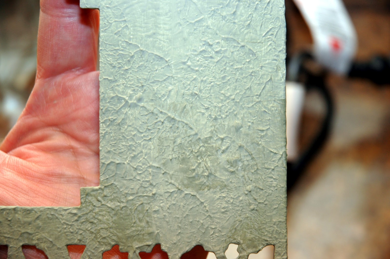
I began by cutting "FAMILY" out of the chipboard using Tim Holtz' Family Movers and Shapers.  Next, I cut out the Mini Vintage Cabinet Card on the left side of the 6x6 board.  I would use this opening as a frame for my vintage portrait.  I wanted this piece to look and feel like an old stone or tile square.  So, I began texturizing the basic chipboard first with some molding paste.  When that was dry, I brushed over it with Claudine Hellmuth's White Gesso.  When that was dry, I mixed Toad Hall and Snowflake Paper Artsy Fresco Finish Paint colors together to get a soft, sage greenish color for my background.


Here is a closeup of my background after applying the molding paste, gesso and paint colors.  I love the texture and the color!  I wanted more depth so I dabbed a cut piece of Cut 'N Dry Foam into just the Toad Hall paint and dabbed it onto the background to add some darker and lighter areas.


Finally, I repeated the dabbing of color onto the background.  Only this time, I introduced Old Gold Fresco Finish Paint to add a bit of shimmer and sophistication to what was looking like a piece of rough tile.  The picture shows the addition of the gold accent.


Here is my frame at the end of applying the texture and the paints.  Next, I heat embossed a design from Tim Holtz' Artful Artifacts stamp set.  I used Queens Gold Embossing Powder.  It is a wonderful antique gold color.


I stamped the entire design on the open area to the right of the frame.  Then I stamped portions of the design to the left corners.  I accented the mini cabinet card opening by heat embossing the gold around the perimeter.  Then I randomly heat embossed some of the outside edges of the frame in gold.  


Finally, I heat embossed "FAMILY" in the gold.  I think the gold embossing makes a dramatic difference on my frame.  I love it!


Next, I added a piece of black cardstock that was lightly dry brushed with some of the Old Gold Fresco Finish Paint behind "FAMILY" so that it would really pop.  I added my vintage portrait of the mother and her two daughters.  I think that picture, with it's sepia and black hues with the black behind "FAMILY" is a perfect combination.


The right side of the frame was the perfect place to add my vintage film reel.  This was made using Tim Holtz' Filmstrip Ribbon, his Mini Gears die cut and two small pieces of a dowel rod.  I originally made this film reel on my Red Letter Day 6x6 board I made for Simon Says Stamp and Show's challenge.  The four gears are cut from Grungeboard and colorized using Gathered Twig Distress Ink.  If you don't have this seasonal ink color, any brown ink will work.  I two pieces of dowel rod (approximately 1 1/4") and also distressed them with Gathered Twig. sized vintage pictures on my computer to fit the filmstrip ribbon and then glued them into place using Glossy Accents.  I backed the filmstrip with a piece of newsprint to hide all of the cut edges of the pictures.  Then I rolled both edges of the filmstrip onto the dowel rods and hot glued them in place.  Next I hot glued the gears onto the ends of the ends of the dowel rods.  I secured the top film reel in place using wire.  I secured the bottom reel in place with hot glue.  


This piece adds a lot of dimension to the frame and I love how the film strip plays off of the vintage portrait in the mini cabinet card cut out.  Finally, I hot glued a few vintage metal buttons on to the left side of the frame.

Now it's YOUR turn to immortalize your favorite word and enter it into our challenge at Simon Says Stamp and Show.  You could be chosen as on of our TOP THREE entries for the week and you also have a chance to win our most generous sponsor's weekly prize of a ...


Check out the wonderful ideas and examples that my Design Teammates have waiting for you this week.  Their work is always incredible and this week is no exception!

Good luck and I can't wait to see your favorite word and how you capture it in an art form!