Saturday, March 28, 2015

VINTAGE CHEVRON FRAMEWORKS CANVAS FOR COMPENDIUM OF CURIOSITIES III

Hello friends!  
Can you believe that we're already on to the 25th challenge in our journey through Tim Holtz' Compendium of Curiosities III book?  It has been such fun for myself and the Curiosity Crew over at the Compendium of Curiosities III Challenge. I hope that you've learned some new techniques, some things about Tim's products and we've inspired you to try new things.  

This challenge is more of a product challenge rather than a technique challenge.  It's all about Tim's Frameworks ... those wonderful little 5 1/2" x 2 1/2" pieces of magic that can add so much texture and dimension to your art pieces. There are six in all:  the Courtyard, Honeycomb, Chevron, Trellis, Lattice and the newly released Wave. So turn to page 64 in your books and check out Frameworks.


Here is my finished project, using the Chevron Frameworks along with Tim's new Correspondence Paper Stash and the matching stamps, Special Delivery Remnant Rubs, and Paper Twine.  Unfortunately, I have not received the matching Tissue Tapes yet or I would have used them as well. 


I began this project with a 6" x 6" stretched canvas.  I covered the top with a square from Tim's Correspondence Paper Stash.  I glued it in place using Ranger's Matte Medium. Then I added a variety of washi tape designs that I already had and thought would go well with a travel or "air mail" theme. I pretty much covered the sides of the canvas with the washi tape and added a few strips on the top for more interest.  


I wanted to add some dimension to the top of my canvas; something that would lend a grunge feeling without being overpowering.  So I decided to use Tim's Bricked Stencil and add some of that multi-talented artist, Wendy Vecchi's wonderful white Embossing Paste colored with a little Carnation Red Archival Reinker.


I simply laid the Bricked Stencil on top of the canvas and while holding it in place, I randomly scraped the colored Embossing Paste through the stencil.


Happy with my design, I brushed a coat of Matte Multi Medium over the entire surface of the canvas to seal it.  Matte Multi Medium is an excellent adhesive and sealant. It goes on smoothly and dries to a clear, matte finish. You can let this air dry or gently heat set it. 

(**Notice that I still am using my Claudine Hellmuth Matte Medium?  It also lasts a long time!)


When the Matte Medium was dry, I wanted to pull everything together so I lightly brushed over the canvas first with Frayed Burlap Distress Paint mixed with a little water to dilute it a bit.  Then I added some darker brown tones with Gathered Twigs.  I wiped away any excess paint from the bricks and areas that I wanted lighter.  Then I used a bit of blue acrylic paint on my finger and added some defining edges to the canvas. 


Here is a photograph of one side of the canvas.  The washi tape really does create a very cool design and when brushed over with the paint, it really blends together beautifully.

Now that the canvas was ready, it was time to make my embellishments.


I die cut three of Tim Holtz' new Butterfly Duo die cuts and embossing folders in one set. LOVE THEM!!  I die cut my butterflies onto watercolor paper.  Then I randomly rubbed some glue onto the paper surface using my finger so that when I began adding my Distress Ink colors, the glue would cause the ink to really stick in a grungy way onto the areas where the rubbed glue was on the paper.


I began with a light coat of Scattered Straw over the entire butterfly.  Then I started in the center and started working my way out.  I added Peacock Feathers over a light coat of Faded Jeans.  The next area was a done with Wild Honey. Next I added Worn Lipstick then a light coat of Fired Brick on top of the outer edges of the wings. 

Next I brushed on a light coat of Crackle Glaze over the butterflies and let it dry.  When dry, I rubbed some Raw Umber Antiquing Cream over all of the butterflies and wiped away the excess, leaving this very antiqued matte finish butterfly.  The body was added on what would be the top butterfly using Wendy Vecchi's Black Embossing Paste and I let it dry.


Then I glued the two lower bodies together.  I added the wire antenna to the underside of the top butterfly with the embossing paste body and then using Glossy Accents, I glued the top butterfly onto the other two already joined together.  In the inset picture, you can see the dimension and the fluttering effect that the three butterflies glued together gives.

  
Since the theme of this piece was about correspondence and mail art, I created a little envelope out of scrap cardstock.  You can see the dimensions of the finished envelope front here.  I added 1/4" tabs that were scored and clipped and the top envelope flap was freehanded and cut out. I then slipped the back of the envelope in place, added 1/8" Scor Tape to the tabs and put them together. Next I added some stamping and some washi tape to the envelope and finally distressed it using Gathered Twigs and Black Soot Distress Ink to give it that vintage, aged look.  You will see the final envelope in the next photo.


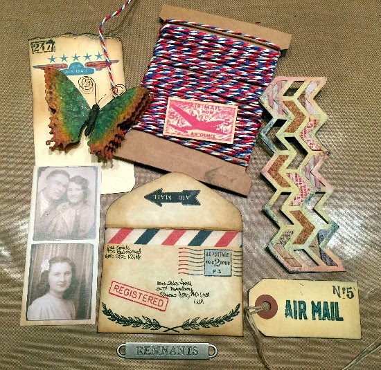
Here are all of the elements that I decided to add to the canvas: the butterfly, the envelope, a card from Tim's new Photo Booth photos (minus the top photo because I wanted the couple's picture to stick out of my envelope), various stamped images on the envelope, cardstock scraps and mini tag, Tim's New air mail colored Paper String, a Word Band and the Chevron die cut. 

The Chevron was cut out of plain Grungeboard and then painted with Antique Linen Distress Paint as a basecoat.  I then added Scattered Straw, Faded Jeans and Fired Brick Distress Inks to give it color and texture. Some of the insets are left blank.  Others are filled with pieces are fabric covered remnants, cork and distressed corrugated paper. 


Here is a closeup of the finished envelope, stuffed with all sorts of stamped memorabilia and the Photo Booth photograph. Those add such a vintage feeling!  The red and blue stamping on the envelope and memorabilia inside was done with Wendy Vecchi's Cornflower Blue and Vermillion Archival Inks. I also added a Remnant Rub from Tim's new Special Delivery set to the envelope. It's the little airplane and "AIR LETTER" writing underneath. So cute!

Behind the envelope, you can see the dimensional bricks.  I think they add a lot to this canvas and give it a bit of a grunge feeling.


Finally the Word Band was added across the bottom and held in place with Tim's new Paper String. I love how the paper string seems to also pull everything together.


So that's it!!!

Now it's YOUR turn to use one of Tim's Frameworks die cuts and incorporate it into anything you can imagine to create.  Then enter our Compendium of Curiosities III challenge. 


The wonderful people at Inspiration Emporium are hosting this challenge and awarding a $50.00 gift certificate to one of our lucky winners.  We thank them so much for their generous support!

And ... as always, Tim and Mario have been so kind to donate a mountain of Tim Holtz products to be given away to our second winner of EACH challenge!  Thank you Tim and Mario for YOUR continued support as well!

Have fun with this challenge! I can't wait to see all of the lovely art that will be posting!


Thursday, March 26, 2015

"ALL ABOARD!" FOR A DIMENSIONAL TRAIN FRAME TUTORIAL AT DECOART

Hi Everybody!

Are you ready for another tutorial using DecoArt's fabulous Media Line products?


Do YOU have a train enthusiast in your family? Ever thought about making something extra special just for them?

The inspiration for this mixed media piece is my 7 year old grandson, Cooper, who has been obsessed with trains since he was a year old.  

This is a home decor piece that will surely excite that very special
"engineer" in your life! 

For the complete pictorial and step by step tutorial, ride the rails to DecoArt's Mixed Media Blog and check it out!  If you'd care to leave a comment, they are ALWAYS greatly appreciated!

Have a crafty weekend and take some time to play!


Saturday, March 14, 2015

REMNANT RESIST FOR COMPENDIUM OF CURIOSITIES III

Happy Saturday!  

Welcome to my blog and the next challenge at 
Compendium of Curiosities III.  Linda Ledbetter and the Curiosity Crew invite you to play along with us as we explore the products and techniques of Tim Holtz

This challenge is all about the Remnant Rub Resist Technique.  What a fun way to use those miscellaneous rub on pieces or even create a fun background using a brand new sheet of Remnant Rubons. So turn to page 51 in your Compendium of Curiosities III book and check out Tim's instructions for this technique.  


The inspiration for my #8 Manila tag is from Tim's new Life Quotes stamp set.  The second I saw "NOT MY CIRCUS, NOT MY MONKEYS" I knew I HAD to have that set! How many of us can totally relate to that sentiment?  

While I cannot show you the technique in creating the background for my tag, I will share as much as I can with you about products used and other techniques I used to put this whimsical tag together.

I used various images from some of Tim's Remnant Rubon sets ... ones that I thought sort of coincided with a "circus" theme.  And speaking of the rub ons; Tim just released a new Remnant Rub Tool at CHA.  


Here is a picture of it and let me tell you, it's AWESOME!  Are you sick of trying to transfer rub on images using the popsicle stick that come with almost all rub ons? Well, here is your answer!  This is a METAL tool with a stylus point on one end and a large flat angled surface on the other. I used it when doing this technique and I am SO GLAD that I bought one of these bad boys! 


I found some vintage circus monkey images online, sized them to fit my tag and cut them out.


I used an old Vaseline Resist trick to make sure a few of the Rubons remained clear and the manila tag would show through after applying the inks.

I used Ripe Persimmon, Mustard Seed, Evergreen Bough and Peacock Feathers Distress Inks to colorize my tag background. I chose these colors because of the areas on the vintage monkeys images.  They had those colors behind them so I carried that color theme to my tag background. 

The images I stamped onto the tag are "Cirque" from The Big Top stamp set, the eye from Oddities stamp set, and the artsy butterfly from the Urban Chic stamp set.


And here is a look at the finished tag background. Granted, much of it will be covered by the embellishments that I layer on top but it was so fun to create and parts of the subtle "chaos" that is the background will still show through.  Finally, I added black to the outside edge of the tag to sort of "frame" the tag and pull everything together.


Since this tag will have a sort of "circus" theme, I decided to create a big top effect for the top of the tag.  I used a piece of scrap cardstock and stenciled "BIG TOP" stripes using the fabulous Wendy Vecchi's Yikes Stripes Stencil. I mixed a combination of Wendy's White Texture Paste and some Carnation Red Archival Reinker and scraped it through the stripe stencil. Perfect BIG TOP!


Next I die cut the bottom edge of the BIG TOP using Tim's Postage On The Edge die cut and sized it to fit my tag.  I left an extra 1/2" at the top of the BIG TOP and scored two 1/4" stripes across the top.  The first would be my fold back line to secure the BIG TOP to the back of my tag.  The second scored line would allow the BIG TOP awning to push out and create some dimension to the tag.


When I laid the monkeys on top of the background, I noticed that they seemed to sort of get lost in all of the pattern and color.  To soften the colors just to the right side of where my two monkeys on the bicycle would be, I swiped a bit of Picket Fence on top of the tag and gently rubbed it in. I repeated this process a couple of times until I was happy with the more muted background area. Then I went over the Picket Fence with Antique Linen Distress Ink to dull the white. That worked really well to help my monkeys stand out against the background. 

I secured the BIG TOP to the tag using 1/8" double sided Scor Tape.


Now for the inspiration of this tag ... the "NOT MY CIRCUS, NOT MY MONKEYS" sentiment.  For this tag, I wanted a sort of old fashioned sign to hang from the BIG TOP displaying the sentiment. So I stamped it onto a piece of cream colored cardstock using Jet Black Archival Ink.  I then cut between the lines of the saying and glued each strip onto a piece of chipboard; to resemble boards or sections of the sign. I clipped the corners of each strip and distressed them using Gathered Twigs Distress Ink.  Once they were all finished, I glued them together onto a scrap piece of cardstock (on the underside of the sign). 


Next I pierced holes into the sign and also into the BIG TOP awning. Using three jump rings on each side, I created a chain and secured the sign to hang freely from the BIG TOP awning.


Finally, I heat embossed "AND SO THE ADVENTURE BEGINS" also from Tim's Life Quotes stamp set to place at the top of the tag.  I heat embossed the sentiment onto black chipboard using Distress Embossing Ink and Ranger's White Embossing Puffs Powder.  After it cooled, I added some light beige paint to the edges of the black chipboard using my finger.  I then glued it in place using 1/4" Scor Tape. 

This was an easy technique and honestly, I put this tag together in less than 3 hours. 

Now it's YOUR turn to try your hand at Tim's Remnant Rub Resist and then enter your art into our Compendium of Curiosities III Challenge.  There are two chances to win some wonderful prizes with every challenge.

This challenge is being sponsored by the lovely and gracious Linda Coughlin of 


The Funkie Junkie Boutique.  She is rewarding one of our winners with a $25.00 Gift Certificate to shop at her wonderful online store. Click on the image above to check out The Funkie Junkie Boutique!

Our other prize package is from those very generous guys who we love and celebrate with this challenge, Tim and Mario!  They have sent a plethora (how's THAT for a fancy word?) of Tim Holtz Products for a very lucky winner each challenge. 

So don't delay!  Get out your Remnant Rub Ons and get busy!  

Good luck!

Friday, March 13, 2015

HUGE DECOART GIVEAWAY!!!

Hello everyone!!!

How about a sneak peek at the fantastic DecoArt Media Line giveaway that is coming up??

Just take a look at THIS ...


Hellooooooooooooo ... now THIS is a giveaway!

Check out all of the cool mediums, colors and stencils and stamps designed by the fabulous Andy Skinner, DecoArt's Executive Creative Consultant.

What do you have to do to win?  Just sign up to receive the Media newsletter HERE.
All the information for this giveaway will be in the March 18th Newsletter. Signing up for the newsletter will make you eligible for THIS amazing prize package and it will also keep you informed on ALL of the latest happenings with the amazing DecoArt Media Line.  There are always cool giveaways among "artsy" information that you won't want to miss out on if you're a mixed media lover.

Also, bookmark the DecoArt Media Blog Page. There are always cool mixed media projects and focuses on various Media Line products as well as techniques galore.

Be sure to sign up today!!!


Tuesday, March 10, 2015

DECOART MIXED MEDIA PROJECT ~ THE DRAGONFLY LADY BOOK

Hello Everyone and welcome to my blog!

I am super SUPER excited to share some news with you! 

I am debuting my first mixed media piece 

Featuring that multi-talented mixed media guru Andy SkinnerI am over the moon ecstatic to be a member of this AMAZINGLY talented group of artists whose work I have admired for a long time. PINCH ME!! 

Here are the other members of DecoArt's International Design Team

Andy Skinner
Mark Gould
Claudia Neubacher
Jools Robertson
Louise aka "ZuZu"
Mel aka "The Yorkshire Fox"
Elly Pirally
Angelica S
Julia 
Lindsay Mason
Michelle Webb


My first piece, titled "Dragonfly Lady" is a book tutorial that can be seen on the DecoArt Mixed Media Blog. It is a plain paper mache book that, through the magic of DecoArt's Media Line products, is transformed into a realistic looking old book with torn, worn pages and a very dimensional distressed and patina metal cover. 

In this tutorial there are lots of techniques that can help you with your mixed media projects!  So when you view the tutorial, don't just think of recreating this book. Get your imagination spinning with all of the things you can create using DecoArt's amazing paint and other mediums! 

Check out the tutorial and if you see something that inspires you, please be sure to leave a positive comment. That would totally make my day!

Thanks for stopping by and be sure to take time for yourself to PLAY!

#decoartsprojects