Monday, October 27, 2014

LAYER IT! ~ A CRAFT HOARDERS ANONYMOUS CHALLENGE

It's Monday!  
Welcome to my blog and my other Guest Designer Spot for Gloria Stengel's Craft Hoarders Anonymous Challenge.  The name of this challenge blog cracks me up because there are SO MANY OF US HOARDERS OUT THERE!!

This challenge is being sponsored by Lindy's Stamp Gang and Add A Little Dazzle. THANK YOU to these fine folks for their sponsorship!

For this challenge, we are asked to pull out all of our hoarded goodies and layer them up!  It could be papers, laces, buttons and trims.  It could be inks, texture pastes, paints and glitters.  It could be stamps, rubons, dies and punches.  Whatever you've got ... layer it up and join in on the fun of this challenge.

Grab a cuppa something and I hope you will enjoy this creative journey I am sharing with you as I definitely "LAYERED IT"!

The project I created is truly fitting for this challenge as it is layers upon layers of pockets and tags and flaps. Half of the pockets have layers upon layers of all sorts of things to create unique designs on each one.  I will open the box and reveal all of the layers in a minute.  But first, let me tell you about the box itself ...

This is a wonderful pattern by my friend, Jim The Gentleman Crafter.  It is appropriately called "The Falling Photo Box" and the pattern is available in his Etsy Store. Click HERE to whisk you away to the store and all of his amazing patterns. 


The box is a very showy piece measuring approximately 7 1/2" x 5 1/2". From the outside, it looks like an interesting but regular vintage box. But ... open it up and ...


Wha-lah!  The sides fall down and there are cascasdes of pockets and flaps and tags for journaling and matting treasured photographs!  Now you see what I mean about layers upon layers??


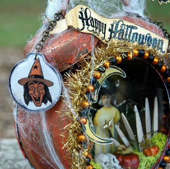
Just the exterior of the box contains several layers:  heavy chipboard, glue, Scor Tape, patterned cardstock, ink, lots of Tim Holtz Ideaology pieces including Box Corners, Pedestal Legs, a Pull Knob, a Monocle, Vial, Light Bulb, Link Chain, Enamel Tag with Rubons and ink, Type Charm, Cash Key and Collage Keys.  

While I would love to give you the step by step in creating this fabulous box, that would not be fair to Jim The Gentleman Crafter.  So, I will share as much as I can about the layers involved. You can purchase the easy to follow instructions from Jim and get all of the construction instructions from him.

After creating the exterior box and covering it with some papers I've had for a long time from Tim Holtz' French Industrial and Prima's Engravers, it was time to make all of the components for the interior.  I used papers from Prima's Ledger Pad to create all of the pockets.  


There are 17 pockets in all.  They all started out as pictured above ... the Ledger Pad paper that I then distressed with Gathered Twigs Distress Ink.  I used the lesser scripted papers to give half of the pockets their own special look.


For example ... here is one of the pockets in the beginning stages. I pulled out and tore some old book text; then distressed it with Gathered Twigs ink. Since this is a photo box, I really liked the sentiment on this piece of ribbon that I've had forever. So, I added the distressing with Gathered Twigs. I also liked the Prima brads. I would add more layers to this pocket, but this seemed like a good start.


Here is the finished pocket.  There are at least FOURTEEN layers on this: the base cardstock, the ink, the glue and Scor Tape used in adhering all of this pocket together, the "journey" stamp and ink, the distressed book text, the sentiment ribbon, the brad, the Journaling Ticket, the Remnant Rubons on the Journaling Ticket and the harlequin design on the pocket, the Tissue Tape of the eye glasses, the filmstrip, the measuring tape, the butterfly and dragonfly stamps, the Perfect Pearls Powders and water to colorized the butterflies and dragonfly and the lace. 

As you can see, each layer adds something of interest to this pocket and contributes to the design.  Don't be afraid to layer!  It adds so much!  

In this Falling Photo Album, I used primarily Tim Holtz stamps but there are some other random ones as well. I also used a variety of tissue/washi tapes that I have had for a long time, old buttons and laces; whatever I thought might look neat. Nothing is new.

So, how do you build layers?  
Well, here is a step by step example of how I did another pocket:


I began with the basic distressed pocket made from the Ledger Pad.  Using Jet Black Archival Ink, I stamped this beautiful face from one of Tim's Classics stamp sets.


I cut a "mask" out of manila cardstock and laid it over the face image.  Then I laid this beautiful Finnabair Prima vintage doily stencil on top of the pocket and masked face.  The color spray is Heidi Swapp's Teal (my favorite color) Color Shine.


Removing the mask to reveal this lovely subtle shimmery pattern, I then colored the face using various Distress Inks and a Detailer Water Brush. You can already start to see the "warmth" that the added layers provide. I also added a striped ribbon using 1/4" Scor Tape across the bottom of the pocket for interest and also to hide the obvious line at the bottom of her neck.


Next I added a piece of torn fabric that I gesso'd on the backside of the fabric so that it would soften the color and allow me to stamp a sentiment on it. I have a friend, Andrea Ockey Parr who does some AMAZING stuff with fabric. This is one of her little tricks; to turn the fabric to the wrong side. You still get the color and pattern.  It's just not as vivid.  Adding the gesso on top further softens the fabric color and patterns and gives you a good base to stamp a sentiment. Leave the stringy stings. They are fun!

  
I added a little almost dry brushed gesso over her head to try to remove the obvious line up there. Next I did a little more stenciling above her head and blended the colors of the pocket with distress inks, further erasing that line. Now, it almost seems as if her face is emerging from the background, not stamped on top of it.  Here you also see the added sentiment to the fabric strip (glued on using Matte Multi Medium) and a vintage button with one organza rose from Tim Holtz' rose ribbon trimmings (sprayed with pink) that was hot glued in place.

So this pocket has a total of at least TWELVE layers: basic cardstock, glue, Scor Tape, hot glue, ribbon, vintage button, sprayed organza rose, torn fabric strip, gesso, inks, stamps, stencil (spray). 

  
Here is another pocket with stamping, Remnant Rubons, Filmstrip Ribbon, stamped images and sentiments, stencils (done with Distress Inks), Tiny Attacher staples, Perfect Pearls Powders (mixed with water and used more like a paint), Distress Inks to color the gentleman with a Detailer Water Brush. 


Still more stencils, stamps, Perfect Pearls Powders used as paints, Distress and Archival Inks, Tissue Tape, a button

  
A pocket mainly done with stamping and both Archival and Distress Inks, a ribbon running across the top held in place by 1/4" Scor Tape. There are less layers here but sometimes not as many layers is still very effective.


A little more "artsy fartsy" design using Tim Holtz' dressform and sentiments paired with red washi tape, Dina Wakley's script stamp and Tim Holtz' Queens Gold embossed wings stamp. The little red circles are from a little stamp set that I've had for ages and ages.


I love this washi butterfly tape and I thought it went perfectly with Tim's Papillon butterfly stamp.  All are colored with Distress Inks and a Detailer Water Brush.  The black circles are from dipping a paint lid into black paint and randomly "stamping" it on the pocket. The script is added using Texture Paste and a Crafter's Workshop 6x6 script stencil. 


I HAD to include this sweet little gentleman from Tim Holtz' Paris Memoir stamp set. He is one of my favorites. I masked the center of Tim's famous Weathered Clock stamp so that I could add the sentiment. I like the way it turned out. The elephant at the top of the clock face is from Tim's Tiny Things stamp set. I really like his randomness as well. 


Here are all eight of the special pockets I created for the Falling Photo Box.  I love how different each one is and it is the LAYERS that really give them depth, color, interest and design.


Once the pockets are all made, they need to be attached to the opposite sides of the box so that when the box opens, they will cascade out.  I used 1/4" Scor Tape to attach each of the pockets to their perspective "tabs" created out of black cardstock. 


Here is one side of the Falling Photo Box with all of the pockets in place.  See how they cascade?  Isn't that cool? The opposite side of the box also has this same arrangement of cascading pockets. To the left, you can see the back of the box with the "tabs" in place to attach large tags for journaling.


And here are the large journaling tags attached to the back side of the falling photo box.  They will also be layered in between the photo pockets when the box is folded up. Each is distressed and stamped with various (mostly Tim Holtz) stamps at the tops.  But, they are mostly left blank so that lots of journaling can be done ... or more photos or other ephemera could be added here as well.


When the box is folded up, this what the interior looks like:  layers upon layers of pockets and large tags. 


Yet ANOTHER layer coming up!  These are the blank tags made from manila cardstock that are slipped into each one of the pockets.  Photographs are to be mounted to them.


And here is the way the tags look inserted into the pockets as they cascade.  I love it!


And again ... here is the Falling Photo Box when it is removed from the legged base, the top is removed and the box is left to open similar to a square "exploding box" design.

NOW do you see why this Falling Photo Box was such a perfect project for this Layer It Challenge?  Layers, Layers Layers!!!

I hope that you've enjoyed this blog post and that somewhere in all of this, you found some inspiration to start rummaging through your hoarded goodies and create something with layers for the challenge.  The link up your design to the challenge.  You may be a winner!

Thanks for sharing part of your day with me and GOOD LUCK with the challenge!


Saturday, October 25, 2014

COMPENDIUM OF CURIOSITIES III CHALLENGE ~ COLORED CRACKLE

Hello blogging buddies!  It's that time again ... for another new challenge from Linda Ledbetter's Compendium of Curiosities Challenges.  

But first, let me just say that our Curiosity Crew has been talking recently about the wonderful quality of art that you guys are posting each challenge.  I am blown away week after week at the beautiful art that is being made and then shared on the Compendium Challenge blog.  Are you guys having fun?  I know that I am!  

The challenge is such a great place to share ideas, new ways to use Tim Holtz products and techniques. I thank each of you who join us bi weekly, leave inspiring comments and share your art with all of us.  It really is a community of sharing and I am thrilled to be a part of it!

Turn to page 53 in your Compendium of Curiosities book and check out "Colored Crackle".  Isn't it beautiful? Such a perfect picture in the book to illustrate the technique. Right??

Okay ... you know how sometimes you do a technique exactly how it is explained and it just doesn't seem to be as perfect as the picture in the book?  Yep ... that happened to me on this challenge.  But you know what, Tim says "Embrace Imperfection!"  So, that is EXACTLY what I am doing this challenge.  

I'm embracing the fact that I made not one but TWO different examples of Colored Crackle for my project and while the crackle is there, it's so tiny that unless you look really closely, you'll miss it.  I think maybe I should have used a darker base color and the crackle would have shown up better. I'll be interested to see and hear what you think after doing this challenge.  I can't say anymore or I'll be giving away the technique!

Moving on ...


Here is my finished project.  It is the front cover of a Christmas album that I will be putting photographs in from Christmas 2014.

 
I began with Wendy Vecchi's Small Art Journal Covers.  These are very sturdy covers made out of some sort of press board.  It is such a great size!  They measure 9" x 7 1/4" and come with two 3" metal rings to use as a binding. So, you have a lot of space on the inside to add dimensional pages if you choose to do that.  Wendy had these at CHA and she stores her stamp sets in them. She customized her covers and they were unbelievably cool! You can see a pictured example of finished covers on the packaging in the photograph above. REALLY NEAT for mixed media work!!


For my covers, I began with an image of vintage Christmas tissue paper. I copied and printed the tissue paper image onto regular printer paper on my computer.  Then I brushed Matte Medium on the front cover of my album, laid the paper down and glued it in place. Then I brushed over the paper with Matte Medium to seal it.  


Next I tinted some Wendy Vecchi White Embossing Paste with Fired Brick and a touch of Barn Door Distress Ink Refills and thoroughly mixed them together. I taped Tim's Holiday Knit Stencil in place and using a palette knife, I randomly scraped the red embossing paste over the stencil, creating the raised pattern on the cover. Be sure to immediately wash your stencil and palette knife before the paste has a chance to harden! 
After that dried, I added some Pine Needles Distress Ink to the predominantly white background and painted the edges of the album cover with Fired Brick Distress Paint.


Across the top and bottom of the cover, I added strips of Tim's silver metallic Industrious Borders and then painted inside of the scalloped area of the border with Fired Brick Distress Paint and a Detailer Water Brush.  The basic cover was now ready to be turned into a fancy, glittery vintage Christmas album cover.

I began with Tim's Plain Grungeboard and die cut a large and a smaller poinsettia from Tim's Tattered Poinsettia die cut.  (In creating the smaller poinsettia, I did not cut the largest petals; only one of the middle ones and two of the smaller ones.) Then I die cut a pair of ice skates from Tim's Ice Skates die cut.  While I can't tell you the steps I used in creating the "Colored Crackle" exterior, I will tell you the colors that I used. I did a basecoat of white gesso ... and as I was saying earlier, I'm not sure that was such a great idea for this technique because I was beginning with a light base rather than a darker one for the crackles to be more evident.  Anyway, that's what I did.

I used a combination of Scattered Straw and Fired Brick on the poinsettias and Antique Linen, Gathered Twigs and Brushed Pewter on the ice skates. Even though the crackling is not real evident, I still love how the poinsettias and skates finished out. Remember..."EMBRACE IMPERFECTION!"  

I put the poinsettias together using a "bling" brad for the centers and then I lightly went around the edges of the petals with Platinum Stickles to add a bit more of that wonderful vintage "glittery" look. 


 I laced the skates using some fairly thin string and a needle to go through the holes already die cut into the skates.  Then tied a bow at the top.  I later attached a gold and a silver jingle bell that dangle and "tinkle" when the cover is moved. 

Next I die cut some of Tim's new Thinlets Paper Snowflakes and Holiday Greens. Both were cut from a shimmery cardstock; the snowflakes on a cream colored, the holiday greens on a deep green with a gold-ish fleck.  


I used my new little Spellbinders Tool 'n One and Foam Pad to get rid of the little pesky cut away paper pieces and it worked like a dream! I didn't have to sit and pick out each little piece. Awesome! 


 Then I gave my snowflakes a quick spritz from my home made Picket Fence Distress Stain (since I don't have the newly released Spray Distress Stains yet) and then I sprinkled a dusting of glitter over the wet stain.  I heat set that and then added a light mist of adhesive spray and sprinkled the snowflakes with some vintage Mica "Snowflakes". Finally I added a rhinestone center to each of the snowflakes and they are lookin' very vintage-y. Love it!


I decided to add some of the mica snowflakes to the poinsettias and skates as well because I love that look.  But...right before I did that, I was rummaging through Tim's new Christmas Ephemera pack and happened on THE PERFECT embellishment for the center of my cover...The Santa Claus Mica Snow Flakes box lid!  THANKS TIM!!! Perfect for my piece!


 I also picked out a round December 25 Christmas Day piece that worked perfectly with a snowflake.   I used my Glossy Accents to add dimension to the December 25 circle and the "SNOW FLAKES" lettering on the box lid by simply tracing inside of the lines with Glossy Accents and letting it dry.  It dries clear and glossy and raised and gives a nice subtle dimension to those embellishments.


Next, I glued my holiday greens in place in the upper left corner. Those greens are amazing! They give such a light, airy touch underneath the heavier poinsettias that I glued on top of them. I added a small bow made from silver metallic-ish ribbon. 


I glued the raw edges of two silver straps that I attached to each of my skates to the upper right area of the cover and popped a large snowflake over the raw ribbon edges.


Then I popped the skates into place.  


Next I popped the lower left snowflake in place followed by the snow flakes box and snowflake/December 25 circle in the center of the cover. Finally I added the smaller snowflake at the lower center of the cover and using Glossy Accents, I added a few rhinestone dots here and there for a bit more sparkle. 

I will finish off the back cover with the same vintage Christmas paper image and either line the interior covers with Christmas paper or just simply paint them with Fired Brick Distress Paint. 

I hope that I have inspired you to join in on the Colored Crackle fun at Compendium of Curiosities. Just create your piece, be sure that you follow the simple rules in your blog write up and then post your art to our challenge blog.   

There will be two lucky winners selected to win fabulous prizes.  This challenge's sponsor is the lovely Linda Coughlin of The Funkie Junkie Boutique.  Her store is filled with all kinds of "goodies" for your crafting pleasure. She is giving away a 

http://www.thefunkiejunkie.com/
   
 $25.00 gift certificate to shop in her store!  Trust me ... you will have fun with that! 

Then, as an added bonus, Tim and Mario have so generously donated all sorts of products to be given away at each of our challenges to one lucky person.  No doubt this array of products will excite and inspire you to continue to create his wonderful vintage style art!

So, come join us and share your art and your experiences with this technique!


Wednesday, October 22, 2014

THE COMPENDIUM OF CURIOSITIES III COMMUNITY

Hi all!

It's a beautiful autumn day and I am getting ready to go outside and soak up some sunshine.  But, before I did that, I wanted to share something with all of you ...


it really feels like a community of artists who love Tim Holtz; his book, his products, his techniques and just the person that he is.  I feel so blessed to have been asked by Linda Ledbetter be a part of this journey she started with the Grungy Monday challenge blog that has morphed over the years into the Compendium challenges. 

As a member of the Curiosity Crew, we really take that commitment seriously.  We hope that through our individual "takes" on each project and our posts that we educate, inspire and share our fun in creating with Tim's techniques and products. It's all about the fun and the learning and sharing. 

The Curiosity Crew is amazed and thrilled with the entries that we have each challenge.  Your creations are really beautiful art.  It's fascinating to see all of the different styles and interpretations and it's FUN to read all of the creative processes that everyone goes through to finally get that last little whatever it is done so that you can get your entry linked up.

http://lindaledbetter.com/2014/10/compendium-of-curiosities-3-challenge-13.html


Our current challenge is Worn Covers. I absolutely love the entries we are getting, including  each person's writeups. A perfect example of this is Vic.  I was just reading her blog this morning and she says that she was dreading this challenge.  But, when she finished, it is one of her favorite things she's ever made.  And Vic has made some beautiful stuff!  I had to laugh because I have felt the exact way sometimes about upcoming challenge projects.  But the feeling of satisfaction you get when you "tackle the beast" and come out with a favorite is amazing!  Beating that fear factor is the BEST!!

You guys have NO IDEA how tough it is to pick winners for our challenges.  The Curiosity Crew has had this discussion many times.  And many times there are so many deserving, wonderful creations that it's nearly impossible. Our current challenge is a great example of this...all so diverse but beautiful examples of how to take Tim's Worn Covers and turn them into something amazing!  You guys make it tough on us but you cannot imagine the gratitude we feel for your participation and also for the letting us know that you are having FUN and you're learning about techniques and how products work.  This is knowledge you will carry with you long after we finish the final Compendium III challenge.

In saying that, here is one more think I would love to share with you.  These are some thoughts from another talented artist from our Compendium Community, ReaThese are HER words ...

 "At every challenge they (The Curiosity Crew) just seem to take us to another level. I love that the Curiosity Crew shares their work... it not only inspires us but you get to see a diversity of the use of Tim Holtz product. I like that not only are we going through his book A Compendium of Curiosities III ( you can still get one by the way ) and learning techniques and use of product; we get to see other Designers use the techniques and product as well. That's exciting  to me. It's also exciting that  the Curiosity Crew has a  Curiosity Choice Award; they actually check out our work... I don't know about you but that's pretty exciting to me... to have Designers SEE MY WORK !"

Thank you Rea for your comments!  You "get it".  You get what we are all about and YES...we DO see everyone's work and we revel in it!  

So, if you've not joined yet us over at the Compendium of Curiosity Challenges, I invite you to check us out and come see what all of the fun is all about.  For those of you who are joining us, THANK YOU for your continued inspiring comments and your participation!

Okay....I'm off to go outside, soak up some sun and get some inspiration for my next project for Compendium of Curiosities.  Hmmm....wonder what THAT will be??? 

Friday, October 17, 2014

IT'S BEGINNING TO LOOK A LOT LIKE CHRISTMAS!

Hello my blogging friends!  
No ... no ... I'm not taking a cue from all of the craft and hobby stores and putting up Christmas stuff yet.  

But, I did recently get my new Tim Holtz St. Nick die cut and was playing around with it today.  I wanted to share him with you because I think he turned out really cute!

I got so engrossed in making this little guy that I forgot to take pictures of every step but I think there are enough for you to get the idea.

I began by die cutting all of St. Nick from Plain Grungeboard.  Then I gave all of the pieces a basecoat of White Gesso.  I'm not sure it was necessary to do that but so much of Santa's beard is white, I thought the gesso background would be good and it also gave me really true red and green colors on the hat and holly.

I wanted this Santa to be dimensional and take on the appearance of a very retro-ish 1950s looking ornament.  So, I gave Santa a real beard and hair and "fur" and pom pom on his hat.  I'll talk more about that in a minute.


 After the gesso was dry, I laid the pieces out and figured out where Santa's face would be so that I could give him flesh tone skin and lightly drew the outline of his face in pencil.  Then using Wendy Vecchi's Pale Ochre Archival Ink and a touch of Victorian Velvet Distress Ink on top, I gave Santa a flesh tone face.  His cheeks (although they are hard to see underneath his beard and mustache) are Victorian Velvet.  All of the Archival Ink was applied using small pieces of Cut 'n Dry Foam.  The Victorian Velvet was applied using an Ink Applicator. Santa's hat is Wendy Vecchi's Vermillion Archival Ink with a bit of Potting Soil Archival Ink around the edges. The holly on his hat is Wendy's Leaf Green Archival Ink with touches of Pine Needles Distress Ink to shade parts of the leaves. The eyes are black from a Pitch Black Paint Dabber and the nose is Victorian Velvet Distress Paint with Potting Soil around the edges.


I gathered small bits of white "fluff" (stuffing you use inside of pillows or to create fake "snow" for Christmas scenes) and pulled it apart to make it less dense.  Then I used some Honey Spray to lightly age and darken the whiteness of the "fluff". Next I applied clear drying glue all over the areas where Santa's beard and hair would be and pressed the "fluff" in place.  He would later get a "hair cut".  This was just to get the fluffy "hair" in place.  I also repeated this same step on the pom pom, furry cuff of his cap, his mustache and even on his eye brows. 

  
After a few minutes, I took used small detail scissors and began giving Santa a trim.  I trimmed around the outsides edges of the die cut and also trimmed off some of the thickness of the fluff. Then I took the Cut 'n Dry Foam piece with Potting Soil and edged all around every furry piece to give a distinct distressed edge for definition. I even lightly brushed the Potting Soil on some of the fur along the edges to give him even more dimension. This was especially important on the eye brows and the mustache that would have gotten lost in the beard.


I love the retro-ish look that mica "snow flakes" add to vintage pieces so I added them to my Santa.  I covered where Santa's face would be with a piece of scrap paper and laid all of my furry pieces on a piece of white paper.  I lightly sprayed some Adhesive Spray and gently sprinkled all of these pieces with little Mica Snowflakes.  I gently tapped them into place and then removed the excess flakes. Then I removed the scrap paper covering Santa's face and began gluing all of the pieces together to create my Santa, layering each in it's appropriate position.


Here is my finished Santa face again and I have it laying next to the actual die cut so you can see the what a difference adding the dimensional "fluff" and little Mica flakes makes.  I absolutely love this little guy and can see him as a Christmas package adornment, an ornament hanging on a Christmas tree or a very retro-ish embellishment for any type of Christmas home decor piece or scrapbook layout.  

These are so much fun to make and really don't take a lot of time at all.  Once you figure out the first one, you could get an assembly line of them going in no time.  

Thanks for stopping by!  Enjoy your weekend!


Monday, October 13, 2014

HAPPY FALL Y'ALL CHALLENGE OVER AT CRAFT HOARDERS ANONYMOUS

Hello and welcome to my blog!  

I am sooo super excited and honored to be doing a couple of Guest Design spots for
 Gloria Stengel's Craft Hoarders Anonymous Challenge this month.  This is such a fun challenge and who among us is NOT a craft hoarder???

I am a HUGE craft hoarder and no, I'm not in any sort of treatment program!  I don't want help, I want more space!  haha  Seriously though, when I saw the theme for the first challenge... "Happy Fall Y'All", I was in love! 

I absolutely LOVE the fall season.  It is my favorite time of year with all of it's splendid color, that unmistakeable crispness in the air, the rustling of fallen leaves, the hearty soups and stews, the multiple craft fairs, all sorts of pumpkin bars and pies and particularly Halloween! I love Thanksgiving, too but Halloween is ... other than Christmas, my favorite holiday to decorate the house.  So, this was an easy challenge for me to come up with a theme!


I promised to create and share a Halloween Assemblage Clock when I wrote my blog post for my Christmas Assemblage Clock. I adore these little Assemblage Clocks and am fast becoming addicted to them!  Yes, I am a hoarder and I have a few more of these on hand. My Halloween clock sitting next to my Christmas clock just makes me smile!

Everything that I used on my clock was mostly out of my "Halloween stash". I have a couple of big plastic containers full of things I have collected over the years that I figured would come in handy when I create vintage Halloween pieces to decorate my home.


I began by painting my Assemblage clock with a basecoat of white gesso to give the shiny silver metal finish on the clock some "tooth" to grab the paint I would later be using. (Some people take their clocks completely apart before they paint them.  I don't). When the gesso was dry, I brushed over it with black acrylic paint. When that was dry, I added a middle coat of Americana's Crackle Medium and when that was dry, I added a top coat of an acrylic vintage pumpkin colored orange paint.


I added some Renaissance Treasure Gold Guilding Wax to the edges and randomly over the orange crackled surface of the clock.  You can see it glistening in this photograph. Then I hot glued the vintage black and orange beads (a garland I tore apart and restrung to fit) around the clock face. Finally, I added the vintage gold tinsel garland behind the bead garland.

Moving to the interior of my vintage Halloween clock ...


I created this "false back" just in case I decided to add Tim's little lantern or something to it. I used some scraps of paper that I save after making projects, put them together and used orange and black Distress Inks to colorize them.


Using Ranger's Black Diamond Embossing Powder, I heat embossed the numbers from Tim Holtz' Mercantile stamp set.  Then I simply cut them out and glued them onto my clock background.  I did not use the "6" because it would be covered up with other things.  I also added Gold Paint Dabber then Platinum Stickles to Tim's Mirrored Stars and let them dry. Once dry, I glued them in place on the background. (I later drew in a few more starts on the left side using the Platinum Stickles after my girls were in place). 


I found these darling little vintage children in one of my many vintage images folders that I have on my computer.  I sized them to fit in my clock and printed them out. I couldn't decide which one to use so I colored all of them and then waited to see which one emerged as the one who wanted to be a part of my clock.  

~ The Progression Of The Little Girls ~


The two little girls won. Their clothes are colored with Scattered Straw, Wild Honey and Spiced Marmalade Distress Inks using a Detailer Water Brush. Their little cheeks are blushed with Tattered Rose Distress Ink. I had decided to add dimensional witches hats to them, so I developed a pattern to fit their heads. (The girls were backed with kraft cardstock before I cut them out and edged with a Black Soot Distress Marker).


Here are the little girls with their little witch hats going on. They are cut from black cardstock and glued in place. The hat brims are elongated ovals that are slit in the center and slipped in place on their heads.  There is a small bead of glue on the back sides of their heads, holding them in place. The rest of the hats are actually rounded in the front and glued to the back of their heads.


I added black tulle to their hats as hat bands and a spooky shawl around the one little girl. The other little girl received her bat wings.  These were heat embossed onto manila cardstock using Black Diamond Embossing Powder and then outlined with Platinum Stickles.


Finally, I added a magic wand to the little bat girl.  This is a toothpick that I colored with Black Soot Distress Ink and added another of the gold and Platinum Stickles covered Mirrored Stars. I cut a slit at her hand and glued the toothpick in place in the back.


I made my own little spooky picket fence out of little pointy craft sticks (found at Hobby Lobby), painted white and then distressed with Gathered Twigs Distress Ink. I joined the pickets together with a thin wire.


Here is the completed picket fence, cut with a rounded bottom and ready for it's placement inside the clock.


Here are most of the interior things that I made out of stash of stuff. I stamped the vintage half moon from an Oxford Impressions stamp set that I have had for a long time. It is stamped onto Specialty Stamping Paper and colorized with Scattered Straw, Mustard Seed, Vintage Photo and blushed with Victorian Velvet Distress Inks.  I also added Platinum Stickles around the edges for a more vintage look.


I added the orange and black "31" Bingo piece to one of my little witches. Since I decided not to use a false back to add the Tim Holtz Lantern, I glued my completed circle onto the metal back of the clock and added a Platinum Stickles edge around the rest of the metal backing.  Once dry, it was ready to pop into place.

But now I needed to create the foreground scene of my clock.


Back to the plastic containers I went to dig out some miniature pumpkins and skulls.  I also added a little greenish mossy stuff for some color and I hot glued everything into place.  I added the picket fence and pulled it apart a little bit so when I got the back in place, you could more easily see the little girls and the magic wand.  The moon is held by a wire glued to the upper side of the clock interior.

I snapped the clock back in place and started working on the exterior embellishments.


I created these three charms from Tim Holtz' Charms Fragments and portions of vintage Halloween Post Cards that are saved on my computer.  I sized them to fit, glued them in place using Glossy Accents, cut off the excess paper and sanded them on the back side. The chains are some junk chains that I have and they are joined onto the charms by Tim Holtz Jump Rings.  I added them to the bell portion of the clock with larger Jump Rings around the handle.


The two vintage tags hanging on the one side of the clock.


The vintage witch tag hanging on the other.


The bats are heat embossed onto Manila Cardstock using Black Diamond Embossing Powder. They are edged with a Black Soot Distress Marker.  I cut out the bats and cut out a manila cardstock backing for them as well.  I distressed the backings and slipped a wire between them.  The wire is then wrapped around the handle on the clock so make the bats appear to be flying.  The Happy Halloween Banner is also heat embossed on Manila Cardstock using Black Diamond Embossing Powder.  I made my own banner and distressed it with Gathered Twigs Distress Ink, edged with Black Soot Distress Marker. It is hot glued in place. Finally, I added the spider webbing from my stash of spooky stuff stored in my good ol' plastic container.  The Happy Halloween stamp can be found on Tim Holtz' Mini Halloween 3 stamp set and the bats are from his Retro Halloween stamp set.


 Here is a photograph of the back of the clock.


Here is a closeup of the scene in side of the clock. These are sometimes hard to photograph with the glass clock front ... but you get the idea. 


As I was sifting through my stash of stuff, I ran across this little piece of metal fencing that was already rusted and everything! So I just hot glued some mini skulls (from Michaels) onto the prongs, bent the sides around and created a scary little fence that I could set in front of my clock if I so desired.


And here it is ... 

Thanks so much for stopping by my blog and checking out my vintage Halloween Assemblage Clock.  I hope that this tutorial has helped you and that you're all fired up and ready to create something to celebrate FALL!  Then link up to the challenge over at Craft Hoarder's Anonymous where you might win a fabulous prize from this challenge's sponsor,  POLLY'S PAPER STUDIO.

Good luck everyone!  See you again soon!