Monday, May 30, 2011

IS IT POSSIBLE TO HAVE ONE FAVORITE STAMP?

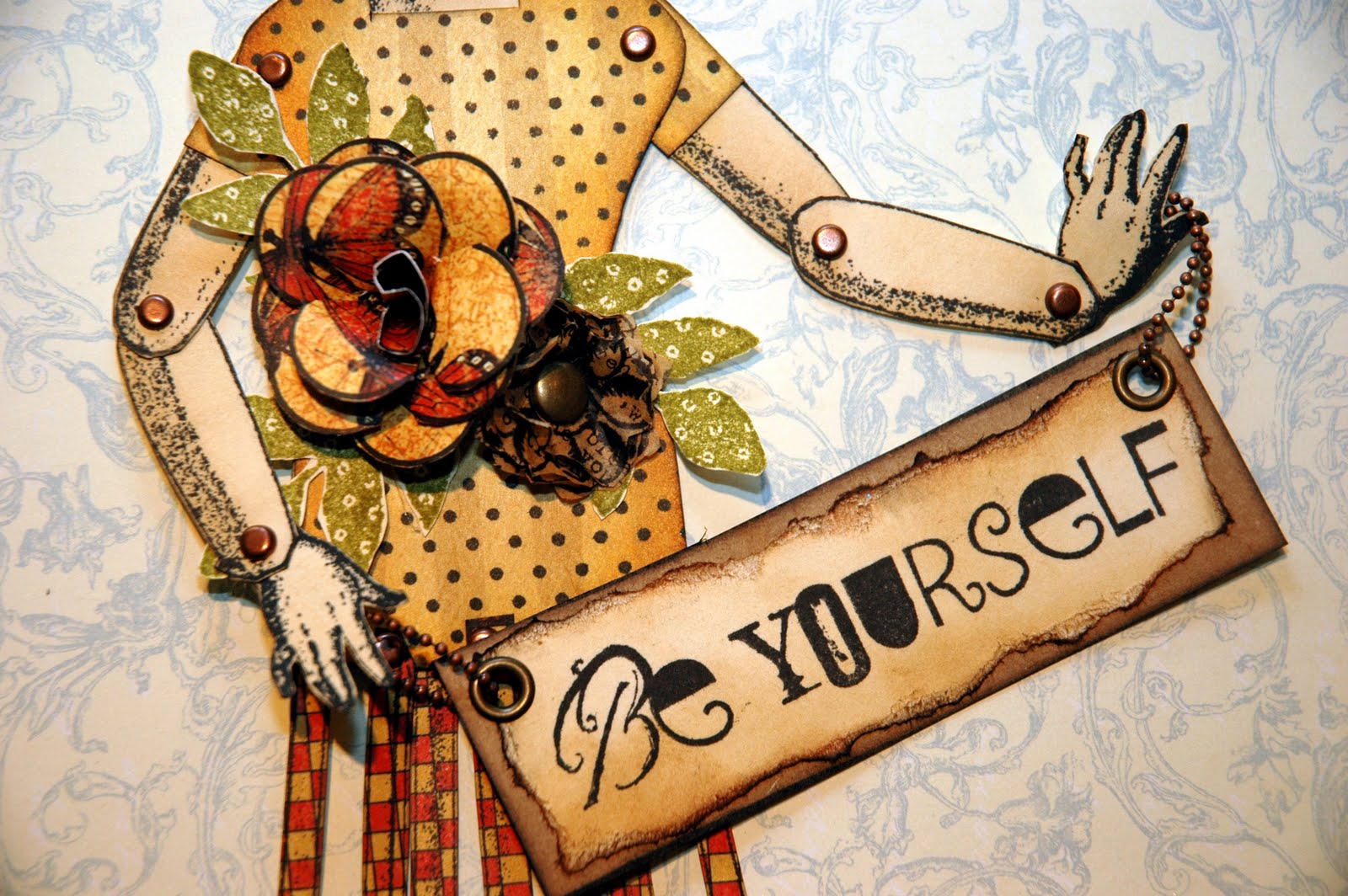
The challenge for this week's Simon Says Stamp and Show is themed "Your Favorite Stamp".  I don't have just one.  How could I choose?  I love so many wonderful stamps from Tim Holtz, Wendy Vecchi, Hero Arts, Magenta, Invoke Arts...the list goes on and on.  TODAY; however, my favorite stamp(s) are "Tools For Art" by Wendy Vecchi.  So, that set inspired my challenge piece for this week.

I started with a plastic artist's palette and the cover page from Tim Holtz' Kraft Resist Paper Stash.  I loved all of the papers in this stash and couldn't decide on just one to cover my palette.  So, I decided to use the cover of the collection.  That way, I could incorporate several of the papers on my palette.

A little bit of this and a little bit of that and before long, I had gone from the plain white plastic palette to this ... 
I began by cutting another of the artists' palettes out of black chipboard to use as an offset background piece.  Then I covered the plastic palette with the cover page from the Kraft Resist Paper Stash Collection.  I inked around the edges with Black Soot Distress Ink.  
The pools of "paint" are various Color Wash colors.  I used 6 of Wendy's sentiments from various stamp sets and heat embossed them onto white cardstock using Clear Embossing Powder so that the words would really stand out among the "paint".  Then I sprayed each of the white pieces of embossed cardstock with random colors and wiped around the embossed words.  Next I cut random splotches from each to look like paint on a busy artist's palette.  
  I used the paint brush, the Speedball bottle and the Diamond Inks Stampine label from the "Tools For Art" stamp set.  I also used one of each of the bottles from Wendy Vecchi's Borders and Bottles Art Parts set.  The art parts fit perfectly under the stamps from Wendy's set. 
   
I stamped 6 paintbrushes onto kraft cardstock using Black Archival Ink.  I wanted the brushes to appear to have been dipped into the small pools of "paint" on the palette, so I heat embossed the corresponding color of "paint" to the ends of the brushes.  Those were done by using the corresponding colors of Adirondak Embossing Powders.  I then wrapped a piece of 1/4" silver Memory Metal Foil Tape around the brushes for added detail.  I arranged them in order onto a small brad and topped the brad with a little Wendy Vecchi flower stamped onto white cardstock sprayed with Butterscotch Color Wash.  I popped the brushes in place using black pop dots stacked three high underneath the brad. 
 
Next I stamped out one Speedball bottle and one Diamond Inks Stampine label onto the kraft cardstock.  I covered the smaller of the two bottles (the one that used the Diamond label) with the kraft resist paper and inked it with black ink.  Then I wiped off the ink to reveal the resist.  Very subtle but pretty cool.  I added a little top to the bottle out of black cardstock.  I added some detail to the bottles by using Crackle Accent on the Diamond Inks label and also all of the detail on the Speedball bottle.
My palette was fun ... but it needed something else.  It needed Wendy's flowers and leaves!!  So, I wiped Fired Brick, Broken China and Peeled Paint Distress Stains onto white cardstock to create the colors for the flowers and leaves.  I stamped polka dots and the grid pattern to accent the flowers and a subtle script on the larger leaves set.  The flowers are free standing by using green floral wire.  After I arranged my flowers and leaves the way I wanted them, I popped the two bottles in place.  
So, my favorite stamp (this week) is actually a conglomeration of Wendy Vecchi stamps all rolled into one creation inspired by "Tools For Art"....a fun and colorful artist's palette. 

Check out the SIMON SAYS STAMP AND SHOW CHALLENGE blog.  There you will find the Design Teams' favorite stamps and some really wonderfully creative, inspiring ideas that will encourage you to pull out your favorite stamp and get busy!  Create something wonderful and link it to our blog.  YOU could be the winner of our very generous sponsor's prize of a $50.00 credit voucher to be spent at Simon Says Stamp Store....THE place for all of your papercrafting and beyond needs!

Thanks for stopping by my blog!  I can't wait to see what you've created with YOUR favorite stamp!


Monday, May 23, 2011

STUDIO 490 ~ WENDY VECCHI STYLE !

Great Monday morning everybody!  It's time for a new SIMON SAYS STAMP AND SHOW CHALLENGE!  This week's challenge is based on the unique and unmistakeable style of Wendy Vecchi of Studio 490.


I decided to combine Wendy's wonderful Art Parts and some of her amazing stamps with a really cool Santos Cage Skirt/Jointed Paper Doll.  This is what I got....  I hope I "did you proud" Wendy! (smile)
 

The head of the doll is from Wendy's Residences Art Parts.  It is the smallest of the houses and is the one with the "picture window" in it.  I covered the house with 7 Gypsies Life Collage Tissue Paper, using Matte Multi Medium as my glue.  I have a really cool set of stamps from Invoke Arts called Block Faces.  I chose the eyes from one of those faces as the eyes for my doll.  Those are peeking out of the picture window.  Next, I cut a couple of butterflies from a sheet of Graphic 45's Botanicabella Collection.  I stacked them, glued the at the body only so that the wings could be more 3D.  Then I added them to the face.  Reminiscent of Silence of the Lambs...don't you think?  The "hair" aka "roof" of the head is colored with Black Archival Ink.  I made a layered tissue paper flower from the 7 Gypsies Life Collage paper.  I stamped it with the flower from the Dimensional Rose Art stamp set as the pattern.  I also used a smaller flower from Wendy's Ticket To Art stamp set as the center for this multi-layered flower.  I used an antique brass brad to put them all together and added a piece of black netting behind the tissue flower for extra interest.


This is a jointed doll.  She was stamped out on cream cardstock using Black Archival Ink. I lightly distressed her using Vintage Photo Distress Ink.  She is put together using small antique copper brads.  The body of the doll was a piece of color on color stripe that I had.  I added the polka dots using Black Archival Ink and yet another of Wendy's wonderful stamps.  This time is was All About Art.  I think the polka dots add a lot and they are "vintage Wendy".  The flowers adorning the body of the doll are also from the same sets I used to make the layered tissue paper flowers on the head.  This time, I cut the larger dimensional rose out of the Graphic 45 Botanicabella paper.  The smaller flower is the 7 Gypsies tissue paper.  The leaves are stamped using Peeled Paint Distress Ink and are from Wendy's Nature's Art stamp set.  "Be Yourself" (don't you LOVE that?) is stamped using Black Archival Ink onto cream cardstock.  I distressed it with Vintage Photo Distress Ink and edged it in Black Soot Distress Ink.  I then glued it onto a piece of kraft paper and edged it with Black Soot Distress Ink.  I added the antique copper eyelets and a small ball chain to "Be Yourself" so that my doll could be holding that sentiment.  Be Yourself can be found on Wendy's very hot A Form of Art stamp set.


The skirt for the doll was cut from one of the papers from Graphic 45's Le Cirque Collection.  The actual skirt is in several pieces on the stamp and is put together with antique copper brads.  The sentiment "Every accomplishment starts with the decision to try" is also part of Wendy's A Form of Art stamp set.  I edged everything with a black cats eye ink pad.

Now, I encourage you to visit our site at SIMON SAYS STAMP AND SHOW CHALLENGE.  The design team has some outrageously creative samples to share with you.  Just amazing stuff!!!  Then it's your turn to create and share!  Post your entry to our blog and YOU could win a $50.00 credit voucher from our ever so generous sponsor.  
And....if your work is considered to be among the TOP 3 entries for the week, you will receive our coveted Blinkie to proudly display on your blog!

Enjoy your week and I can't wait to see YOUR Wendy style! 


Sunday, May 22, 2011

DIAMONDS AND PEARLS

So, I was getting caught up on reading blogs early this afternoon.  I happened on my good friend, "Airport Girl" and Ranger U Sister;  the lurvely and multi-talented Hels Sheridan's blog.  She does something every Sunday called the SUNDAY STAMPER CHALLENGE. You have GOT to check this out!!!  This week the challenge is themed "Diamonds and Pearls".  So THAT caught my attention.  I played around this afternoon and made this tag.
Guess I was feeling all "girly" today with this theme.  I thought of Marilyn Monroe and her famous song "Diamonds Are A Girl's Best Friend". 

The background was done using Claudine Hellmuth's layered (text) paper technique.  Simply layer text onto a tag using Matte Multi Medium and let it dry.  Then burnish pieces of masking tape onto the paper and pull it off.  This creates a really interesting background texture.

Next I used Claudine's Studio pink, white and teal paints to create my background.  I also brushed a little Iridescent Medium over the top to create that wonderful pearlized effect. 

I typed "Diamonds Are A Girls Best Friend" on my computer, sized it to fit, transposed it and did a transfer technique to apply it to my tag.  To do the transfer technique, I printed out the words onto a piece of inexpensive copy paper (on my inkjet printer).  Next I brushed it generously with Matte Multi Medium and pressed it down onto the tag.  I lightly burnished it onto the tag and let it dry for several hours.  Then I sprayed the paper with water and rubbed off all of the white copy paper, leaving only the transferred phrase showing. 

I added a couple of stamped Wendy Vecchi flourishes and a decorative pink pearl strip.  Marilyn is printed out on semi gloss photo paper and glued onto the tag.  Isn't she amazing??  I added some "diamonds" around her neck from some vintage diamond trim I found at a flea market.  She needed some "bling" around her neck!  In the picture, she has a white feather boa around her shoulders.  I loved that idea but decided that pink was more her color for this tag!
  
Finally, I added pink and black ribbon and I made my own little jeweled embellishments to hang from the ribbon using pink pearls and fire polished Swarovski crystals.  So there you have it...my rendition of "DIAMONDS AND PEARLS".

Wednesday, May 18, 2011

GRUNGY MONDAY 07

Time for another Grungy Monday challenge!  Check out my "Airport Girl" buddy Linda Ledbetter's  Studio L3 site to see more about the Grungy Monday Challenges.  They are fun!
Check out Ranger's Blog for this week's challenge technique... TIM HOLTZ' INK COLOR BLOCKING.

I chose to go with several different Distress Ink colors:  Barn Door, Peeled Paint, Mustard Seed and Wild Honey to create my block background.  After doing that, it looked like an old farmhouse tablecloth to me.  So, I pulled out my Oxford Impressions Country Girl Stamp Set and used it to create the images for this tag.  OXFORD IMPRESSIONS has beautiful stamps!  You need to check them out.
First I heat embossed "chicken wire" to the background using silver embossing powder.  Then I stamped the vintage picture, left a little cardstock edge, distressed it and added black photo corners.
I used an antique gold bottle cap as the background for the Grade B label.  This also added more dimension to the tag.  I used Crackle Accents on the label.  I double stamped all of the little sunflowers with Mustard Seed and lightly edged them with a black cats eye to pick up the black brad center.  I fringe cut the top sunflower and left the one underneath flat.  I added a little piece of green leaf trim up the side of the tag and glued all the flowers into place.
Next I added the "nest" at the bottom of the tag by hot gluing some brown excelsior grass down.  I then added three little eggs, a few feathers and it was finished!  I added the stamped image of the little girl behind the nest.  Finally, I stamped the sentiment "The beginnings of all things are small", tore the edges, distressed it and popped it into place using two silver brads.  
Hope you're having a really fun week! 

Monday, May 16, 2011

AN OLD WIVES' TALE

Hello Everyone and Happy Monday!  

I have got to say that our last challenge was so much fun and even with the Blogger mess, we had the best participation since the SIMON SAYS STAMP AND SHOW CHALLENGE began!  Over 300!!!!  So...a huge THANK YOU to everyone who joined in the fun of creating "Anything Goes" last week!  There were some AMAZING entries...just totally blew me away!  It's so much fun to be everyone's interpretation of the same theme...we had everything from cards to altered clocks!  You guys are so inspiring!!!


Are you ready for this weeks challenge?  It's .... AN OLD WIVES' TALE!

When I saw this theme, I immediately was 5 or 6 years old again, hearing my Mother tell me not to cross my eyes.  Why do kids do that?  Anyway...can you finish this old wives' tale?

That's right....Don't cross your eyes!  They will stick like that!  

I started this project with a 5x7 stretch canvas that I coated with Claudine Hellmuth's Matte Multi Medium.  Next I created an interesting background (also taught by Claudine Hellmuth) by applying Matte Multi Medium to text pages out of an old book and letting them dry.  Once dry, I took several pieces of masking tape and attached and burnished them to the text in various places. Then I pulled off the tape, creating layers of texture and text.  Next I used Claudine's Studio Dab of Yellow and Classic Teal paints to create a vibrant background that went from bright yellow and teal to blended green tones.

After that dried, I used the Matte Multi Medium to create a haunting transfer of a man's face from a black and white inkjet printed image.  Then I stamped a vintage eye chart on the right side of the canvas from Tim Holtz' Oddities Stamp Set.  

Next I dusted a combination of Perfect Copper Perfect Pearls and a touch of Blue Patina Perfect Pearls to create that special little shimmer.  

I found the vintage image of the cross eyed boy, sized him, printed him on semi gloss photo paper and cut him out.  I inked his edges with Chestnut Roan and Black Sepia cats eye ink pads.  Then I glued him in place. 

Finally, I decided to add two optical lenses to the canvas to look resemble glasses on the haunting man's face.  I thought they were the perfect touch.  Then I typed and sized "DON'T CROSS YOUR EYES...THEY WILL STICK LIKE THAT" on my computer using "Vintage Typewriter" as my font.  I cut the words out separately, inked around the edges of each and glued them in place.

So there you have it...my take on an "Old Wives' Tale"!  

Now go to Simon Says Stamp and Show Challenge and check out the amazing samples and projects that my very talented and creative Design Teammates have for you.  Then get your creative juices flowing and bring your favorite old wives' tale to life!  Post it to our blog. 

YOU could be the lucky winner of our generous sponsor's gift of a $50.00 credit voucher to Simon Says Stamp!  If your creation is chosen as one of the TOP 3...you will be awarded with our coveted BLINKIE to proudly display on your blog!  So, what are you waiting for?

Also...did you SEE Tim Holtz' new lines of finished goods he introduced last weekend in New York?  They are called DISTRICT MARKET.  If you've not seen them, hop over to his blog and check them out.  They are really cool and I'm quite sure I'll be owning them as soon as they hit the market!  After all, it IS TIM!!!


Saturday, May 14, 2011

THE BUTTERFLY BOOK IS COMING !!

Hello!  It's a dreary Saturday here in Springfield, Missouri.  I think Spring has Sprung and we're skipping Summer and going right back into Fall!  It's a good day to be in my studio messing around with inks and stamps.
 
I promised the gals taking my Butterfly Garden Book Workshop at Scrapbook Generation on Monday, May 23rd from 12 to 5, that I would post a supply list for them to bring.

So...for those ladies...here's the supply list ... and here's also another peek at some of the work we'll be doing.
(Front and Back Covers of the Book)
 
Craft Mat, Sanding Block, Glue – liquid or Matte Gel Medium (and a foam brush), Hot Glue Gun and Glue Sticks, Brayer, Pencil, Scissors, Paper Trimmer, Ruler, Chestnut Roan Cat’s Eye Ink Pad, Pop Dots, Glossy Accents, 1/8” & ¼” Double Sided Tape, Distress Inks – Vintage Photo, Walnut Stain, Black Soot, Victorian Velvet and Applicator Tools, Bone Folder, Heat Tool, Exacto Knife and cutting mat

(One Set of Inside Pages From the Book)
As always, if you don't have something on the list above, I will have my "stash" and you're welcome to use it. 

I love this book and am really excited to teach it.  There are lots of pockets and pieces, pull outs and interactive elements to this vintage chipboard book.  We should have a lot of fun venturing into the world of the butterfly!
Have a wonderfully creative weekend everyone!

Tuesday, May 10, 2011

GRUNGY MONDAY CHALLENGE

It's time for another Grungy Monday...only it's Tuesday.  Here is my entry into Studio L3's really fun and fantastic Grungy Monday Challenge.  I love doing this challenge because it lets me get my "Tim" style on and play with all of his wonderful stamp, dies, inks and Ideaology stuff.  The possibilities are endless!!
So, here is my tag using Tim's technique from The Twelve Tags of Christmas 2007, Day 8 for the background.  I used a Terra Cotta Paint Dabber and then a combination of Vintage Photo, Walnut Stain and a touch of Black Soot to finish the background.
Then I stamped the vintage camera "Photographic Studio" image from Tim's Captured Moments Stamp Set.  I slit the top of the camera and made a ribbon from Tim's Filmstrip Ribbon coming from the top of the camera and winding its way down the side of the tag. 
I used Tim's Mini Baroque die cut on a piece of chipboard and cream cardstock.  I stamped a portion of the vintage photo image (with Walnut Stain) from Tim's Photo Studio Stamp Set.  I distressed the background with Vintage Photo and a bit of Walnut Stain and just a hint of Dried Marmalade to pull in the orange from the background.  I popped the image into place using pop dots.  
Finally, I added some Tattered Flowers cut from basic cream cardstock and Kraft Glassine Papers.  I heat embossed a script with white embossing powder on the Kraft Glassine flowers and went over the image with Vintage Photo.  I then stamped a checkerboard pattern on the cream cardstock by multi inking the stamp with Dried Marmalade and Walnut Stain.  I then inked the edges of the flowers with the browns and a touch of Black Soot.

I will be at SCRAPBOOK GENERATION in Springfield, MO this evening doing free demonstrations on EMBOSSING 101 from 6 to 8pm.  If you're in the area, come on by and learn all about embossing powders, techniques and then have fun playing and experimenting!

I hope you are having a wonderfully creative GRUNGY day!
Take time to PLAY... it's SOUL FOOD! 

Monday, May 9, 2011

ANYTHING GOES!!

ANYTHING GOES!!!  That is the theme of $imon $ays $tamp and $how Challenge this week!  I encourage you to check out the challenge blog and see what wonderfully unique and creative projects the Design Team has put together for you!  If seeing those wonderful examples doesn't get your creative juices flowing...nothing will!!

And ... if you are the lucky winner of our random drawing, YOU will be rewarded with a $50.00 credit voucher that you can $pend to your heart's de$ire at our generous sponsor's store...


 If you are chosen by our team to have (in our humble opinions) the best projects for this week's challenge, you will receive our coveted Top 3 Blinkie Award to post on your blog.

 How is THAT for motivation????  

Okay....ANYTHING GOES...so.......HERE GOES...........


I decided to try some of the amazing techniques I learned at Ranger U using various mediums on ATC size cardstock.  But then what to do with them?


The perfect solution!!!  I made a wall collage using a black 7 Gypsies Printer Tray.  Each compartment houses a different technique using various Ranger products including Distress Inks, Alcohol Inks, Color Washes, Distress Stains and Paint Dabbers.  After doing the techniques for the backgrounds, I ink stamped, water stamped, heat embossed, dry embossed and tinted them to best showcase the background technique. 
For example, this section of the printer tray is an example of industrial grunge on Tim Holtz' Gadget Gears die cut.  The background is Tim Holtz' Bricked Texture Fade folder colored with Fired Brick, Vintage Photo and edged with Black Soot.  Then I smeared Rock Candy Stickles over portions of the brick for a bit of a glisten-y look.  It is finished out with some of Tim's Sprockets Gears, Game Spinners and a Word Stick.

This compartment is an example of a shabby chic background.  I placed the largest wings from the Regal Adornments over the top of the compartment to resemble a roof top.  I put a little Juniper paint from a Paint Dabber on my finger and brushed it over the wings to give them a patina look.  I thought the wings complimented the shabby chic background.  Finally, I added a Tim Holtz Pen Nib and a Fractured Doll. 

This compartment is an example of a resist technique using a Snow Cap Paint Dabber to resist the Distress Inks.  I dabbed the paint right on to the stamp and stamped the image on the cardstock.  Let it dry or heat tool it dry.  Then I blended the Distress Ink colors over the entire ATC sized cardstock.  I used a damp paper towel and wiped the ink off of the stamped image, revealing the white design.  I then lightly swiped Black Archival Ink over a script stamp and stamped over the entire background.  I finished out this compartment with some Sketchbook Tissue Tape, a Memo Pin, an Ornate Plate and a couple of Tim Holtz Light Bulbs.  
 This compartment is an example of a stamped water color background with faux porcelain flowers adorning the lower corner.  These were done by dipping paper flowers and leaves into hot Clear UTEE, removing all the drips and then arranging them in place.  The Butterfly overhead is done with Grungeboard wings painted with Broken China Distress Crackle Paint, smeared with Rock Candy Stickles and then distressed with Vintage Photo Distress Ink.  The butterfly's body is another one of Tim's Pen Nibs.
In this compartment, the dress form was heat embossed with Distress Black Soot Embossing Powder and then finished out using gathered tulle and Maya Road flowers colored with Fired Brick Distress Stain.  A Tim Holtz Hanger Clip is hanging on a Hitch Fastener.  It is holding a stamped image of a book of needles from Tim Holtz' Haberdashery Stamp Set.

Next to the dress form compartment is an example of a Rusted Enamel background.  This compartment is adorned with a Steampunk cuckoo clock I made form various Ideaology pieces and link chain.  The stamped images are from Tim's Steampunk Stamp Set.

The vintage picture of the little boy and girl was printed out on semi gloss photo paper and tinted using Stormy Sky and Victorian Velvet Distress Inks.  I tinted one half of the photo so you can see the dramatic difference the tinting makes.  Three pink faux procelain roses are sweetly sitting on the ledge in a small vial from Tim Holtz' Corked Vials.

What is a sampler without Tim's famous Umbrella Man?  He was stamped using black ink on Grungeboard and then lightly sprinkled with Black Sparkle Embossing Powder and a touch of regular black embossing powder.  The background is an example of Distress Wrinkle Free Scribble Stain.  

The JOURNEY and butterfly compartment is an example of faux batik on white mulberry paper backed with white Glossy Paper.  The design was stamped with Clear Embossing Powder and heat embossed.  Then I sprayed various Color Wash colors to create that wonderful blended batik look.  I placed the mulberry paper between a folded piece of newsprint and ironed it to remove the melted clear embossing powder.  Thus, the faux batik look!  The little birdcage is a Prima piece and the pink rose attached to the birdcage is another faux porcelain piece.  

This is an example of a different faux batik background done with embossing powders and inks rather than clear embossing powder and Color Wash.  The metal 1/2 number is a faux porcelain technique.  The Memory Frame was done by pouring hot light green tinted UTEE over the picture of the tree in the frame.  Then I added some "glitz" to the frame.  I finished it off with some Tim Holtz metal Foliage.  

The Alcohol Ink compartment was done with various colors of Alcohol Inks dripped directly or tapped onto a piece of silver Foil Tape Sheet that was embossed with Tim's Patchwork Texture Fade.  I then alcohol inked some Fragments, backed them with white Glossy Paper and popped them in various places on this compartment.  I also made a second portion of weathered clock part of the texture fade and popped it on top of the original; for more depth and interest.

The last compartment is an example of Wrinkle Free Distress that is merely stamped with "LIFE IS THE ART OF DRAWING WITHOUT AN ERASER".  I love that saying and thought it needed no embellishing other than coloring in the heart with a Red Pepper Adirondak Pigment Pen.  Sometimes less is more.
 
I really love the way this wall collage sampler turned out!  It will be a great addition to the wall in my studio and a wonderful remembrance of my time at Ranger U.

I can't wait to see what you've been inspired to create and post on Simon Says Stamp And Show's challenge this week!!  Have fun with it and remember...ANYTHING GOES!


Thursday, May 5, 2011

RANGER U - THE BIG FINALE

A week ago today, I was "leaving on a jet plane"...headed for what was to be one of THE MOST memorable experiences of my life!
 Here I am at the Ranger mailbox with "Freckles".  This is Hels Sheridan's constant companion.  
He's been everywhere with her...like a Flat Stanley.  Check out her blog today.  Tim is holding Freckles!!

It seemed as though I had just walked through the door for our first day of Ranger U and in fact, it was our third and LAST day.  The "airport girls" all decided that we were going to stage a sit in and not leave when our last session was over!  Either that or spread Matte Multi Medium or Glossy Accents on our rear ends and glue our behinds to the chair....good test to see just how adhesive those two products really are!!!  (smile)
Our last day together was an incredibly informative day.  It was devoted to the complete Adirondak lines of Pigment Inks, Dye Inks, Pigment Pens, Embossing Powders, Color Wash, Alcohol Ink, Paint Dabbers, and the White Opaque Pigment Pen.  Whew!!
Here is what all of our technique tags looked like for just this one day.  

We covered A LOT of material and techniques but it was so enlightening!  I now have a MUCH better understanding of inks and their properties. That has always intimidated me.  What is the difference between a pigment ink, a dye ink, water based vs. oil based and when is something permanent and when is it not?  Now, I get it!!!

I really had not used some of the products in this line all that much.  Again, I was of the mind set that a pigment ink is a pigment ink and Color Wash was not a big deal.  It's just spray dye.  Oh how wrong I was!!  Color Wash is amazing but it is a permanent dye so you have to take some extra precautions when using it.  But, the results are so worth it!

TECHNIQUE TIME...PAINTING WITH ADIRONDAK EMBOSSING POWDERS!!!
 The colors against the black are VIBRANT!  My camera does not do this sample justice.

1.  Using black cardstock gives you dramatic results but it will work on any cardstock!  Stamp your image onto the cardstock using clear embossing ink.
2.  Place your cardstock on a piece of paper or newsprint (to catch any excess powder).  Pinch a very small amount of Adirondack Embossing Powder between your thumb and forefinger and begin sprinkling it onto different sections of your embossed image.  It only takes a little bit of powder for this...REALLY!
3.  Repeat step 2, using multiple colors of embossing powder to cover the entire image.  Just the image, not the entire piece of cardstock.  I can't stress enough how little embossing powder this takes!!
4.  Now for the MAGIC!!  Rather than doing the usual technique of turning the cardstock on one side and gently tapping off the excess powder...you will hold the cardstock FLAT and lightly begin tapping the UNDERSIDE of the cardstock with your fingers.  Move your fingers across the bottom of the tag, gently tapping it.  As you do this, the powder will begin to move and like magic...the image will appear!  It is the coolest thing to watch!!!  Once your image is completely visible, then you can turn the card on it's side and gently remove any excess powder.  The underside tapping allows the colors to mix and "dance".
5.  Heat emboss with a heat tool.  If you over heat this powder, it will begin to turn white...so stop when the colors are vibrant! 

ONE MORE TECHNIQUE TIME...COLOR WASH BRAYERING!!!
 Usually you think of Color Wash as bold splashes of color achieved by simply spraying it on.  Well, here is a great technique for backgrounds using Color Wash that still gives you the vibrant colors but a completely different look.
1.  Spray a little Color Wash on to a craft sheet, creating a palette of several colors. 
2.  Lightly roll a small Inky Roller into a color of ink.  Don't press down hard or you will smoosh the ink off of the brayer.  Just lightly roll it across the color.  
3.  Roll the brayer across the tag.  Repeat with any additional color or colors you choose.  You can blend the colors even more by spraying water on the craft sheet, blending your colors and then running the brayer on to the tag.  Color Wash is water reactive; so water will change the appearance of the colors.
4.  Heat set with a heat tool.  
Throughout Ranger U, Tim told us stories about his beginnings in the industry and some of the funny things that have happened to him along the way.  He is hysterical; a great story teller.
No, he's not doing a monkey imitation here.  He was telling us about a really funny experience that happened to him involving some bright raspberry paint.
Upon completion of Ranger U, we took our "class photo".  Amazing people from all over the world; Austraila, Canada, Great Britain, South Korea, and all over the United States.


After our class photo was taken, we were all given our certificates and a box of "goodies" that you would not believe!  I am proud to say that I am officially a "Certified Ranger Educator".  But, it is so much more than that.  I am a member of a unique "sisterhood" (this is not to exclude the men who have attended Ranger U).  There is a kinship between us.  A love of what we do and a burning desire to always evolve, always keep learning, always keep sharing.  I hope my stories about Ranger U will encourage you to do the same.


Also...a special shout out to Mario.  He is the most amazing person!  He is the man behind the scenes that quietly keeps things running like a well oiled machine.  He tweets everything that is going on.  He made sure we had our breakfast waiting for us every morning.  He refilled our drinks and made coffee.  He arranged and had lunch ready for us every day.  He never gets flustered...he is simply Mario and everyone loves him so much!  So, thank you Mario for taking such good care of us!!  I am proud to call you my friend.
I encourage you to use Ranger products.  I've seen them...from the vat to the labeled and shrink wrapped bottle.  Their quality control is amazing.  Their attention to detail and performance is unsurpassed.  I was always a Ranger girl.  But, now I'm totally a Ranger advocate!  Thank you to Ranger Industries, Tim, Mario, Claudine and all of the "family" of Ranger who made this dream come true for me!
And finally...a sad farewell to our "inky binkies".  These were towels given to us at the beginning of Ranger U and returned upon graduation.  They were our "security blankets" in a sense.  Security that we could clean up a mess or wipe off a potential disaster.  I'll miss my inky binkie!!