Tuesday, June 21, 2011

IDEAOLOGY INTRIQUE WITH TIM

I spent last weekend in creative heaven in what was truly the Land of Ahhhhh's; Shawnee, KS!  I was one of those lucky ones who attended classes at Stampers Ink with The Duke of Distress....Tim Holtz!  Check out his blog for the story.
  There were four classes offered:  Creative Blocks, Patchwork Pandemonium, Ideaology Intrigue and Configurations of Your Imagination.
These are the projects from the four classes plus a couple of "bonus eye candy" that Tim brought along.  I had taken the Creative Blocks and Configurations of Your Imagination classes last October at Absolutely Everything in Topsfield, Massachusetts.

But, I have to say that Patchwork Pandemonium and Ideaology Intrigue have to be two of my favorites!  They were chalk FULL of technique and product! 

Tim advised us before we ever started Patchwork Pandemonium that we probably would not complete it in class...there is just so much technique involved.  He was absolutely right! About 99.9% of the class of 100 people did not finish.  But, we all managed to finish our backgrounds.  I still have some stitching and other things I want to do to the background and then I will finish with all of the embellishing.  But, I DID finish all of my Ideaology Intrigue pieces.
There were six pieces in all.  This is the pocket watch, the ring, a sweet faux porcelain flower pin and a charm bracelet.
This is the necklace and the bird's nest pendant.  Six pieces in all....so unique and amazingly beautiful.  I think my favorites are:
  the pocket watch
and the bird's nest pendant...although I LOVE them all!!

Mario, Joy and Michelle were the ones who kitted up ALL of the product used in these classes and trust me....there was a TON of stuff to kit up.  So, a huge thank you to them!  The hundreds of people who took the classes were the beneficiaries of YOUR hard work.  And a very special "thank you" to Tim.  He is such an artist, visionary, creative mind and incredible teacher.  He continues to inspire me to "embrace the imperfections" and completely ENJOY this creative journey!

Monday, June 20, 2011

BACK TO GRUNGE!! SHOW SOME METAL!!

Simon Says Show "SOME METAL".  Oh boy!!  I LOVE metal!  It makes me think of Tim Holtz.  That alone makes me happy!  But then I think of all of his wonderful products; especially his Ideaology line and all of the METAL in those pieces!

I recently got my Tim Holtz "Artful Dwellings" die cut and saw this as the perfect opportunity to make some metal row houses.  Here is my piece for this week's challenge.

There are lots of Tim Holtz elements and products used on this piece.  I am a HUGE Tim Holtz fan.  I love his Ideaology line because it allows you to really cut loose with your creative thinking and find new ways to use all of the pieces.  I also love to mix metals.  I think it adds a lot of interest and makes things look a bit "hodge podge"...not so perfect and planned out. 

I started with a 6" x 12" stretch canvas.  I sprayed it with Stream and Butterscotch Color Wash Sprays and the spritzed a little water to let the colors run even more.  I wanted to create a splotchy background so I sprayed Color Wash onto a paper towel and dabbed it onto the canvas, creating irregular color splotches and intense colors in areas.  Then I stamped the text background using Versafine Vintage Sepia Permanent Ink and Tim's Papillon Stamp Set.  The two ends are cut out of Ranger's Silver Foil Tape Sheets using Tim's Iron Gate On the Edge die cut.  I then embossed them with Tim's Bricked Texture Fade.  I tapped the shiny silver with Vintage Sepia to dull the shine and it worked perfectly.  

 
The Artful Dwellings is a great die cut!  It has all four of the shapes for my "row houses" on one die.  I also used the Mini Openings Die Cut Set to create the windows on the houses.  I wanted to add vintage children to this piece; thus the windows.  I cut the houses out of black chipboard followed by the various metal sheets.  The first house was covered with a thin piece of aluminum that I embossed.  I also made a mini butterfly using Tim's Mini Butterflies Die Cut Set. I cut the butterfly using two pieces of thin gold sheet metal (for the front and back of the butterfly) and a piece of cardstock in between.  I embossed the butterfly with Tim's ATC sized Bingo card from the Playing Games Texture Trades Set.  I made sure that "FREE" was centered on the butterfly's body because I intended to "chain" it up.  I attached a Plaquette to this house and then chained the butterfly to the house using a Swivel Clasp.  There are flowers in front of this house.  That was done using Tim's Foliage Ideaology set.  Notice the little face peeking out of the window?
  
The second of the row houses is the largest in the set.  It was embossed with Tim's Notebook Texture Trade.  It looks like siding, doesn't it?  This house was made using thin copper sheet metal.  I then swiped  a Juniper Paint Dabber over it and wiped away the excess to create a patina look.  I added one of Tim's Corners to the roof and the smallest Timepiece to the house.  Behind the timepiece is a larger copper decorative piece I found at Hobby Lobby.  The hands on the clock are from ScrapFX.  Love their die cuts!  There is a little vintage boy standing in the door way that is created from an antique silver Ornate Plate.
The third house is my favorite.  This house was made from a thin gold piece of sheet metal and embossed with a portion of Tim's Patchwork Texture Trade.  I added the silver "4" from Tim's Numerals Ideaology set.  Does the little girl look familiar?  It's Shirley Temple!  She's leaning out of the arched window, folding her arms and waving her magic wand.  A roof line is formed above the window using a pair of the smaller wings from Tim's Regal Adornments Ideaology set.  There is a Fleur De Li (from Tim's Adornments Ideaology set) at the very top of this house.
The fourth and final of the row houses is made from a piece of thin copper sheet metal and embossed with Tim's Checkerboard Texture Fade.  I lightly rubbed over some of the raised area and around the edges of this house with a Pitch Paint Dabber.  The covering over the window is curled back to reveal yet another vintage little girl peeking out of the window.  An antique silver "DREAM" key from the Word Keys Ideaology set lays across this little house.  It is adorned with an antique gold tassle from Tim's Chain Tassles Ideaology set.  A picket fence made out of Idealogy Pen Nibs and silver wire guards this house and key.  The "crowning glory" of this house is the large antique silver crown from Tim's Regal set that sits atop the roof.

I centered the row houses and hot glued them all into place.  Then I added the two iron gate sides and added the large antique gold brad heads to the sides.  Little gold round "stars" are the finishing touch above the houses.  This piece was a lot of fun to make and surprisingly went together pretty quickly.  But then, it's easy when you're working with all of these Tim elements and pieces!  They all just make sense and work together so perfectly!

Now it's YOUR turn to show "SOME METAL".  The design team at Simon Says Stamp and Show have some AMAZING designs for you on our blog.  Head on over to SIMON SAYS STAMP AND SHOW CHALLENGE and check them out!  Then, link your creation to our blog.  You could be the weekly random winner of our generous sponsor's $50.00 credit voucher to shop at Simon Says!!!

 
If you're chosen by our design team as one of the TOP THREE artistic entries for the week, you will be awarded our coveted BLINKIE AWARD to be proudly displayed on your blog.  So what are you waiting for??? SHOW SOME METAL!!!

Tuesday, June 14, 2011

DAILY JUNQUE BOOK SUPPLY LIST

As promised, I am posting the list of supplies needed for the Daily Junque Gatefold Book Workshop.  So for those of you who don't live in the area or are not signed up for the workshop, please bear with me as I post this for my Daily Junque Gals who are coming!!

Here are a couple more peeks at what we'll be doing....


The workshop is at Scrapbook Generation in Springfield, Missouri on Monday, June 27th from noon to 5pm.  This book is so much fun to make and I'm really looking forward to sharing its construction and that special time together with the ladies who will be attending. 

Here is the list of supplies you will need to bring with you:
Black Cats Eye Ink Pad, 1/4" Double Sided Tape, Scissors, Ruler, Glue, Adhesive Tape Runner, Stapler, Black Masking Tape, Brayer, Black Soot and Vintage Photo Distress Inks and Applicators, Sanding Block, Black Permanent Ink, Score Pad, Bone Folder, 1" Circle Punch, Paper Trimmer

**  If you don't have one of the above items, I will have extra you can use.  All other items will be provided for you in your Daily Junque Book Kit.  WooHoo!  Can't wait!!! 

Monday, June 13, 2011

Grungy Monday 11

Where did the weekend go?  It's already Monday and we all know what THAT means...a new week for Simon Says Stamp and Show Challenges and Grungy Monday!  My sweet friend and Ranger U Alum, Linda Ledbetter hosts Grungy Monday.  And my fellow Simon Says Stamp and Show Design Teammie, Dan, is one of the featured artists on Grungy Monday this week!  This week's challenge is from Tim Holtz' January 2008 Technique Challenge.


I chose the Umbrella Man as my subject to highlight using this technique.  While I won't give the technique away, I will tell you the colors I used and the steps I used to create this tag.

I started with a manila tag and stamped the Umbrella Man with Antique Linen.  I then distressed the tag using Tumbled Glass, Mustard Seed and a hint of Rusty Hinge.  After completing Tim's technique, I distressed the edges with a Tonic Distressing Tool and then inked the edges with Walnut Stain.  I then lightly swiped a flourish stamp with Vintage Photo and randomly stamped a few flourishes on the tag.  Finally, using a Tonic scratching tool, I scratched areas on the tag for a more distressed look.  Now to embellish the tag....


I sprayed some Worn Lipstick Distress Ink spray I made onto a Mini Heart cut from Tim's Mini Hearts Die Cut.  Then I stamped the sentiment onto the heart using one of the sayings from Tim's "Stuff To Say" stamp set.  I inked around the edges of the heart with Black Soot.  I added the Game Spinner and the Foliage piece to the heart and topped them off with a snap.  Then I began a small silver link chain underneath the umbrella and slinked it down the side of the tag.  At the bottom, I added a little silver heart, another piece of chain and a silver key.  The chain is held in place by Glossy Accents until it comes out from under the heart.  At that point, the chain can swing freely.  The heart is put in place using black pop dots.

Finally I added some Harlequin images to the tag by swiping Vintage Photo onto the stamp surface and lightly touching it to the tag.  I added just a hint of Barn Door Distress Ink to areas of the tag to pull in more red.  

I hope you're having a Grungy Monday!  Doesn't it feel GOOD to get ink on your fingers?!?!
 

DISTRESSED/TORN EDGES

This week's theme for SIMON SAYS STAMP AND SHOW'S CHALLENGE IS "YOUR DISTRESSED/TORN EDGES.  Usually when you think of distressed and torn edges, you think "TIM HOLTZ" and then (of course) you think of "GRUNGE"!  That is my favorite!! But, I wanted to show you that tearing and distressing edges doesn't necessarily have to be grunge.  It can be ... let's say ... shabby chic!


I've got to say, I love this piece! Love the colors and the textures all combined together.  And I LOVE the image.  This was a film actress in the 1920s, Maude Fealy.  She is hauntingly beautiful and perfect for this piece.

I made the "cabinet card background" out of a piece of corrugated paper.  Notice the DISTRESSED AND TORN EDGES?  I painted it with a Juniper Paint Dabber followed with lightly brushing some Shell Pink Paint Dabber for that shabby chic look.  Then I mixed some Perfect Gold Perfect Pearls and water together to make a thin "paint" consistency.  Then, using my small Koi Water Brush, I lightly painted the gold into the grooves of the corrugated paper.  I added some metallic gold edging around the arched area of the cabinet card using a Krylon Gold Leafing Pen.  Finally, I added just a touch of Vintage Photo Distress Ink and a hint of Black Soot Distress Ink mainly around just the torn edges for that aged look.  The background behind Maude is a piece of cream cardstock with a script text stamped on it. 


I printed Maude's image out on glossy cardstock and I chose to cut her image away from the entire picture.  Her hat is wonderful and I didn't want to hide it behind the cabinet card mat so I decided to let her "emerge" from the background.  I lightly went over her picture with Antique Linen Distress Ink before colorizing the flowers on her hat.  WHEN USING THE COLORIZING TECHNIQUE ON BLACK AND WHITE PHOTOGRAPHS, IT IS IMPORTANT TO NOTE THAT THIS TECHNIQUE WORKS BEST ON GLOSSY PHOTO PAPER AND ONLY ANTIQUE LINEN OR OLD PAPER DISTRESS INKS should be used to lightly rub over the photograph.  Then I took Cut N Dry Pen Nibs and rubbed them into various Distress Inks to colorize the flowers and leaves on her hat.  I used Victorian Velvet, Tumbled Glass, Bundled Sage and Scattered Straw Distress Inks to colorize her hat.  (If you've never done this technique, I encourage you to try it.  It is so much fun and when you start to add color, it's like you're breathing life into those vintage photos!)


Next I added the embellishments.  On the left side, I added a piece of vintage lace.  I made some what I like to call "attic flowers" out of white organza fabric.  I sprayed some of it with a product called Design Masters Home Decor Stain.  The color is "honey".  That is the sepia tones you see in some of the flowers.  Then I edged them with the Juniper paint.  The sheer ribbon and the pink roses were sprayed with Pink Bubblegum Glimmer Mist.  I added a little more vintage lace and tore some cream netting to add to the flowers.  The wispy fibers coming from the flowers is some of the organza that has raveled.  LOVE that look!  Maude is holding a charm with her soon to be ex boyfriend, "John's" picture on it.  It hangs freely from her hand.  The picture is coated with Crackle Accents around the edges and Glossy Accents on the image (so it would not be distorted by the crackling). 

On the right, you can see the beginnings of the "Dear John" letter that Maude is writing to him.  Poor John!  The letter is stamped on cream cardstock and torn on the top and bottom edges.  It is distressed using Vintage Photo Distress Ink and edges with Black Soot Distress Ink.  It is being held in place by a Memo Pen. 

You should see what my Design Teammates have created for you this week!  I was blown away when I saw all the unique and wonderful ideas for you!  Hop on over to Simon Says Stamp and Show Challenge and check them out!  Then get your creative juices flowing and create your own Distressed/Torn Edges.  Post them to our blog and YOU could be the winner of our random drawing.  That fabulous prize from our most generous sponsor is a:

  
$50.00 credit voucher to Simon Says Stamp!!!  If you are chosen by our design team as one of the Top 3 entries...you will be awarded our coveted BLINKIE for your blog!  I can't wait to see what you come up with!!  Enjoy your week and remember to take time to PLAY!!!  IT's SOUL FOOD!!!


Monday, June 6, 2011

SIMON SAYS SHOW A TAG!!

Good Monday morning!  This week's Simon Says Stamp and Show Challenge is "A TAG".  I thought I would do something a little different ... so I went for a "girlie" Summery kind of look this time.


 This is a basic #8 Manila Tag that is stamped and colored with some of Ranger's NEW Archival Ink colors: Magenta Hue, Monarch Orange, Saffron, Sap Green, and Aquamarine.
The background of the tag is the natural color of the manila tag.  I spritzed the tag and then stamped the background design with multiple colors of ink on the stamp.  The foliage design is from Tim Holtz' Fairytale Frenzy stamp set.  LOVE that set!  Next I lightly inked around the edges of the tag with the Magenta Hue and Black Soot Distress Ink.  Then I rubbed Rock Candy Stickles all over the tag for the fine crystal glittery look. 

 
I multiple stamped the butterflies out of cardstock white cardstock colored with Magenta Hue and Monarch Orange inks.  I made three butterflies for each one and stacked them on top of each other so that the wings would look as if they were fluttering.  The larger butterflies are from Tim Holtz' Spring Sprung stamp set.  I added Pen Nibs for the bodies of the butterflies.  


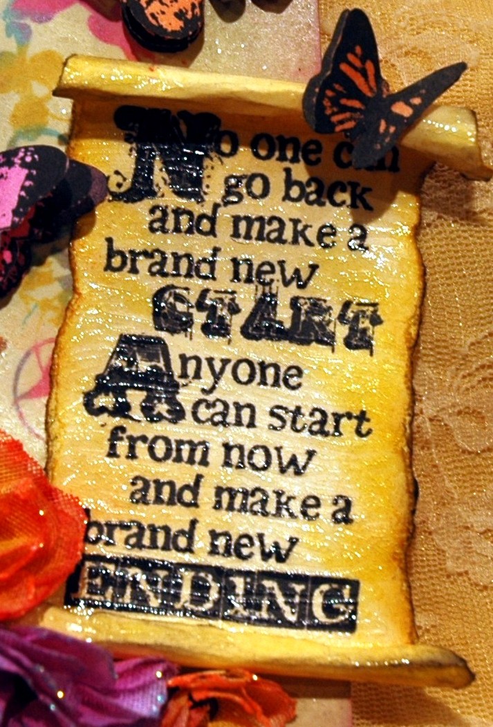
The scroll was made out of cream colored cardstock.  I stamped the sentiment from Tim Holtz' Fairytale Frenzy onto the cardstock.  Then I tore around all of the edges, leaving more cardstock at the stop and bottom so I could roll them inward.  I lightly distressed the perimeter of the scroll with Vintage Photo and touched the edges with Black Soot Distress Inks.  Next, I completely covered the scroll and the portions of the scroll that would show with Crackle Accents.   I love the aged, yet gleaming porcelain type of cracking that it produced.  I added the smaller multiple stamped butterfly to the top of the scroll as if she was delicately balancing herself on it. 


The multi-layered flowers adorning the lower portion of the tag were cut from crinoline using the middle flower from Tim Holtz' Tattered Flowers die.  I colored them using Magenta Hue and Monarch Orange inks.  I put them together using a small copper brad and garnished the edges of the flowers with Tropical Tangerine and Waterfall Stickles.  When dry, I attached them to the bottom of the tag along with a piece of white Hug Snug Seam tape that I colored that beautiful shade of teal using the Aquamarine Ink. 
Easy peasy...A TAG!

If you haven't already, I encourage you to visit the Design Team's amazing samples made just for YOU!  They are all unique...very creative and use all sorts of different elements.  Go to SIMON SAYS STAMP AND SHOW CHALLENGE and check them out.  Then, create your very special tag and link it to our blog.  You could be the winner of our generous sponsor's gift of a:


How's THAT for a nice prize just for entering our challenge if you're chosen as the randomly selected winner?  And...if your work is chosen by our Design Team as one of the TOP 3 entries, you will receive our coveted BLINKIE AWARD to proudly display on your blog!

Thanks for stopping by my blog.  I can't wait to see YOUR tag!

Thursday, June 2, 2011

DAILY JUNQUE IS COMING!!!

I just put the finishing touches on my new workshop featuring the Daily Junque collection from Pink Paislee.  It's a gatefold paper bag book made from the colorful and fun papers of the Daily Junque collection.   I showed it to my husband last night and when he opened it up, his eyes got big and he said, "Whoa!  There's a lot going on in here!"  He loved it and could not believe that it's made primarily with paper bags. 

The book is full of special motivational sentiments, vintage travel photos and tons of pockets to put all sorts of things including the wonderful Daily Junque Ephemera that is included in the workshop, your own pictures and memorabilia or journaling.

The Front Cover

The book is 8 1/2" closed and 18 1/2" when completely folded out.  
Here is just a small peek at the fun waiting inside.

These are just small sections from pieces of a couple of pages.  As you can see just from this sneak peek, there is a lot of "junque" in this book!!
The Back Cover is also unique and students will be able to duplicate this idea or use other stamps that will be available to them to make this book truly their own.

The Daily Junque Workshop will be at Scrapbook Generation in Springfield, Missouri on Monday, June 27th from 12 - 5.

Monday, May 30, 2011

IS IT POSSIBLE TO HAVE ONE FAVORITE STAMP?

The challenge for this week's Simon Says Stamp and Show is themed "Your Favorite Stamp".  I don't have just one.  How could I choose?  I love so many wonderful stamps from Tim Holtz, Wendy Vecchi, Hero Arts, Magenta, Invoke Arts...the list goes on and on.  TODAY; however, my favorite stamp(s) are "Tools For Art" by Wendy Vecchi.  So, that set inspired my challenge piece for this week.

I started with a plastic artist's palette and the cover page from Tim Holtz' Kraft Resist Paper Stash.  I loved all of the papers in this stash and couldn't decide on just one to cover my palette.  So, I decided to use the cover of the collection.  That way, I could incorporate several of the papers on my palette.

A little bit of this and a little bit of that and before long, I had gone from the plain white plastic palette to this ... 
I began by cutting another of the artists' palettes out of black chipboard to use as an offset background piece.  Then I covered the plastic palette with the cover page from the Kraft Resist Paper Stash Collection.  I inked around the edges with Black Soot Distress Ink.  
The pools of "paint" are various Color Wash colors.  I used 6 of Wendy's sentiments from various stamp sets and heat embossed them onto white cardstock using Clear Embossing Powder so that the words would really stand out among the "paint".  Then I sprayed each of the white pieces of embossed cardstock with random colors and wiped around the embossed words.  Next I cut random splotches from each to look like paint on a busy artist's palette.  
  I used the paint brush, the Speedball bottle and the Diamond Inks Stampine label from the "Tools For Art" stamp set.  I also used one of each of the bottles from Wendy Vecchi's Borders and Bottles Art Parts set.  The art parts fit perfectly under the stamps from Wendy's set. 
   
I stamped 6 paintbrushes onto kraft cardstock using Black Archival Ink.  I wanted the brushes to appear to have been dipped into the small pools of "paint" on the palette, so I heat embossed the corresponding color of "paint" to the ends of the brushes.  Those were done by using the corresponding colors of Adirondak Embossing Powders.  I then wrapped a piece of 1/4" silver Memory Metal Foil Tape around the brushes for added detail.  I arranged them in order onto a small brad and topped the brad with a little Wendy Vecchi flower stamped onto white cardstock sprayed with Butterscotch Color Wash.  I popped the brushes in place using black pop dots stacked three high underneath the brad. 
 
Next I stamped out one Speedball bottle and one Diamond Inks Stampine label onto the kraft cardstock.  I covered the smaller of the two bottles (the one that used the Diamond label) with the kraft resist paper and inked it with black ink.  Then I wiped off the ink to reveal the resist.  Very subtle but pretty cool.  I added a little top to the bottle out of black cardstock.  I added some detail to the bottles by using Crackle Accent on the Diamond Inks label and also all of the detail on the Speedball bottle.
My palette was fun ... but it needed something else.  It needed Wendy's flowers and leaves!!  So, I wiped Fired Brick, Broken China and Peeled Paint Distress Stains onto white cardstock to create the colors for the flowers and leaves.  I stamped polka dots and the grid pattern to accent the flowers and a subtle script on the larger leaves set.  The flowers are free standing by using green floral wire.  After I arranged my flowers and leaves the way I wanted them, I popped the two bottles in place.  
So, my favorite stamp (this week) is actually a conglomeration of Wendy Vecchi stamps all rolled into one creation inspired by "Tools For Art"....a fun and colorful artist's palette. 

Check out the SIMON SAYS STAMP AND SHOW CHALLENGE blog.  There you will find the Design Teams' favorite stamps and some really wonderfully creative, inspiring ideas that will encourage you to pull out your favorite stamp and get busy!  Create something wonderful and link it to our blog.  YOU could be the winner of our very generous sponsor's prize of a $50.00 credit voucher to be spent at Simon Says Stamp Store....THE place for all of your papercrafting and beyond needs!

Thanks for stopping by my blog!  I can't wait to see what you've created with YOUR favorite stamp!


Monday, May 23, 2011

STUDIO 490 ~ WENDY VECCHI STYLE !

Great Monday morning everybody!  It's time for a new SIMON SAYS STAMP AND SHOW CHALLENGE!  This week's challenge is based on the unique and unmistakeable style of Wendy Vecchi of Studio 490.


I decided to combine Wendy's wonderful Art Parts and some of her amazing stamps with a really cool Santos Cage Skirt/Jointed Paper Doll.  This is what I got....  I hope I "did you proud" Wendy! (smile)
 

The head of the doll is from Wendy's Residences Art Parts.  It is the smallest of the houses and is the one with the "picture window" in it.  I covered the house with 7 Gypsies Life Collage Tissue Paper, using Matte Multi Medium as my glue.  I have a really cool set of stamps from Invoke Arts called Block Faces.  I chose the eyes from one of those faces as the eyes for my doll.  Those are peeking out of the picture window.  Next, I cut a couple of butterflies from a sheet of Graphic 45's Botanicabella Collection.  I stacked them, glued the at the body only so that the wings could be more 3D.  Then I added them to the face.  Reminiscent of Silence of the Lambs...don't you think?  The "hair" aka "roof" of the head is colored with Black Archival Ink.  I made a layered tissue paper flower from the 7 Gypsies Life Collage paper.  I stamped it with the flower from the Dimensional Rose Art stamp set as the pattern.  I also used a smaller flower from Wendy's Ticket To Art stamp set as the center for this multi-layered flower.  I used an antique brass brad to put them all together and added a piece of black netting behind the tissue flower for extra interest.


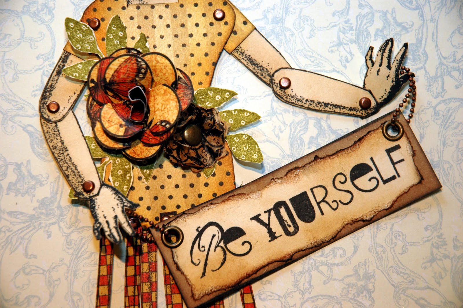
This is a jointed doll.  She was stamped out on cream cardstock using Black Archival Ink. I lightly distressed her using Vintage Photo Distress Ink.  She is put together using small antique copper brads.  The body of the doll was a piece of color on color stripe that I had.  I added the polka dots using Black Archival Ink and yet another of Wendy's wonderful stamps.  This time is was All About Art.  I think the polka dots add a lot and they are "vintage Wendy".  The flowers adorning the body of the doll are also from the same sets I used to make the layered tissue paper flowers on the head.  This time, I cut the larger dimensional rose out of the Graphic 45 Botanicabella paper.  The smaller flower is the 7 Gypsies tissue paper.  The leaves are stamped using Peeled Paint Distress Ink and are from Wendy's Nature's Art stamp set.  "Be Yourself" (don't you LOVE that?) is stamped using Black Archival Ink onto cream cardstock.  I distressed it with Vintage Photo Distress Ink and edged it in Black Soot Distress Ink.  I then glued it onto a piece of kraft paper and edged it with Black Soot Distress Ink.  I added the antique copper eyelets and a small ball chain to "Be Yourself" so that my doll could be holding that sentiment.  Be Yourself can be found on Wendy's very hot A Form of Art stamp set.


The skirt for the doll was cut from one of the papers from Graphic 45's Le Cirque Collection.  The actual skirt is in several pieces on the stamp and is put together with antique copper brads.  The sentiment "Every accomplishment starts with the decision to try" is also part of Wendy's A Form of Art stamp set.  I edged everything with a black cats eye ink pad.

Now, I encourage you to visit our site at SIMON SAYS STAMP AND SHOW CHALLENGE.  The design team has some outrageously creative samples to share with you.  Just amazing stuff!!!  Then it's your turn to create and share!  Post your entry to our blog and YOU could win a $50.00 credit voucher from our ever so generous sponsor.  
And....if your work is considered to be among the TOP 3 entries for the week, you will receive our coveted Blinkie to proudly display on your blog!

Enjoy your week and I can't wait to see YOUR Wendy style! 


Sunday, May 22, 2011

DIAMONDS AND PEARLS

So, I was getting caught up on reading blogs early this afternoon.  I happened on my good friend, "Airport Girl" and Ranger U Sister;  the lurvely and multi-talented Hels Sheridan's blog.  She does something every Sunday called the SUNDAY STAMPER CHALLENGE. You have GOT to check this out!!!  This week the challenge is themed "Diamonds and Pearls".  So THAT caught my attention.  I played around this afternoon and made this tag.
Guess I was feeling all "girly" today with this theme.  I thought of Marilyn Monroe and her famous song "Diamonds Are A Girl's Best Friend". 

The background was done using Claudine Hellmuth's layered (text) paper technique.  Simply layer text onto a tag using Matte Multi Medium and let it dry.  Then burnish pieces of masking tape onto the paper and pull it off.  This creates a really interesting background texture.

Next I used Claudine's Studio pink, white and teal paints to create my background.  I also brushed a little Iridescent Medium over the top to create that wonderful pearlized effect. 

I typed "Diamonds Are A Girls Best Friend" on my computer, sized it to fit, transposed it and did a transfer technique to apply it to my tag.  To do the transfer technique, I printed out the words onto a piece of inexpensive copy paper (on my inkjet printer).  Next I brushed it generously with Matte Multi Medium and pressed it down onto the tag.  I lightly burnished it onto the tag and let it dry for several hours.  Then I sprayed the paper with water and rubbed off all of the white copy paper, leaving only the transferred phrase showing. 

I added a couple of stamped Wendy Vecchi flourishes and a decorative pink pearl strip.  Marilyn is printed out on semi gloss photo paper and glued onto the tag.  Isn't she amazing??  I added some "diamonds" around her neck from some vintage diamond trim I found at a flea market.  She needed some "bling" around her neck!  In the picture, she has a white feather boa around her shoulders.  I loved that idea but decided that pink was more her color for this tag!
  
Finally, I added pink and black ribbon and I made my own little jeweled embellishments to hang from the ribbon using pink pearls and fire polished Swarovski crystals.  So there you have it...my rendition of "DIAMONDS AND PEARLS".

Wednesday, May 18, 2011

GRUNGY MONDAY 07

Time for another Grungy Monday challenge!  Check out my "Airport Girl" buddy Linda Ledbetter's  Studio L3 site to see more about the Grungy Monday Challenges.  They are fun!
Check out Ranger's Blog for this week's challenge technique... TIM HOLTZ' INK COLOR BLOCKING.

I chose to go with several different Distress Ink colors:  Barn Door, Peeled Paint, Mustard Seed and Wild Honey to create my block background.  After doing that, it looked like an old farmhouse tablecloth to me.  So, I pulled out my Oxford Impressions Country Girl Stamp Set and used it to create the images for this tag.  OXFORD IMPRESSIONS has beautiful stamps!  You need to check them out.
First I heat embossed "chicken wire" to the background using silver embossing powder.  Then I stamped the vintage picture, left a little cardstock edge, distressed it and added black photo corners.
I used an antique gold bottle cap as the background for the Grade B label.  This also added more dimension to the tag.  I used Crackle Accents on the label.  I double stamped all of the little sunflowers with Mustard Seed and lightly edged them with a black cats eye to pick up the black brad center.  I fringe cut the top sunflower and left the one underneath flat.  I added a little piece of green leaf trim up the side of the tag and glued all the flowers into place.
Next I added the "nest" at the bottom of the tag by hot gluing some brown excelsior grass down.  I then added three little eggs, a few feathers and it was finished!  I added the stamped image of the little girl behind the nest.  Finally, I stamped the sentiment "The beginnings of all things are small", tore the edges, distressed it and popped it into place using two silver brads.  
Hope you're having a really fun week! 

Monday, May 16, 2011

AN OLD WIVES' TALE

Hello Everyone and Happy Monday!  

I have got to say that our last challenge was so much fun and even with the Blogger mess, we had the best participation since the SIMON SAYS STAMP AND SHOW CHALLENGE began!  Over 300!!!!  So...a huge THANK YOU to everyone who joined in the fun of creating "Anything Goes" last week!  There were some AMAZING entries...just totally blew me away!  It's so much fun to be everyone's interpretation of the same theme...we had everything from cards to altered clocks!  You guys are so inspiring!!!


Are you ready for this weeks challenge?  It's .... AN OLD WIVES' TALE!

When I saw this theme, I immediately was 5 or 6 years old again, hearing my Mother tell me not to cross my eyes.  Why do kids do that?  Anyway...can you finish this old wives' tale?

That's right....Don't cross your eyes!  They will stick like that!  

I started this project with a 5x7 stretch canvas that I coated with Claudine Hellmuth's Matte Multi Medium.  Next I created an interesting background (also taught by Claudine Hellmuth) by applying Matte Multi Medium to text pages out of an old book and letting them dry.  Once dry, I took several pieces of masking tape and attached and burnished them to the text in various places. Then I pulled off the tape, creating layers of texture and text.  Next I used Claudine's Studio Dab of Yellow and Classic Teal paints to create a vibrant background that went from bright yellow and teal to blended green tones.

After that dried, I used the Matte Multi Medium to create a haunting transfer of a man's face from a black and white inkjet printed image.  Then I stamped a vintage eye chart on the right side of the canvas from Tim Holtz' Oddities Stamp Set.  

Next I dusted a combination of Perfect Copper Perfect Pearls and a touch of Blue Patina Perfect Pearls to create that special little shimmer.  

I found the vintage image of the cross eyed boy, sized him, printed him on semi gloss photo paper and cut him out.  I inked his edges with Chestnut Roan and Black Sepia cats eye ink pads.  Then I glued him in place. 

Finally, I decided to add two optical lenses to the canvas to look resemble glasses on the haunting man's face.  I thought they were the perfect touch.  Then I typed and sized "DON'T CROSS YOUR EYES...THEY WILL STICK LIKE THAT" on my computer using "Vintage Typewriter" as my font.  I cut the words out separately, inked around the edges of each and glued them in place.

So there you have it...my take on an "Old Wives' Tale"!  

Now go to Simon Says Stamp and Show Challenge and check out the amazing samples and projects that my very talented and creative Design Teammates have for you.  Then get your creative juices flowing and bring your favorite old wives' tale to life!  Post it to our blog. 

YOU could be the lucky winner of our generous sponsor's gift of a $50.00 credit voucher to Simon Says Stamp!  If your creation is chosen as one of the TOP 3...you will be awarded with our coveted BLINKIE to proudly display on your blog!  So, what are you waiting for?

Also...did you SEE Tim Holtz' new lines of finished goods he introduced last weekend in New York?  They are called DISTRICT MARKET.  If you've not seen them, hop over to his blog and check them out.  They are really cool and I'm quite sure I'll be owning them as soon as they hit the market!  After all, it IS TIM!!!


Saturday, May 14, 2011

THE BUTTERFLY BOOK IS COMING !!

Hello!  It's a dreary Saturday here in Springfield, Missouri.  I think Spring has Sprung and we're skipping Summer and going right back into Fall!  It's a good day to be in my studio messing around with inks and stamps.
 
I promised the gals taking my Butterfly Garden Book Workshop at Scrapbook Generation on Monday, May 23rd from 12 to 5, that I would post a supply list for them to bring.

So...for those ladies...here's the supply list ... and here's also another peek at some of the work we'll be doing.
(Front and Back Covers of the Book)
 
Craft Mat, Sanding Block, Glue – liquid or Matte Gel Medium (and a foam brush), Hot Glue Gun and Glue Sticks, Brayer, Pencil, Scissors, Paper Trimmer, Ruler, Chestnut Roan Cat’s Eye Ink Pad, Pop Dots, Glossy Accents, 1/8” & ¼” Double Sided Tape, Distress Inks – Vintage Photo, Walnut Stain, Black Soot, Victorian Velvet and Applicator Tools, Bone Folder, Heat Tool, Exacto Knife and cutting mat

(One Set of Inside Pages From the Book)
As always, if you don't have something on the list above, I will have my "stash" and you're welcome to use it. 

I love this book and am really excited to teach it.  There are lots of pockets and pieces, pull outs and interactive elements to this vintage chipboard book.  We should have a lot of fun venturing into the world of the butterfly!
Have a wonderfully creative weekend everyone!