ANYTHING GOES!!! That is the theme of $imon $ays $tamp and $how Challenge this week! I encourage you to check out the challenge blog and see what wonderfully unique and creative projects the Design Team has put together for you! If seeing those wonderful examples doesn't get your creative juices flowing...nothing will!!
And ... if you are the lucky winner of our random drawing, YOU will be rewarded with a $50.00 credit voucher that you can $pend to your heart's de$ire at our generous sponsor's store...

If you are chosen by our team to have (in our humble opinions) the best projects for this week's challenge, you will receive our coveted Top 3 Blinkie Award to post on your blog.
How is THAT for motivation????
Okay....ANYTHING GOES...so.......HERE GOES...........
I decided to try some of the amazing techniques I learned at Ranger U using various mediums on ATC size cardstock. But then what to do with them?
And ... if you are the lucky winner of our random drawing, YOU will be rewarded with a $50.00 credit voucher that you can $pend to your heart's de$ire at our generous sponsor's store...
If you are chosen by our team to have (in our humble opinions) the best projects for this week's challenge, you will receive our coveted Top 3 Blinkie Award to post on your blog.
How is THAT for motivation????
Okay....ANYTHING GOES...so.......HERE GOES...........
I decided to try some of the amazing techniques I learned at Ranger U using various mediums on ATC size cardstock. But then what to do with them?

The perfect solution!!! I made a wall collage using a black 7 Gypsies Printer Tray. Each compartment houses a different technique using various Ranger products including Distress Inks, Alcohol Inks, Color Washes, Distress Stains and Paint Dabbers. After doing the techniques for the backgrounds, I ink stamped, water stamped, heat embossed, dry embossed and tinted them to best showcase the background technique.

For example, this section of the printer tray is an example of industrial grunge on Tim Holtz' Gadget Gears die cut. The background is Tim Holtz' Bricked Texture Fade folder colored with Fired Brick, Vintage Photo and edged with Black Soot. Then I smeared Rock Candy Stickles over portions of the brick for a bit of a glisten-y look. It is finished out with some of Tim's Sprockets Gears, Game Spinners and a Word Stick.


This compartment is an example of a shabby chic background. I placed the largest wings from the Regal Adornments over the top of the compartment to resemble a roof top. I put a little Juniper paint from a Paint Dabber on my finger and brushed it over the wings to give them a patina look. I thought the wings complimented the shabby chic background. Finally, I added a Tim Holtz Pen Nib and a Fractured Doll.

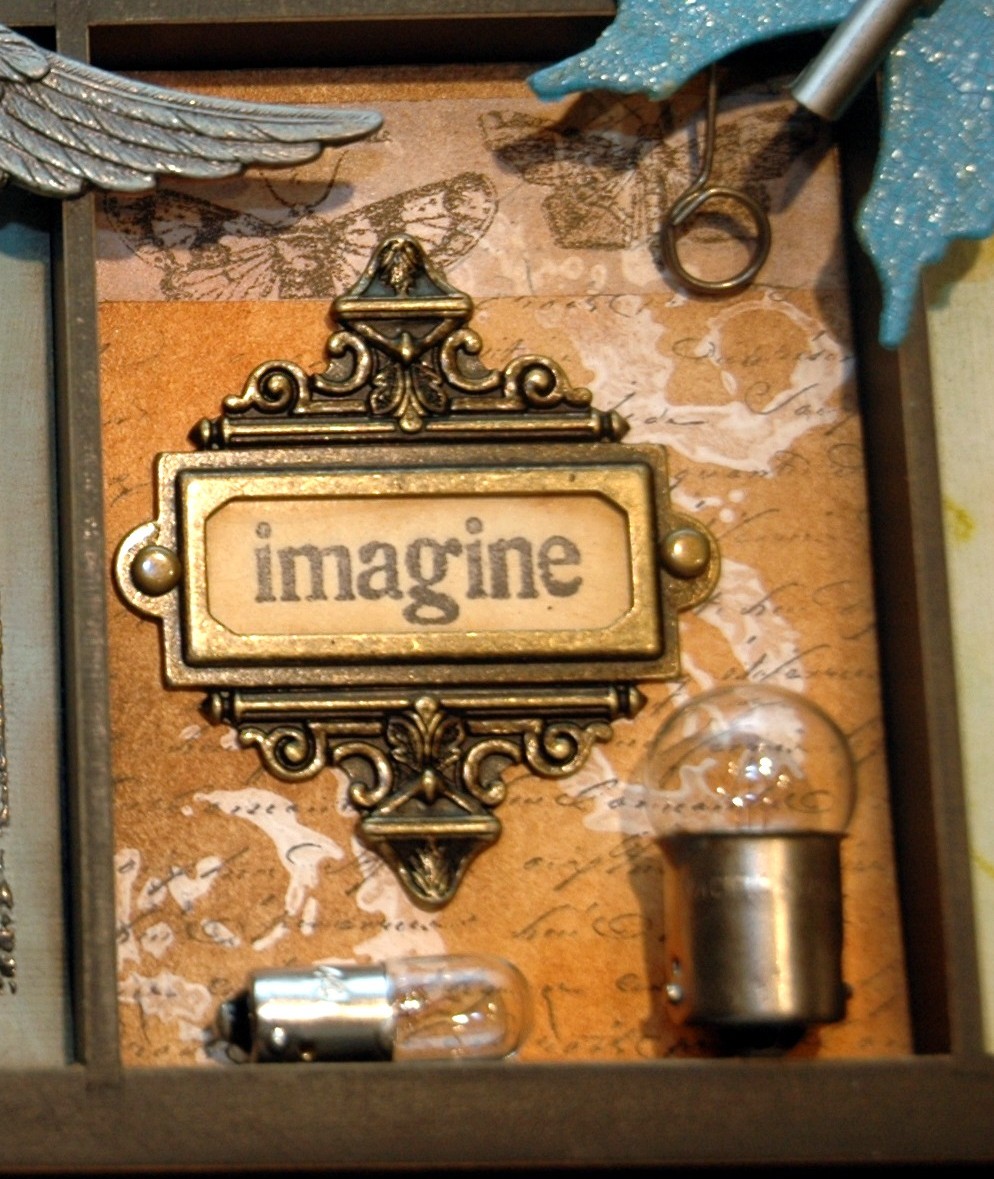
This compartment is an example of a resist technique using a Snow Cap Paint Dabber to resist the Distress Inks. I dabbed the paint right on to the stamp and stamped the image on the cardstock. Let it dry or heat tool it dry. Then I blended the Distress Ink colors over the entire ATC sized cardstock. I used a damp paper towel and wiped the ink off of the stamped image, revealing the white design. I then lightly swiped Black Archival Ink over a script stamp and stamped over the entire background. I finished out this compartment with some Sketchbook Tissue Tape, a Memo Pin, an Ornate Plate and a couple of Tim Holtz Light Bulbs.

This compartment is an example of a stamped water color background with faux porcelain flowers adorning the lower corner. These were done by dipping paper flowers and leaves into hot Clear UTEE, removing all the drips and then arranging them in place. The Butterfly overhead is done with Grungeboard wings painted with Broken China Distress Crackle Paint, smeared with Rock Candy Stickles and then distressed with Vintage Photo Distress Ink. The butterfly's body is another one of Tim's Pen Nibs.

In this compartment, the dress form was heat embossed with Distress Black Soot Embossing Powder and then finished out using gathered tulle and Maya Road flowers colored with Fired Brick Distress Stain. A Tim Holtz Hanger Clip is hanging on a Hitch Fastener. It is holding a stamped image of a book of needles from Tim Holtz' Haberdashery Stamp Set.
 Next to the dress form compartment is an example of a Rusted Enamel background. This compartment is adorned with a Steampunk cuckoo clock I made form various Ideaology pieces and link chain. The stamped images are from Tim's Steampunk Stamp Set.
 The vintage picture of the little boy and girl was printed out on semi gloss photo paper and tinted using Stormy Sky and Victorian Velvet Distress Inks. I tinted one half of the photo so you can see the dramatic difference the tinting makes. Three pink faux procelain roses are sweetly sitting on the ledge in a small vial from Tim Holtz' Corked Vials.
 What is a sampler without Tim's famous Umbrella Man? He was stamped using black ink on Grungeboard and then lightly sprinkled with Black Sparkle Embossing Powder and a touch of regular black embossing powder. The background is an example of Distress Wrinkle Free Scribble Stain.
 The JOURNEY and butterfly compartment is an example of faux batik on white mulberry paper backed with white Glossy Paper. The design was stamped with Clear Embossing Powder and heat embossed. Then I sprayed various Color Wash colors to create that wonderful blended batik look. I placed the mulberry paper between a folded piece of newsprint and ironed it to remove the melted clear embossing powder. Thus, the faux batik look! The little birdcage is a Prima piece and the pink rose attached to the birdcage is another faux porcelain piece.
 This is an example of a different faux batik background done with embossing powders and inks rather than clear embossing powder and Color Wash. The metal 1/2 number is a faux porcelain technique. The Memory Frame was done by pouring hot light green tinted UTEE over the picture of the tree in the frame. Then I added some "glitz" to the frame. I finished it off with some Tim Holtz metal Foliage.
 The Alcohol Ink compartment was done with various colors of Alcohol Inks dripped directly or tapped onto a piece of silver Foil Tape Sheet that was embossed with Tim's Patchwork Texture Fade. I then alcohol inked some Fragments, backed them with white Glossy Paper and popped them in various places on this compartment. I also made a second portion of weathered clock part of the texture fade and popped it on top of the original; for more depth and interest.
 The last compartment is an example of Wrinkle Free Distress that is merely stamped with "LIFE IS THE ART OF DRAWING WITHOUT AN ERASER". I love that saying and thought it needed no embellishing other than coloring in the heart with a Red Pepper Adirondak Pigment Pen. Sometimes less is more.
I really love the way this wall collage sampler turned out! It will be a great addition to the wall in my studio and a wonderful remembrance of my time at Ranger U.
I can't wait to see what you've been inspired to create and post on Simon Says Stamp And Show's challenge this week!! Have fun with it and remember...ANYTHING GOES!


