Are you ready for a trip to France? Well, not literally, but creatively speaking.
Astrid MacLean is hosting our creative endeavor this week. It is "A Little Bit French".
This can have so many interpretations ... "Oui"? I invite you to pull out your creative passport and join in on the fun over at A Vintage Journey. The Creative Guides have some gorgeous projects waiting for you there.
Have you ever created something only to have someone say, "that's beautiful but what are you going to do with it?" Being more of a mixed media artist, I get that question a lot more than probably someone who is primarily a card maker or a scrapbooker. Their art has an obvious purpose.
But sometimes, don't you just feel like creating something purely for the artistic value and it doesn't necessarily have to have a purpose? I hope that I'm not the only one who feels that way from time to time.
But I also like to create things that do have a specific purpose; usually a home decor piece. Today, I took the "A Little Bit French" challenge and created this ....

a French shabby chic kleenex box cover. I'd never made one and thought it might be a fun thing to do.
Anyone can do this. You just need to measure the sizes of your kleenex box and increase the numbers just a little bit before you cut your chipboard, so that your creation can easily slide over the kleenex box. In this case, my kleenex box sides measured not quite 4 1/2" wide and approximately 5 1/4" tall.

So, I cut 4 sides out of chipboard that measured 4 3/4" wide x 5 1/2" tall. The top is 4 3/4" square and I die cut the oval in the center using the medium sized oval from Tim Holtz' Sized Ovals die cut.

I created "structure strips" out of kraft cardstock cut into 1" strips then scored down the center at the 1/2" mark. Next add a piece of doubled sided tape (in this case I used 1/4" Scor Tape) on either side.

Then you basically make a box without a bottom on it. To do this, begin with your center section and adhere one of the structure strips cut to a 5 1/2" length to the outer edge of the chipboard. Then line up a side piece (it doesn't matter which one is first) at a 90 degree angle and attach the side to your center with the Scor Tape. You will repeat this for all sides of the box. But before completing the square box, add the top of your box to what will be the front or back using the structure strips and attaching it in the same manner. Then complete the box. At this point, all of the structure strips will be on the INSIDE of the box.

Apply more structure strips on the OUTSIDE of the box for more support. Cut each strip to fit the length of the joint and attach in place. Do the sides of the box first and then the top. Now you are ready to cover your box.

Since this is a French themed challenge, I immediately thought of Tim Holtz' French Industrial Paper Stash. I cut these papers from the section that has the 6"x6" squares. I cut them to fit my 4 3/4" x 5 1/2" chipboard sides. Before attaching them to the sides of my box, I wanted to shabby chic them up a bit.

First I added some of Wendy Vecchi's Crackle Texture Paste through Tim Holtz' Harlequin Stencil. I absolutely love this stencil for a french theme and also the Crackle Paste. It's creamy, easy to work with and you get great crackled results!
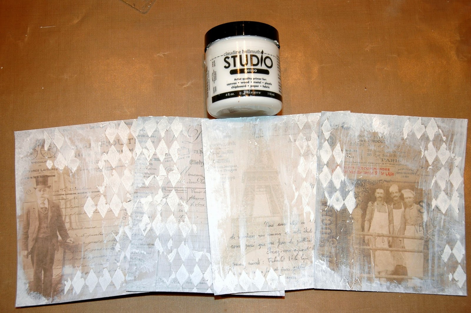
When that was dry, I lightly brushed some white Gesso over the papers. Be careful to not cover up your images too much with the Gesso. It's fairly opaque if you brush it on fairly heavy. Then heat set it.
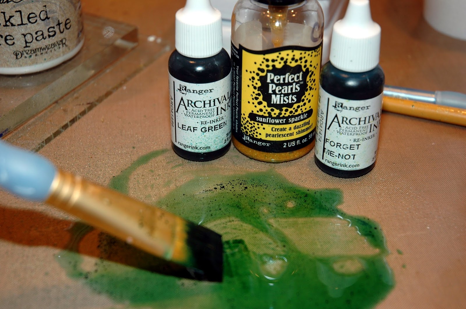
Time to experiment! I wanted to add color to my sides; a teal-ish color because I LOVE teal. But I wanted to do it in an unconventional manner. Experimenting is so much fun and sometimes you stumble onto the coolest things! So, on my Non Stick Craft Sheet, I mixed some of Wendy Vecchi's new Archival Ink Reinker colors; Leaf Green and Forget Me Not. (These are permanent inks and once they are dry, they will not react with water). And I added a little water to dilute the ink down and added a spritz of Sunflower Sparkle Perfect Pearls Mist.

The color was just a tad too green for me, so I softened it with Peacock Feathers Distress Ink and "Oooh La La" ... I love the teal-ish tone that I got!

The absolute coolest thing happened when I started adding my brown tones. First (not pictured) I used my Ink Blending Tool and began adding Gathered Twigs Distress Ink to pull in the brown from the paper still showing underneath. Then the magic happened!! I used a make up sponge and started adding Wendy Vecchi's Potting Soil Archival Ink to darken the harlequin pattern and then began randomly adding it to the paper. I guess it was the Sunflower Sparkle that was in the teal-ish wash that I created; but when I started rubbing the Potting Soil ink over the colored paper, it started looking like a tarnished brass finish. The coolest thing ever! You really need to try that! It's AMAZING!

Next I added some Black Soot Distress Ink using a small eye shadow sponge just to the raised harlequins and a touch around the edges of the paper. That really added a lot of definition to the papers.

Here's a trick for adding stamped images to surfaces that are not flat ... I stamped some "french" images from Tim Holtz' stamp sets; Paris Memoir, Papillon, Mini Classics, Attic Treasures and Paris To London onto white tissue paper using Jet Black Archival. I heat set the image and then tore out around them. Then I lightly brush Matte Multi Medium over the area I was going to apply the stamped image. I laid the stamped tissue paper in place. Then lightly brushed more Matte Multi Medium over the top. The tissue just "melts" into the background. I actually lightly brushed over the entire paper with the Matte Multi Medium and let it dry. Once dry, I added highlights to some of the images using a spritz of Sunflower Sparkle on my Non Stick Craft Mat and a Detailer Water Brush. In the photo above, you can see the stamped images and also the subtle golden highlights. I also used the eye shadow applicator to add some Florentine Treasure Gold Guilding Wax to the raised harlequins and randomly along the edges of the papers.

Once all four sides had the stamped additions to them, it was time to attach them to the chipboard sides. I did that with 1/2" Scor Tape. When all of the side papers were in place, I added Tim's Tissue Tape to cover the edges. Then I inked the tape first with Peacock Feathers followed by Potting Soil and finally some random swipes of Florentine Treasure Gold.
I created the top for the box in the same manner that I did on the sides. I Tissue Taped the edges and it was time to finish embellishing each side.

Side One ~ I added Tim's Ribbon Flags cut out of scrap paper from the French Industrial Paper Stash. I distressed the banner with Picked Raspberry Distress Ink and a touch of black on the edges. Then I stamped "REVE" which is the French word for "DREAM". I then brushed Rock Candy Distress Crackle Paint on top and let it dry. I gently pounced the banners with Gathered Twigs and glued them to a piece of black cording that I draped across the top. I added two small Ideaology Fleur De Lis (with their charm tops clipped off) from Tim's Adornments to cover the ends. Finally, I altered the two silver Pen Nibs with Gold Paint Dabber, some Florentine Treasure Gold and a little black acrylic paint to represent dried ink and glued them in place.

Side 2 ~ I added Tim's Plaquette that I distressed with Potting Soil Archival Ink. Then I die cut the flowers from Tim's Tattered Flower Garland from more scraps from the paper stash.

I distressed the leaves with Evergreen Bough and Gathered Twigs Distress Inks. The flowers were distressed with Picked Raspberry and Mustard Seed. Then all were brushed with Rock Candy Distress Crackle Paint and left to dry. After drying, I edged all of them in black. I added a piece of vintage tulle behind the flowers and leaves and glued them in place.

Side 3 ~ I added the Prima resin picture frame that I had distressed with black acrylic paint then a Gold Paint Dabber and a touch of Juniper (greenish) Paint Dabber (for a patina look) and a touch of Florentine Treasure Gold. The metal crown at the bottom is from Tim's Regal Adornments It originally was a pewter color but was altered with Green Amber Treasure Gold, a touch of Silver Treasure Gold and Florentine Treasure Gold. The decorative metal piece at the top was a little "treasure" in my stash of stuff.

Side 4 ~ I added Tim's Ornate Plate with a computer generated "AMOUR" which in French means, Love.

Once again, here is my finished very vintage/shabby French kleenex box cover!
"Je pense que c'est très joli. Aimez-vous?"
English Translation: "I think it is very pretty. Do you love it?"
I'm glad that your vintage journey led you here today! I hope you will join us at
A Vintage Journey with your own "A Little Bit French" creation. You could be the lucky winner of our generous sponsor's £10 gift voucher at

Have a wonderfully crafty day and enjoy YOUR vintage journey!

