Sunday, July 15, 2012

GRAPHIC 45's ABC PRIMER ALBUM

It's time for another "ANYTHING GOES" week over at Simon Says Stamp and Show.  Hop on over and check out the really cool and unique projects that my Design Teammates have created for you.

Since this is an "Anything Goes" week, I decided to make an album to display my grand children's school pictures.  Even though they are not even in Kindergarten yet, they still have pictures made at their preschools.

Front cover of my album 

You probably know by now that I love all things vintage.  So, I ask this question....is there any paper more perfect for creating a childhood school album that Graphic 45's ABC Primer papers?  I bought both the 12x12 and the 8x8 pads to do this project.  I also used a couple of papers from Graphic 45's Playtimes Past and Communique collection.  Graphic 45 papers seem to always coordinate with most of their collections from year to year.


This is a thick album with TONS of pull ups, pop outs, pockets and pages.  The pattern is The "Glam Girl" Album from Kathy Orta of Paper Phenomenon.  Here is a picture of the outside covers of the album.  The chipboard spine in the center measures 3 1/4" across.  The chipboard covers are 8" tall x 6" wide.  So, you can see that this is a substantial album.  I love it!

  
In this picture, you can see the inside covers and the inside pages that are attached using a hidden hinge system.  There are 6 interactive pages.  Each page has a different pattern for pops, pull outs and pockets.  I created the entire basic book out of Kraft Cardstock.  Then I distressed all of the corners, creases, pages and pull outs using Gathered Twig Distress Ink followed with a touch of Black Soot Distress Ink.  Once that was complete, I began covering each piece with the images from the Graphic 45 papers.  This took a lot of time but the end results are worth it! 

Most of the gluing was done with 1/4" Double Sided Scor Tape.  I LOVE this stuff!!!  The backing comes off so easily!  It's easy to work with; not as messy as liquid glue or glue sticks.  It's quick, easy and always dry!  I inked all of my edges of my matted pieces of paper with a Black or Chestnut Roan Cats Eye Ink Pad to give them more of a vintage feeling.
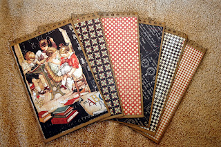
   
Here are all of the inserts that fit in the top slots of the 6 pages.  They are matted on both sides.  I punched the top edge of the inserts with an EK Success Binding Edge Punch for added detail.  


Here is a closer up picture of the first page.  You can see the flip up that is in the red polka dot.  Underneath it is a pocket.  You can mat photographs on these pages and then stick little memoirs inside of the pocket. The top flap (in red polka dot) also houses a slit in the side that is holding a tabbed insert made out of kraft paper.  This will be great for either adding more pictures or for journaling. 


Flip over to the next page and you will see this.  On this photograph, the flap on the right hand side is down. 


This is the same page as above but the flap is pulled up and opened out to extend the page even further. There is a big pocket in the center.  The other pages are perfect for matting photographs.  See what I mean about this album being so interactive and loaded with all sorts of pockets and pull outs?


On this set of inside pages, the flash cards on the left are also a pocket.  And the graphic of the girl on the right is also a large pocket.  Behind the pocket on the right is a hidden pocket with a tabbed insert peeking out.


More inside pages.  On the left...just a page to mount a photograph on.  The page on the far right is actually a folded out and flipped up extension of the right side page.  There is a pocket at the bottom of the far right.  In the center, the ruler is right at the top of a pocket that is decorated by images from the Graphic 45 Playtimes Past collection.  I love how those papers work so well with the ABC Primer papers.


Still another set of pages.  This time, the left side of the page is folded out to reveal the "ABCD" panel.  There are two pockets on the other side of this fold out.  The little boy on the right side is actually the top of a flap that is attached to a pocket underneath it.


As you can see, this is a really wonderful book; full of all sorts of interactive features.  I think that it one of the reasons I love it so much!  As my family is looking at all of the pictures that will someday cover this book, they will be surprised to find all sort of little pockets and pull ups hiding little "treasures" and journaled memories.

Now it's YOUR turn to create anything your heart desires and post it to our challenge.  You could be the winner of Simon Says Stamp's


This is drawn randomly each week.  We also pick the TOP THREE entries for the week for special recognition.  This is quite special as we have some wonderfully talented artists that play our challenge each week!  


So, get your creative juices flowing and let's see what you come up with!


Sunday, July 8, 2012

SIMON SAYS SHOW MORE THAN ONE LAYER

Don't you just LOVE Mondays so you can see what Simon Says Stamp and Show has for your challenge this week?  Well...without further adieu ... this week is all about layers.  

Last week I focused on Dyan Reaveley and her wonderful Dylusions line of products.  This week ... I chose to focus on someone who I think is a creative genius.  I totally love his products.  From his die cuts to his stamps and every piece of Ideaology and ink colors in between; I admire and respect the creative vision of TIM HOLTZ.  

I had a bit of a dilemma because I've been dying to try out my new Tim Holtz In The Bag die cut.  But, I could not load it up with a bunch of layers of "stuff" because it would fall over.  But, I R-E-A-L-L-Y wanted to use the die cut!  So ... I decided to make my layers out of things like inks, markers and stamping rather than lots of dimensional elements.

   Front view

So, this is what I ended up with ... a really cute little paper bag that is the perfect size to hold ATCs among other small things.  The finished size of this bag is 3x4 and approximately 3/4" deep.  The size is so stinkin' cute!

I started out using a piece of paper from Tim Holtz' Kraft Resist Paper Stash.  It was the perfect base for creating more and more layers.


Here is just the basic paper bag cut from the die cut...folds are already scored for you.  LOVE IT!

I used Broken China and Wild Honey Distress Inks as my background colors to create my first layer.  Next, I wiped off the excess ink, exposing the resist pattern that is already printed on the paper pad.  How is THAT for a cool texture and layer?  Next I added another subtle layer by spraying Blue Patina Perfect Pearls Mist over the bag.  It adds a subtle shimmer to the surface and gives it a beautiful iridescent quality.Then I ran a black cats eye ink pad along the score lines and edges to make them pop.  It's much easier to create your design for your paper bag while it is still flat ... so that is what I did.

   Background before and after other layers have been added.

Ready for my next layer!  I pulled out my Tim Holtz Stamps and gathered up a few of them that I wanted to use to begin buuilding the background.  His Ultimate Grunge stamp set has so many wonderful little background snippets on it.  I used three images off of it .. .the random polka dot, the checkerboard and the mesh.  They are all stamped using Jet Black Archival Ink.  Instead of placing them on an acrylic block, I just held the the stamp in my fingers and randomly rolled it onto the paper bag to pick up portions of the design, not all of it.


When I was happy with the background, I worked on each side.  This is the front of the paper bag.  I used more of Tim's amazing stamps to create my design.  The optical glasses are from his The Countdown stamp set.  Next I stamped the man with the funky birdcage hat onto a piece of manila cardstock.  That image is from Tim's Pen and Pencil stamp set.  I colorized him using several Distress Markers:  Antique Linen, Tumbled Glass, Tea Dye, Worn Lipstick, Tattered Rose, Spiced Marmalade and a touch of Picket Fence.  I cut him out and lined the edges of the paper using the Black Soot Distress Marker.  Then I stamped the image right onto the paper bag front because I wanted the black squiggly lines on either side of the man to appear on the bag.  Then I cut out the man I had stamped and colored and glued him right on top of the stamped image on the bag.  On top of the checkerboard pattern, I heat embossed "POST CARD" from Tim's Postcards stamp set out of Copper Embossing Powder.  I also added a Mini Gear in the middle of one of the optic lenses.  I can't stand to not have metal SOMEWHERE no a project! (smile)  


Here is a closeup of the backside of the paper tag.  I'm sure you recognize Tim's steampunk gentlemen.  I used the smaller version of them from his Warehouse District stamp set.  They are stamped on manila cardstock and colored with Distress Markers then cut out and glued on top of the distressed and gathered doily.  The hot air balloon behind the gentlemen is from Oxford Impressions.  It was the perfect size for this little bag.  It was also stamped on manila cardstock and colored using Broken China and Barn Door Distress Inks and then Distress Markers of the same colors to shade and blend.  Then I heat embossed "Let Yourself Fly" on top of the balloon, creating yet another layer.  I glued them all together and the bag now looked like this ...

  
The last step was to fold the paper bag into it's shape and place the back end over the piece of double sided tape.  Then you just work the bottom tab into the slot that is made for it and it's all done!  Just one piece of tape connects the whole thing!

 Front of the finished bag.

 Back of the finished bag.


Finally, to really add a little bit of dimension and "glitz", I added one more layer to the front and back.  I added some squiggles of Glossy Accents to the left of my steampunk gentleman on the front, just to the left of his shoulder and also at the opposite top corner.  Then I sprinkled some crushed Tea Stained Mica Fragments over them.  On the back, I did the same thing, to the upper left side and the lower right corner of the bag.  I had never used that stuff before but I LOVE it! The picture really doens't pick up the cool texture and shine the mica flakes create.


Layers, layers and more layers ... but very little dimension! Now it's time for you to have a go at layering!


Post your entry to our challenge at Simon Says Stamp and Show.  You could be the winner of our  wonderfully generous weekly prize ....


You might also be honored as one of our TOP THREE artists for the week! 


I can't wait to see you creations!!!  Good luck!


THREE ADORABLE ATCs

Happy Sunday everybody!

I received some adorable ATCs from a recent "New Members Swap" at through my Yahoo VPI Group.  I wanted to share them with you...


Our theme was completely open ... so they could be about ANYTHING! I love them!

Thanks to April Dudko for hosting the event.  Her beautiful card is the one on the far left.  The center vintage card was made my Mandy Chilvers and the adorable card on the right was created by Jan Larson. I am so lucky to be a part of such a wonderful and talented group of artists who inspire me through their incredible ATCs.

Have a great rest of your Sunday, everybody!  I hope you've had some time to get inky this weekend!  Remember to take time to play!  It's SOUL FOOD!

Sunday, July 1, 2012

SIMON SAYS SHOW SOME SPRITZ; SPRAYS OR STENCILS

What glorious fun ... the Three S's!  This week's Simon Says Stamp and Show Challenge is all about creating with Spritz, Sprays or Stencils!  Whether it be an art journal page, a tag, a background for a card...whatever your heart desires...as long as it's involving spritzing, spraying or stenciling.

Yikes!!!  Back to the "out of my comfort zone"...bright color and an art journaling style.  But, you know what...that is one of the things I love about challenges.  They challenge you to step outside of that comfort zone and experiment.  And THAT is usually where a lot of really cool things are "born".  So....here I go, diving into the world of art journaling.  It's like a Forrest Gump's box of chocolates ... you never know what you're gonna get!

I absolutely adore Dyan Reaveley's Dylusions line from Ranger.  She is quite a colorful character and her personality definitely carries over into her products.  Her Dylusions Sprays are bright and fun.  Her Stamp Sets are quirky, original pieces of magic.  Her Stencils are great complimentary pieces for her sprays and stamps.


I have created two art journal pages using pretty much everything Dylusional!  The right side, I have purposely left unfinished.  I'm not quite sure what I'm going to do with it yet and I wanted you to be able to see a completed page as opposed to one still in progress.


The left page colorful background was achieved with sprays, Claudine Hellmuth's White Gesso, and Sunflower Sparkle Perfect Pearls Mist.  The Sunflower Sparkle doesn't really show up well in this picture, but in person, it shimmers and gives a really cool iridescent effect when exposed to light.  I started by spraying the Dylusions Spray colors of: Bubblegum Pink, Lemon Zest, Vibrant Turquoise, Pure Sunshine and Fresh Lime.

Next I laid down Dyan's 5x8 Diamond Of A Border Stencil and spritzed the Sunflower Sparkle Perfect Pearls Mist onto the page.  Then I picked up the stencil with the remnants of the mist still on it and pressed onto the right side of the journal pages.  This is a technique that Dyan does and it's a great way not to waste any of your products. It also makes really cool negative prints.  You can see all sorts of Dyan Reaveley techniques HERE.  Check her out.  She's AMAZING!!!


Anyway...back to the page.  After I spritzed the Sunflower Sparkle, I heat set it onto the page.  You can see the harlequin shaped bits of golden sparkle accenting the page.  Next I laid down another 5x8 stencil called Dotted Flowers and scraped a bit of Claudine Hellumth's White Gesso over it using an old hotel room key card.  Don't EVER throw away your old cards!  They are GREAT for applying texture to your work!  I randomly placed some of the flowers and polka dots onto the page then heat set them.  This adds some nice texture as well as contrast.  Then I started stamping my images onto the page.  

I love Dyan's leaves.  I have used two different sets to create the leaf perimeter on this page.  The more vine-y leaves are from Dyan's Further Round The Edge stamp set and the black leaves that I have doodled in are from her Doodle Parts stamp set.  I colored in the leaves using her Vibrant Turquoise Spray (sprayed onto my Non Stick Craft Sheet) and my water brush.  I picked up just a bit of the color onto the water brush and quickly filled in the leaves.  When dry, I added some white highlights and doodles with my Posca pen sent to me by my dear friend....the mahoosively talented and creative mustached beauty Kaz Hall.  She is on Dyan Reaveley's Design Team and her work is just simply AMAZING!  


My character that I've added to this page is actually a combination of THREE of Dyan's stamp set:  Background Love (the hair), Ruby Rainbow (the body) and Bits of This (the face).  She is stamped onto Ranger's Specialty Stamping Paper using Jet Black Archival Ink.  I used the same Dylusions Sprays to color her as I did to create my background.  I colored her in the same way I colored in the leaves; by spritzing just a touch of the color onto my craft sheet and then picking up the color with a water brush and brushing it on.  I added just a hint of color to her cheeks and eye lids by adding more water to my brush.


I colored in the black hair with my Black Soot Distress Marker.  Then I added the flowers that are cut out and stacked on top of the black hair.  (I colored in between the flowers with the black marker).  I finished her off with a bit of "bling"...using Lagoon Stickles on her eye lash edges.

The sentiment is from Quintessential Quotes and I thought it perfect for this page and for my "fear" of getting out of my comfort zone.  "UNTIL YOU SPREAD YOUR WINGS, YOU HAVE NO IDEA HOW FAR YOU'LL FLY".


The right journal page is left unfinished so you can see more of the background.  I did this background pretty much the same as the left side only I've used some different stamps and a different stencil to spritz some Sunflower Sparkle through.


On this portion of the page, you might be able to pick up the Sunflower Sparkle.  I spritzed it through the Dotted Flowers Stencil that I used with the Gesso on the opposite page.  The cute border across the top is from Further Round The Edge.  The hanging spider and bugs are part of the Bits of This stamp set.  The white polka dots are courtesy of my white Posca Pen and the Dotted Flowers Stencil.  I colored in the dots with the pen and then took a fine tip black pen and circled some of them.


The images on the right bottom are all courtesy of the Bits of This stamp set.  Dyan's stamps are so versatile! I LOVE them!  The fun stripe running down the left side is from Further Round The Edge....a GREAT borders stamp set!

So that's it...my spritzed, sprayed and stenciled piece for this week's challenge.

Head on over the the blog to see the really cool pieces that my Design Team buddies have waiting for you.  Then jump right in to create your own masterpiece and post it to our challenge.   You could be the lucky winner of our generous sponsor's ...


$50.00 credit voucher!  Imagine the FUN you could have with THAT!
And...if your work is chosen as on of the TOP THREE...you will receive special recognition for that.  This is quite an honor if you've noticed all of the really wonderful entries we have every week.  We are so proud of our followers....a very creative and talented crew!


Good luck!  I can't wait to see you work!

Sunday, June 24, 2012

DEPTHS OF DISTRESS

Simon Says Show some DEPTHS OF DISTRESS!  Who can think of this challenge theme without thinking of that "Duke of Distress"...Tim Holtz?  After all, he is the man who brought us Distress Inks, Distress Stains, Distress Markers ... if it's "Distress"...it's synonymous with Tim Holtz  So, my creation for this challenge is all about Tim, all about distress and all about fun!  I hope you like it!

If you've not yet seen the incredible examples of Distress, stop by Simon Says Stamp and Show!  My Design Teammates have rocked this challenge with some really creative, unique ideas!

I just recently got my Matchbook Set Movers and Shapers and I've been dying to try it.  So, I used some Tim Holtz techniques from his A Compendium of Curiosities ~ Volume II in the creation of this piece.

  
This is the larger of the two matchbooks in the set.  I cannot tell you how fun this was to make!

I started out with a plain piece of manila card stock and cut my matchbooks using my Vagabond.  That die cut machine is just THE BEST!  It make die cutting so effortless.

Next I cut two pieces from a Metal Foil Sheet to cover my manila matchbook.  Then I used Tim's new Subway and Stencil Texture Fade to emboss the foil.  That new texture fade is soooo cool!  I love it!  

Since this challenge is "THE DEPTHS OF DISTRESS"; I did not want the metal to be shiny.  I wanted it grungy and distressed.  So, I used black paint from a Pitch Black Paint Dabber and rubbed it all over the embossed metal foil.  Then I used a paper towel to remove most of the black paint, leaving behind this look....


I instantly achieved that grunge, distressed "Tim" look I wanted.  But...not done yet!  I wanted an even more distressed look; like weathered, pitted, patina metal.


So, I dabbed some Gold Paint Dabber onto a Non Stick Craft Sheet (gotta have one of those!) and lightly rubbed the gold randomly over the embossed image.  Still not done....


I repeated the process; adding highlights from a Juniper Paint Dabber to give it that patina look.  NOW...I had achieved that DEPTH OF DISTRESS that I was looking for for the exterior of my matchbook!


So, this is what my matchbook looked like before I did anything to the interior of the matchbook and before I assembled the exterior onto the manila card stock.

I am quite sure that it is not by accident that the larger matchbook cover is the perfect size for a pad of Post It Notes!  THAT TIM!!!  He's a genius!  You could make some really cool note pads either for yourself or as gifts using this Matchbook Set Die Cut! 

I wanted to finish out my interior with more distressing...so I chose not attach a note pad to this cover.  But, I can assure you....I WILL be making some really cool and unique note pads!!  If you wanted to simply add a Post It Note pad, you could do so right after inking and adding a design to the interior.


I used the Faded Layers Technique from Tim Holtz' Compendium of Curiosities Book ~ Volume II to create the background for my interior.  It's a neat technique and I really like the results.  For this background, I used two of Tim Holtz' Mini Mask Sets: the Flourish and Crown and also the Mini Mask Compass.  The Distress Ink colors I used are:  Vintage Photo, Brushed Corduroy and Broken China. 


After applying the inks over the mask and before removing the masks, I used the large french script stamp from Tim Holtz' Papillon stamp set and randomly stamped parts of it onto the background using Jet Black Archival lnk.  Then I stamped the small version of those wonderful butterflies of Tim's from his Attic Treasures stamp set.  The numbers across the bottom of the interior of the strike plate are from Tim's Stuff To Say stamp set. 


The five cent symbol in the center of the compass at the top of the matchbook interior is from Tim's Remnants stamp set.  After I finished all of my stamping and heat setting it, I misted the interior with water to let the inks blend and lesser define the masked edges.  Then I heat set it.

I loved the result but it looked just a bit plain.  So, to further add a distressed look, I tore a piece of corrugated paper into a long strip and distressed it with a Juniper Paint Dabber and rubbed the edges with a black cats eye ink pad.  

  
Then I found a really cool little piece of rusted metal mesh and added a piece of that on top of the corrugated strip.  SINCE I HAD NOT YET ATTACHED THE METAL EXTERIOR TO THE MANILA DIE CUT, I used my Tiny Attacher to add the distressed corrugated strip to my matchbook interior.


Next, I stamped one of Tim's sentiments from his Warehouse District stamp set onto a piece of scrap manila cardstock.  I bent it all up, distressed the edges with Brushed Corduroy and a touch of Black Soot Distress Ink at the edges and popped on top of the strip.  I then added two of Tim's Mini Gears on the top and bottom of the wire mesh piece.  I love the dimension and the distressed feeling it added to the interior.

  
So...here is the finished interior.  And now to assemble the exterior....


I first applied the adhesive backed Metal Foil strips to the top crease and the bottom strike plate.  I cut them a little larger on purpose...so that the edges would be underneath the back and front pieces of the matchbook and the cut edges would not be butting up against each other.  **Since the strike plate will be folded up, I needed to be sure that my metal strip was facing the correct direction!  Next, I added the front and back of the exterior matchbook; lining up the straight edges of the metal to the straight edges of the folded areas and overlapping the metal strips I'd already put in place.  Then trimmed away any excess.  I rubbed my fingers over all of the edges to make sure that they grabbed the manila cardstock base.


Here is the exterior of my matchbook.  I love the DEPTH OF DISTRESS!


When it is all folded properly, this is the matchbook cover.  I used one of Tim's Ornate Plates and Numerals to embellish the cover.  The Ornate Plate is covered a Juniper Paint Dabber.  The Numeral is painted with a basecoat of Paper Artsy's Sky Fresco Paint followed by a layer of their amazing effective Crackle Glaze and then followed by a coat of Haystack Fresco Paint.  Within minutes, I got this wonderfully distress and crackled "2".  I lightly inked the edges with a black cats eye ink pad and then glued it onto the Ornate Plate using Glossy Accents.  I then glued the Ornate Plate onto the cover using Glossy Accents.  All done!

I hope that I have inspired you to try the Depth of Distress challenge! Just post your entry to our blog and YOU could be the lucky winner of our random drawing for a 


... Yep ... that's right ... FIFTY DOLLAR CREDIT VOUCHER at Simon Says Stamp!


You could also be chosen as one of our TOP THREE entries!  So, good luck and don't BE DISTRESSED ... just GET to distressing! 


Wednesday, June 20, 2012

THANK YOU TRACY!!!

Imagine my surprise when my postman rang my doorbell this afternoon and I had a package from the UK waiting for me!!  I opened it to find this beautiful chunky ATC that my friend, VPI comrade and Design Team buddy at Simon Says Stamp and Show, TRACY EVANS, sent to me!!

This is a "RAK" ~ Random Act of Kindess!!!  She also sent me a cute little stamp set of flowers, two darling little stamped clothespins and a little set of three frames that look sort of like slide casings.  I love it all!!!


Tracy, I LOVE it!  Your work is always so inspired and beautifully crafted!  I thank you from the bottom of my heart and I treasure it!

Tuesday, June 19, 2012

DESIGN TEAM CALL AT SIMON SAYS STAMP AND SHOW


Yep....that's right!!!  One of THE most pretigious challenge blogs ... Simon Says Stamp and Show is now looking for new Design Team Members!  Hop on over to the challenge blog and check out all of the details!  

 I know I speak for not only myself but also for my other Design Team buddies, Tracy, Dan, Terry, Sarah when I say that we are excited about having some new teammies on board! Simon Says Stamp is an incredible company and we so love designing for them!  The challenges are always fun and inspiring! 

This Design Team call is ending Wednesday, June 27th; so don't delay in submitting your project!  We all wish you the very best of luck and hopefully, YOU will be the newest member of our creative community!!! 

Sunday, June 17, 2012

SIMON SAYS SHOW A BIT OF BROWN!!

I LOVE BROWN!  When I think of brown, I think of Tim Holtz!  If you are a Tim Holtz fan, you already know that his original claim to fame is convincing Ranger to introduce a few shades of brown ink; the beginnings of the Distress Ink line, at CHA (after he became part of the Ranger family.)  So...here's to Tim and his vision!  It all began with BROWN! 

 
This is my creation for Simon Says Stamp and Show this week...and also Tim's 12 Tags of 2012 - June Tag challenge.  The baby on this tag is very special to me.  It's a picture of my Dad when he was a baby.  He has passed on now...but I still wanted to honor his memory on a (belated) Father's Day type of tag.


I started with a blank manila #8 tag.  I used Wild Honey, Vintage Photo and Picket Fence Distress Stains to create my marbleized background.  Then I spritzed it with a touch of water to create the mottled effect.  Next I used Jet Black Archival Ink to randomly stamp portions of the larger flourish from Tim Holtz' Fabulous Flourish stamp set.

  
I added a piece of vintage lace to the bottom using 1/8" Wonder Tape and little mesh metal screening with my Tiny Attacher.  That little tool is soooo handy!  This is the base of my tag.


I sized the vintage portrait of my Dad and printed it out on Semi Gloss Photo Paper.  The original picture had a lot more sepia tones in it, so I photo edited the picture to be more black and white.  I think Tim's colorizing technique looks better on a more black and white picture.  I used Ranger's Craft Nibs and Tumbled Glass Distress Ink to create the light blue romper. The little bit of blush in his cheeks was achieved using Spun Sugar Distress Ink.  You color by lightly rubbing the nib onto the Distress Ink pad and then gently rubbing the nib over the area you want to color.  For me, the key is to just color a couple of things, not the entire picture.  This really creates a beautiful old vintage look and really brings the picture to life!  After you've finished coloring, lightly rub a pad of Antique Linen Distress Ink over the entire picture and let it dry.  This really gives those golden, aged tones to the photograph. 


I then tore some corrugated paper, distressed it with Gathered Twigs Distress Ink and rubbed the edges with a Black Cats Eye Ink Pad.  That would serve as the base for my vintage photograph and later be added to the tag.  All of the added Ideaology has some symbolism behind it. 

 I added the Mini Numeral "1" to the tag because my Dad was about a year old in this picture.  The little Adornment Star is attached to a Gem Clip.  This symbolizes my Dad's military service.  The little File Tab displays the letter "C".  My Dad's first name was "Calvin".  The Adornment Wing hanging from the Hinge Clip also refers to my Dad's military service.  He was a Navy radioman and gunner during during World War II, stationed in the Philippines. 


The wing, as well as the other metal pieces, have been altered.  They started out as a silver metal.  I lightly alcohol inked parts of the metal with Gold Alcohol Ink.  Next I rubbed just a touch of Pool Paint Dabber over the metal with my fingers to give it a more patina look.  The Pool blue also coordinated with the light blue in my Dad's romper.


Next, I added Pool to fill in the lettering of the Word Band.  It reads "Dream As If You'll Live Forever".  I loved that sentiment coupled with this portrait.  I attached the Word Band with a piece of crochet thread that I braided and wrapped around the tag.  Finally, I added a few light blue buttons and the orangeish-brown ribbon at the top.


Stop by Simon Says Stamp and Show's blog and check out the amazing idea that my Design Team buddies have waiting for you!  Then, enter your Bit of Brown piece to our challenge.  You could be the lucky winner of our most generous sponsors ...


$50.00 credit voucher.  You could also be named as one of our TOP THREE entries for the week! So....put your creative thinking caps on and let's see what you can come up with!
Good luck!!!


Wednesday, June 13, 2012

MY BEAUTIFUL ATCs FROM VPI FRIENDS

I recently received my Gone With the Wind ATCs (Artist Trading Cards) from the VPI Swap.  I shared with you a few weeks ago the ATCs that I had made for the swap on THIS POST.  In the VPI group, all ATCs must have a vintage image on them.  I totally LOVE that because I am so intrigued and in love with all things vintage.

Today, I am sharing the ATCs that I received in return.  I love them!

 
These beautiful creations were made by:  (left to right) Jan Larson, Terri Daugherty
 and Gina Peake


And these were created by:  Kris Dickinson and Connie Koutsourelis

So, THANK YOU ladies for such lovely little works of art!  If you've never tried making Artist Trading Cards, I suggest you give it a try.  They are fun and very addictive!  Get involved in a swap group!  It's SO MUCH FUN to see other people's interpretations of a theme.  I am just blown away by the beautiful art that I have received.