Happy Wednesday!
I hope you're having a good week. It's rainy here in Missouri and the extended forecast is for more of the same.
I hope you're having a good week. It's rainy here in Missouri and the extended forecast is for more of the same.
So this is a perfect time to steal away to my studio and play!
We were recently given a new word prompt for our year long art journal through Wanderlust 2016. This time the theme was "Things I need to let go of."
I typically like more positive, happy pages but this theme had more of a dark connotation for me because things you need to let go of are typically things that are not good for you.

So ... after much soul searching, then many layers of background to try to convey more of a broken, chaotic, disjointed feeling; this is the art journal spread I ended with.

I began by just gluing and sealing bits of random cardstock and book text onto my art journal pages. I used Golden Soft Gloss Gel to do this. After it was dry ...

I painted a coat of Diarylide Yellow followed by a light coat of Pyrrole Red DecoArt Media Fluid Acrylics to the surface and let it dry.
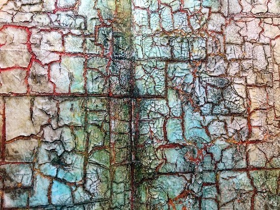
Next I decided to use Andy Skinner's Mega Crackle technique. You can see a video of that HERE. Basically after the paint on the background surface was dry, I painted a medium coat of Paper Artsy's Crackle Medium over the entire surface of the background and let it air dry thoroughly. You could also use DecoArt's Weathered Wood for this step.

Next I painted a medium coat of DecoArt's Media Crackle Paint over the Crackle Medium. Work fairly quickly and do not continue to brush back over your surface. Almost immediately the Crackle Medium will activate and large cracks will appear. Let air dry thoroughly.

To create even MORE crackles or a "Mega Crackle" effect, paint a medium layer of DecoArt Media Crackle Glaze over the surface and let air dry thoroughly.

To age and better define all of this crackling going on, paint a light coat of DecoArt Media Antiquing Cream over the surface of the crackled background. In this case, I chose Raw Umber. Once dry, use a baby wipe or damp cloth to remove the excess Antiquing Cream.

After wiping away the excess Antiquing Cream, here is what the Mega Crackle technique looks like so far. Perfect for my background that I am attempting to look chaotic, discombobulated to fit the theme of these pages.

To add more color to the background, I dry brushed first DecoArt Media Fluid Acrylics Cobalt Teal Hue followed by Transparent Yellow Iron Oxide to add sepia tones and the "age" factor and finally a little bit of Carbon Black around the edges and randomly on the pages.
With dry brush colors randomly added, here is a sample of what the background now looks like.

I love Dina Wakley's silhouette stamps and one in particular was perfect for my pages. Except....the stamp size was too small. So, I scanned the image and increased her size to 6 1/2" on my computer. Then I printed her out on heavy cardstock, cut her out and later glued her the left side of my art journal spread. I added the sketched lines after she had dried. I glued her in place using Golden Soft Gloss Gel as a glue and then a sealer.

I love Dina Wakley's silhouette stamps and one in particular was perfect for my pages. Except....the stamp size was too small. So, I scanned the image and increased her size to 6 1/2" on my computer. Then I printed her out on heavy cardstock, cut her out and later glued her the left side of my art journal spread. I added the sketched lines after she had dried. I glued her in place using Golden Soft Gloss Gel as a glue and then a sealer.
I added a brick effect to the perimeter of my journal pages using Tim Holtz' Bricked stencil and Archival Ink.

Here are the art journal pages before I glued on the silhouette and finished them out. Before I glued that in place though, I wanted to lighten the left side a bit where the silhouette would be to create a better contrast.

So using my finger, I first lightly added DecoArt's Media Fluid Acrylics Titanium White around the general area where the silhouette would be. Then I added some Yellow Iron Oxide to soften the vivid white just a bit. When I was happy with that area, I glued the silhouette in place and added my sketch lines around here with a permanent black pen.

Next I added the words "Let Go Of" using some old rub on letters I've had forever. I just love them!

To start filling in the background, I added some random stamping using one of Dina Wakley's Script Stamps and Black Archival Ink.

Here are the art journal pages before I glued on the silhouette and finished them out. Before I glued that in place though, I wanted to lighten the left side a bit where the silhouette would be to create a better contrast.
So using my finger, I first lightly added DecoArt's Media Fluid Acrylics Titanium White around the general area where the silhouette would be. Then I added some Yellow Iron Oxide to soften the vivid white just a bit. When I was happy with that area, I glued the silhouette in place and added my sketch lines around here with a permanent black pen.
Next I added the words "Let Go Of" using some old rub on letters I've had forever. I just love them!
To start filling in the background, I added some random stamping using one of Dina Wakley's Script Stamps and Black Archival Ink.
I used a white Posca Pen to do a little doodling on the rub on letters to help them stand out. Here is what this portion of the art journal spread looks like at this point.

I used Tim Holtz' Rays Stencil and DecoArt's Dazzling Metallics Peacock Pearl color to create rays emerging from my silhouette. I extended the rays even further onto the journal page with the paint and a small brush.

On my computer, I created the things that I need to let go of. I sized them to fit on my rays but I did not want the white paper to cover the rays. So, I experimented with a piece of plain tissue paper taped onto a piece of plain paper using Scor Tape around all four edges to secure the tissue paper in place when the paper ran through my printer. IT WORKED!!! So then all I needed to do was tear around each thing I need to let go of.

If your tear instead of cut the edges, they will meld better into your background. I first brushed a layer of Golden Soft Gloss Gel on the surface of each ray, laid my tissue paper piece in place and then brushed over the tissue paper with more of the gel. Here is how it turned out. I love it!

For the finishing touches, I added a few circles stamped from paint lids dipped into paint and some dots stamped randomly onto the page using Tim Holtz' dot stamp.
I hope that you're having a wonderful week and will find some time for yourself to just let yourself go and play with your art. These pages were very catharsis for me by helping me realize things that could be holding me back from being my best self.
I used Tim Holtz' Rays Stencil and DecoArt's Dazzling Metallics Peacock Pearl color to create rays emerging from my silhouette. I extended the rays even further onto the journal page with the paint and a small brush.
On my computer, I created the things that I need to let go of. I sized them to fit on my rays but I did not want the white paper to cover the rays. So, I experimented with a piece of plain tissue paper taped onto a piece of plain paper using Scor Tape around all four edges to secure the tissue paper in place when the paper ran through my printer. IT WORKED!!! So then all I needed to do was tear around each thing I need to let go of.
If your tear instead of cut the edges, they will meld better into your background. I first brushed a layer of Golden Soft Gloss Gel on the surface of each ray, laid my tissue paper piece in place and then brushed over the tissue paper with more of the gel. Here is how it turned out. I love it!
For the finishing touches, I added a few circles stamped from paint lids dipped into paint and some dots stamped randomly onto the page using Tim Holtz' dot stamp.
I hope that you're having a wonderful week and will find some time for yourself to just let yourself go and play with your art. These pages were very catharsis for me by helping me realize things that could be holding me back from being my best self.
I love what you created! May have to try some of the crackle effects.
ReplyDeleteThis is wonderful, love your crackle background and the colors you chose.....makes me want to let go and create!
ReplyDeleteAWED. Speechless. Touched. XXXXXXXj.
ReplyDeleteWow Candy you have used so many amazing layers and techniques to create these fabulous pages. I love mega crackle and yours has textured beautifully creating a wonderful base for the silhouette and words to sit on, definitely grunge at its best. Hopefully working through these steps you have let go of some of those things now. Huge hugs to you and yours xxx
ReplyDeleteOMG, Candy this is totally amazing!! The background by itself was so stunning already, but then the way you finished it, - wow!! So many clever ideas and details, like adding the light around the figure, the words in the rays, - I could go on and on, a totally brilliant spread, I love it!!!!!
ReplyDeleteWow, what a fantastic grungy page, Candy - the effects and textures and techniques are amazing as always, and what a great idea to enlarge the silhouette to get just the size you wanted. Dramatic and atmospheric, and a fantastic statement of intent to let go of those troublesome things.
ReplyDeleteAlison x
You are such a genius! I LOVE that you made the girl larger on the computer, and the things to let go with the tissue paper...that is hard to get right stuff. LOVE LOVE LOVE all the crackle too, and the many layers on that. Just really awesome and heart felt pages.
ReplyDeleteAn amazing job of stepping out of your comfort zone. Such an emotional, stirring piece!
ReplyDeleteThank you so much Cindy!
DeleteHoly smokes, that crackle effect is AMAZING! What a great layout this is. I say it all the time, but I totally love your journal pages and your process. Thanks again for sharing another inspiring piece of art. (P.S. I need to let go of some very similar things as you.) :)
ReplyDeleteHey Jamie!!! Oh my gosh! I am thrilled that you left a comment. You are SUCH a talented artist and young lady. Congratulations on your recent graduation. I know you have an incredibly bright future ahead of you. Thank you for your very sweet comment. ❤️
DeleteI really do think that you achieved what you set out to achieve, with the crackle representing the broken, chaotic, disjointed nature of things but the brick wall bringing everything back to feeling more positive - I get that! Your mega crackle is incredible and I just love how you did the words, they really do 'melt' into the gorgeous background. Love it - a lot! Anne xx
ReplyDeleteThis is amazing! I had to come over to your blog after seeing the pages on FB, well worth it! X
ReplyDeleteHi Jan! Thank you so much for stopping by my blog! It's much appreciated.
DeleteCandy, this is freaking fabulous!! Love your background it's almost like a map to your soul. The way you have the rays extended from the woman works beautifully. TFS I have to catch up a bit.
ReplyDeleteCandy, your background is soooo delicious!! And the way you created your word strips and used them in the rays- well, Brilliant!! I really think that stencil/mask by Dina was the perfect choice for this spread-well done girlfriend! Another outstanding journal spread!
ReplyDeletexo Jackie
ps...this is def one of my favs!!
DeleteWhat a great spread, and your step out if terrific. I'm drawn to the 'dark side' for this theme - well done.
ReplyDelete